

Jana B
-
Posts
20 -
Joined
-
Last visited
Posts posted by Jana B
-
-
So I have just compared with prints. This company sends two versions of the prints - uncorrected one to check own monitor calibration and corrected one to also see the effects that their complimentary colour correction service can have on the images. (https://blog.loxleycolour.com/the-ultimate-guide-to-colour-management-57873/) .The brightness of the screen and the prints match after the calibration and overal the colours are not bad. However, when I compare skin tones of uncorrected prints and the screen, the screen has much more warmth in it and the colours are overal warmer/bolder/more vibrant. (corrected version matches the screen better) .
I have also noticed that this company has printer profiles to download for softproofing. Their test prints are "Lustre prints". "Shall I download their Lustre & Gloss" print profile? (https://www.loxleycolour.com/help/colour). If yes, at what stage of editing and how shall I use it? (I have never done softproofing before).
What would you suggest that I did now about calibrating as I am not entirely satisfied with how the "uncorrected" prints match the screen? (I know that I cannot expect exact match, but I am not happy with the comparison).
Thank you in advance!
-
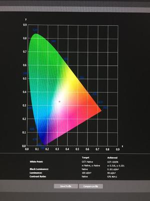
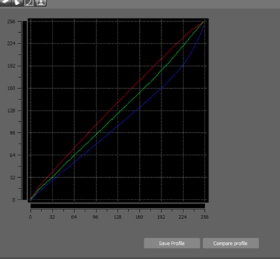
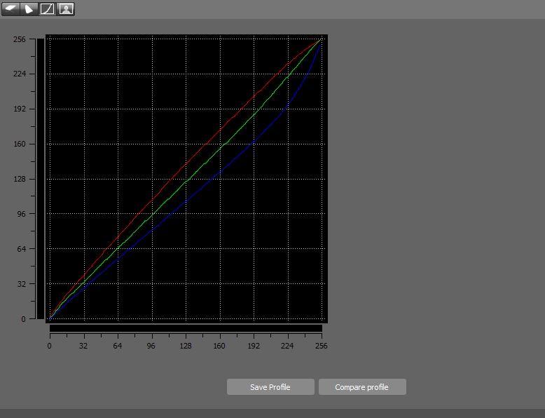
Also, when I tried calibrating using the wrong instructions and I believe that time I chose the preset mode "Rec. 709 Mode", I achieved white point: CCT 6337K. Was that not better than the number above? Shall I try to calibrate tomorrow again using that preset mode (Rec 709?) instead of "standard mode". ?
-
I have just calibrated the screen. The brightness of the screen had to be adjusted down to 7, which really suprised me. Is that normal? I wil compare the screen with the prints tomorrow. If the brightness is OK, but I still find the screen more vibrant/bold, what should be my next step?
-
Thank you.
I am reading (https://www.damiensymonds.net/cal_i1DP_pc1.html) "Calibrite ColorChecker Display Pro
X-Rite i1Display Pro
Calibration tutorial: desktop method 1 . "Hope it is the correct one.
At the beginning there is written: "Before you begin, please make sure you’ve read this article." and in that article it was mentioned to turn off automatic screen brightness adjustments. I did not notice there that it was only in case you were calibrating a laptop.I will calibrate now and report back tomorrow after I compare the screen with the prints during daylight. Thank you once again!
-
Hi Damien,
I got a new PC and a screen a couple of weeks ago and I have just realised that I calibrated it wrong - following wrong instructions (I used the ones that I used to use for my laptop. The result of the calibration was that the brightness matched the prints, but the colours of the screen were more saturated/bold than the prints, which I was not happy about, especially when it comes to skin tones).
Now I'm reading these instructions https://www.damiensymonds.net/cal_i1DP_pc1.html, which I hope are the correct ones, but I struggle with a few following things. I hope that you could help me with those, please.1.) I cannot find the screen type.
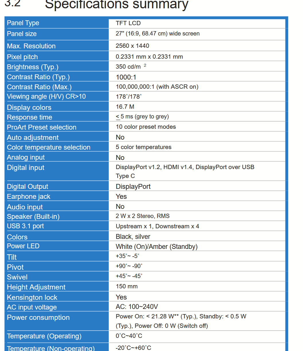
My monitor is ASUS ProArt Display PA278QV 27" QHD IPS Monitor
and in it's manual it is written : (Link to the manual: https://www.manualslib.com/manual/2037826/Asus-Pa278cv-Series.html?page=28#manual)
Which of the options (generic, CCFL, wide Gamut CCFL, white LED, RGB LED...) should I chose then, please?
2. Is it possible that my monitor does not have an option to turn off "automatically adjust brightness"? (When I go to Settings > System > Display, I cannot see such option there. I tried to google it, but cannot find any help with this)
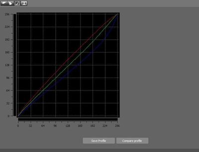
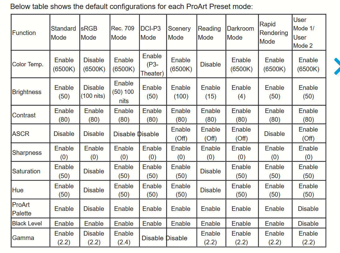
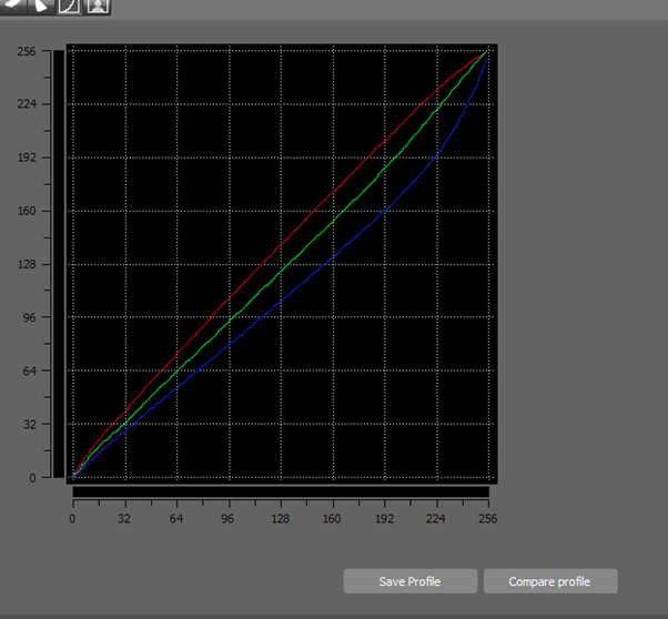
3.This screen has a lot of colour presets and it's manual shows their colour temperature.
(see the screenshot below please)
Shall I still be checking each preset's temperature with the calibrator?
If checking their temperature is not necessary, which one of the options would you recommend choosing?
I found on ASUS page that to change brightness and colour of the screen, I should chose Rec. 709 Mode. Shall I go with that one then?
https://www.asus.com/support/FAQ/1043885
Thank you in advance!
Jana
-
I re-calibrated last night again to the target of 60 and compared the prints during the daylight today. I can see some improvement, but I still think that the prints are darker than what I see on the screen. I guess, that I shouldn't go lower than the target of 60, correct? What would you advise now, please?

-
OK, so last time I calibrated to 70. Shall I try 60 now? Also, when I calibrated to 70, I struggled to adjust the brightness to the set target of 70 - it was either 54 or 81, so I chose the lower target because it was written there that the calibrator would adjust the brightness to the set target anyway if the screen’s brightness cannot be adjusted “manually” accurately. Was that the correct thing to do? When I have two options of adjusting the screen’s brightness - one way lower and one way higher than the target, is it better to choose the lower one or the higher one? Does it matter at all if the calibrator will attempt to adjust it correctly to the target value anyway? TIA
-
I am more satisfied with the daytime match now, but I still think that the prints are darker (but not as much as I thought before I moved the desk) than what I see on the screen. What’s the next step now?
-
Regarding the photo above being a bit underexposed, it might also mean that I am not good at finding bright mid-tone when checking correct exposure of the subject's skin. It is definitely something I need to work on.
-
Oh my, I saw your responses only now. So I have moved my desk to the place which we discussed (about 1.5 metres from the window along that wall, light coming from my left). Is there anything else to do regarding getting my screen correct during the day or is it time now to look at the light at night -aka change the lightbulbs?
-
Thank you. I could actually try to move it about 1.5 metres from the window along that wall. I'll definitely try to do that to see if it makes any difference. (I forgot to mention that currently I edit 90% of time at night though).
So I wonder now, do you find that photo of my boy that I attached above underexposed? Am I underexposing because of not having correct light around my computer? Is that the reason why the prints came out dark?
I should perhaps also mention that I've recently had a photo published in a magazine and when I compare that photo in the magazine to my screen, I am happy with the match. That really confuses me now.
-
So just to double check that I understood correctly: if I move my desk to where the black guitar case is in the photo, should I position it so that light is coming from my left side?
-
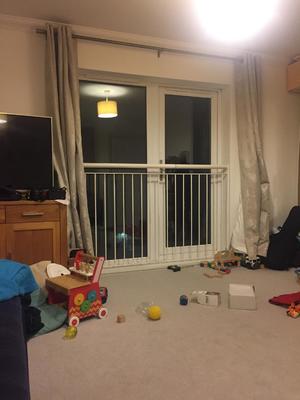
Oh no, first of all, this room has the biggest window that we have in our flat and secondly, there is literally nowhere else to move the desk in our tiny two bedroom maisonette.
Could moving the desk somewhere else within the room help?
PS: sorry for the mess in the photo. I've just put my boys to bed and am about to tidy up.
My desk is currently where I took the photo from and I suspect that it's possition is wrong. (there are no other windows in this room, but the light also comes in through a door on the camera's left.
-
I've just doubled checked on their website. It must be "lustre" as there is no other option to select for the test prints.
This is a link to their products
https://www.loxleycolour.com/help/colour
-
Hi Damien,
Due to the fact that we're in different times zones and also because I can see the note about you going away this weekend, I decided to post the update to my print comparison here as well. (I posted it under my "blade of grass removal" thread, but I assume that either you're busy now or you might not have noticed the notification.)
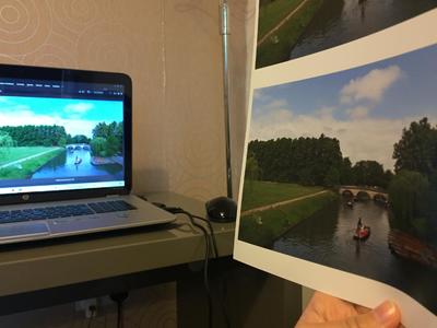
So I compared the prints during daylight yesterday, following your article "Before calibrating your monitor". I did not hold the prints close to the screen , I held them to one side and turned my head ninety degreees when comparing them to the screen. Unfortunately, even if I do not expect perfect match, I find them too dark and I am not satisfied with them. I am not sure how to show you what the comparison looks like. Unfortunately, I did not take any photos when I did the comparison yesterday during daylight, but I tried to do take a photo of the comparison again this evening with the lights on. However, I could not find a right angle to do it without backlighting the prints. I'll attach one meagre example though (I held the print even further from the screen when I did the actual comparison), but I think that this example won't help at. How would you advice I proceed now? You mentioned that I cannot calibrate to a lower target than 70, so what else could I do now?
I also would like to mention that when I have people in a photo, I check whether my subject's skin is well exposed by using the "curves method" (hovering the sample point over a bright midtone and looking where on the curve it lands). In the photos, which I used for the test prints, it shows that the skin was properly exposed, but the prints are darker. (I am attaching one of the photos that I used as a test print-a photo of my little boy). What are your thoughts on this, please? PS: The lab I used is called Loxley Colour

-
Hi Damien, thank you very much for your prompt reply! Yes, my laptop has a touch screen (which I never even use) and unfortunately I do not have any desktop screen. Do you have any articles on which desktop screens you would recommend that you could send me a link to, please? Regarding the colours, I need to compare them again tomorrow when my eyes are less tired. I found it hard to compare though as prints were so much darker than the screen, but I would say that the colours were fine. I have already found a pro lab that I want to get tests prints from, so if the colours from those new prints turn out not to be fine, I’ll ask for your help/advice again, if you do not mind. Lastly, thank you for your link to your article about light around computer. I definitely need to change the light bulbs because I think that the living room (where I always edit) is not bright enough and the bulbs might be too warm. All in all, what steps should I take for now when it comes to calibrating my not-so-very-good laptop screen, please?
-
Hello Damien,
I am new here, I've just bought x-rite i1Display Pro calibrator based on the list of your recommendations and tried to calibrate the screen of my laptop (HP Envy TS 17-j011sa).
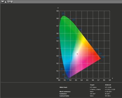
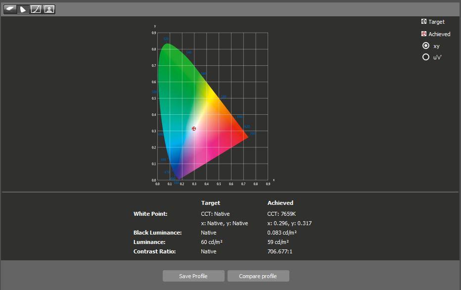
I followed your step by step instructions and when I got to the end, I noticed that the white point target is CCT 7689. In your instructions you mention that "6500K is the common standard, and 500K either side of that is perfectly acceptable". Could you please explain to me what it means that my white point target is so much higher than 6500K? Is there any way to bring it closer to 6500K?
Lastly, after setting Luminance to 100 and comparing the result with the prints, I had to re-calibrate and drop luminance to 80. However, my prints (unfortunately not from a professional lab, just from Bonusprint) are still darker than the screen. I wonder whether I might have misunderstood instructions when calibrating. I switched the lights off during the calibration process but as it was already night here, the room was almost completely dark. Was that the correct thing to do or would it be better to calibrate with the lights switched on? (At the moment I have time to edit only at night. If the lights being off during the calibration could not have effected the fact that the screen brightness does not match the prints, shall I be then aiming at editing only during the day?).
I hope that my questions make sense and that you'll be able to help me.
Thank you
Jana


Calibrating ASUS ProArt Display PA278QV 27" QHD IPS Monitor
in Monitor calibration questions or problems
Posted · Edited by Jana B
Thank you, Damien. Unfortunately my calibrator started malfunctioning, so we had to send it for repair this morning. (It looks like a problem with a cable, but as its warranty is going to expire next week, we were told to send it immediately) As soon as it comes back from the repair (or is replaced), I’ll recalibrate following your troubleshooting instructions and post the result under this thread. PS: I had read your print guidelines and had ordered prints according to them. There are no very vivid colours and it’s the skin tones that bother me the most when comparing the screen and the prints.