Samantha_R
-
Posts
242 -
Joined
-
Last visited
Everything posted by Samantha_R
-

Printing a Flyer
Samantha_R replied to Samantha_R's topic in Output - print, websites, Facebook, email, client disk, etc
They came in yesterday & they are just lovely! I chose the option that you could have a different image on the back of each card & some images have not printed a bit sketchy. But I can live with that - time to start networking! Thanks so much Damien for all of your help on it - it was much appreciated! I'll take a little pic of them for you & add it in here soon. -
Printing a Flyer
Samantha_R replied to Samantha_R's topic in Output - print, websites, Facebook, email, client disk, etc
I'm expecting delivery tomorrow!! Will let you know ? -
Printing a Flyer
Samantha_R replied to Samantha_R's topic in Output - print, websites, Facebook, email, client disk, etc
Woohoo!! So as a general rule when printing anything stick to the CMYK colours? And convert text to shape - so basically everything we went through for this flyer? Thanks again Damien - you are a bloody legend. -
Printing a Flyer
Samantha_R replied to Samantha_R's topic in Output - print, websites, Facebook, email, client disk, etc
I think I may have been fluffing around with that trying to get the spacing right before I started on this thread with you! I've just changed that to 14pt. I'll send you the file again. -
Printing a Flyer
Samantha_R replied to Samantha_R's topic in Output - print, websites, Facebook, email, client disk, etc
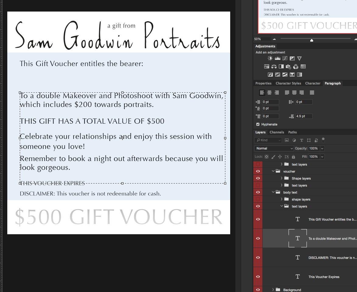
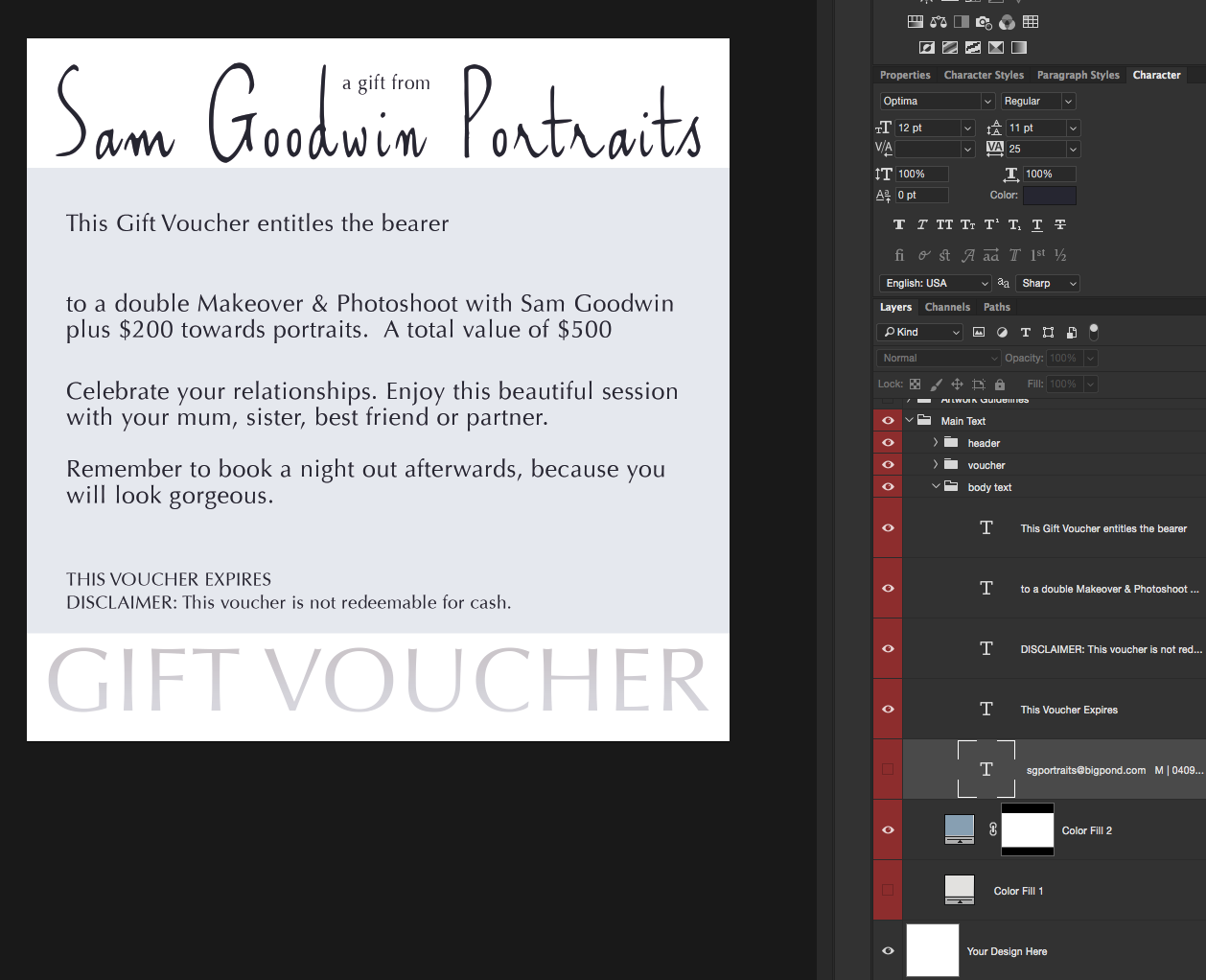
Yes they should have stopped at the Smurfs cartoon in my opinion. It's saying 12 point in the text box size? I've attached the screen shot just in case I've misunderstood the above!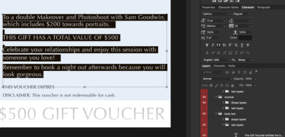
-
Printing a Flyer
Samantha_R replied to Samantha_R's topic in Output - print, websites, Facebook, email, client disk, etc
I just checked after each sentence & it's telling me 4.9 - or have I got the wrong end of the stick? (which is the most likely story, lets be honest!) So I moved everything a smidgen to leave more room for hand writing a name in, and sadly my computer kicked its clogs last week (otherwise I would totally have printed this bad boy), and I've yet to do battle to make it print again.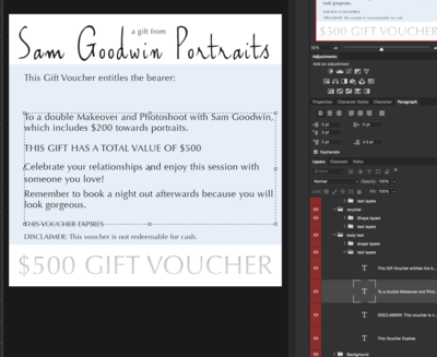
-
Printing a Flyer
Samantha_R replied to Samantha_R's topic in Output - print, websites, Facebook, email, client disk, etc
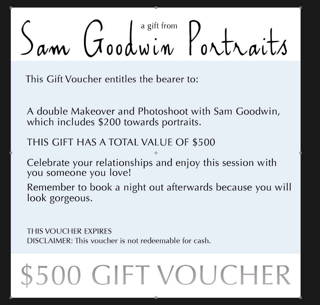
Yep I did do the text to shape thing - I do that last before saving the PDF. So I've adjusted the paragraph spacing so it is all 4.9 pt - let me know your thoughts once I send the file. I think I've looked at it so much my eyes have glazed over it. So bring on the nerd, it's all good! I also just realised why I have that large gap between the 'bearer' line & the body text, as I was going to hand write in the persons name on the card when I gave it to them. I've just fixed the text for it make sense. -
Printing a Flyer
Samantha_R replied to Samantha_R's topic in Output - print, websites, Facebook, email, client disk, etc
I fixed the black on the gradient - tucked away in plain sight! Just sent you the pdf again. You are a legend. -
Printing a Flyer
Samantha_R replied to Samantha_R's topic in Output - print, websites, Facebook, email, client disk, etc
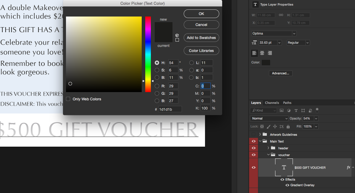
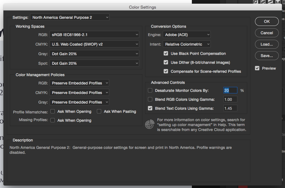
Where do I choose the colour from in here to make sure it's black & white only? I've been in & out of this bit so many times & can't work it out!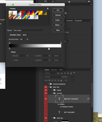
-
Printing a Flyer
Samantha_R replied to Samantha_R's topic in Output - print, websites, Facebook, email, client disk, etc
With the 'GIFT VOUCHER' text, it was showing as 100% for K when I went in... What have I missed?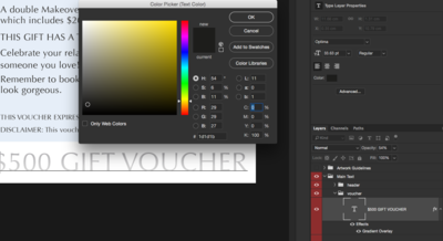
-
Printing a Flyer
Samantha_R replied to Samantha_R's topic in Output - print, websites, Facebook, email, client disk, etc
I got caught up with the electrician - I was half way through it! I'll send document to you know. -
Printing a Flyer
Samantha_R replied to Samantha_R's topic in Output - print, websites, Facebook, email, client disk, etc
I'm just checking I'm doing it right, I would out 0 as the value under C, M & Y, and 100 for K? -
Printing a Flyer
Samantha_R replied to Samantha_R's topic in Output - print, websites, Facebook, email, client disk, etc
Done! thanks, Sam. -
Printing a Flyer
Samantha_R replied to Samantha_R's topic in Output - print, websites, Facebook, email, client disk, etc
I've just added a little more room now. -
Printing a Flyer
Samantha_R replied to Samantha_R's topic in Output - print, websites, Facebook, email, client disk, etc
You sir have the patience of a saint. Thank you Damien.
-
Printing a Flyer
Samantha_R replied to Samantha_R's topic in Output - print, websites, Facebook, email, client disk, etc
How does it look now?
-
Printing a Flyer
Samantha_R replied to Samantha_R's topic in Output - print, websites, Facebook, email, client disk, etc
God I'm such a noob at this. Thanks Damien. -
Printing a Flyer
Samantha_R replied to Samantha_R's topic in Output - print, websites, Facebook, email, client disk, etc
The gradient is plain white & definitely no blend modes. Could I reduce the opacity or leave it at 100% - I like how it's a bit muted as such. I'm happy with plain black text for printing purposes. For electronic versions I can use the colours I had originally I suppose. I started playing with the text & such this morning to make it better. I'm not sure how to best place the text? The spacing has been bothering me but I don't know how to make it better. Would I make a layer for each sentence? So I can move the layer to get the spacing I want?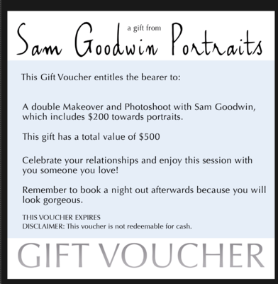
-
Printing a Flyer
Samantha_R replied to Samantha_R's topic in Output - print, websites, Facebook, email, client disk, etc
I thought I'd start it at black & then see if I could do that gradient overlay if possible? Or can I reduce the opacity instead? -
Printing a Flyer
Samantha_R replied to Samantha_R's topic in Output - print, websites, Facebook, email, client disk, etc
Yes sorry, I missed that bit. It's at 22% So I've done the replacement layer, 100% opacity, with CMYK as follows: 10, 3, 0, 2 Does that colour work for the purpose of printing under these specifications? Ok, I'll change text to Black only. Right, so I think I'm losing my mind, I've changed all the text to black, but am I really tired or does it not look black? Especially the GIFT VOUCHER text? I've checked that opacity is at 100% - or am I just being a proper muppet? Or I've been looking at it too long.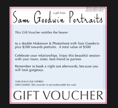
-
Printing a Flyer
Samantha_R replied to Samantha_R's topic in Output - print, websites, Facebook, email, client disk, etc
1. 51, 29, 22, 5 2. 82, 74, 52, 65 3. gift voucher text colour is the same as point 2, it has a colour overlay at 49% & the blend mode is: colour burn. Is that enough info for point 3? -
Printing a Flyer
Samantha_R replied to Samantha_R's topic in Output - print, websites, Facebook, email, client disk, etc
here's what it has.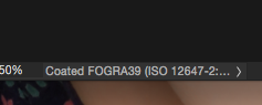
-
Printing a Flyer
Samantha_R replied to Samantha_R's topic in Output - print, websites, Facebook, email, client disk, etc
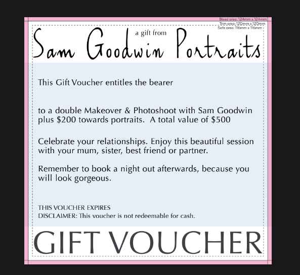
Of course! I'm just plugging away at my marketing material, so no rush at all. Just getting to the pointy end on this flyer! I'm not sure, I downloaded their template to use & just put my text in etc. Is this what you mean?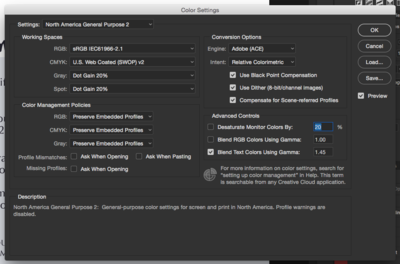
-
Printing a Flyer
Samantha_R replied to Samantha_R's topic in Output - print, websites, Facebook, email, client disk, etc
They suggest the following: Try to keep text in bold colours, made up of one or two inks only (C, M, Y or K). When printing lines in a solid or dark colour, make sure they are no thinner than 0.5pt. If you're using a lighter colour, we recommend 1pt. -
Printing a Flyer
Samantha_R replied to Samantha_R's topic in Output - print, websites, Facebook, email, client disk, etc
No probs. Do you want me to expand the rest of the text layers for you? Or is this enough?