angelah
Member-
Posts
25 -
Joined
-
Last visited
Everything posted by angelah
-
Thank you. I have another question.. I called WHCC just to see if they could give me advice since it's their product. The girl I spoke with mentioned that I could manually adjust my white point, making it 7000k etc which she told me would make my monitor cooler. I tried to figure it out since all I see are presets of 5000k, 6500k, native etc. Would you happen to know if this is doable? How to do it? Would it be of any benefit?
-
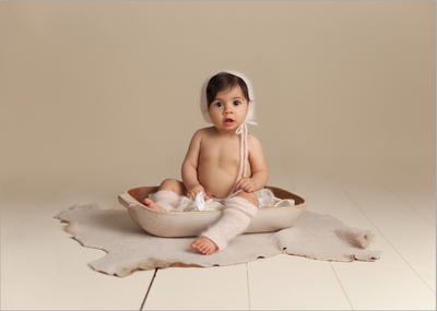
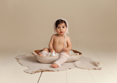
Yes this is the second batch of prints I ordered. They are a tad better because I made some slight adjustments in hopes that they would have the desireable outcome. But they are definitely cooler, the one image I sent you was much more noticeable. I see a pretty magenta/reddish hue (not a color issue) on my monitor, I like that and was hoping the prints would match that in which I edited to my tastes. What I got was not that.
-
Yes I warmed it all so it doesn't look true grey. But hat, wrap, and fur were all a greyish tone. Well I didn't see the option to do so, there was a button I could have clicked that said apply color correction $1.00 but I left it unclicked of course. Do the skin tones look how I described to you? reddish and warm?
-
THank you so much for helping me further!!! Yes it is the exact same file! I have these separate so I can hopefully see the good test prints vs bad. My monitor is warmer, redder, more magenta in the grey portion (which I know you probably cannot see from the file I sent) Is that what you see as well? Because the print is cool and dull
-
oh I know it's a guideline, I played with it and I feel my brightness is pretty much what I see in my prints, but the color is off in the prints making them appear dull and lifeless. I am confused however because I thought I was supposed to calibrate in dim light (which I did) Can you clarify this? I saw someplace that it needed to be dark but then I do believe I saw contradiction that it should be bright enough to do homework in. I was reading a lot of stuff trying every avenue.
-
I get that my monitor is lying to me, but it's what I want to see my prints look like, getting the prints is a big surprise when they don't look like what I'm trying to achieve. My room is not dark, I'd do homework/read a book in this light in this light, no light is hitting my monitor and it's very even light (no bright sun at the moment and I calibrated in the same space when the sun was down so it was pretty dim on the darker side) My colorspace was checked all are in srgb as mentioned above. And I do believe my brightness is near what Damien said he had his at correct? @77? I kind of feel that when I unclicked calibration toggle button that the uncal looked closer to what my prints were. yes
-
Sorry for the delayed response. I attempted to order from my newly calibrated monitor again and all the images are the same cyan, yellow, darker in tone than what I see on my screen. I think I have my brightness at around 78 or 79 at this time. Does that affect it? I'm at a loss, I prefer what I see on my screen and I'm ordering from WHCC. Any other suggestions?
-
Looking at my prints again, they just do not look that similar, my prints are much darker and greener and duller than what I see on my screen. I don't know if maybe I had unclicked the uncalibrated view when I thought they matched or not. But no matter what I do I cannot get them to look like these prints. Everytime I calibrate, it seems to make the screen redder slightly, like a slight magenta haze. Which is the total opposite of what I have in my hand Any thoughts or anything else I can try? Oh and for the heck of it, I tried rgb led and it didn't make a difference.
-
haha it's obvious! Okay so I think I'm going to go with the 6500 for my calibration. To me it looks closer to my prints right now. Excuse me if this seems stupid to ask but do I just tweak what I have on my screen to match what I now hoped it would be, being then closer to what I thought I did see originally when I ordered these prints I'm comparing to right now?
-
yea putting it to 6500 makes it super red, it's pretty and its closer to what my screen was before I calibrated. Using the native makes it closer to my prints but it's still seems like the screen got brighter like there was a soft light haze (its super soft) added. I have my slider for brightness down to 83 now as well which was a lot less than I had it before. When you say grim news what does it mean??? argh!!
-
Thank you! At first the screen was very red and warm, more of what I thought I was getting for print. What I got back was cooler, yellow/green, and cyan in tone. I've calibrated again just recently, I think it's getting closer but still seems a tad off. I've taken my brightness quite a bit down and for some reason it seems brighter now.
-
I've been having some issues with my prints not matching so conducting a calibration with Spyder 4 pro. I'm at the step (following Damiens tutorial) on inserting gamut and backlight and I cannot find the info in my manuals or online. I called Apple today and they seem to think it's a normal gamut and rgb led. I'm thinking the rgb maybe incorrect but like I said I cannot find the info. Can anyone help me in finding this info? I also looked at the display info when clicking about this mac and saw rgb space (is that the same as backlit info?) I need to reorder some canvases for a client that are incorrect so I need to figure this out quickly. Thank you!!


