

Cheryl D
-
Posts
183 -
Joined
-
Last visited
Posts posted by Cheryl D
-
-
I don't doubt at all that you are right about a new screen. Thank you for helping me.
I think I've been staring at it too long now -- most of the day -- so will come back to it later with fresh eyes.
Cheers!
-
 1
1
-
-
No, unfortunately, I don't have another screen. I turned the lamps on and raised the blinds. Better.
I've been doing this 10 years and actually felt competent until today. ?
-
No, they are a very good lab. They do a lot of competition prints. I have every reason to believe the problem is on my end... and of course, I'm suspicious about an 8-year-old monitor's accuracy. But I don't want to run out and buy another monitor (Covid has wrecked my budget) if that is not the problem.
-
However, I can't afford another round of $100 prints I can't deliver... so I'm open to ideas. ?
-
Logically, yes. But I've been told for 10+ years not to edit in bright light... so my brain just exploded.
-
I would not describe the room as "nice and bright." I would describe the lighting as subdued. Typically the lamps aren't on during the day.
Trying to understand. Are you saying if the room is brighter the prints will look less dark and then be closer to matching the screen? I have to take them to the window and view them there for them to be even reasonably okay.
Sorry to take up so much of your time! I need to get this right.
-
Small-ish bedroom with 2 lamps and one window (with blinds). No direct sunlight. Only edit in the daytime. I'm really at a loss here...
-
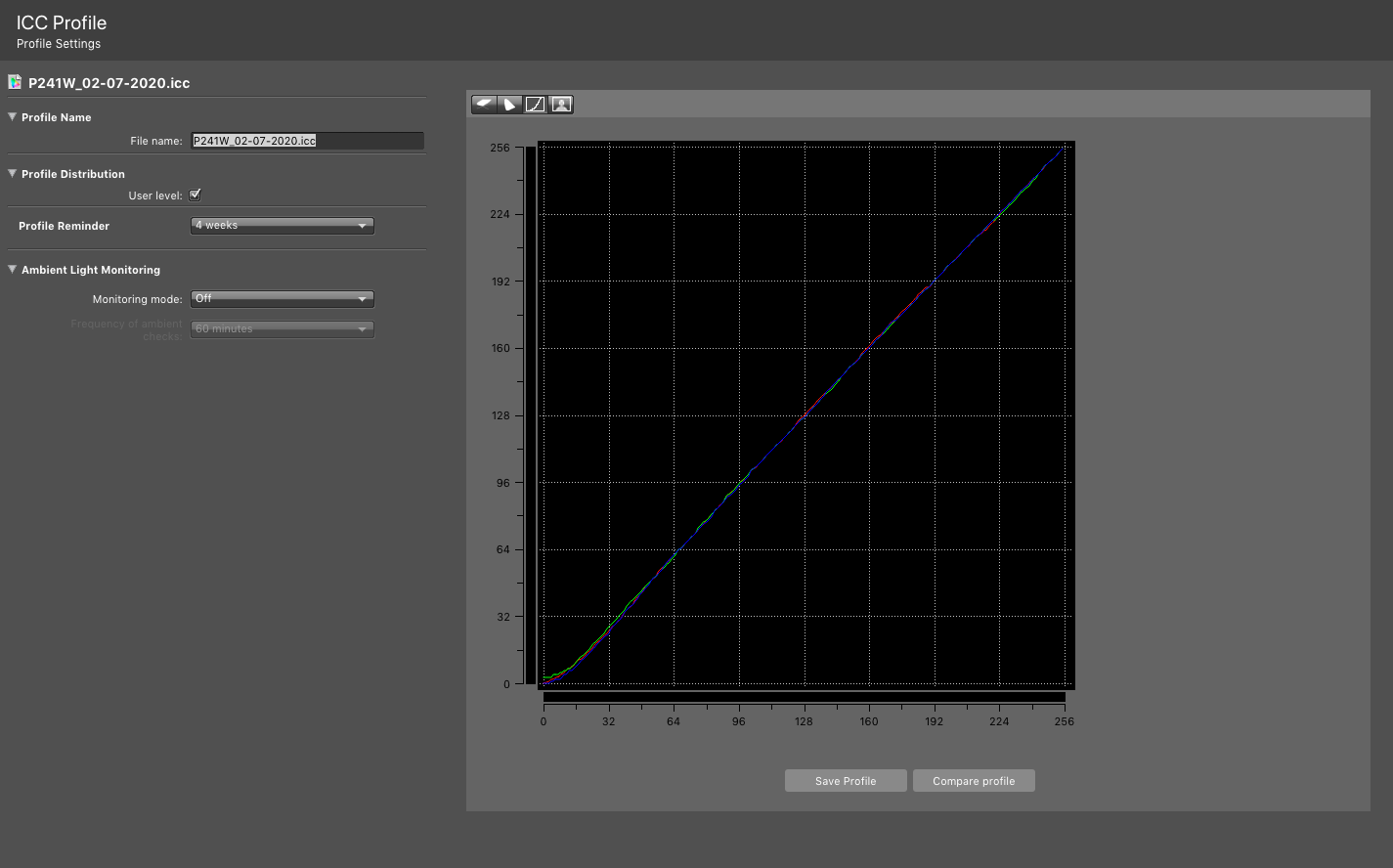
Ah... before I saw your last post... i tried method 2 again. Very interesting! I ignored the RGB adjustments, but for the brightness adjustment, I had to bump the monitor setting for brightness to 125 to get the "measured white luminance" to 80.
End result: achieved white point of 6522! Progress!
Do my prints match? No, sadly, not even close. They look smashing on my screen. ?
If I turn my monitor brightness down to 50, the prints are still darker than the monitor. And the color in the prints is decidely leaning more toward cyan or green.
Not sure what to do now.
-
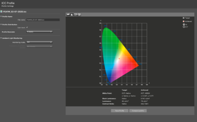
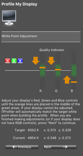
Yes, I can adjust the white temp! Should I make that match what the calibration is showing? Here is screenshot showing white point reading of 4928 and target of 6502...

-
UGH. White point 4741 using wide gamut CCFL. Even worse.
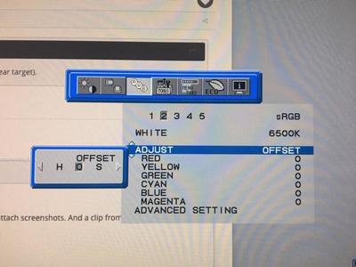
I did not press on previously with method 2, because I couldn't figure out how to adjust the individual R-G-B values on this dang monitor. The screenshot shows my options to adjust the sRGB preset... I have hue, offset (whatever that is) and saturation. Already tried hue and that did not work. When I go to advanced settings, I just get options to change the x and y values.
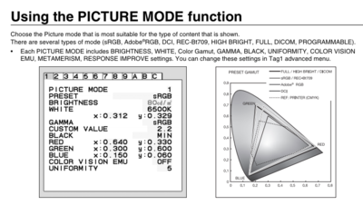
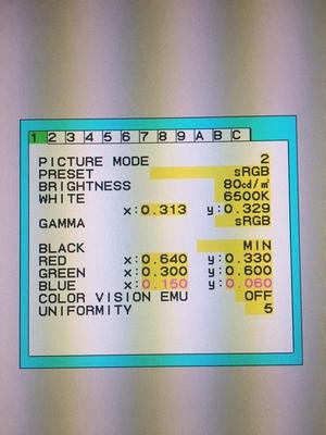
Also here is a clip from the monitor manual, which shows my blue is the norm x & y values for sRGB(?). I'm so over my head here!
I will try method 2 again and see if I can get all the way to an end result.
-
Check was fine.
Going through the steps again and realized I used CCFL instead of wide gamut CCFL. Off to calibrate again... be right back.
-
I must be doing something wrong but I have no idea what. The "presets" I have are sRGB, High Bright (Native) and Full. The closest uniformity number was 6358 for preset sRGB so I set the monitor to that.
Then I ran the calibration and the white point came back as 4992. I just did it again and it came back slightly lower.
-
I'm using an old NEC Monitor, the P241W. I think I bought it about 8 years ago. ?)
I'm going through the RAW class and did (or tried to do) a calibration today using my i1 Display Pro.
I tried method 1, and the white point came out nowhere near the target. (Calibration Screen 1&2 images attached.) Did it 3 times with same result.
When trying method 2, I saw my blue is VERY low compared to red & green (which are very close in values and near target). Since you said this could indicate a problem with the monitor, I thought I'd post some screenshots and seek your advice.
I'm confused because I had prints as recently as February that I loved.
Thanks for your help!


Replace Old NEC Monitor?
in Monitor calibration questions or problems
Posted
I'm now editing in a room with nice light.")
You were right about the prints -- they weren't that bad. I checked with the lab and they do recommend editing at 50% monitor brightness so that made me feel a bit better too.
In the end, I added a tiny bit of brightness to my latest files and reprinted on my usual paper. Much happier. (Last order I had tried Canson Rag and it's a little yellowish for my liking.)
Thanks for your help. Going to complete the Raw Class in the next few days--have learned a lot already! I can tell it's going to greatly reduce my editing time and frustration with skin tones.