TxaTmAg
-
Posts
8 -
Joined
-
Last visited
Everything posted by TxaTmAg
-
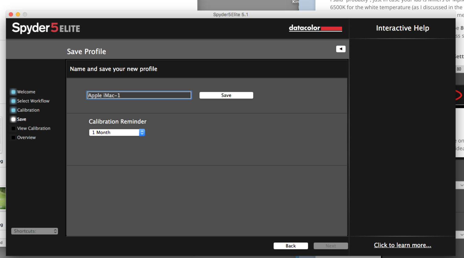
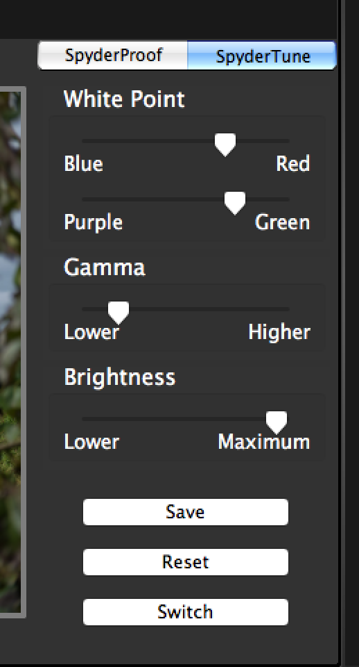
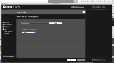
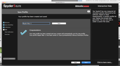
 I reran calibration this morning with fresh eyes and I think it is pretty close. (I put the sharpness out of my mind. ) I ran it with brightness at 90 per your suggestion and adjusted the colors through the sliders with spydertune only slightly adjusting the gamma and brightness. (I had my husband do the same with the sliders to confirm my eyes aren't deceiving me and his sliders landed almost exactly where mine did.) That all being said, I still feel like the color is ever so slightly off and therefore would respond to your statement with "The screen is cooler than the prints" However, I am definitely more happy with the match than I originally was! I don't know how perfect the match has to be. I figure pretty darn close since you would need to see the same thing as I am if I have any further questions. I'll attach a pic of my saved settings. If you are okay with these, I am too. If I'm in the clear, I'm excited to begin the raw classes.
-
While waiting...I tried it a third time at brightness 100. (My screen is originally reading 464 for brightness). I have to say my eyes are now tired and I can't figure out what is what and which looks right anymore. On brightness 100 I didn't have to play with the gamma, but I did lower the brightness slider slightly. However, for the colors...I just couldn't get it right. So I'm going to call it a night and I'll try again in the morning assuming you don't have a magic fix before then. Thank you for your patience and your help in figuring this out with me.
-
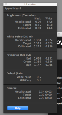
Sorry, one more picture. Maybe these numbers will help.
-
My ultimate concern with the images being crisp on the screen and not in print will be that I will continue to print dull images/less sharp as a result. Don't big prints need additional sharpening? (Another thread I remember reading. Which I would miss because they already appear sharpened.)
-
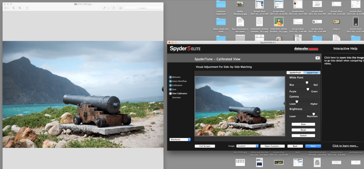
Okay, I did it twice. First time I did it, I got excited because it matched perfectly! But then I went to check the spider tune and it had my old settings (which I previously screenshot for you!) So I reset those and played with them again. Again, I found myself back to the settings very similar to what they were. So I pressed reset and started the whole process over...even wiped off the monitor before the second go and ran it through again. This time I screen shot as much as possible and pulled up Preview of one of the images a bit larger to see if my eyes were just playing tricks on me due to the 4x6 screen they provide. Unfortunately, I found myself in the same predicament. I can't say that the brightness is what is bothering me because as you can see, my slider is already maxed out on it. Would you recommend I increase my brightness (not 80 but higher) and see if that helps. Again, the thing that differentiates the prints from the screen though is still the crispness when i only play with the white points and leave the gamma alone. I'm sorry to be confusing. I will attach the screen shots and maybe something I'm doing wrong will jump out and therefore be any easy fix.
-
No, I chose the option for Brightness is good, but color was close but I'd be happier if it were tweaked a bit (something to that effect.) Which sent me to the sliders. Once there, I got the color situated and still wasn't happy. So i tried the brightness slider, which didn't tone down the pictures enough to match the prints. so I started playing with the gamma. I sat for almost an hour playing with the sliders for all of the white points/gamma/brightness on 14 different files/prints. To get it perfect like the instructions stated. Are you thinking I should start over? I can screen shot if that helps...but it doesn't change the fact that you can't see the prints. (I'm doing the 90 degree thing also...not looking directly at the picture by the computer.) I chose the 3rd option.
-
No, it seemed more that my prints seemed dull/less sharp than my screen. I know it's the other way around technically as the prints are set and the screen is what we are altering. I just felt like I was adjusting my screen to a lower quality to match my prints. Seems off. The only way to bring down the crispness of my screen seemed to be to lower the gamma so much.
-
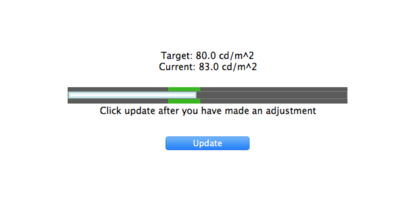
81 was as close as i could get it to 80. Well within the 4% margin though.
-
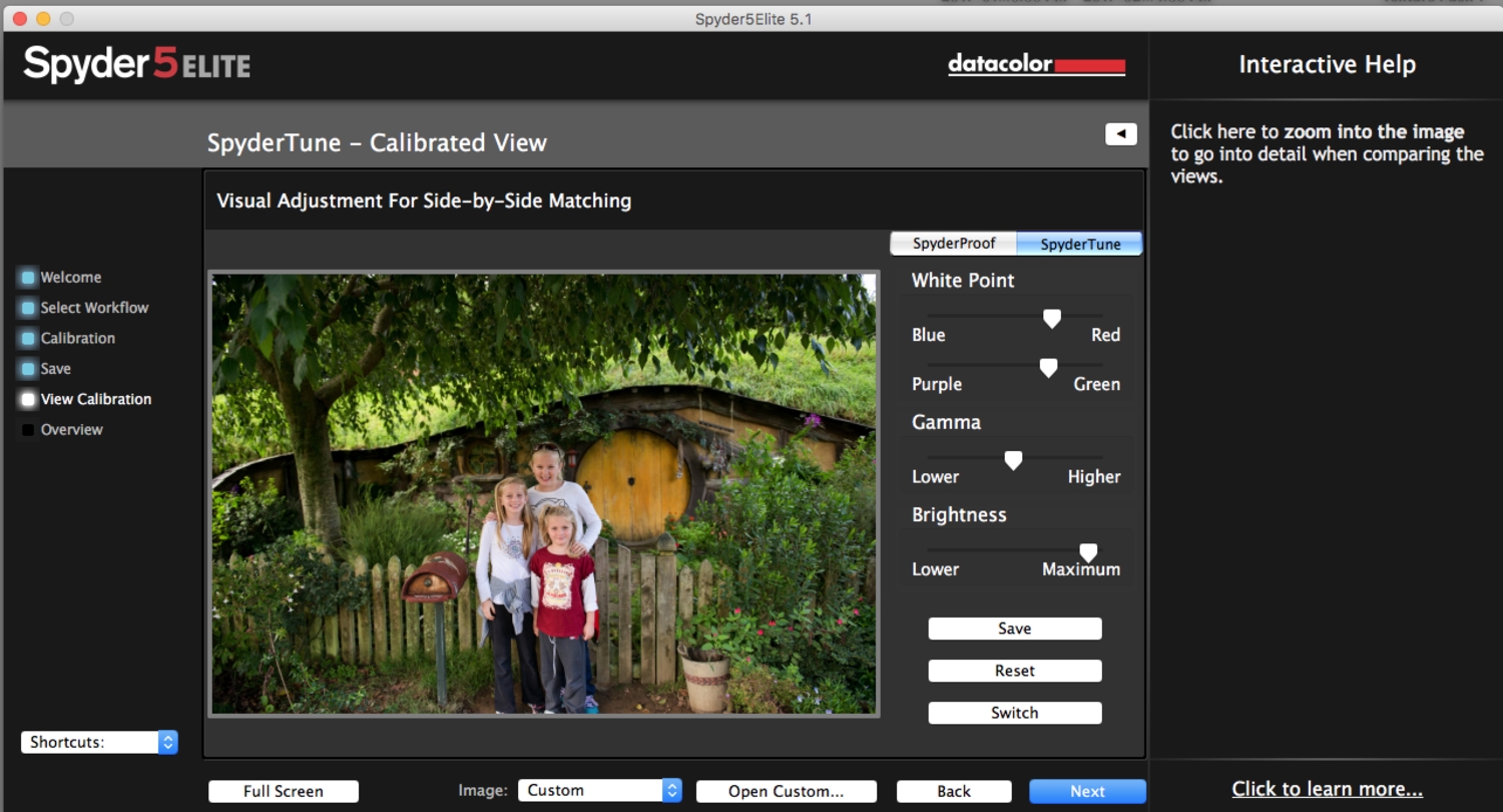
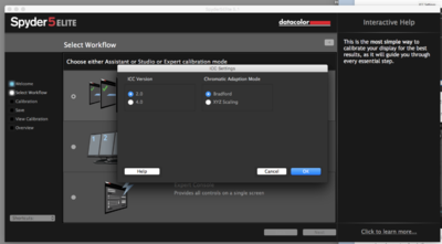
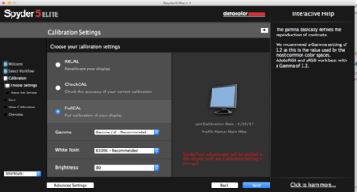
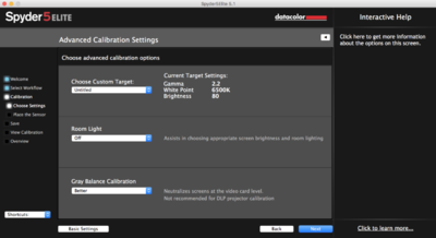
Hi, I have followed your calibration instructions. I have finally gotten the 14 test prints I ordered to match the new calibrated screen. However, in order to achieve this, I had to really slide the Gamma down and I had to bump the colors to the right what seems like a drastic amount. (see attached picture) I am not sure if this was the right thing to do as you specifically stated on the Gamma to only do a little bit. Please let me know if I need to anything different. (First time calibrator. Using Spider 5 Elite on a 27"iMac. I use PS4 to edit and have my profiles set to srgb as you recommend. I use White House Custom Color to print.) I just signed up for your Raw Class, so I'm trying to make sure I have everything ready prior to diving into your classes. I do hope I followed the asking questions protocol correctly. Kind regards, Paige