Sarah Neese
-
Posts
282 -
Joined
-
Last visited
Everything posted by Sarah Neese
-
Thank you! I will work on getting that from her when our stay at home orders are lifted.
-
I don't have a scanner myself but she said she has a better one at the office she can scan it on.
-
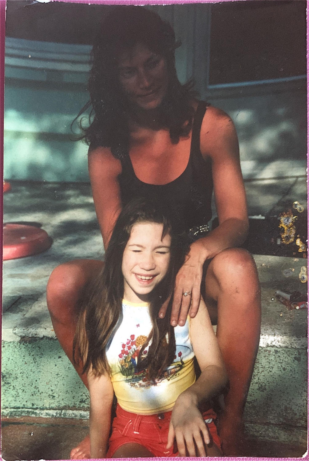
Hey Damien, I have a friend that asked me if it was possible to brighten up her moms face? This is one of the only three pictures she has with her and obviously taken before digital was even a thought.

-
Calibration & Test Prints-February
Sarah Neese replied to Sarah Neese's topic in Monitor calibration questions or problems
I'm actually working on it. Started it this past weekend. -
Calibration & Test Prints-February
Sarah Neese replied to Sarah Neese's topic in Monitor calibration questions or problems
ok, thank you! I definitely will. I've been playing with tiny changes in the calibration and its still as it was but it is 100% different than last night! Thank you again so much! -
Calibration & Test Prints-February
Sarah Neese replied to Sarah Neese's topic in Monitor calibration questions or problems
I am sooooooclose.....Brightness is right on, prints are ever so slightly warmer, I notice the warmth more in the neutrals. -
Calibration & Test Prints-February
Sarah Neese replied to Sarah Neese's topic in Monitor calibration questions or problems
I've gone back and recalibrated and the prints are slightly warmer...so slightly and you notice it more in the neutrals. -
Calibration & Test Prints-February
Sarah Neese replied to Sarah Neese's topic in Monitor calibration questions or problems
Out of 6 prints that I am using to compare, 4 are not cool. -
Calibration & Test Prints-February
Sarah Neese replied to Sarah Neese's topic in Monitor calibration questions or problems
Yes, the screen is cooler. -
Calibration & Test Prints-February
Sarah Neese replied to Sarah Neese's topic in Monitor calibration questions or problems
The print is warmer. The brightness is fine though. -
Calibration & Test Prints-February
Sarah Neese replied to Sarah Neese's topic in Monitor calibration questions or problems
The other two that I was comparing was MPix and Millers. Not the two best other choices. -
Calibration & Test Prints-February
Sarah Neese replied to Sarah Neese's topic in Monitor calibration questions or problems
I do but I've only been using prints from one lab when matching prints to calibration. The same lab I used the ICC profile and soft proofing for. -
Calibration & Test Prints-February
Sarah Neese replied to Sarah Neese's topic in Monitor calibration questions or problems
Yes, the prints I am comparing to the calibration are all from the same lab. -
Calibration & Test Prints-February
Sarah Neese replied to Sarah Neese's topic in Monitor calibration questions or problems
Went through them again and OMG I think I got it! I have a couple that don't match but I have four that match with both brightness and color. -
Calibration & Test Prints-February
Sarah Neese replied to Sarah Neese's topic in Monitor calibration questions or problems
Absolutely! Done! I apologize that I didn't have that updated. Spyder5 Elite -
Calibration & Test Prints-February
Sarah Neese replied to Sarah Neese's topic in Monitor calibration questions or problems
I'm calibrating the onboard screen. I don't have the desktop running off of it. -
Calibration & Test Prints-February
Sarah Neese replied to Sarah Neese's topic in Monitor calibration questions or problems
No. I'm currently using a MacBook Pro. Yes, old computer was a MacBook as well. -
Calibration & Test Prints-February
Sarah Neese replied to Sarah Neese's topic in Monitor calibration questions or problems
Screen has always been more red than the print. Print is more yellow than the screen. New screen. I've had the calibrator for a few years now. There have been more problems of the lab I was using not having accurate color consistently and I wanted to look for a new lab so I went and had some test prints made at a few labs that came highly recommended to me. -
Calibration & Test Prints-February
Sarah Neese replied to Sarah Neese's topic in Monitor calibration questions or problems
No, when comparing the print and screen the screen has more red and the print has more yellow. The print is as if there is a yellow filter on there. The prints just look dirty no matter how I change the brightness to match the print. I'm so sorry. I'm so frustrated. -
Calibration & Test Prints-February
Sarah Neese replied to Sarah Neese's topic in Monitor calibration questions or problems
Ok, so I've lowered the brightness of the screen and recalibrated and there is still more red in the screen than on the print. I've gone through all the steps in the soft proofing link and there wasn't any difference in color when toggling back and forth. -
Calibration & Test Prints-February
Sarah Neese replied to Sarah Neese's topic in Monitor calibration questions or problems
Sorry, no, was going to submit a print order with my brightness adjusted. -
Calibration & Test Prints-February
Sarah Neese replied to Sarah Neese's topic in Monitor calibration questions or problems
I don't think it was bright enough...the prints were darker than I would want them to be. Going to recalibrate at a brighter screen, and just print a few test prints to confirm and peace of mind. -
Calibration & Test Prints-February
Sarah Neese replied to Sarah Neese's topic in Monitor calibration questions or problems
Absolutely, especially when comparing print to screen of the camping set up (tent/hammock/middle of fire). The neutrals are right on. I'm hoping lack of brightness is part of the issue. The prints just look more dull than they do on my screen. Definitely more red on the screen and more yellow on the print. -
Calibration & Test Prints-February
Sarah Neese replied to Sarah Neese's topic in Monitor calibration questions or problems
Unfortunately not to how I would want it to be. Part of it is that it didn't print as bright as I hoped it would so I needed to make adjustments there. I think I just need to reprint some test prints again, especially to ensure brightness is accurate as well. There's still more red tones on the screen vs on the print. -
Calibration & Test Prints-February
Sarah Neese replied to Sarah Neese's topic in Monitor calibration questions or problems
Got it and did it!