Rachelle T
-
Posts
132 -
Joined
-
Last visited
Everything posted by Rachelle T
-
I organize all my folders by year and then month&year (or by last name if I take pictures for others). But, if I want to choose a group of photos to include on my website, or a group of photos to include in an printed photo album then I like to create a "collection" of those photos. So everything stays nicely organized in their folders, but I don't have to search and search for photos everytime I work on a project. Does that make sense?
-
Oh good, there is!? It's important for organization.
-
And I really apologize you have so waste so much of your time convincing all of us to stick with Bridge.
-
But there's not a way to create collections in Bridge? Sometimes collections are so important to be able to create.
-
I've had a new idea, haha. I could still import my PSD files into LR and organize them (after I open them from Bridge into PS and save as PSD files). IDK, I'll do my best to just try to Ignore LR for now. Adobe is so dumb! They should just solve this problem, with today's technology there's no excuse.
-
I just wondered if I could use Bridge to decide which numbers would actually be accurate, and then plug them into LR, that way I wouldn't really have to transition, which feels so overwhelming, that I just can't bring myself to complete a big project, because all my organization is in LR...
-
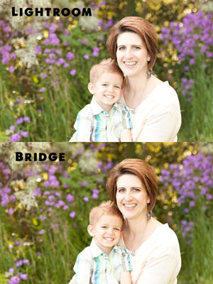
Well, this is what they look like Layered next to each other in Photoshop. ?
-
Can I open a photo in Bridge, decide how I want to edit it, and then plug those same numbers into LR, export to PS as a PSD in sRGB 8 bit and get the same results; would it be the same as opening the photo from Bridge into PS (all with the same WB, exposure, contrast, highlights, etc)?
-
Calibrated with X-rite i1 Display Pro
Rachelle T replied to Rachelle T's topic in Monitor calibration questions or problems
I've played around with it a little bit but I'll look into it more later today. Thanks. -
Calibrated with X-rite i1 Display Pro
Rachelle T replied to Rachelle T's topic in Monitor calibration questions or problems
The question is, what do I do about it? Can I desaturate my monitor or do I need to compensate by adding saturation after I finish editing each picture? I remember seeing a comment on the internet by someone about adding saturation before printing and then I couldn't remember where the comment was to go back and read up on it to see if the person was referring to a specific instance or if they always add saturation. -
Calibrated with X-rite i1 Display Pro
Rachelle T replied to Rachelle T's topic in Monitor calibration questions or problems
Ok, yes I think we're on to something. I've tried overall desaturation on a few of my pictures and then they match my prints! -
Calibrated with X-rite i1 Display Pro
Rachelle T replied to Rachelle T's topic in Monitor calibration questions or problems
My prints look desaturated compared to my monitor. -
Calibrated with X-rite i1 Display Pro
Rachelle T replied to Rachelle T's topic in Monitor calibration questions or problems
i don't think they clash. -
Calibrated with X-rite i1 Display Pro
Rachelle T replied to Rachelle T's topic in Monitor calibration questions or problems
I looked back on an old chat I had about calibrating my iMac and one photographer said, "there are loads of ways to calibrate- i just used the kit my lab (millers) sent me." -
Calibrated with X-rite i1 Display Pro
Rachelle T replied to Rachelle T's topic in Monitor calibration questions or problems
I calibrated my monitor with the light off and door shut, a tinted window let in just a tiny bit of natural light. -
Calibrated with X-rite i1 Display Pro
Rachelle T replied to Rachelle T's topic in Monitor calibration questions or problems
I think the light's ok. It's kind of a weird room, it has a small amount of natural light and two white light bulbs (not fluorescent) in the center of the room. -
Calibrated with X-rite i1 Display Pro
Rachelle T replied to Rachelle T's topic in Monitor calibration questions or problems
Ok, I've calibrated my monitor using a small variety of settings so I can look and decide which one matches the closest. The weird thing is that listed under Display profile on my iMac is the option AdobeRGB and that seems to be the closest to my prints. They are just maybe just slightly cooler than my prints. What do you know about that setting? Can I just use that for my display profile?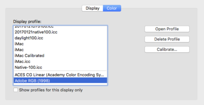
-
Calibrated with X-rite i1 Display Pro
Rachelle T replied to Rachelle T's topic in Monitor calibration questions or problems
I remembered that I have some prints from ProDPI as well. I compared them and they aren't as warm as my monitor either. -
Calibrated with X-rite i1 Display Pro
Rachelle T replied to Rachelle T's topic in Monitor calibration questions or problems
Yes, lol, I understand that my prints are what's important, but I want to love my pictures on my screen AND prints! I bought a mac because I got sick of having my other computers crash on me and have to be completely redone every couple of years. That is why I bought it and it has delivered. It's nearly 5 years old and hasn't given me an ounce of problems, other than this whole calibration issue . I did a lot of research before I bought it, I WANTED another windows computer, but after experiencing one too many issues with my PC I made the switch. Some people said not to calibrate the iMac monitor at all, maybe I should've listened, but I couldn't help myself. I'll keep trying to get it figured out. I'll try a different lab and perhaps try the "daylight temperature." Hey, if all else fails can I connect my old screen to my iMac? I know, that sounds dumb, but is it a possibility? -
Calibrated with X-rite i1 Display Pro
Rachelle T replied to Rachelle T's topic in Monitor calibration questions or problems
I remember checking at times in the past and feeling ok with my match. But mostly I've looked at my prints away from my monitor and thought they looked good, without comparing them exactly to my monitor. But when doing that I realize they don't look quite as warm. So, if I've already chosen the setting to get my monitor to its coolest setting what do I do next? I really LOVE how my pictures look on my monitor, the prints aren't as nice, and I'm referring to color, not brightness. Do you think I should try my other lab before I start to worry too much? Could it partly be due to my lab? I'm located in El Salvador and it's nearly 11:00PM my time, so I'll check back in in the morning. -
Calibrated with X-rite i1 Display Pro
Rachelle T replied to Rachelle T's topic in Monitor calibration questions or problems
I've gathered some older prints and it they're not quite as warm as my monitor either. Hmmm. -
Calibrated with X-rite i1 Display Pro
Rachelle T replied to Rachelle T's topic in Monitor calibration questions or problems
Okay, so I should compare it to my older prints, gotcha, that makes sense now that I think about it. And I'll contact WHCC and ask them to reprint that picture for me. I set up an account with another printer as well, maybe I'll send it off to them to print as well. -
Calibrated with X-rite i1 Display Pro
Rachelle T replied to Rachelle T's topic in Monitor calibration questions or problems
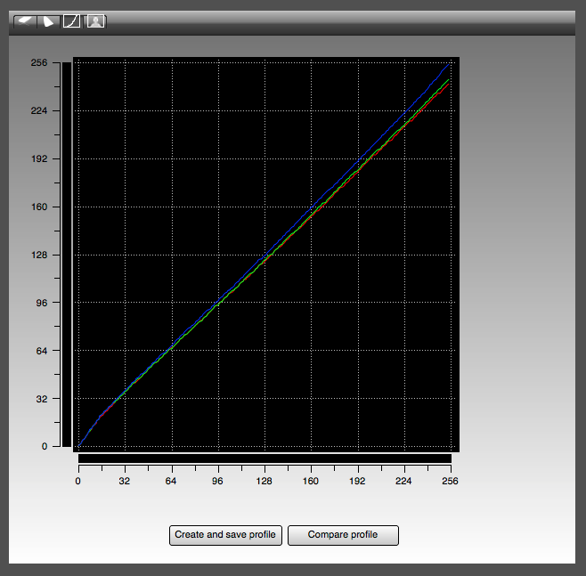
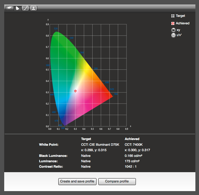
I order my prints from WHCC. I just received my first unsatisfactory print from them that really does not match my screen. It looks more green and cool and blah. But the color profile was sRGB. I did not calibrate right before editing that picture so I figured maybe my calibration was off. When I compare it to other recent prints, I wasn't as unhappy with them, but they do looks less warm than my screen. I just recalibrated using D75 and i don't think it looks much different. Perhaps WHCC did really botch one of my prints on their end? I'm attaching the results of my latest calibration.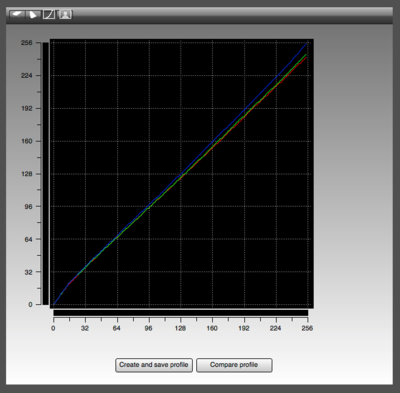

-
Calibrated with X-rite i1 Display Pro
Rachelle T replied to Rachelle T's topic in Monitor calibration questions or problems
I also wonder why I wouldn't want to choose sRGB for the tone response curve (instead of standard/default) since I edit in sRGB. I have an iMac, no retina. -
Calibrated with X-rite i1 Display Pro
Rachelle T replied to Rachelle T's topic in Monitor calibration questions or problems
Yes, and that's what gave me the idea that I should recalibrate with different settings other than native. I've always been fine with the native setting before now, so I guess I'm a little nervous. Your instructions say, "If I wanted a cooler result, I could try 6500K (“D65”) or even 7500K (“D75”)." I'll go for it.