Jaimie.taylor10
-
Posts
16 -
Joined
-
Last visited
Jaimie.taylor10's Achievements
-
Monitor way too magenta/red
Jaimie.taylor10 replied to Jaimie.taylor10's topic in Monitor calibration questions or problems
yeah... i know that. i just thought it was interesting that it matches the prints exactly, but my computer doesn't. -
Monitor way too magenta/red
Jaimie.taylor10 replied to Jaimie.taylor10's topic in Monitor calibration questions or problems
Hey Damien! So after all of that, the photos now are more red/magenta and warmer in person than on my monitor. My iPhone matches my prints almost exactly, but my computer is now almost too dull... Any ideas? If I have to just live with it, that's ok. I can adjust my expectations... but if I can get them to match, that would be amazing! -
Monitor way too magenta/red
Jaimie.taylor10 replied to Jaimie.taylor10's topic in Monitor calibration questions or problems
Sounds good! Thanks for all the help tonight! Talk to you when it's brighter out! -
Monitor way too magenta/red
Jaimie.taylor10 replied to Jaimie.taylor10's topic in Monitor calibration questions or problems
Hooray and not hooray! Now my stuff looks like crap! LOL. I'm worried I may have gone TOO far... it's almost like the monitor is looking TOO dull compared to my prints which are now looking a little more magenta than the monitor! (This is such a pain!) is there like a setting in between Native and D65? -
Monitor way too magenta/red
Jaimie.taylor10 replied to Jaimie.taylor10's topic in Monitor calibration questions or problems
Hey again! So I went back to take a picture of my screen to show you the difference between that and the dropbox link I sent you... but there wasn't really a difference anymore... then I looked at my other photos I've edited and they looked much more grey and dull (like they keep looking when I print them or view them from my phone)! So... sadly but thankfully, I think somehow the calibration did work but maybe it just didn't change immediately or something? But it seems to have worked now. Then again, it's 10:30pm here right now, so I'm viewing my screen in the complete dark... if it didn't fix the problem when I look in the morning, I will be back here to keep asking questions! -
Monitor way too magenta/red
Jaimie.taylor10 replied to Jaimie.taylor10's topic in Monitor calibration questions or problems
https://www.dropbox.com/s/oatle12eqenzx2j/IMG_2761-Edit.jpg?dl=0 let me know if that link works. I don't have any to show posted to FB or anything because it makes them look so bad and grey. If I want to post, I have to make them almost RED on my computer for them to look kind of normal skin color (not greenish grey) when I post anywhere. I will take a picture of what this same photo looks like on my computer -
Monitor way too magenta/red
Jaimie.taylor10 replied to Jaimie.taylor10's topic in Monitor calibration questions or problems
Yep! I followed them exactly. I ended up thinking maybe my monitor display was too warm and made a profile of 90_d65 and that didn't help. It actually didn't seem to really make any difference... i guess I could try the ambient light checkbox this time? It's just that nothing I change makes a noticeable difference... -
Monitor way too magenta/red
Jaimie.taylor10 replied to Jaimie.taylor10's topic in Monitor calibration questions or problems
Hey! Thanks for responding! Unfortunately it looks just as bad comparing in PS. I have the x-rite colormonkey display -
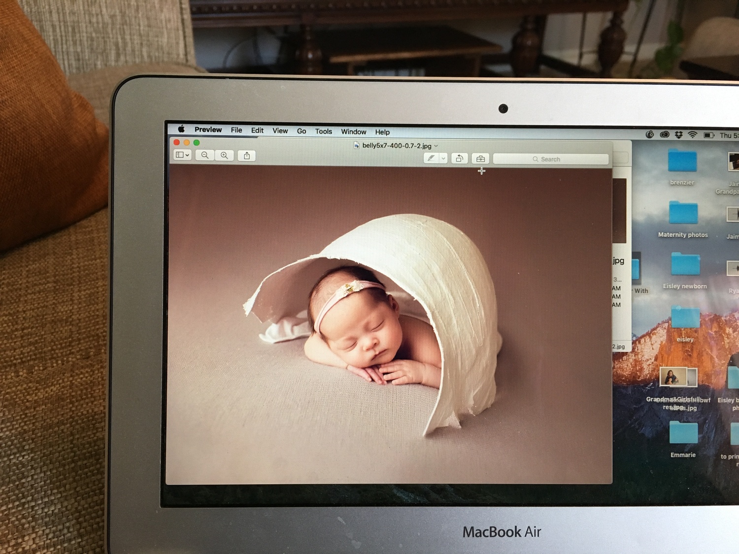
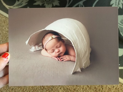
Hi Damien! I am trying to calibrate a laptop (I know, I know... but it's all I have an all I can afford right now)... it's a MacBook Air from I think maybe 2012? anyway, I am trying to calibrate and when I compare my test prints to my screen, the screen is MUCH pinker than my prints. I would assume it's a problem with my laptop, but my iMac desktop (that is now so old I don't use it anymore) had this exact same problem. For example, I can edit, but when I post to social media and look at it from my phone or when I make prints through ProDPI, my skin tones consistently look darker and greyer than they did on my computer. Here's an example.

-
PRODPI calibration
Jaimie.taylor10 replied to Jaimie.taylor10's topic in Monitor calibration questions or problems
Thanks, Damien. I haven't gotten test prints yet. Should I change the Gamma and the Temperature first before I order them, or should I just order them now and change/calibrate after I get them back? I know you need test prints to calibrate, but since it specifically says which temp and gamma is needed, I thought maybe I should just change that first? -
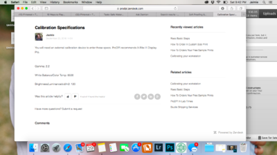
Got a new computer and switched labs, so it's time for me to calibrate again! bleh! When I go to PRODPI's website, it has this information about calibrating the screen. Should I input those values or should I just calibrate based off of the test prints? Or both somehow? I've never seen something like this before. I apologize if this has already been asked. I searched and didn't see it... but I may have completely missed it. Thanks!
-
Ok. When I am calibrating with the ColorMunki, I get to the brightness step, and I have to turn the brightness all the way up on my screen to get the yellow into the green. I've done this 6 times now. The room is very dim. When I compare my test prints, though, the only way I can get it CLOSE to the prints is to turn the brightness all the way down. I have calibrated with Native, 90, and now I am on 80... And each time I have to turn he brightness all the way up to match the target but all the way down to match my prints. Am I doing something wrong?
-
Calibrating in the dark!?
Jaimie.taylor10 replied to Jaimie.taylor10's topic in Monitor calibration questions or problems
Perfect! Thank you!! -
Calibrating in the dark!?
Jaimie.taylor10 replied to Jaimie.taylor10's topic in Monitor calibration questions or problems
Nope! But that's how I have always edited... With the brightness up all the way. ? I'm sure you said this somewhere... But I can't find it. When I edit now, after I have compared my prints and they match (hopefully) and everything, can I edit in dim light, or do I need to edit in the same light I used to check my prints to the screen? -
Calibrating in the dark!?
Jaimie.taylor10 replied to Jaimie.taylor10's topic in Monitor calibration questions or problems
Well... I turned all the lights on and calibrated the brightness, then I turned them all back off and calibrated the brightness, and it didn't seem to matter... I had to put my screen up to its maximum brightness in order to have the yellow line close (and it is actually a tiny bit below the green line). Could it be because I have an old/ancient iMac? It's 8 years old at this point... Maybe the display is failing or something?