AndreaLR
-
Posts
11 -
Joined
-
Last visited
Everything posted by AndreaLR
-
Monitor cooler than prints
AndreaLR replied to AndreaLR's topic in Monitor calibration questions or problems
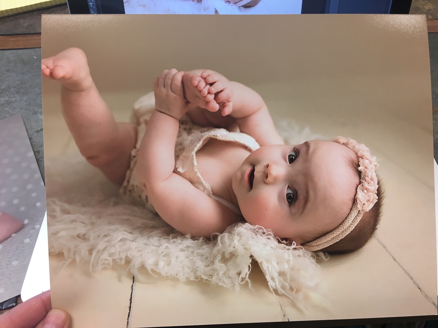
Just the print. It does look more lifeless in the comparison photo than it does in person.
-
Monitor cooler than prints
AndreaLR replied to AndreaLR's topic in Monitor calibration questions or problems
Alrighty, I am at my studio with even overhead lighting. First off, my print looks better than it did at home, but it's still far off.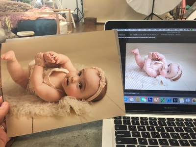
-
Monitor cooler than prints
AndreaLR replied to AndreaLR's topic in Monitor calibration questions or problems
Ahh, so weird!! I am so confused on what to do next. I've tried ordering the print again. Main going to try looking on another calibrated monitor. I didn't before because I didn't want to confuse myself anymore! -
Monitor cooler than prints
AndreaLR replied to AndreaLR's topic in Monitor calibration questions or problems
I did order this print from 2 different labs and it looks exactly the same. (I only ordered from the second lab to rule out a lab error) I also shot this photo with a Einstein light, which is color calibrated to 5600K. I usually edit the photos at 5700K to warm them up just a smidge. (I am not sure if any of this is relevant. I just want to throw this all out there.) -
Monitor cooler than prints
AndreaLR replied to AndreaLR's topic in Monitor calibration questions or problems
Absolutely!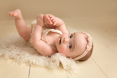
-
Monitor cooler than prints
AndreaLR replied to AndreaLR's topic in Monitor calibration questions or problems
It is definitely green! You are correct! The wall in front of me (behind my computer) is green. Windows to the right, open room to the left and behind me. color space is correct -
Monitor cooler than prints
AndreaLR replied to AndreaLR's topic in Monitor calibration questions or problems
Side note: I found one of the preprogramed color profiles for the mac that matches my prints much closer than this. It's not perfect, and I would definitely like to find a better solution, but at least I can move forward with editing in the meantime! -
Monitor cooler than prints
AndreaLR replied to AndreaLR's topic in Monitor calibration questions or problems
So, I didn't yet get new bulbs for the lights in my room, but I have compared prints in every different daytime lighting situation possible, and have tried calibrating my monitor at multiple different times as well. I am am at a loss for what to do next.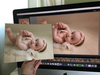
-
Monitor cooler than prints
AndreaLR replied to AndreaLR's topic in Monitor calibration questions or problems
Got it!! Off to the hardware store in the morning. I'll post back if things are still a miss after that. Thank you! -
Monitor cooler than prints
AndreaLR replied to AndreaLR's topic in Monitor calibration questions or problems
I have. And you are right, they are a little better in cooler light situations, but its still not close enough to call it a match. -
I am working with a late 2015 iMac, retina 5K screen. I am calibrating with a Spyder5Pro. I have followed the directions and troubleshooting tips exactly but I am still unable to get my monitor to match my prints. My prints are much warmer than my monitor. I am editing in my family room, which unfortunately has a lot of light coming in. The main window is east facing, which tends to work out well since I edit in the mid afternoon into the evening, so I don't have any direct light coming in my room. I have calibrated in the evening so there is no extra light coming in. Prints do not match, either in the daytime or in the evening. I have recalibrated multiple times with the various white point settings, (5000, 5800, and 6500) Even 5000 is not warm enough. On my screen things look nice and pinky-magenta with creamy skin, but in print it is warm, grey, and lifeless. I am not sure what to try next to get my screen to match my prints!