megflyawaydaisy
-
Posts
17 -
Joined
-
Last visited
Everything posted by megflyawaydaisy
-
I meant like his skin tone lol.
-
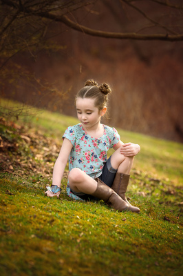
Does the image I added look ok to you?
-
Yes, they matched pretty spot on. I think what has me going a little crazy is the fact that I have to add so much so the image doesn't look green...to me. I do notice the more green around my subject the worse it is and when I do look at other's images online not all of them look green to me, just some. Maybe my eyes are just going to shit, who knows. I know its impossible to know what devices my clients are viewing the images on but I just want to make sure they see what I see and not the hulk or hellboy. lol I mean I guess if prints match then it can't be THAT bad right?
-
Oh and my prints do match right now.
-
Yes and yes. I ended up starting over and calibrated from a fresh start. I still feel like I have to add magenta to take that green cast out and I am not sure if its just the locations with green around because it's usually just the skin tones that have the green cast to them. I am adding an image that I edited after calibrating earlier. (I did enhance fall colors but just the background.)

-
I meant to say I add the magenta in ACR with white balance.
-
I didn't have the calibration tool they said needed for that program so I didn't want to worry too much about it. It was just how it described the way my monitor handles color and all that technical stuff made me wonder if I needed to use that tool to get a more accurate calibration. Ok, let me try to explain what I meant without sounding bat shit crazy...which maybe I am lol. When I first calibrated, I matched my prints as close as possible. After awhile I realized that a lot of my images had a green tint to them which noticed that so did my prints so it was more I guess how I was editing. So I tried to make sure that when I edited I added more magenta so that my images weren't coming out too green but then it almost felt like it was maybe too warm. I calibrated every month. I noticed that even other people's images were looking green which I know I only need to worry about mine but it has kind of made my eyes and me feel kind of crazy. This is probably more of an editing question possibly but it just has me feeling confused. I have ordered a good bit of prints for clients and they have looked great since changing up how I edit and adding more magenta it's just throwing me off with other people I know who calibrate and their stuff looks green. Am I crazy? Do you want me to attach an image I feel is green and then one that I feel is too warm? Will that explain a little better or no?
-
Hey Damien, So I have been using the ColorMunki Display for months now. My prints seemed to match my monitor pretty well. I noticed my images starting to take on a green tint so I calibrated again and got out my prints to compare and all seemed ok. I have learned some new editing techniques(finding my style) and lately I just feel like they end up too warm. So I thought I would go back to your instructions and possibly just start over. When I got to the technology type of my monitor I decided to do some research on my monitor to make sure I was using the correct option. Well in doing research for my monitor I read about using a specific calibration tool and certain software offered by Dell for these particular types of monitors. So I am sitting here kind of confused, wondering what to do lol. Would you care to look it over and give me your opinions on this. I have the Dell U2413. Thanks!!! https://photographylife.com/how-to-properly-calibrate-dell-u2413-u2713h-u3014-monitors
-
Yes I'm very happy with how these prints look. Thank you so much for your help.
-
I finally received my prints. Well I had to contact them so they could reprint and overnight them because the other ones were delayed and still no clue where they are. Anyways, these prints look pretty darn good. The red tone I was seeing in the other prints seems to not be there at all. I am pretty happy with how they look! My only other questions is the brightness part. I do edit with a fairly bright lamp or during the day in natural light. So should I be too concerned that I had to turn my brightness down further than what the 80 setting allowed? My prints are to my satisfaction with their brightness so I feel my monitor is just right in that aspect.
-
Ok I am off to get some sleep, as soon as these other prints get here I will report back!
-
I only notice a very slight difference. Maybe its because it's sharpened once it's resized for Facebook. I am not sure. Its not a big difference though, like if I had to pick out what was different it would be hard to say. I've been sitting here flipping back and forth.
-
I went ahead and downloaded Firefox because I was using Chrome and couldn't get the color management thing to change. Although not completely the same, maybe only slight differences it looks a lot better!!! Photoshop seems warmer now, less on Firefox. Do people ever go crazy worrying about all of this? haha
-
I know looking at images outside of photoshop isn't reliable but clicking on the ones I sent you and looking at the ones on Facebook I am noticing that everything is looking more saturated and almost more closely like my prints. In photoshop my images are looking dull and desaturated. I think I had this problem when I got this monitor(before I got a calibrator) and was messing with settings. eeek
-
Yes I can. Are there any settings I need to check in Photoshop perhaps? I can't remember if I messed with anything when I first got this computer or not. I don't think I did but I wanted to make sure there wasn't something with the color settings that maybe might have been changed.
-
Yes from looking at the prints, the rest of the image seems to look ok to me. I know it doesn't match perfectly but I am happy with everything else. As for the skin tones they just seem to have more of a magenta & red tint to them. The prints I have are from ProDPI. I actually just ordered a few others from Bay Photo as I switched to Shootproof and wanted to have a 2nd option. I should get those in the next few days.
-
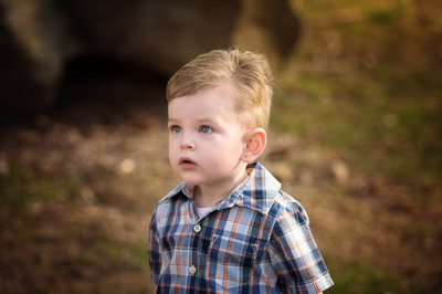
I have a Dell Ultrasharp Premier Color monitor. It has the options in the color settings to change it to to sRBG, Adobe RGB, then color temp and other presets. I have done the reset, changed the color temperature setting to closely match prints then calibrated with my ColorMunki Display, I had to manually turn my brightness down and then recalibrate as before it was just too bright. I do edit either in the daytime when there is enough light coming in or at night with a fairly bright lamp on. I was able to resolve that part. I have messed with the color temperature a few times and recalibrated but my issue isn't so much as warmth as the prints seem to fairly match in that aspect. My prints just seem to have a more red tint to them. I am wondering with my type of monitor if I should change the color setting to sRGB and then calibrate or if the color temperature should be fine. If that would make any difference at all. Also what can I do as far as my prints having the red tint to them and my monitor does not. I will attach a couple of the images I have prints of. I mostly notice the red more so on the skin than anything else. Thank you