haddoxmom
-
Posts
13 -
Joined
-
Last visited
Everything posted by haddoxmom
-
New Imac 5k & Spyder5 Pro
haddoxmom replied to haddoxmom's topic in Monitor calibration questions or problems
Okay, thank you for trying to help me! -
New Imac 5k & Spyder5 Pro
haddoxmom replied to haddoxmom's topic in Monitor calibration questions or problems
Hi Damien, with changing to v4 I noticed my grays & blacks did look a little better however skin tones & whites had red/orange streaks. I had 2days left on my 30 day calibration reminder so I went ahead & did everything again, but saving my last profile also in case it was needed, as well as the v4 profile. I don't see any difference though with matching my prints. -
New Imac 5k & Spyder5 Pro
haddoxmom replied to haddoxmom's topic in Monitor calibration questions or problems
Yes, I have been using v2 and I will try the 4 now -
New Imac 5k & Spyder5 Pro
haddoxmom replied to haddoxmom's topic in Monitor calibration questions or problems
I tested 4 of the photos, there was a funky red & purple color to them and one had olive green shades with purple! -
New Imac 5k & Spyder5 Pro
haddoxmom replied to haddoxmom's topic in Monitor calibration questions or problems
Yes in photoshop (also on safari and in LR) -
New Imac 5k & Spyder5 Pro
haddoxmom replied to haddoxmom's topic in Monitor calibration questions or problems
The images on my screen look dull. I know there will be a little difference between screen and print but it is an extreme amount of difference. (I calibrated my hp laptop to travel with & it matches very close to the prints.) -
New Imac 5k & Spyder5 Pro
haddoxmom replied to haddoxmom's topic in Monitor calibration questions or problems
They look very dull still. The contrast & blacks especially, whites are dingy towards warm side also. The red has more of a pinkish tint. -
New Imac 5k & Spyder5 Pro
haddoxmom replied to haddoxmom's topic in Monitor calibration questions or problems
I also took my monitor briteness from 120 to 90 -
New Imac 5k & Spyder5 Pro
haddoxmom replied to haddoxmom's topic in Monitor calibration questions or problems
Yes, I read the tutorial on lighting for room. I thought that was where I was having problems at first. My desk is near a window so I have it blacked out so not to let light in. And even though you said not to sit in total darkness, I have been trying that this past few days to see if it was a light that's across the room. (I bought one of the light bulbs recommended so not to throw orange/yellow casts) There's no light that falls onto my monitor from any other source. -
New Imac 5k & Spyder5 Pro
haddoxmom replied to haddoxmom's topic in Monitor calibration questions or problems
Yes, they match each other -
New Imac 5k & Spyder5 Pro
haddoxmom replied to haddoxmom's topic in Monitor calibration questions or problems
Millers and Nations Lab -
New Imac 5k & Spyder5 Pro
haddoxmom replied to haddoxmom's topic in Monitor calibration questions or problems
Yes Damien, it is a new Spyder 5Pro. I went over & reread your information & help tutorials also as you suggested above. Right now, I'm still playing by photo by editing photo & then checking it on several different laptops before moving to next image. Any help is greatly appreciated! Thank you -
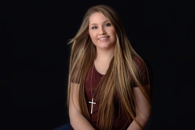
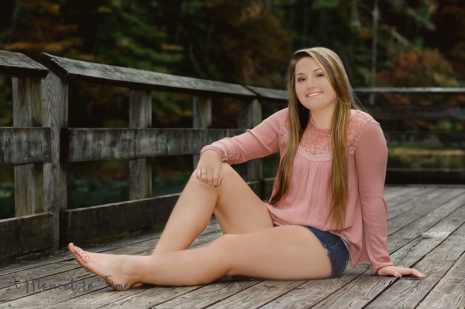
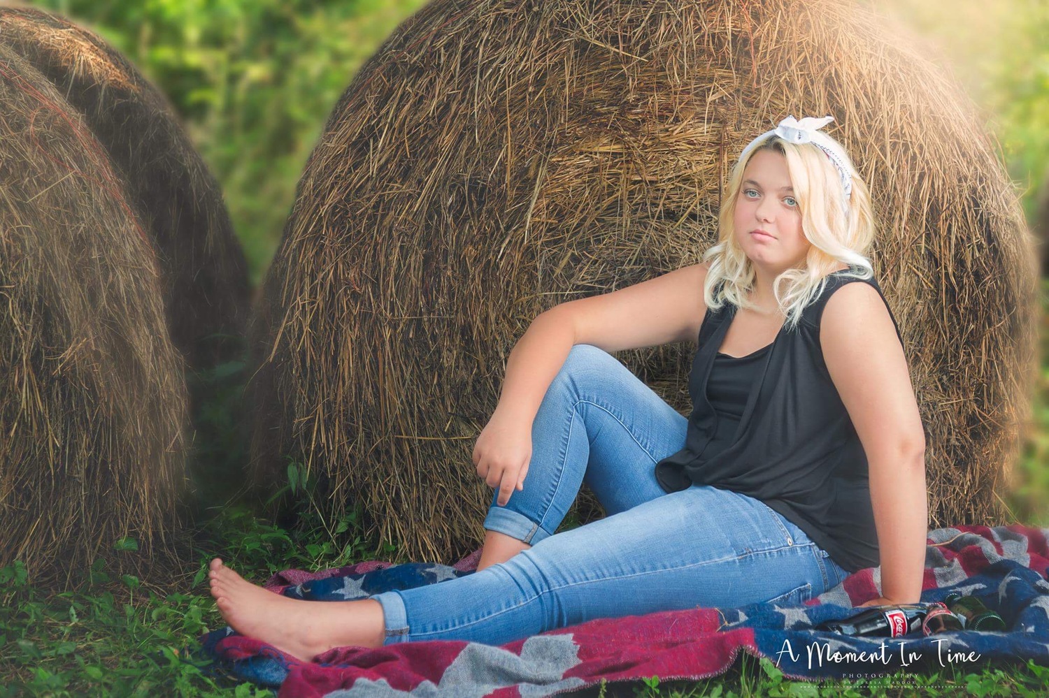
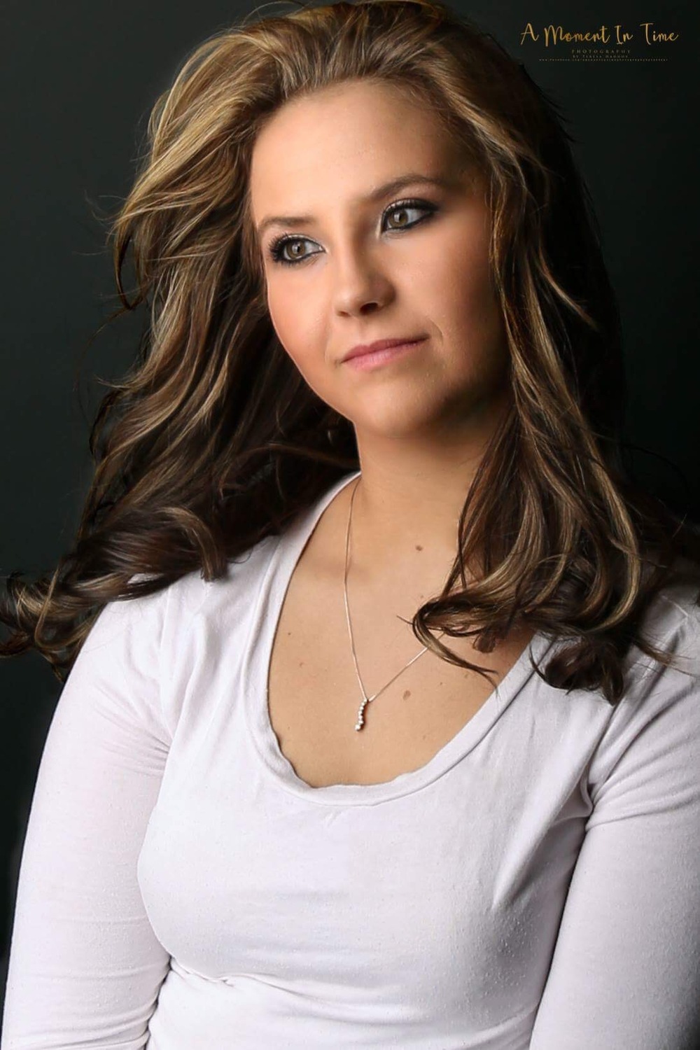
Hi, I hope you can help! I am going crazy trying to get my calibration correct on my new iMac (5k) using a Spyder5Pro. I read your guides over & over and I still don't think mine is correct. It seems the blacks, contrast and saturation are all off. My prints are coming out too dark (my monitor brightness is down so far I literally have trouble reading text or seeing detail) and as for others viewing my photos they look terriable! Some say they are washed out, too bright and a few say they are dull & flat! I'm guessing as I go because now I don't know what color is true and what is not and I don't want any new customers until I fix it! Do you have any other suggestions for me to try on getting my monitor calibrated correctly? Thanks