GraceCJG
-
Posts
34 -
Joined
-
Last visited
GraceCJG's Achievements
-
Hi Damien! Spectacular! Much Appreciated! I will do it as soon as I return, late tonight or tomorrow morning. Still in mid-work rush...
-
Hi Damien, I would be willing to post the problem areas of the images to you via e-mail but prefer not to post them to the forum. Blessings Grace
-
Deeply appreciate all the assistance Damien! Many Thanks! Just a heads up. I will be away from my desk for a while, I will be headed out today at 3 pm for some photography work and will be returning tomorrow at about 10 pm, or so. I will check back in as soon as I return.
-
Update... It's 10:30 A.m. Sunny Blue sky outside. All 7 windows are open. In photoshop - checked the prints this morning. Still having the same issue with the 1st of the three, with the red and green not showing properly, yellow, orange and purple also not quite right. Over all its dim, with some colors fadining into nearly non-visible detail. In one place on the photo the red I see on the print, looks like more like there is no red/pinkish tone there at all on the screen image in photoshop, the detail basically just is so faded its nearly vanished into a more off white/pinkish patch, meanwhile in the print there is a clear redish pink to that exact same spot. The second print, is also dim overall. The green and red bits in it are also faded, barely audible. The spot I know to be red/ish pink on the print, looks more like a dim black, and if I squint at it I can almost pick up the redish tones. The greenish blue is almost faded into a grey but not quite if I lean in and examine, but still reminds me more of a grey with a faint greenish blue tint. Different from the print as well.. The Third print. The bright aqua in the print, looks more dim, not vivid at all and almost green. The purple and red are faded into non-existence almost. in photoshop, rather the same color just very dim compared to the actual print. The other lighter purples and oranges are also faded, more of a dim color. basically an overall dimness that makes the colors almost look like a different color than the actual physical print... No clue what to do, but, something is definitely off :-/ Hmm...
-
Uh oh! Guilty! Palm to face! It was neither! I will match them again in the morning using photoshop to open the image file!
-
Also, upon checking other prints, its so dim, that certain colors are not even appearing at all. The second print I tried has reds and greens in it, very visible in the physical print, but on the screen, it looks like certain colors are not even there. Everything seems quite dark overall, unfortunately to the point where details visible on the print are not on the screen. No clue what could be wrong...
-
Just checked the print in the daylight. (This morning blue skies.) it is 9:52 A.M here, the print's colors are vibrant, compared to the screen, for example the yellow on the print looks, like a pretty and vibrant yellow, while the yellow of the same file on the screen (not in the spyder 5 software) I opened the file directly so I could make it large, and compared it to the now calibrated screen. It looks dim and muddy looking, not anything like the physical print it's self. I am not quite sure what I did wrong in calibration... Or what the issue is. But the screen and print match even less than prior to calibration at the moment... Any ideas?
-
No it won't drag at all, and the spot to expand it is grayed out...

-
Any ideas what to do in a room with 7 windows to get consistent lighting? (it's a rented place, so my only idea is maybe more lamps for at night?) Off to sleep for now, feeling not too physically well need some sleep before the early start, work in the morning... Deeply appreciate all the assistance Damien! I will check the prints with the screen first thing before leaving the house tomorrow. Hopefully lighting will be good tomorrow morning.
-
Sorry Damien! I am half asleep here, extremely low on sleep right now... Just realized I should have had the spyder software not minimized !

-
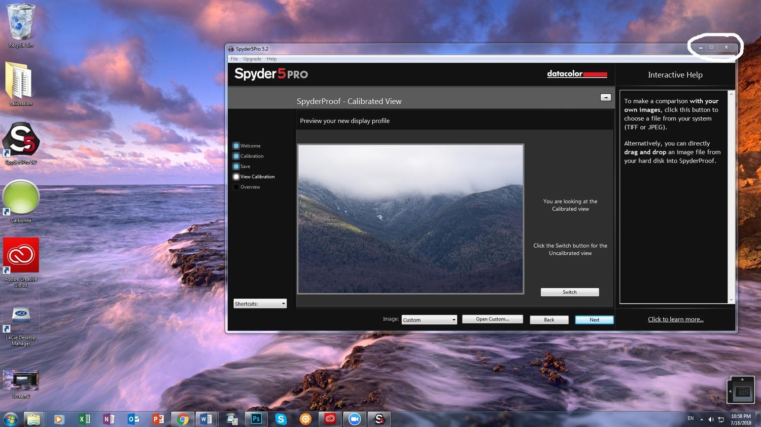
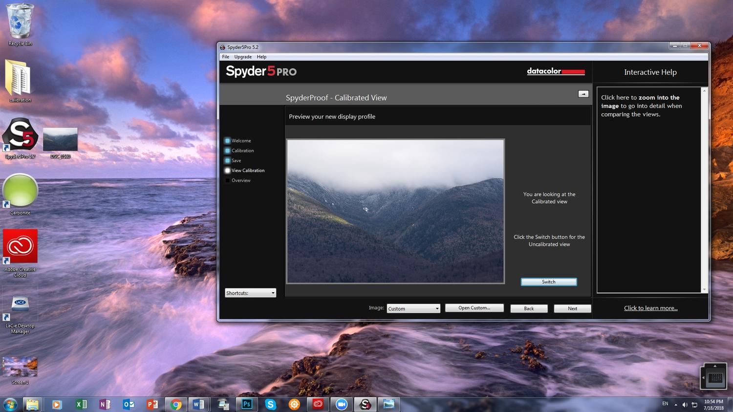
That's a relief not to have to compare to uncalibrated and calibrated images in the software! The tiny image in the software are rough to see clearly! I'll check the prints to the screen in the morning when lighting in my room becomes bright enough. Yes I will make a screen shot of my screen now. Anything in particular you would like open or just the screen in general?
-
The un-calibrated one looks lighter than the calibrated one which looks much dimmer in color. however it is dark outside, and my lighting in my room, frankly sucks. It was dim evening light plus lights on in the room by the time I got to the "turn the lights back on" of the calibration process. I cannot seem to make the image in spyder 5 bigger, so I have to really lean in to try and see details in the comparing print part of it. No clue what I may have done wrong, or maybe I am just sitting staring for no reason and I just need to get used to it. but, everything looks so dark, rather the screen looks darker than the prints, but maybe its the lighting...
-
My apologies Damien! I was waiting to message till I had an answer to that. I have all the lights on in here, and I have been sitting comparing print to calibrated and not calibrated. and it still does not look right! I sitting here trying to figure out what I did wrong.
-
Alright I will re-start the calibration process and continue on from the setting at 15 for screen brightness and the output reading of 92. Thank You Damien! The dim feel of the screen startled me as when I matched prints earlier I set the brightness of the screen to 92, so 15 seemed like a really wild change to set it at for an out put of 92.