

Mike Comber
-
Posts
180 -
Joined
-
Last visited
Posts posted by Mike Comber
-
-
Sorry for the question above, but I think I'm OK now. I just noticed that there are Basic and an Advanced selection buttons on the Home page. I was on Basic. When I switched to Advanced, I found the selection for checking uniformity and can now follow along with your instructions.
-
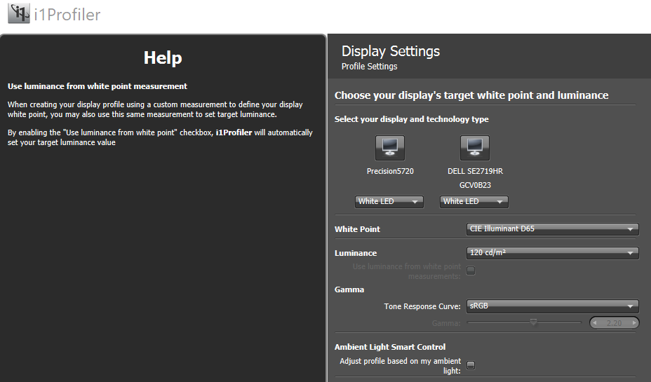
My i1 Pro app has screens that differ from the ones you show. The first screen I get after selecting Display Profiling on home page looks like this:
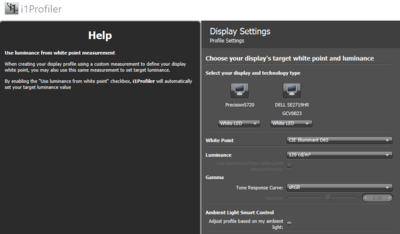
If I hover over any element in the Display Settings panel (e.g. White Point, Luminance , or Gamma), so comments on suggested settings show up in the Help panel. Not sure what to do here for these settings.
-
In your instructions, you list color settings of Warm, Normal and Cool.
The first monitor I'm calibrating (a Dell) has color settings of Warm, Standard, Comfort View and Cool. Should I ignore Comfort View and use Standard in place of Normal?
-
I have my prints.
-
Have just ordered some prints (from mPix). Will take about a week to get.
-
 1
1
-
-
Dell PremierColor was enabled. I've disabled it and am ready to start a recalibration. I have these display settings:
White Point: CIE Illuminant D65
Luminance: 80 cd/m2
Gamma Tone Response Curve: sRGB (I previously used Standard, with Gamma set to2.2)
Are these OK? What do you suggest for "Adjust for ambient light"?
Thanks.
-
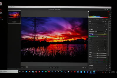
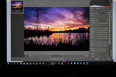
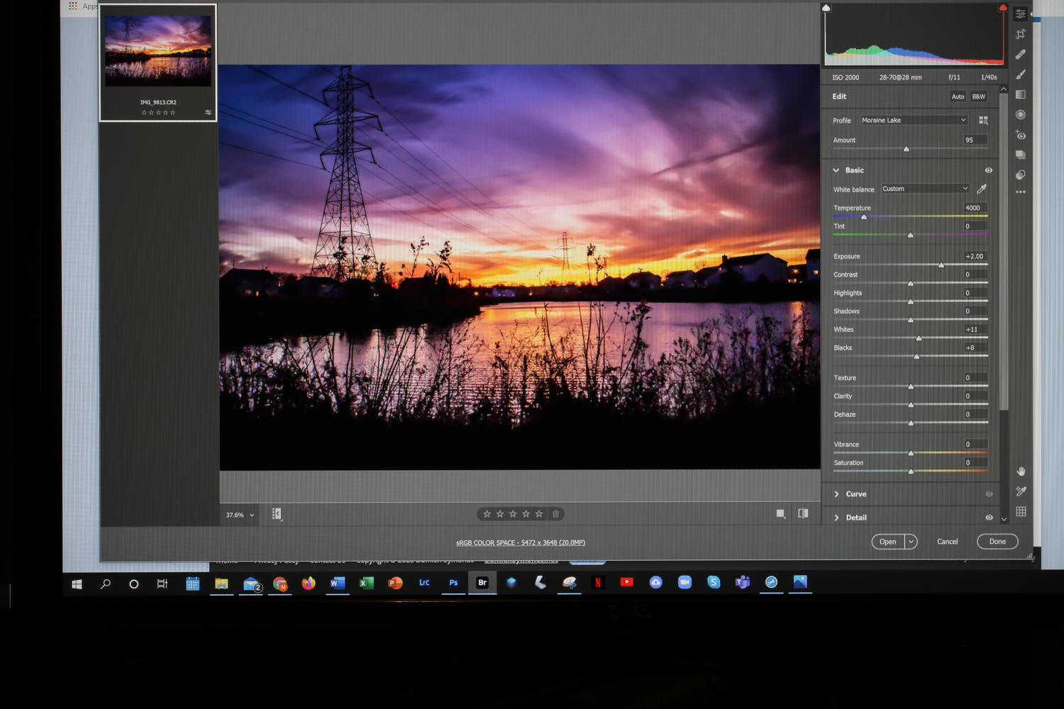
First of all, I have a general problem in that I have two monitors that display colors differently, even after calibrating them both with the x-rite i1 pro. Monitor #1 is an integral part of my Dell Inspiron 5720 computer, and monitor #2 is a stand-alone Dell monitor. Both monitors are 27" (not sure that matters much), with maximum resolutions of 3840x2160 (monitor #1) and 1920x1080 (monitor #2). Here is how a particular photo appears on each of the monitors
Monitor #1
Monitor #2
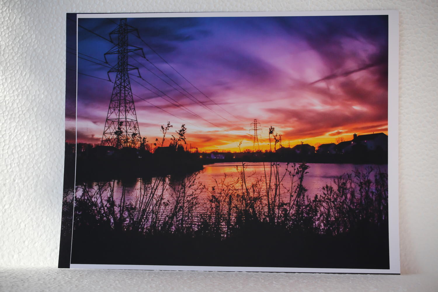
As for printing, I have only used my in-home Epson ink-jet printer. Its color rendition is much closer to that of monitor #2, but with a somewhat darker overall appearance. I took a photo of the print in a well-lit room to give you an idea of the comparison.
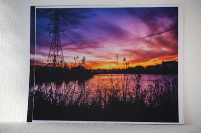
I am printing on matte photo paper rather than glossy - not sure how much difference that makes.
-
I think I've answered my own question. I can re-open the image in Camera Raw and then use "toggle to default settings"
-
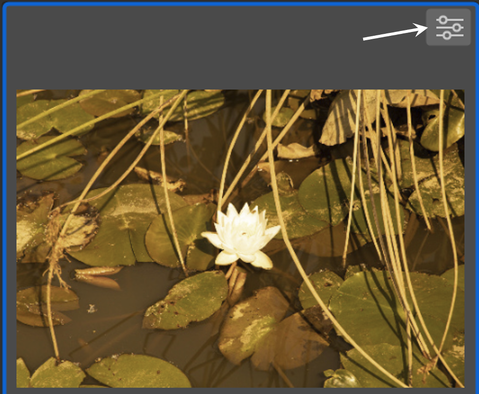
When I open an as-shot RAW image in Bridge, then edit it in Camera Raw, then return to Bridge, what I see is the edited image with some notation in the top right corner that (I think) is an indication that the image has been edited. See following example:

How can I find and view the original unedited image?

Mike
in Monitor calibration questions or problems
Posted
I see the instruction now to switch to Advanced.
I found the "warm" color setting on my monitor to give closest to 6500K (actually ranged from 6526-6769K). Process seemed to go smoothly, but not too sure of the end result - the "achieved" white point was 7442K. Maybe I did something wrong and should try again. The curves looked good in that there was no separation.