Kiwiellis
-
Posts
76 -
Joined
-
Last visited
Everything posted by Kiwiellis
-
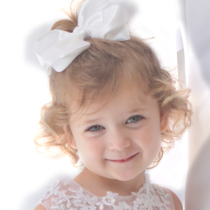
Best way to change painted numbers on a building
Kiwiellis replied to Kiwiellis's topic in Help with editing
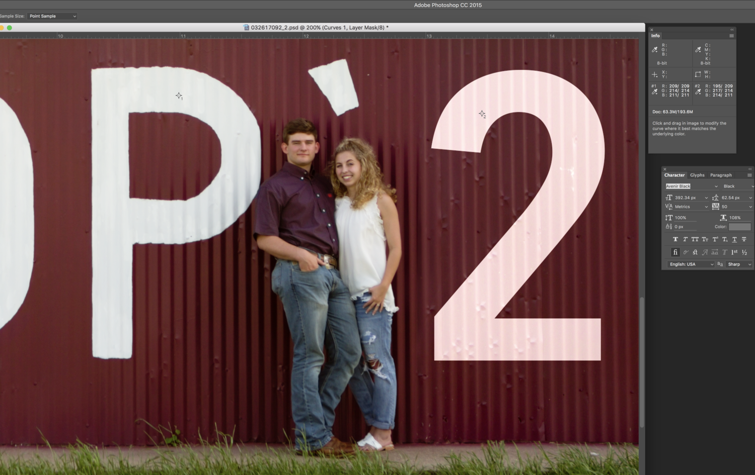
I clearly don't understand exactly how color works... I'm working on trying to tweak the color on the 21. My thought was that if I did a color sample of the original white, and then made the color numbers match for the color of the 21, then they would match. But that is not the case. Can you explain the error in my thinking? I attached a screenshot. I tried various types of blur filters on the edges and still not hitting it. When you said "blur the text" did you just mean soften the edges with a feathered brush? Or literally blur it? If blur, Gaussian, or some other type?
-
Best way to change painted numbers on a building
Kiwiellis replied to Kiwiellis's topic in Help with editing
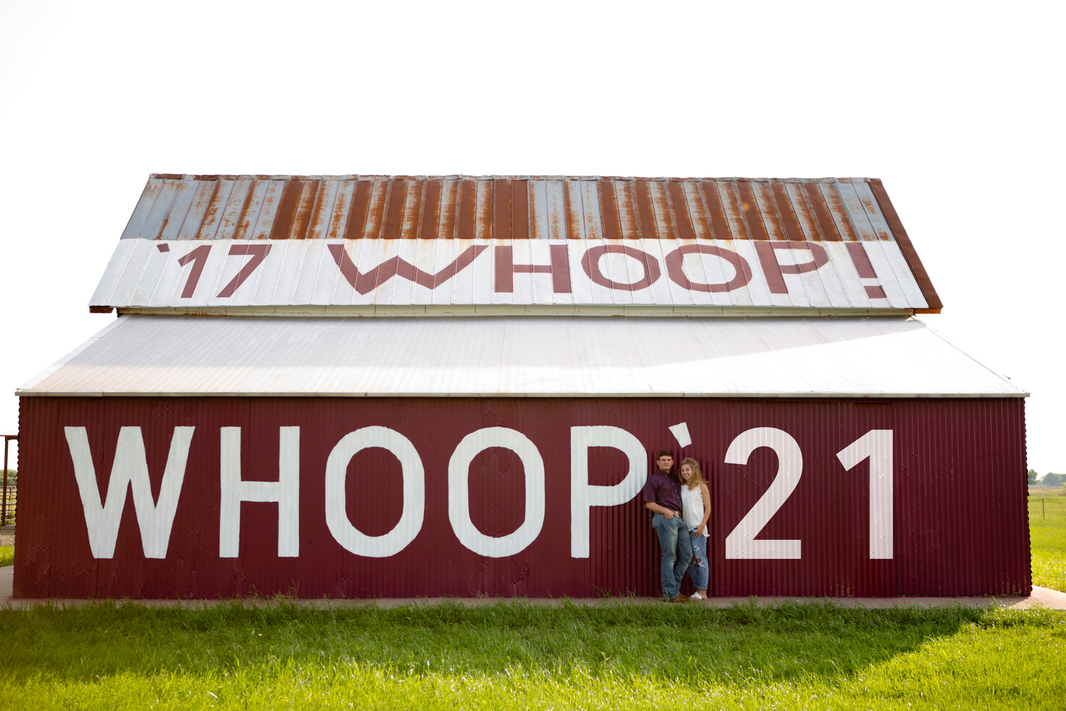
Yes, let me see if I can tweak. Here's the 17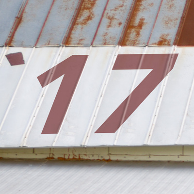
-
Best way to change painted numbers on a building
Kiwiellis replied to Kiwiellis's topic in Help with editing
How do you do that? I tried the pale green on the '21 and it got really close. I feel like I see a bit of a pink tinge in it, but only on the thumbnail. Good enough, you think? The '17 still doesn't look 100% believable to me. But I'm also too much of a perfectionist. So if you think it looks ok, I'm moving on!
-
Best way to change painted numbers on a building
Kiwiellis replied to Kiwiellis's topic in Help with editing
I had to put this on the back burner because my husband had back surgery last week, so I'm just now getting back to it this week. I guess I don't really know how blending modes work with color, because I've played around with what feels like every color and can't get even close. For the 21, the blending modes that look the best are either Hue/Saturation/Color or Overlay. But with Hue/Sat/Color it changes the color to very dark gray (that's when the text color is set to white) - that's the lightest color I can get. On Overlay is makes a crazy/bright red, and that's the closest I can get to the white. For the 17, Overlay is about the only thing that looks believable, and that makes it a very light/transparent red when the text color is set to white. Do you have any advice on how I can arrive at the colors I need?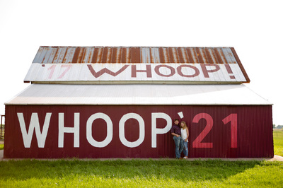
-
Best way to change painted numbers on a building
Kiwiellis replied to Kiwiellis's topic in Help with editing
Here's where I am so far. None of the blending modes are really accomplishing the job. Right now the white '20 is in Hard Light mode, and the '17 is in Multiply. It really just looks like I lowered the opacity a little bit so you can see the wall texture through it - it doesn't look painted on. There are some other modes that really make it look ON there, but those modes change the colors of the text. Advice?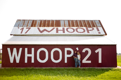
-
Best way to change painted numbers on a building
Kiwiellis replied to Kiwiellis's topic in Help with editing
okay, great. I'll get started! Thank you! -
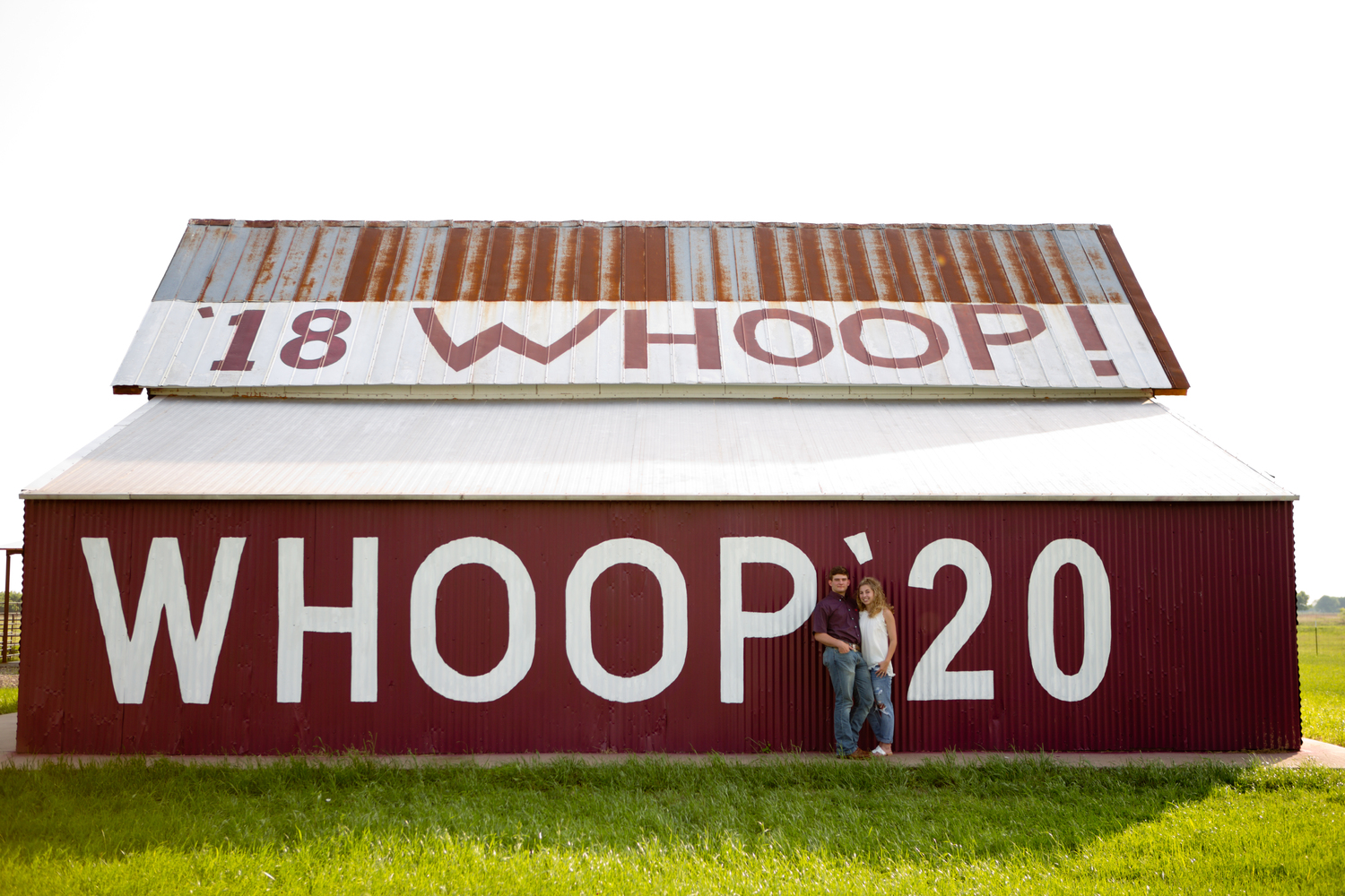
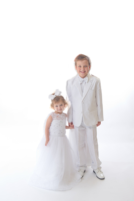
What is the easiest and most realistic-looking way to go about changing the numbers on this barn to '17 and '21? My initial thought is that I'd probably clone out the current numbers, then change the numbers and maybe use one of the blending modes to get the texture of the wall/roof to show through. I anticipate some issues with perspective on this too. Before I get too far into it, I thought I'd see if I'm thinking in the right direction? Once I get this fixed I think I might want to drop a prettier sky into the background, but I'll be asking about that in a separate post. This image is SOOR. Thank you!!

-
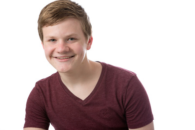
"Technically", there is not supposed to be spill on the subject from the background. I do like a little on the hair or the shoulders for accent/definition, but I worry it's distracting on the jawline just because it's pretty much blown right there. But honestly, if you don't think it looks bad, then I'm going to leave it!
-
I shot headshots for over 50 students at my daughter's school, and I did not notice until I uploaded the images that several of the subjects had background light spill on their left jawline. This did not affect any of the girls because their longer hair blocked the spill, but every boy I shot has this problem. And because I was going for a bright white background, the edge of their jaw is now pretty much blown out. Can this be fixed? This is SOOR with a few blemishes cleared with the patch tool.
-
I didn't think I could do it. Thank you for your help!
-
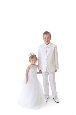
I am still working on this. I am struggling with the area in between the boy's feet. Can't really go to full white there because of shadows and needing to keep that perspective. I may have already taken it too far where that is concerned. What's the best way to handle that there? Does the overall masking look ok? I have definitely been staring at this too long. I'm going blind.
-
Using the blend mode of Luminosity does help! And the shift key - genius. Thank you!
-
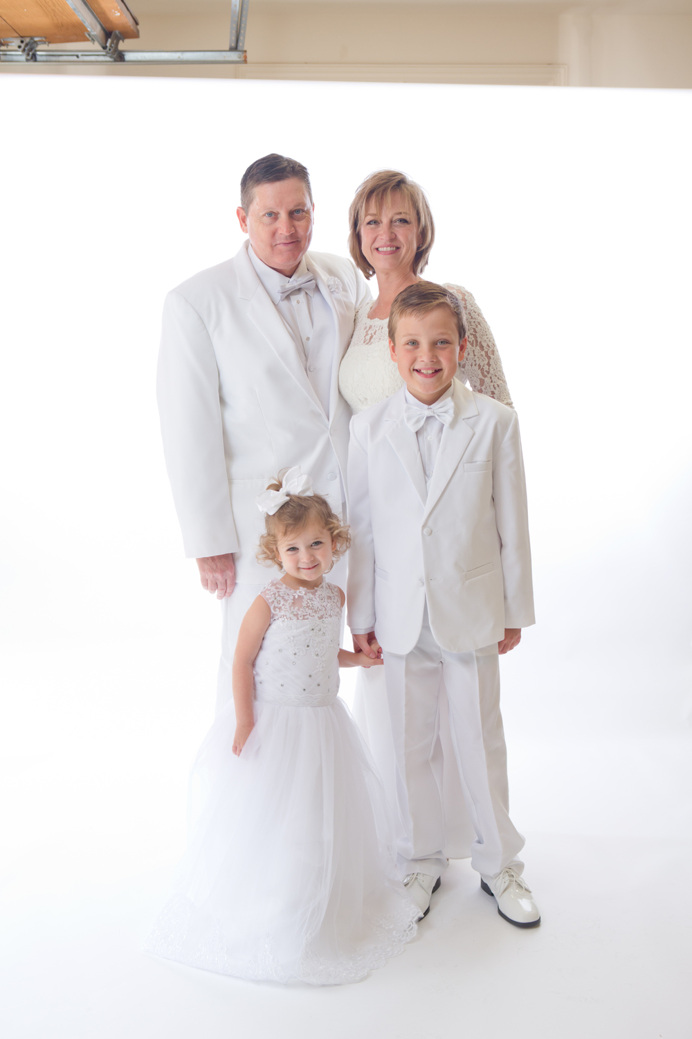
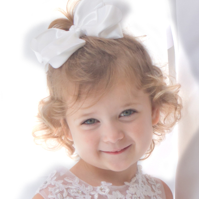
Ok, I started by just painting out the big areas of the parents that weren't close to any edges with a big white brush. Then I clicked the white eyedropper on the dad's suit right behind the little girls hair. Is that the area you'd recommend I do it? It does blow everything out, but her hair is so light that when I brush over the hair, the hair in that area starts to look neon blonde. There's also a spot on her shoulder where the dress fabric is a bit see-thru, and masking over that area blows out the dress fabric there. But if I mask only to the edge of the dress, the see-thru part is too dark to match the background. This would be so much easier if everything in the picture wasn't white. LOL So I'm not sure how to handle those two areas, but everywhere else, I just need to paint along all edges of the boy and girl to make them out, correct?
-
I did the family pics first and got several great ones, but by the time I got to taking sibling pics, the 4-year-old girl was DONE and I didn't get anything good. Mom really wants one of just the two kids to print large for over the fireplace. This image is my favorite of the siblings together so I want to attempt removing the parents from it. I already anticipate problems around the little girl's hair where you will be able to see the background through it. How should I proceed? What's the easiest way to mask or remove the parents? Ultimately, I DO want the background completely blown out like most of it is right now. This is SOOR. Thank you!

-
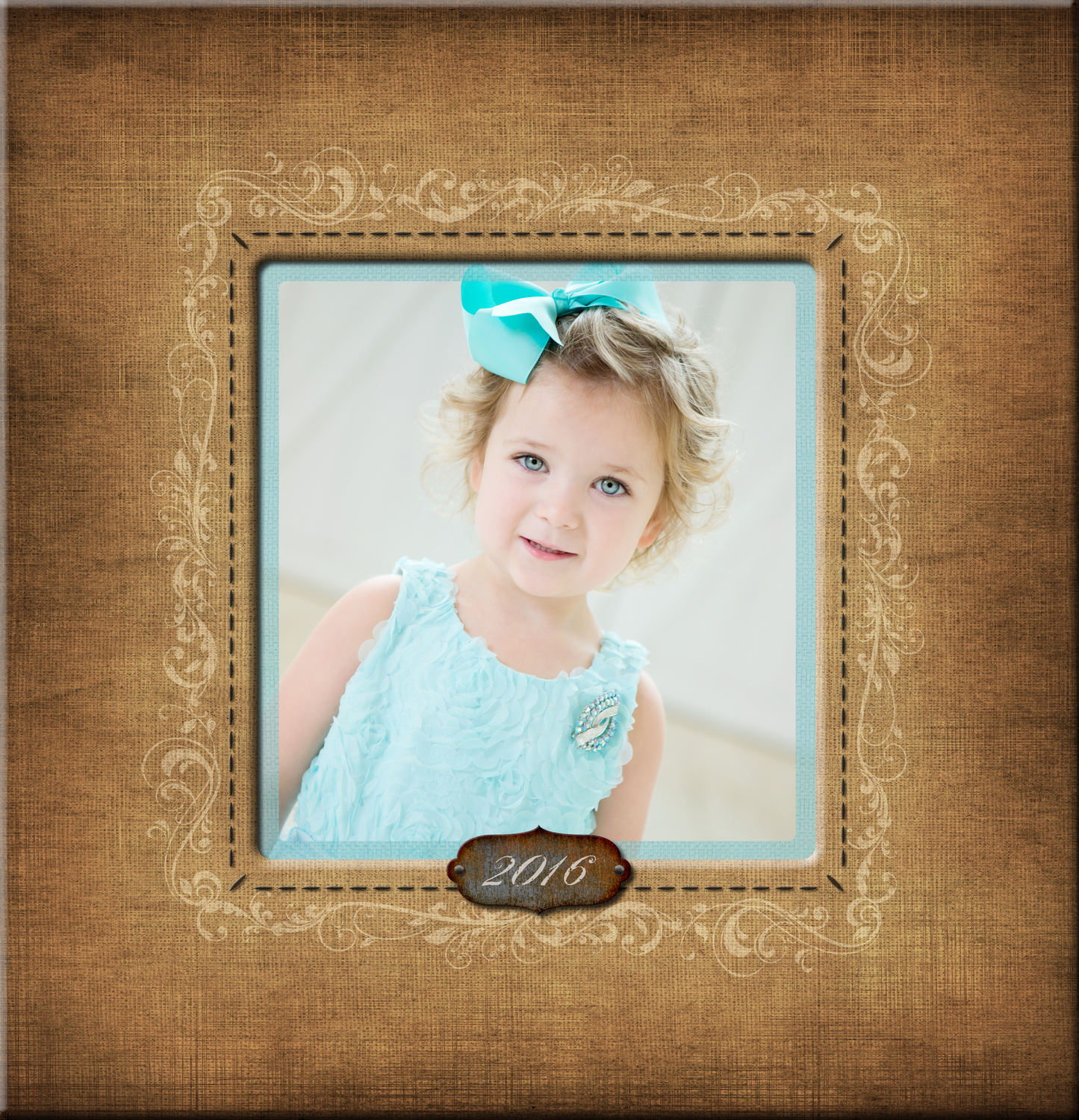
I'm putting together an album for a client and I'm using a purchased template. I will want to change the paper/background colors on just about every page to better match the images I'll be using. What's the best way to do this? Hue/Sat layer just changes the whole color and I lose the depth of the different shades, and I have no idea how to manipulate the color sliders on methods like a color balance layer to achieve the color I want. Just not really sure what's easiest and/or best. Thank you! I'm attaching one sample page. I'm wanting to change the color on this particular page from the brown to a off-white/ivory to match the background in the photo, but every page will be different.

-
I'm terrible at detailed masking but hopefully this will work - it will just be on a 5x7 graduation announcement. The image itself is still unedited, but the background is changed. I think the color is pretty close!
-
For future reference, is there a method I can learn for figuring out the channel values to match an exact color?
-
That is PERFECT! Thank you!
-
Oops, just noticed that I forgot to slide my Luminance noise reduction setting back down after checking color. Here's the corrected SOOR files.
-
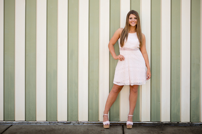
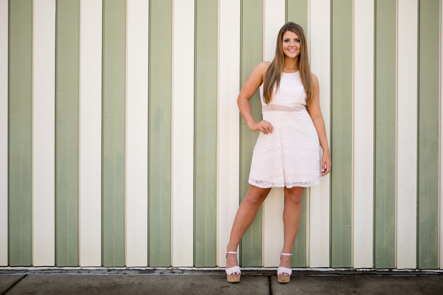
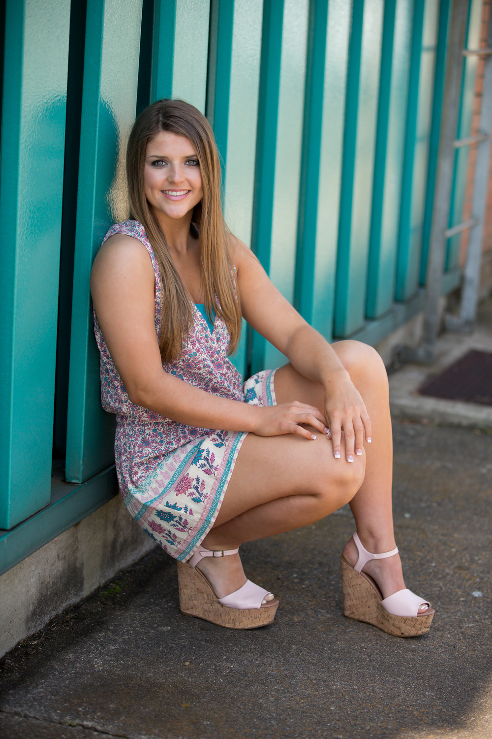
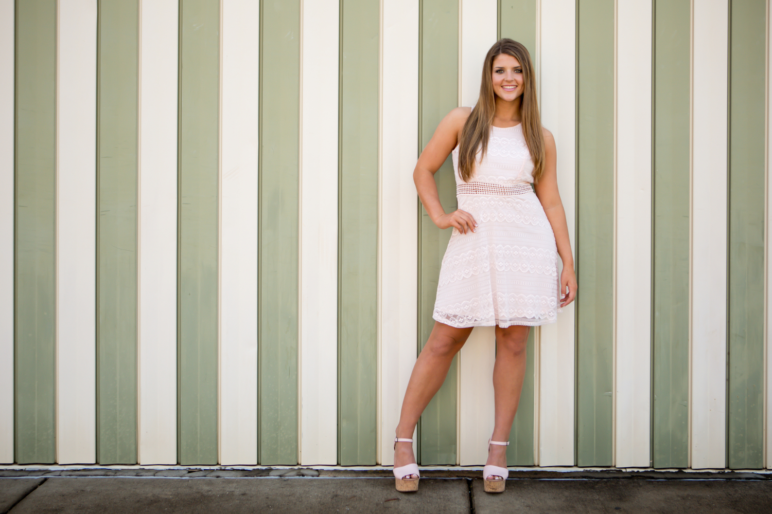
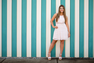
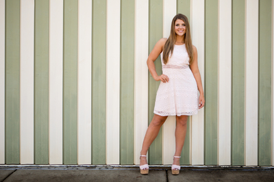
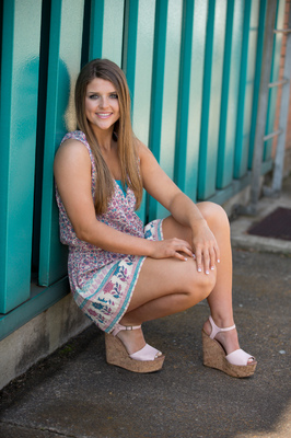
What is the best way to change the color of the green "stripes" on the wall behind her in the standing pic, to match the teal of the wall in the "sitting" pic? I've tried using Replace Color and I just cannot get the selection (with the dropper) or the color correct. It keeps turning out a horribly neon, saturated mess, and when I try to tone it down it ends up looking muddy and fake. These are SOOR. Thank you!