S. Roberts
-
Posts
323 -
Joined
-
Last visited
Everything posted by S. Roberts
-
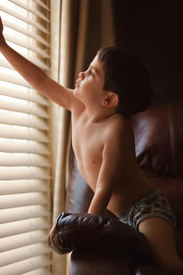
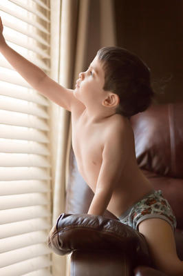
I'm not desperate, I'm more curious. I'm not used to not knowing. I have others that are better focused. It was these where I was backed away, with the high ISO - lots of grain - lots of noise removal, where now I'm not sure. How can I know?
-
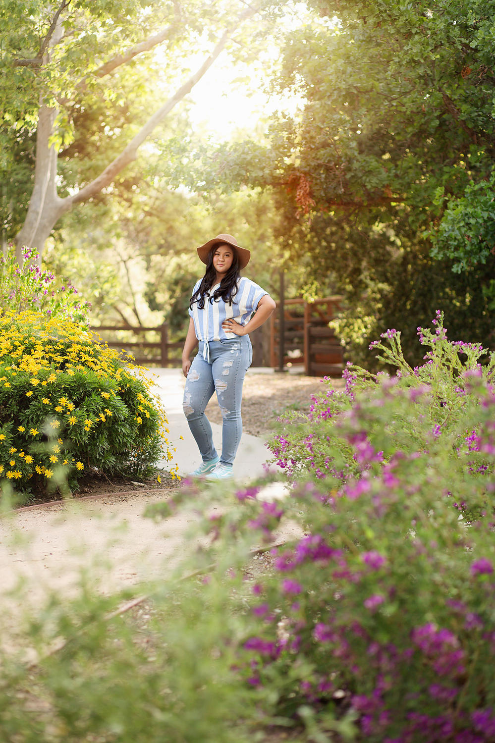
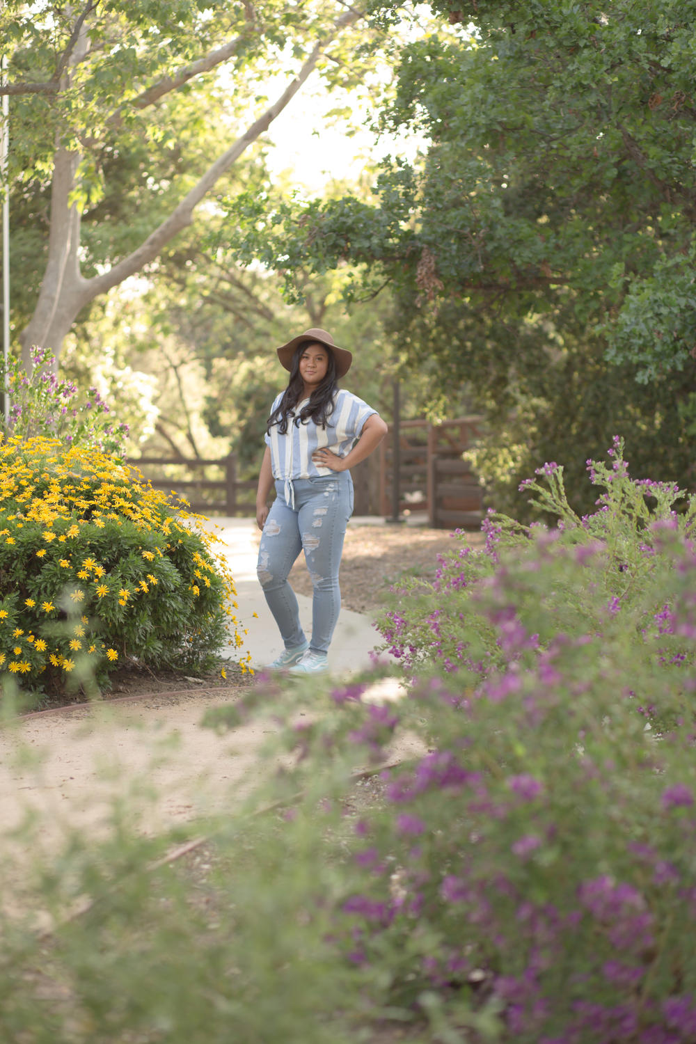
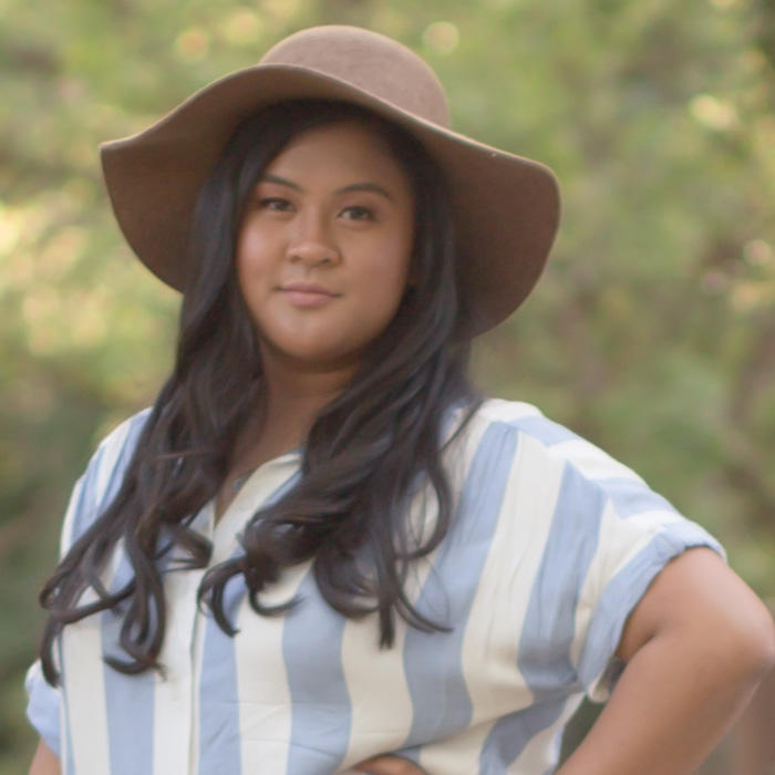
Focus check, please.

-
Focus check please. I'm not used to determining focus after using aggressive noise removal. Is there a class that will teach me how to determine focus on my own? I don't typically shoot with ISO's this high, but it was an unusual situation for me. Thank you.
-
Thank you!
-
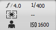
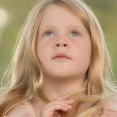
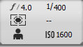
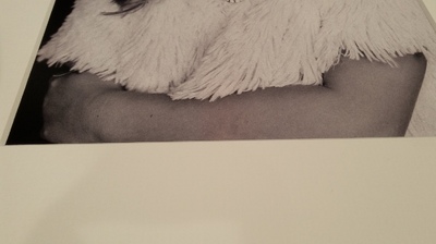
4.0, 1/400, 1600 ISO, with 70-200 at 200 Focus check please.

-
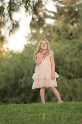
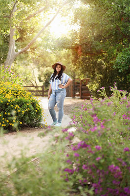
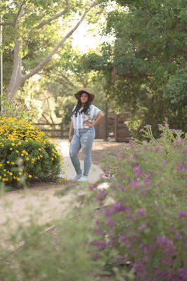
So, this is where I ended with this fun little project. I rarely shoot outdoors or at these long distances. Appreciate your help.
-
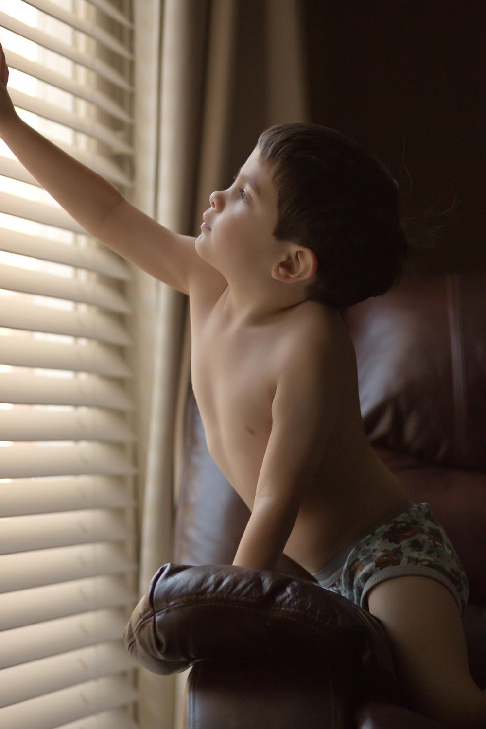
Focus check please. F 2.8, 1/320, ISO 250, 85mm Thanks Damien

-
 Great questions! I show clients 25-30 images, fully edited, to choose from at an in-person sales appointment. I edit. Some photographers outsource this step. (However, I do not shoot events of any kind.) I do not show unedited work. If I understand, you shot pre-wedding (engagement?) photos for a friend for free? Consider showing them your images and outsource (hire) the editing and let them pay for it. Yes! For example, Creative Live (website) has different classes in photography all the time with business advice. WPPI has a website with resources. There are many Facebook groups belonging to industry-leaders. Seek them out and find groups that suit your genre of interest. You will find a community that suits you.
 -
I think it looks good with the 30/70 split. I tried a few others. The skin goes red/glowy fast. Thank you.
-
Great! Here it is.
-
RAW only?
-
I adore this creamy window light, and the tones in everything Meg Loeks creates. Is this photo close enough to give it a go?

-
This will affect my post-processing. I have a night sky / milky way opportunity in a dark site. Do I use the wb sheet, if so, how would you suggest I do it? I'll have a long, 14 second exposure for the sky. Thank you
-
... where's the chillin' with a frosty beverage emoji? Lol. Now to get on with turning my woeful images into masterpieces. Got it! Thank you, Damien.
-
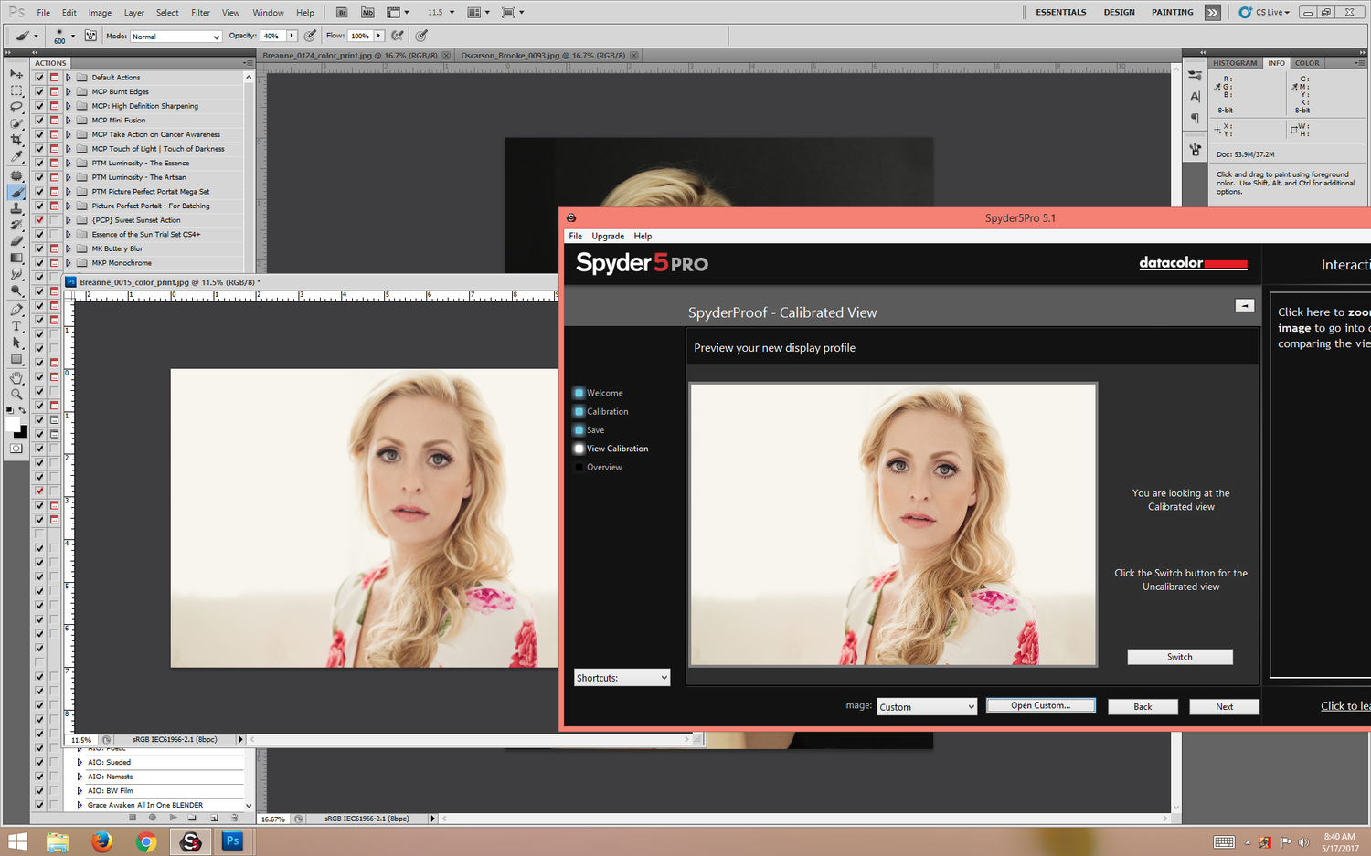
Hi Damien, I read through the link. I don't think this is the problem. I noticed immediately when I installed the DVI cable and the monitor was reset. It was crazy bright and very blue. This does not happen when my monitor goes to sleep or when I get security alerts. It never happens. So, I've looked at these prints and feel that the colors are so similar. I notice small tone or shade differences, but no one else does, unless I go to great pains to point them out. Generally, the prints are a touch more yellow especially in whites, skin tones, and are a bit more - green (maybe) in the blacks. Pinks/reds/blues don't seem to be affected. Should I move on to RAW?
-
I though you were talking about the monitor color being better (monitor to monitor). Yes, the prints compare better now. Datacolor said this, " Very often this a problem forced by the graphic drivers Their control panels need longer to boot than the SpyderUtility start-up which gave them the chance to overwrite the data we just wrote to the lookuptable of the graphic adapter. Depending on your graphic card you can disable the control panel." I suppose I could reactivate it and see how it goes.
-
I think so, but without a comparison it's hard to tell. My memory of color is imperfect. If I sent you a screen shot of "as best calibrated" with VGA and the same image "as best calibrated" with DVI -- can you tell me? I will say, what has made the most impression on me was disabling my graphics card from the startup menu. That made me think my screen looked really quite dark.
-
Yes, I calibrated with the DVI. Mostly, brightness has been affected. I had to increase brightness to match prints.
-
The DVI cable came in. With the VGA still in, I laid out a collage, saved a screen shot. Plugged in the DVI-d (thinking I could do another screen shot) and it reset the monitor to factory settings. My thought is that my prints now match pretty close. Some prints are off by slight shades. I wish I could tweak the Kevin color between 5000-5700k, but I can't.
-
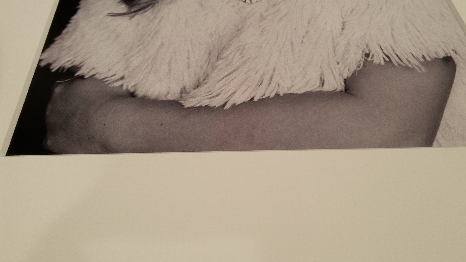
While still waiting on my DVI cable, Datacolor got back to me. They had me disable my nVidia graphics card from the start menu, then reset to factory settings, and full calibrate to 2.2, 6500K, and of course the 120 cd/m2. When I open the same file in Spyder cal software at the end of calibration, and open the same file scaled to about the same size, is it me -- or do they look different? Also, last night I was loading a slip-mat with one of the black and white prints I got back from ProDPI --which prompted me to begin this thread-- and noticed a magenta stripe running the length of the print (middle of her forearm). I KNEW this batch looked pink. After following Datacolor's recommendations, as compared to actual prints (not the last batch, obviously) my screen is now too bright. I'm sitting at a brightness level of 30 on the Dell monitor / 117 cd/m2. So, I will go in and bring it down until it matches my prints then recal.

-
Backlight banding
S. Roberts replied to S. Roberts's topic in Output - print, websites, Facebook, email, client disk, etc
Will the Layers and Mask class teach me this masking technique? -
Yes.
-
With bright daylight added, the color is still off. I'll come back to this once I've got the DVI and added light. Do you recommend any fixtures?
-
Once I get prints matching I'll post these in raw (SOOR) to learn how I can improve consistency.
-
This is what led me to conclude that I needed an extra lamp to add light to the prints. But now I understand I may need a floor lamp to go with my in-ceiling flood lights. I need to bring up the overall light in my workspace to mimic the temperature (4000k-4700k) and strength of daylight.