

Yvonn.ie
-
Posts
747 -
Joined
-
Last visited
Posts posted by Yvonn.ie
-
-
Sorry Damien, me again. I recalibrated based on my last prints, now the next batch have arrived and they are actually worse. Having a hell of a time getting it right!
I now have done it again, at 7500 and brightness 55, with a fine tune adjustment toward magenta, and it's closer but still not perfect I don't think. I see above you say if you need to go below 70 then your room must be too dark? But I'm making my screen darker by lowering it, right? I do edit in daylight in a not particularly bright room, so I have done the calibration in another brighter north facing room which will be my office once I get it set up. (closing the curtains at the right time). Is this in itself causing an issue, calibrating and checking in a brighter room?
It's almost at it's minimum brightness (4%) and I think the prints arguably still look darker or at least greyer in the skin than my screen does. Any further advice before I just throw out the screen? It's quite frustrating!
-
On 4/12/2016 at 1:34 PM, Damien Symonds said:
I'm crossing my fingers and hoping that the Channel Mixer and Levels layers should work fairly well for all similar images.
The topmost layer is the "Colour Fix" layer from the Handyman Method.
It's not quite finished. As the last step of all, I would recommending adding another blank layer, and using the Clone Tool (set to "Sample: Current and below") to tidy up a few little lines and specks here and there. Of course, it all takes time, so you'd need to decide how much time you can afford to spend.
Is this link still live? I'd like to have a look and nothing happens when I click the download button.
ta
-
thank you, you're very helpful,
-
Hi Damien
Is there any way to check that your calibration is working? Normally when I turn on my laptop there is a noticeable colour shift after a couple of seconds. I didn't notice that happening today and the colour of the whites look off to me, is there any way to make sure that it's definitely showing the calibrated view, without going through the whole process, as I only did it a few days ago!
thanks
-
thanks Damien that has helped a lot, and I think maybe what I was considering excessive warmth on the screen may have been somewhat green rather than yellow. I've now got the slider half way over to the full purple side and the magenta-ness matches the prints, but also now looked colder than the prints! So I've recalibrated at 6500 and with the purple adjustment I think it now matches quite well. Hopefully over time my eyes will be trained to better tell the difference!
I'll check again once more prints arrive.
By they way I am not sure what the Gamma one does as when I slide it I get an error message saying 'SanitycheckLUT failed" hmmm
-
Hi Damien
so my prints are colder than my screen, and more magenta! I've taken the warmth up to 9400 and I think it's just about right now - is this reasonable, as it's off the scale! Might explain why I like the look of what you call too cold images though, I must be seeing them warmer than they are despite having previously calibrated as per the Spyder instructions arrgh...
I'm in daylight, north facing, currently 1pm.
The brightness target I have to set at 70 to match, previously I had it at the default so I'm guessing my photos were way too dark then without me knowing it.
But... there still seems more magenta in my prints, I can't see any way to address this. It's a decent screen and fairly high end PC replacement laptop, with a graphics card. I think I might need to buy that new screen sooner rather than later. I don't have any other screens that I can try.
Anything I have missed re the magenta / green bias?
-
58 minutes ago, Yvonn.ie said:
my update button isn't working, the current remains at max brightness. I've started again to see if that solved it and still the same, any ideas? thanks
nevermind, after several tries and a system reboot it is working now!
-
 1
1
-
-
my update button isn't working, the current remains at max brightness. I've started again to see if that solved it and still the same, any ideas? thanks
-
Hi Damien
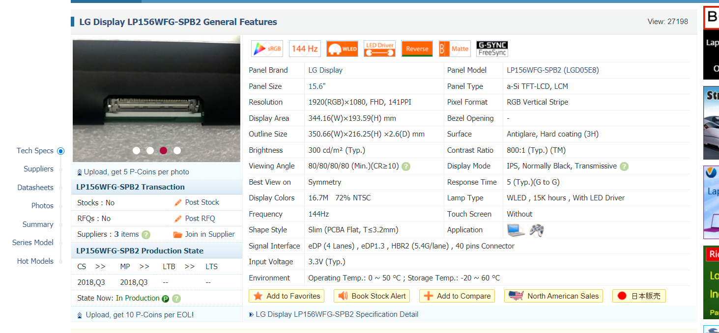
recalibrating my screen and following your instructions to ensure I'm defo doing it right. I had it set to wide LED, based on checking before - but I am not knowledgeable enough not to be wrong! Here is the spec as sent from where I bought the laptop, does WLED mean Wide LED? Google suggests maybe not!
further spec info here:
https://www.panelook.com/LP156WFG-SPB2_LG Display_15.6_LCM_parameter_38454.html
thanks!
-
On 8/15/2020 at 5:51 AM, Damien Symonds said:
Then you'll need to make two actions.
- The Facebook one will be 2048x2048px
- The Instagram one will be 1080x1080px
probably stupid question...
I usually export in LR for web by saying width 2048 for FB and width 1080 for LR, then I've been adding my watermark by placing an embedded image in Photoshop manually. I know you'll have at least 2 issues with this fact but let's ignore that for now....
I imagined that this specifying only the pixel width was ok for both square and non-square crops, as the pixels would be scaled up to maintain the aspect ratio. Probably completely dumb and revealing my ignorance but would the above same pixel size for width and height not result in "stretched" out pixels in anything other than a square? If not, a simple explanation would be fab
Yvonne SXElite
in Monitor calibration questions or problems
Posted
I'm in a bit of a muddle as after the 2nd last calibration to match my prints, I re-edited the picture to make it look more like I intended it to. So this time I was comparing a slightly different edit. To make matters worse I have had to send it anyway so I no longer have it 😫 I was already delayed on the postal as there was physical damage on the first print (a tiny speck of something which gave me a reason to try to make it better on the reprint) which meant even tho the old one looked better I had to send the new one.
My husband said the new one looked great so hopefully a non- expert eye won't find fault. The others in the batch I was happy enough with so I didn't reprint.