Courtney Goldman
-
Posts
543 -
Joined
-
Last visited
-
Days Won
1
Everything posted by Courtney Goldman
-
Would you trade me for entry into that class?
-
Thanks!!
-
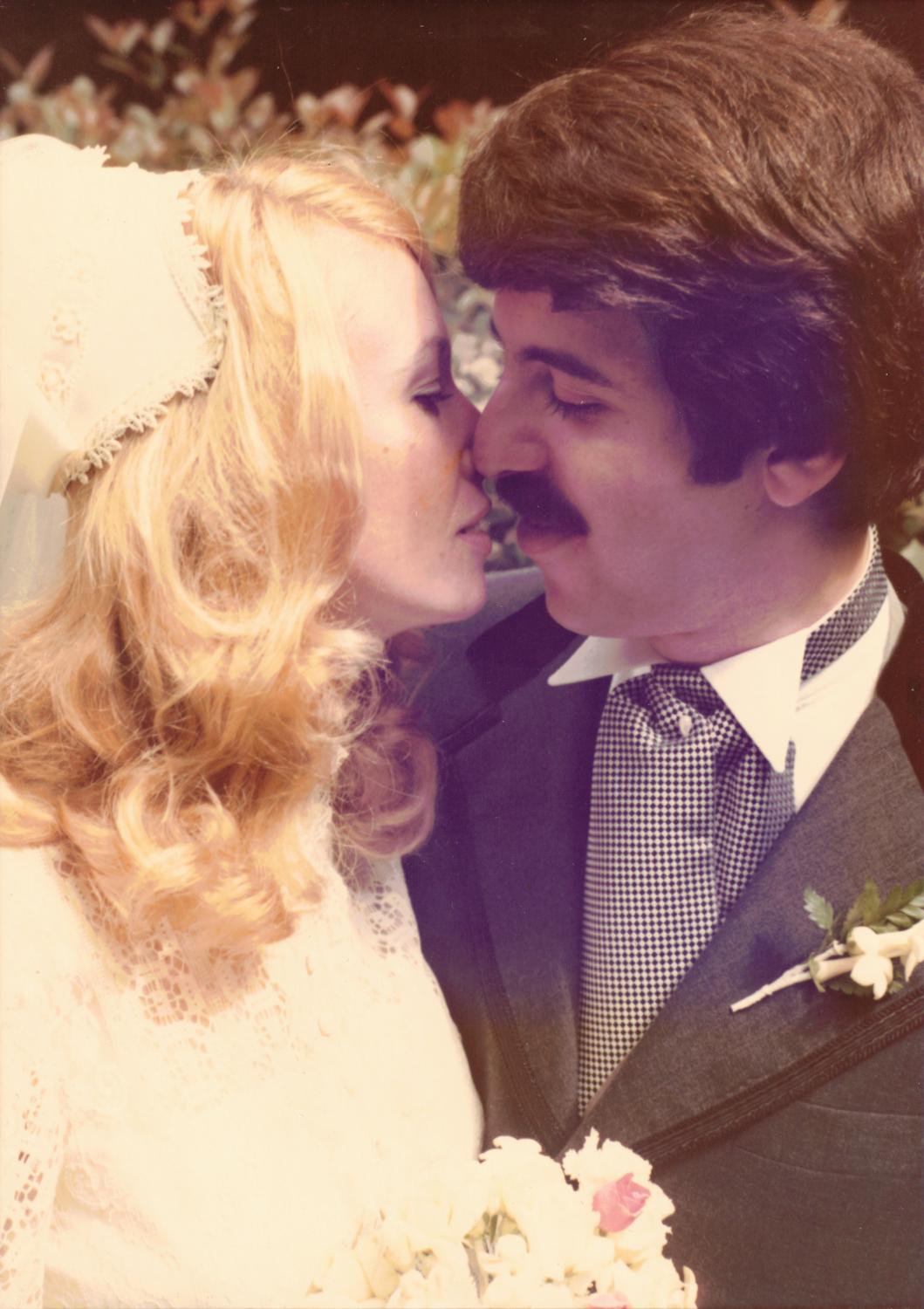
My father has asked me to do some minor editing to some old photos of his. He doesn't have the time or inclination to get them professionally scanned, so what I have is all I'm gonna get. There's an odd chunk of purple on a handful of the photos, most prominently in this one. Any advice on how to fix that? Thanks!!

-

Number of Colors
Courtney Goldman replied to Courtney Goldman's topic in Monitor calibration questions or problems
I think I've come as close as I can without having someone come here to help me! -
Number of Colors
Courtney Goldman replied to Courtney Goldman's topic in Monitor calibration questions or problems
I get one photo to look right, then another looks all wrong!!! -
Number of Colors
Courtney Goldman replied to Courtney Goldman's topic in Monitor calibration questions or problems
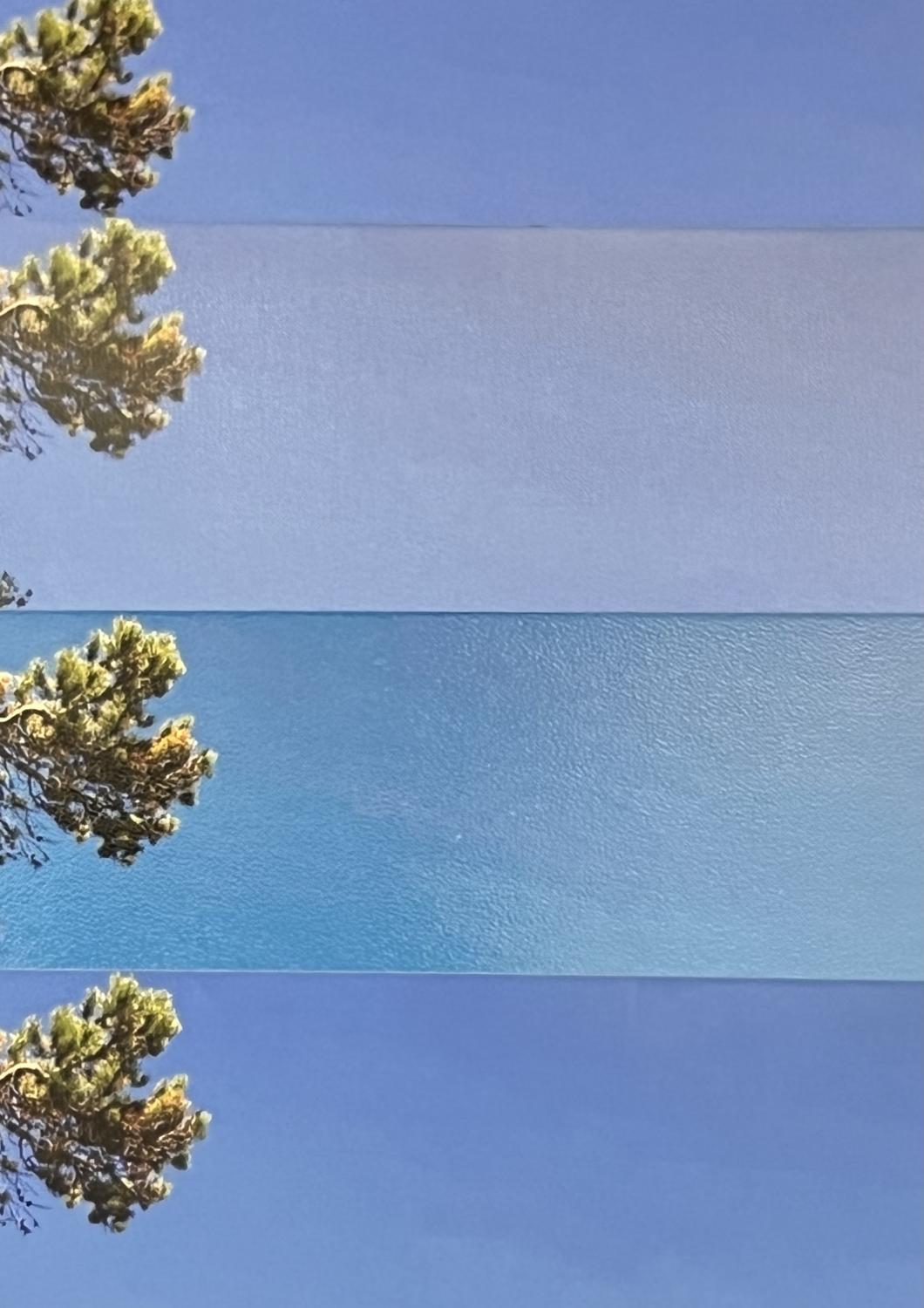
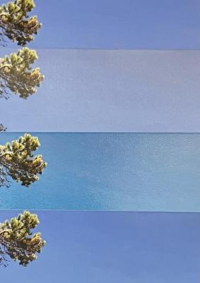
Yep, still working on it. Are any of these better or worse for the prints I'm trying to match? I have avoided using the orange tree leaves and the aqua jacket to compare. (I chose these as they are to give to my sister and parents, and I got multiple copies of each...)


-
Number of Colors
Courtney Goldman replied to Courtney Goldman's topic in Monitor calibration questions or problems
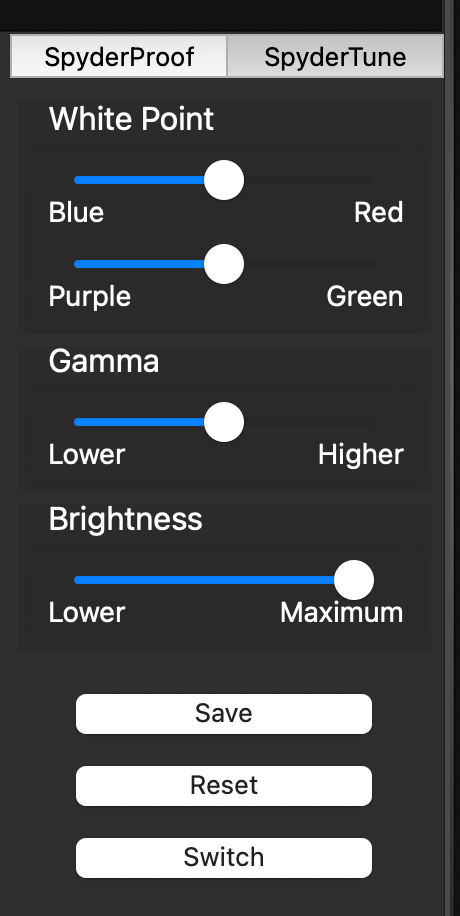
On the monitor, then, not SpyderTune? Because SpyderTune has blue and red as opposite, so I'd have to choose one...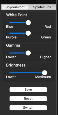
-
Number of Colors
Courtney Goldman replied to Courtney Goldman's topic in Monitor calibration questions or problems
What do I need to do to make my screen pinker? -
Number of Colors
Courtney Goldman replied to Courtney Goldman's topic in Monitor calibration questions or problems
I dunno. I think I've lost my mind. The prints are warmer and pinker than my screen. I've tried re-doing the calibration with different color temps, per your instructions online. That didn't work. I tried using SpyderTune, and I feel like I can get the subject to look right, but then the sky or background is totally wrong. Also, I'm thrown by the Red vs Blue and Purple vs Green. I tried pushing it towards Red and towards Purple - going for warm and pink - but it's just not working right. I'm going to quit for the night and try again tomorrow. -
Number of Colors
Courtney Goldman replied to Courtney Goldman's topic in Monitor calibration questions or problems
I'm about to work on it now. Ironically, I thought maybe my room wasn't bright enough so I added another light. Now I am getting a glare from the white wall behind me! -
Number of Colors
Courtney Goldman replied to Courtney Goldman's topic in Monitor calibration questions or problems
A little, but I'll work at it again tonight. -
Number of Colors
Courtney Goldman replied to Courtney Goldman's topic in Monitor calibration questions or problems
Elite -
Number of Colors
Courtney Goldman replied to Courtney Goldman's topic in Monitor calibration questions or problems
Do you think one gives better results than the other in general? I'm still having a hard time getting my WHCC prints to match. -
I used to use a colormunki, and recently got the Spyder X. Why does the Spyder use so many fewer colors when it does the calibration than colormunki? Or maybe my real question is how can it be as accurate?
-
Replace Color using Curves
Courtney Goldman replied to Courtney Goldman's topic in Help with editing
Never mind, I finally figured it out! I was double clicking on the middle dropper but hadn't chosen the curves part, I was on the mask part. -
I learned a technique for replacing a color using curves in a class for NILMDTS editing, and I know I've seen you bring it up to. I searched both here and there and can't find it. I know it is using a curves layer and the eye dropper tool. Can you help? Thanks!
-
Test Prints Vary
Courtney Goldman replied to Courtney Goldman's topic in Monitor calibration questions or problems
ok. So to start, what prints should I use to match to the screen when calibrating? -
I figured I'd kill 2 birds, if you will. I had 2 objectives. First, to calibrate my screen. Second, decide between my 2 labs' prints. I decided to pick 10 photos, and using the same files, I ordered both matte and lustre prints from both labs. I'm amazed and super frustrated at the difference between the prints! I know the look between matte and lustre is different, but didn't expect them to have such different colors. (I also was surprised at the different amount of shine between Kodak and Fuji lustre prints!) And of course the two matte prints from different labs are different. And I use yet another lab for my metal and canvas prints, etc. So now what? Just decide which lab I'll use for what paper and match that? Or something else? Just look at these skies!!! Thanks!! Oh, and I did read about soft proofing, but I don't think that is a solution here, right? That's just for helping with out-of-gamut colors?
-
Thanks. I can handle $2,500 for the whole thing, but now that I'm part-time in photography I just can't justify nearly twice that!
-
Oh no. Guess I'm back to the drawing board. I might just have to go to PC at this point. Thanks for responding and letting me know!
-
Just wanted to let you know that I've done some research and gone to the Apple store and they told me that I can use any display, not just with thunderbolt. I also contacted Spyder and they said their calibrators are compatible with the new iMacs. So these are some GREAT updates!!
-
I'm reading through some of these old posts to learn! I read the levels-eyedropper lesson from the link above, in which you say to use the white eyedropper for that example, but if the background was dark to use the black. Do you ever use the gray one for this type of work? or did you use the black one? Thanks!
-
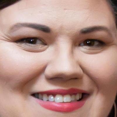
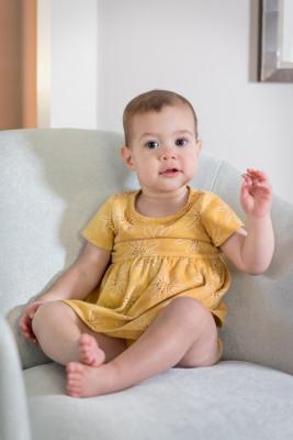
Focus test please and thank you! f/2.8 1/160s ISO 2500 38.0 mm