Sarah_
-
Posts
584 -
Joined
-
Last visited
Everything posted by Sarah_
-
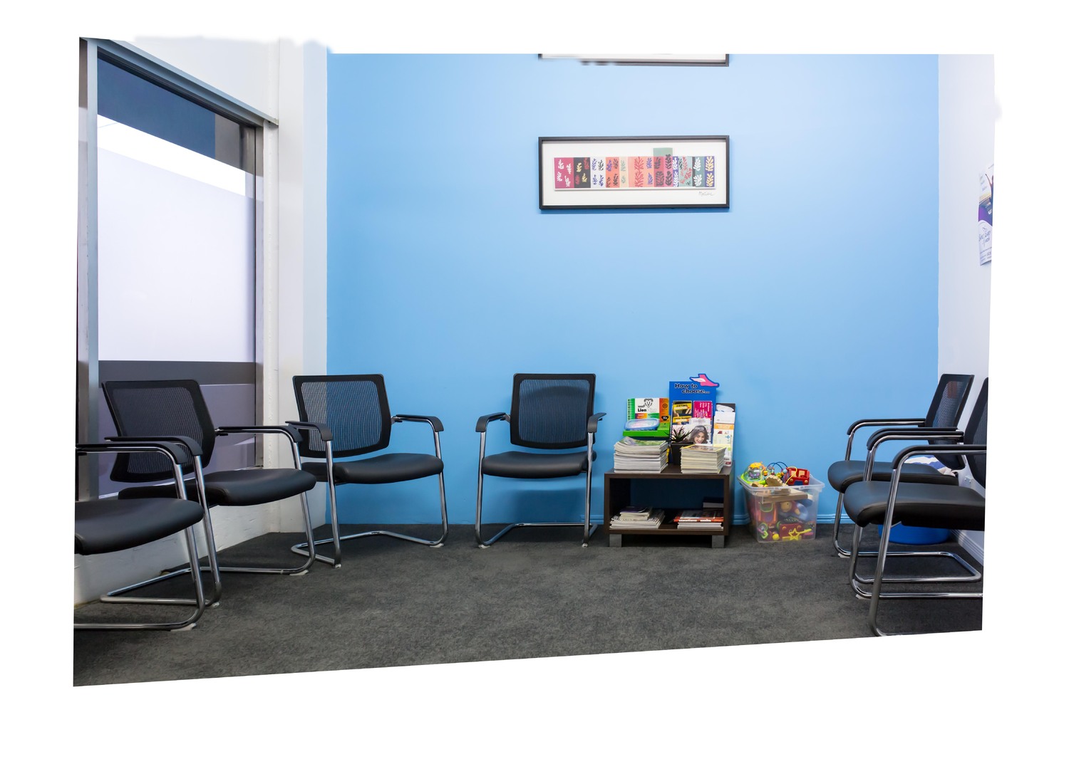
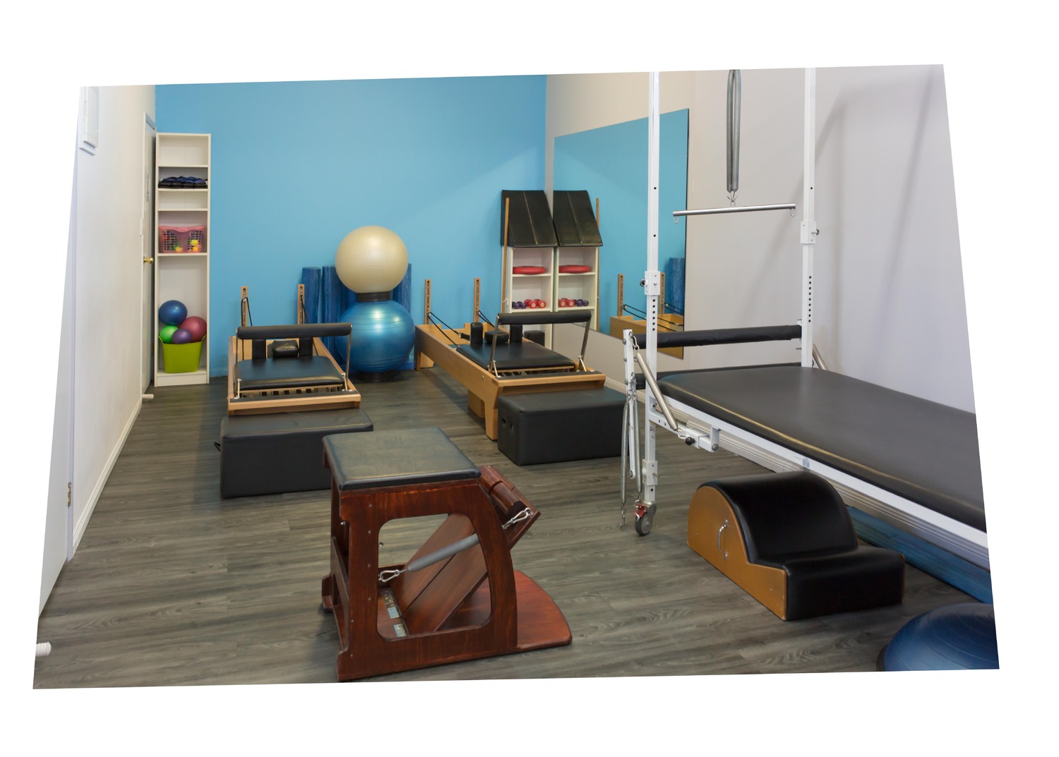
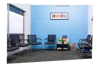
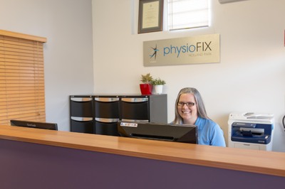
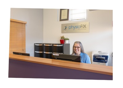
There are so many colour brightness variations in both walls. It would be ideal to keep the posters and frame and as much of the bottom as possible too. Is this a handyman fix?
-
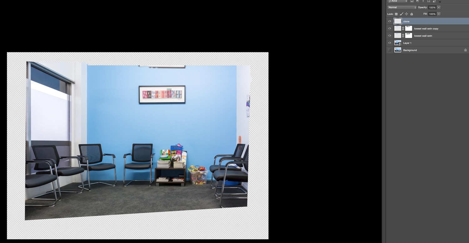
Actually, I think it'll look better with both sides extended at that ratio. Sigh.
-
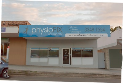
About to tackle this one - needs to be 2000 x 680 px. Should I add the extension to the right wall? It is the longer wall in real life.
-
Ignore please!
-
Super! Ready for levels?

-
-
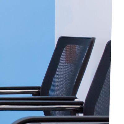
I'm hoping there's a genius Damien fix for the orange behind the chair?
-
It is UGLY!
-
I'm thinking this is all I'll do for now - if you approve? Unsure if they'll want the white paper flyer on the right wall removed. Should I clone it out now and mask it back in if they want to keep it later?
-
Extension attempt (upper wall) - I think I have broken a rule here and 'clone' layer has been move to allow cloning.
-
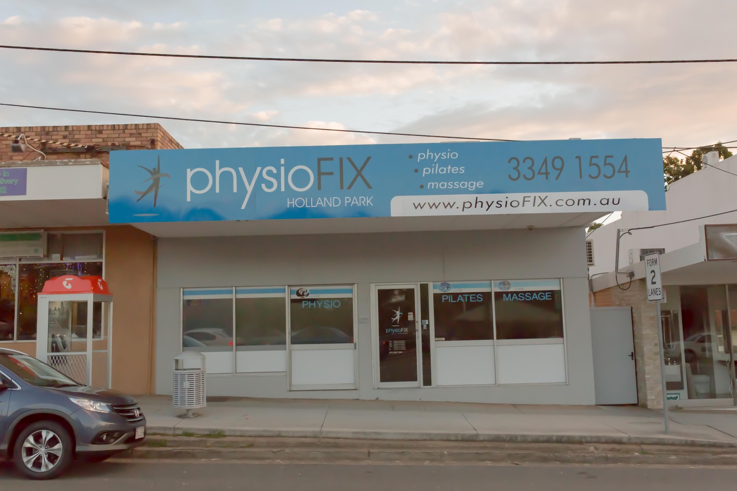
pf removal of car, bin, telephone booth, power lines, pipes etc
Sarah_ replied to Sarah_'s topic in Help with editing
*happy dance! -
pf removal of car, bin, telephone booth, power lines, pipes etc
Sarah_ replied to Sarah_'s topic in Help with editing
Tail lights cloned gently.

-
pf removal of car, bin, telephone booth, power lines, pipes etc
Sarah_ replied to Sarah_'s topic in Help with editing
Yes! So clone work will do later with all the other shots. -
pf removal of car, bin, telephone booth, power lines, pipes etc
Sarah_ replied to Sarah_'s topic in Help with editing
I was hoping to minimise the reflections - pretty sure I positioned myself out though. If you think it's ok as is - then I'll leave it and move into Levels. -
pf removal of car, bin, telephone booth, power lines, pipes etc
Sarah_ replied to Sarah_'s topic in Help with editing
Windows- would I use the same solid colour and D&B technique? Or is there a better way to not interfere with the blue text (on windows)? It would be nice if there was still an element of shine. -
pf removal of car, bin, telephone booth, power lines, pipes etc
Sarah_ replied to Sarah_'s topic in Help with editing
Dodge & burn attempt on solid colour window on right. Too subtle?
-
Sorry - ignore this.
-
Tricky one...
-
This was was a bit easier!
-
I'll go back and leave as is. Thanks.
-
pf removal of car, bin, telephone booth, power lines, pipes etc
Sarah_ replied to Sarah_'s topic in Help with editing
The grey window on RHS - solid colour layer. Kept the sign pole for the window edge. Quite handy really! -
Gee I'm a bit crooked!

-

-
Finished size to be slightly wider than a standard format.

-
Standard size.