novagary
-
Posts
301 -
Joined
-
Last visited
novagary's Achievements
-
Proofing: the "simulate paper color" button
novagary replied to novagary's topic in Questions about tutorials and articles
I keep my screen dim at level 80. I use two kinds of paper for printing, and I have not been having trouble matching them to my screen. In preparation for a talk, I thought I would review the proofing process and was shocked at the affect the "simulate paper color" button had on some test screen images - basically muting the colors noticeably. I have not yet done a test print to take a really close look to see if the "simulate paper color" button is out of whack or accurate. I took the lazy way out, and asked you. -
Proofing: the "simulate paper color" button
novagary replied to novagary's topic in Questions about tutorials and articles
Thank you. That makes sense. -
In an article on proofing you wrote, with regard to the "simulate paper color" button, that you have never found it satisfactory and it was sometimes disappointing. Then you recommended leaving it off unless you have a good reason to use it. Playing around with it, it does appear to make a dramatic difference with certain papers. Is your objection that the results shown, on the monitor, by pressing the button are just not reliable? If so then what would constitute a good reason to use it?
-
Damien, in your opinion, what is the reasoning behind Adobe making ProPhoto the default color space in Lightroom? Is it strictly a marketing device to appeal to people who may think "bigger is better", or is there another rationale?
-
So in some cases, the histogram might be gently kissing the walls, but there is still significant color clipping going on? I am not a LR user, so I am guessing there isn't an equivalent function to the "alt" button in ACR to reveal what pixels might be clipped. (In ACR, I prefer the alt button to the histogram to reveal clipping.)
-
If you soft proof in LR and set the color space to sRGB, does that then make the histogram usable, in other words does it reflect sRGB colors and clipping, just like in ACR? And regarding the point you made above about accurate clipping in whites, is that because all color spaces share the same white point?
-
Damien, what do they represent then? I ask because I often try to talk intelligently with LR users and would like to understand its shortfalls inside and out.
-
Don't know why pic posted twice. Ignore the weird water - my levels work for this was quick and dirty (not final).
-
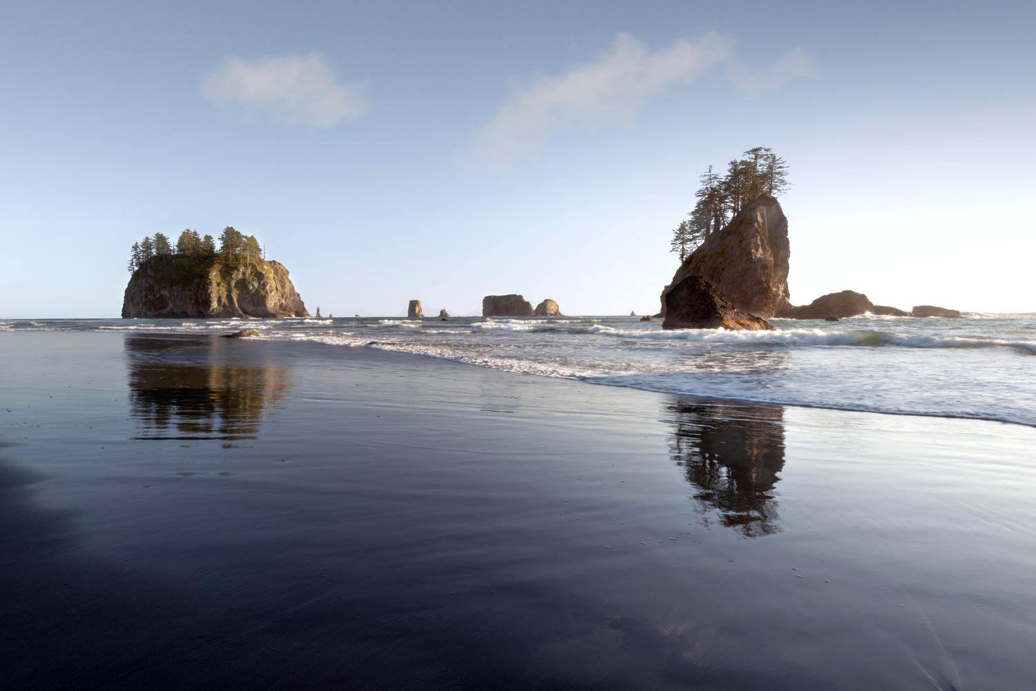
I tried this method: color range selection, tidy up mask, and just paint sky with color of old sky then gradient fade: It's not really a fix per se, but it's not a sky substitution. I painted the clouds in - do you think they look bogus?


-
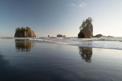
Sometimes polarizing filters mess with the sky. What would be your preferred method of dealing with this problem? Here is an example SOOR: