-
Posts
1,779 -
Joined
-
Last visited
-
Days Won
2
Everything posted by Jackie Matthews
-
LAB colour mode
Jackie Matthews replied to Jackie Matthews's topic in Miscellaneous questions or problems
got it. I was just wondering. As I said I've been watching some youtube videos and thought I'd explore this colour mode and see what your thoughts were. I can see that you don't like it - a bit like lightroom . It was confusing to follow but thank you anyway -

LAB colour mode
Jackie Matthews replied to Jackie Matthews's topic in Miscellaneous questions or problems
not even if it's converted to a smart object before converting back to sRGB? -

LAB colour mode
Jackie Matthews replied to Jackie Matthews's topic in Miscellaneous questions or problems
I did my raw processing first. Still a no? -
Is there anything wrong with using LAB colour mode? I've read some articles and watched some videos on using it but wondered what your thoughts were
-

buttons
Jackie Matthews replied to Jackie Matthews's topic in How to achieve a certain look or effect
Thank you -

buttons
Jackie Matthews replied to Jackie Matthews's topic in How to achieve a certain look or effect
yes looks good -

buttons
Jackie Matthews replied to Jackie Matthews's topic in How to achieve a certain look or effect
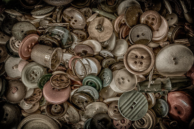
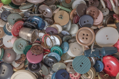
I have created something which I like but it's not quite in his style and it was also done using Topaz clarity and Nik hdr software - I would like to be able to create these looks in ps if it's possible -
I love this guy's style of editing, would you know how I can replicate it please on my 'buttons' picture? (soor) /www.facebook.com/RandyBenziePhotography/photos/a.158792530985279.1073741826.158792307651968/449266028604593/?type=3&theater
-
-
my colour lut's adjustments don't seem to be working as they used to. There are three sections: 3dlut file, abstract and device link. I used to be able to use all three sections but over the last few months only the 3dlut file option has been working and now that is playing up too. Is there any way I can reload the colour profiles for these? I've tried to locate them but without any success
-
Ok no worries. I hate the light too!
-
I didn't get the 'art' genes in my family . Maybe I should leave it without. Was I right about the banding though - if it's not visible at 100% it's not there?
-
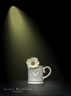
I found a 'brush' for the light beam. Added noise at 33% opacity on light only as per your article, any lower than this and it was still visible. Have I seen you write somewhere that if banding isn't present at 100% then it's not there?
-
On another iteration of this I did, or thought I had, but it made no difference. I'll check my noise pattern in case in the recent PS update the one I used wasn't correct but ty
-
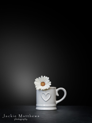
this is by no means finished and I'm not totally sure how to add a fake light but why is there banding on the light I've added or how do I get rid of it or have I even done it correctly?
-

lilac door hdr effect
Jackie Matthews replied to Jackie Matthews's topic in How to achieve a certain look or effect
:-( OK, thanks for looking anyway. I'll just use the Nik software sparingly -

lilac door hdr effect
Jackie Matthews replied to Jackie Matthews's topic in How to achieve a certain look or effect
Sent again. I did get a 'file sent' mesage yesterday -

lilac door hdr effect
Jackie Matthews replied to Jackie Matthews's topic in How to achieve a certain look or effect
sorry, thought this was the right place - apologies -

lilac door hdr effect
Jackie Matthews replied to Jackie Matthews's topic in How to achieve a certain look or effect
It's not necessarily that I 'need' to go to the effort, I like this effect, and some of the other effects that Nik has, but I'd like to manually learn how to draw the information out of the files as they do. I'll send the raw file anyway if that's ok -
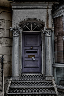
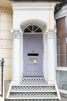
This image is mine and I've edited it using Nik software hdr effects but I'd like to know how to achieve this with photoshop
-

How to blend copied portion of picture
Jackie Matthews replied to Jackie Matthews's topic in Help with editing
Ok and would I increase the canvas size before I did that or after? -
Not sure I've got my workflow correct which is why I may be struggling but how do I blend the copied portion of this picture to match the rest? I need a bit more sky and post to put the pier in the centre of the picture so I increased my canvas size, copied the portion I wanted, used a hue/saturation clipped layer to try and match colour (this may need adjusting) but the line where the two meet needs blending but I don't know where/how to do this


