PhOtO JuNkie
-
Posts
79 -
Joined
-
Last visited
Everything posted by PhOtO JuNkie
-
Photoshop so slow
PhOtO JuNkie replied to Jodie Williams's topic in Photoshop / Elements / Bridge / ACR questions or problems
Mine is pretty slow too. -
Still waiting on proof.
-
Did it again. I like what it looks like now, thoughts???

-
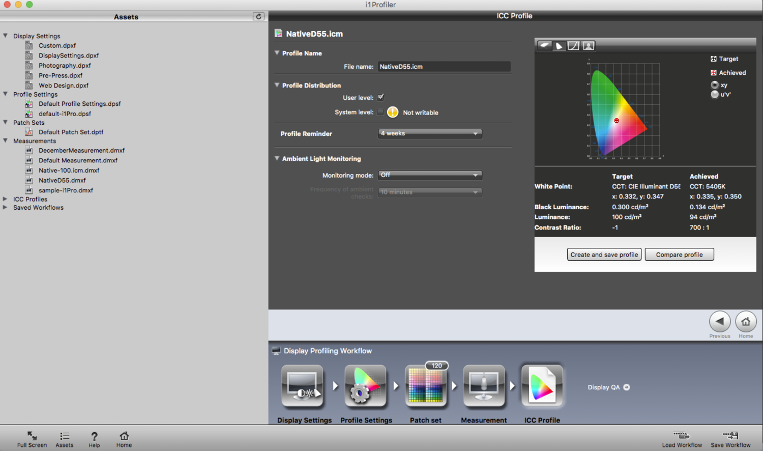
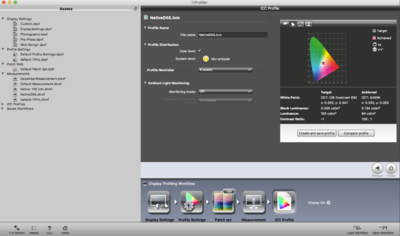
THEN I changed my Native to D55 and it got a little too warm.... See attached.
-
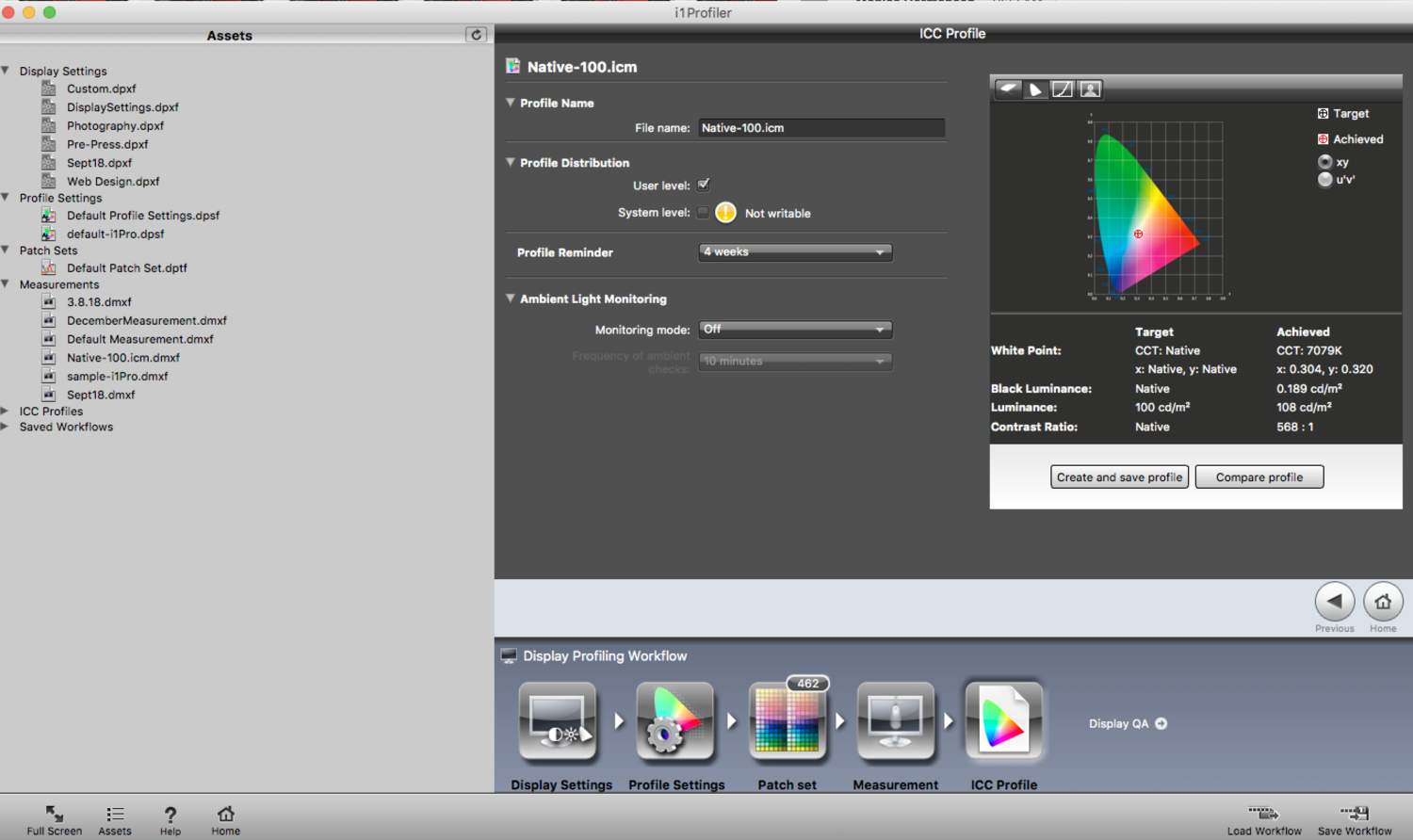
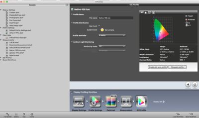
Damien, I followed the instructions above and my white point target is 7079. Shouldn't it be closer to 6500k? Please see attachment.
-
I didn't even realize there was a reply. Sorry. No, these aren't the same. Looks like they are a tad bit different.
-
I’ve calibrated my monitor per your instructions but IM STILL having issues with color and my prints. My image on my monitor looks beautiful, however, the print I received from my lab looks desaturated and gray. I continue to have issues with color. I feel like my work is inconsistent because of this. I use srgb which is what my printer uses, so where is the disconnect and why do my images look like s*it?? Sorry just very frustrated. PLEASE PLLLLEEEAAASSSEEEE HELP ME FIX THIS. I use 27” iMac, idisplay profiler to callibtate. Use canon 5d mark iii to shoot and usually 24-70mm lens.
-
Thanks.
-
Wondering... is it best to retouch images in Photoshop with shades drawn closed making the room darker or with the natural light? For coloring purposes. I shoot portraits and had shades put on my windows and the room is much darker. Thank you.
-
I guess to each his own. I actually love mac's.
-
Why????? I'm a headshot photographer and it is vital my prints look like the images I edit.
-
Thank you.
-
I had the SpyderPro 4. It seems like there was a color cast on my prints (greenish/gray tint). I just purchased a 27" iMac pro retina display 5k about 4 months ago.
-
Sorry for the delay - I've been having trouble with my images not looking like the prints. I just purchased a i1 Display Pro. I'm hoping it corrects the problem. (fingers crossed).
-
Okay. Thank you, Damien.
-
My images look different in iMac Preview than they do in Photoshop CC. It is a slight difference but it could be the problem I am having with color casting. In Photoshop the image looks good (vibrant) but when I pull it up via iMac Preview, it looks a little dull (some of the color is missing). What could be happening here? Anyone else going thru this?
-
Spyder 4 Tutorial
PhOtO JuNkie replied to PhOtO JuNkie's topic in Monitor calibration questions or problems
Hi Damien, I'm back because I now am editing off a new iMac 27" retina display. I've calibrated with my Spyder4pro and just printed several headshots from a printer I use often. I just received the prints back and what I see on my computer is way off from the prints. The color is very muted almost gray/green color but on my monitor color tone looks good. What am I doing wrong???? I am so frustrated as I feel like "color" is always my battle. I even calibrate monthly using my SpyderPro4. I'm just frustrated because I NEED MY PRINTS TO MATCH WHAT I SEE ON MY MONITOR for my clients. This is not good. HELP!!!!!!!!!!!!!!!!!!!!!!!!!!!!!!!!!!!!!!!!!!!!!!!!!!! -
Yes. Sometimes horizontal but most times vertical 8x10.
-
I provide digital images for clients who then have them printed to be used. No graphic designer.
-
It is for headshots 8x10.
-
The headshot should be 8x10 but I crop 8x12 in case they want to crop closer. Is that what you need? Thank you so much for following up with me about this.
-
Damien, I think it is called "constrain proportions". Does that sound familiar to you? A Photographer friend made me an action for it. I need to ask her for the details.
-
lab. They told me most of photos look very yellow. And sometimes I think when they print them they look too grey (washed out).
-
Hi Damien, I'm really struggling with color right now. I just purchased an iMac with retina display and have calibrated my monitor and followed your directions regarding srgb. BUT for some reason photos from printer look too yellow. The printer uses srgb color profile. When I edit my image in Photoshop CC 2017, the image looks fine but when I choose PROOF SETUP under VIEW menu, I choose SRGB it looks very yellow or too red. Shouldn't I be editing in this "proof value"? It makes me have to select it every time. Maybe I am not understanding this correctly. I just do not know what I need to do to be editing with the same colors so my portraits look the same. PLEASE HELP ME!! Thank you.
-
Hi Damien, I am a headshot/portrait photographer and I am so very thankful for your site. It has helped me tremendously. Since I've had to reinstall Photoshop CC, I am at a loss with a few things. One being, color profile. I read somewhere (of course I can't remember, maybe one of your classes I took) that the color profile set in Photoshop should be SRGB. Is that correct? However, I read something that I should be using ProPhoto RGB because it has more colors???? I do not print for my clients but I want to be sure what I provide them is good enough to print with vibrant (true) colors. So what should my settings be in my camera (canon 5d mark iii) Adobe Rgb or SRGB? And what should be my settings in Photoshop CC?