AniaAnia
-
Posts
311 -
Joined
-
Last visited
Recent Profile Visitors


AniaAnia's Achievements
-
Wow, that's so much better! I would personally go a tad further. I haven’t used the liquefy function before so I will definitely look this up and try it. I'm excited and greatful to know I can fix this type of problem. Thank you very much Damien.
-
My phone distorts photos from time to time. Unfortunately this happened on an image that is meaningful to me. Is it able to be fixed?

-
Would the Dell U2722D work with my i1 Display Pro or would I also need budget a calibrator? Currently The Dell is selling for AUD $399 on Amazon vs Asus Proart AUD $529 on Kogan. The spec difference is the refresh rate, 60Hz for the Dell 75hz for Asus. I think the Dell has a smaller stand = more desk space. If I can use my calibrator with the Dell, than that's seems better value. Unless the imaging is just that much better with Asus.
-
I have an x-rite i1 Display Pro. Yes, it's a few years old.
-
Hi Brian, What are your thoughts on the Asus Proart Displays? https://www.asus.com/au/displays-desktops/monitors/proart/proart-display-pa278cv/ Thanks, Anna
-
Trouble with 100% Red, Green and Blue
AniaAnia replied to AniaAnia's topic in Monitor calibration questions or problems
Thanks Damien. That worked well. I'm ready for my next class -
Trouble with 100% Red, Green and Blue
AniaAnia replied to AniaAnia's topic in Monitor calibration questions or problems
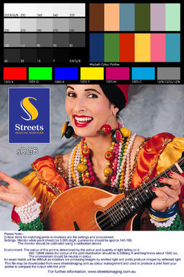
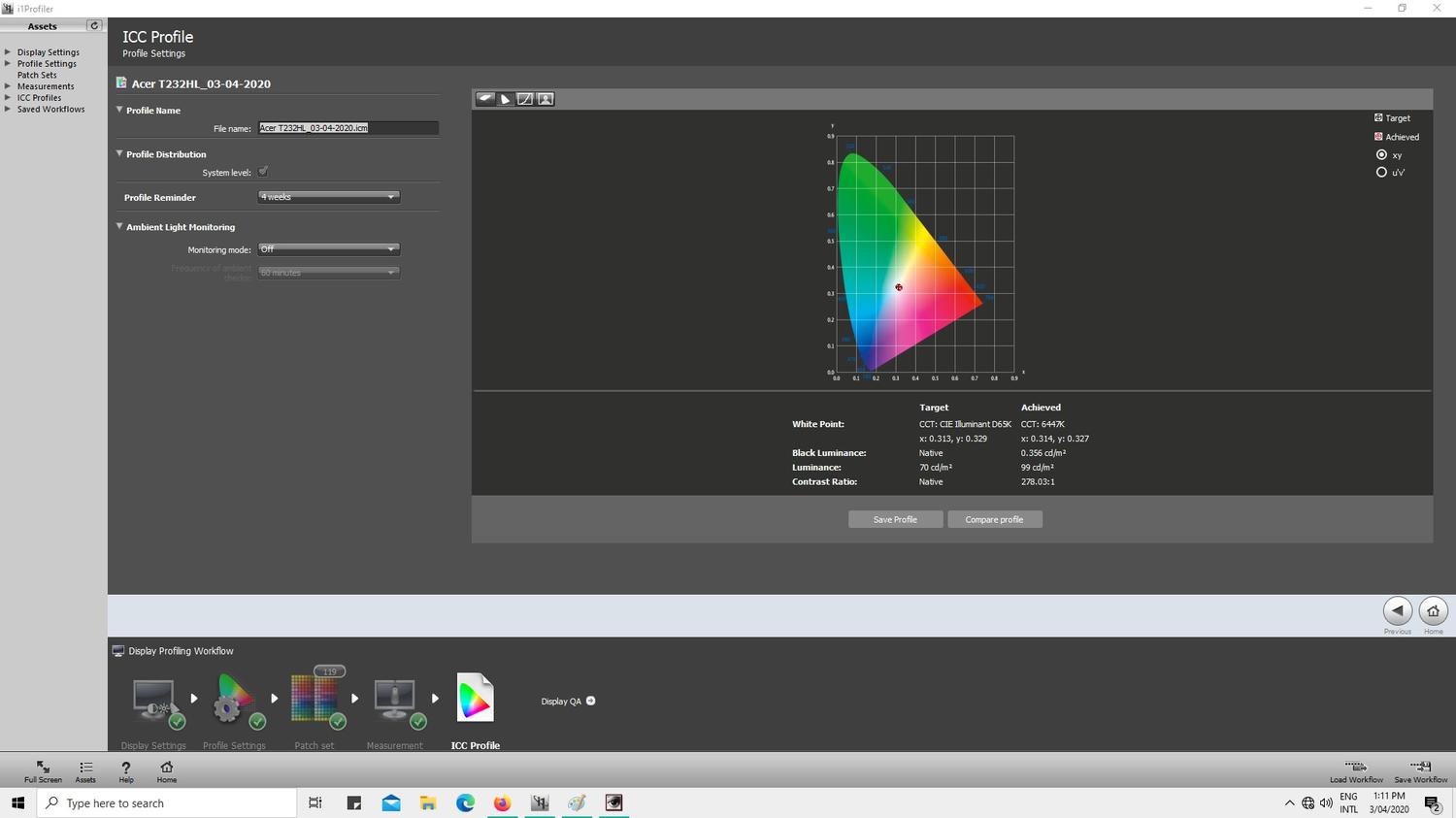
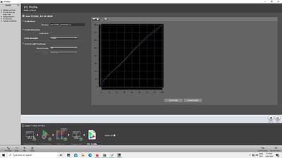
Hi Damien, I hope the rest of your week is going well. I got an i1DisplayPro and have had much better results. I can see that my screen is a little warmer than my prints. In your troubleshooting instructions you show how to change it but I'm not sure how far I should go if the difference is small. What increment would you suggest? Some screen shots with the i1;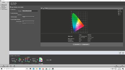
-
Trouble with 100% Red, Green and Blue
AniaAnia replied to AniaAnia's topic in Monitor calibration questions or problems
Okay, thanks Damien. I will get onto that asap. Can I assume the devices in your calibration list are up to date, and I can look at something from there? Also, do you think I should get a different monitor while I'm at it? -
Trouble with 100% Red, Green and Blue
AniaAnia replied to AniaAnia's topic in Monitor calibration questions or problems
I tried with a different monitor (LG Fratron W2753VC) the presets for temp were: Normal 4543K User 4536K Internet 4634K Movie 4672K This monitor will allow me to adjust temp, but the above were taken with the default of 6500K. Comparing prints, the results look similar to my previous experience - prints show reds that are more dull, greens that a brighter and different hue. The blue on this monitor is brighter and the yellow a closer to the print. -
Trouble with 100% Red, Green and Blue
AniaAnia replied to AniaAnia's topic in Monitor calibration questions or problems
Bahahaha - Ay Macarena! I'm interested in why you don't recommend using a lab's test prints. Isn't that the purpose of them? Yes, I'm following your calibration instructions (always). Today I recalibrated as well as doing a full calibration with the same result. In the FullCal today I chose a warm present (6866K), and ECO colour management brightness profile (95). Yes, I have a few of my own photos printed from the same lab. Unfortunately I no longer have as many as I once did so my comparison is somewhat limited, which I was hoping to use the picture of the lady for. I have 3 photos - one underwater photo on a reef, one portrait and a b&w (though I think it was edited to be b&w by desaturation in LR, so I don't know if you count that as a true b&w photo). Anyway, I'm happy with the brightness of all three prints. -The reds in my photo prints don't look as vivid as those on the screen, they are more dull. The portrait looks slightly warmer in print but the overall the skin tones look close. The bright red of a coral fish in the underwater photo or the red in clothing in the portrait is much duller in the print. I would guess that the red of the very bright fish might be brighter than what the lab can print (going by what I read on another post) but I would expect that red in the dress would be within limits. As the skin tones are also close, I am wondering why the red is so off the mark. - The greens in the prints are brighter than on screen. This is a little confusing because the hue in the print looks different too - on screen it looks more olive green, but in the print it looks more green apple. As a side note, the underwater shot has a little yellow in it and it is more dull in print too. -
Trouble with 100% Red, Green and Blue
AniaAnia replied to AniaAnia's topic in Monitor calibration questions or problems
Acer T232HL -
Trouble with 100% Red, Green and Blue
AniaAnia replied to AniaAnia's topic in Monitor calibration questions or problems
The calibrator only shows Spyder4, but the software is Spyder4Pro. -
Trouble with 100% Red, Green and Blue
AniaAnia replied to AniaAnia's topic in Monitor calibration questions or problems
Spyder4 -
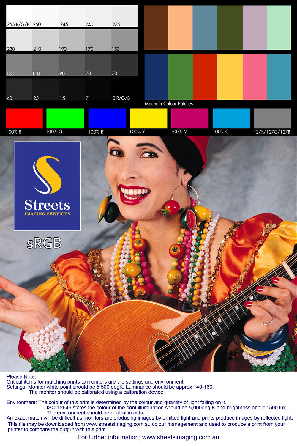
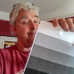
Hi, When comparing prints, I am happy with the greyscale and Macbeth colour patches in the example but the 100% Red, Green and Blue are 100% less luminescent/vibrant on my print! I'm not sure where to go from here - about 6 months ago I had a picture I tried to print that had reds and earthy browns in it and it printed so badly. I spent days or even weeks trying to recalibrate and reprint and non of my attempts worked at getting my picture to what I was seeing on screen. I ended up thinking it was my monitor or my editing which is how I have arrived here. I'm ready to go back to basics with classes and getting help. So is this a calibration issue? Is it normal for everything in the attached picture to appear fine except the 100% colours? Thanks.