

Jackie Matthews
-
Posts
1,776 -
Joined
-
Last visited
-
Days Won
2
Posts posted by Jackie Matthews
-
-
I did my raw processing first. Still a no?
-
Is there anything wrong with using LAB colour mode? I've read some articles and watched some videos on using it but wondered what your thoughts were
-
Thank you
-
yes looks good
")
-
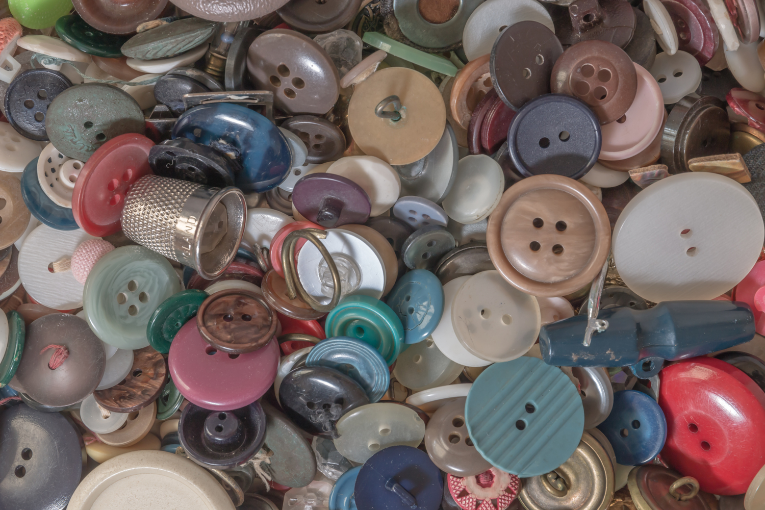
I have created something which I like but it's not quite in his style and it was also done using Topaz clarity and Nik hdr software - I would like to be able to create these looks in ps if it's possible
-
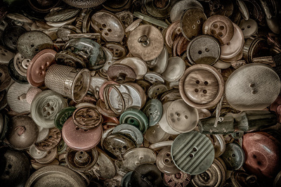
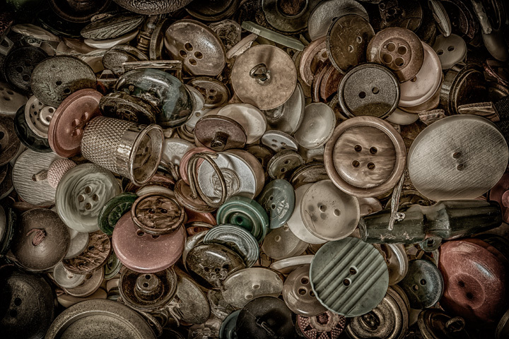
I love this guy's style of editing, would you know how I can replicate it please on my 'buttons' picture? (soor)
/www.facebook.com/RandyBenziePhotography/photos/a.158792530985279.1073741826.158792307651968/449266028604593/?type=3&theater

-
-
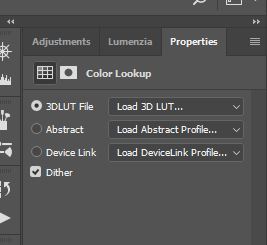
my colour lut's adjustments don't seem to be working as they used to. There are three sections: 3dlut file, abstract and device link. I used to be able to use all three sections but over the last few months only the 3dlut file option has been working and now that is playing up too. Is there any way I can reload the colour profiles for these? I've tried to locate them but without any success
-
Ok no worries. I hate the light too!
-
I didn't get the 'art' genes in my family
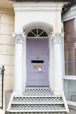
 . Maybe I should leave it without. Was I right about the banding though - if it's not visible at 100% it's not there?
-
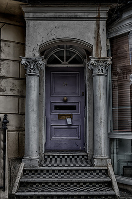
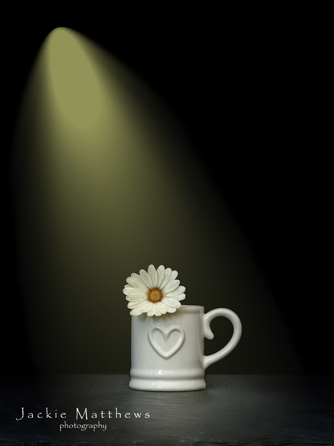
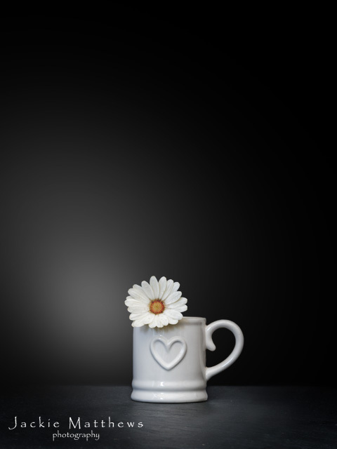
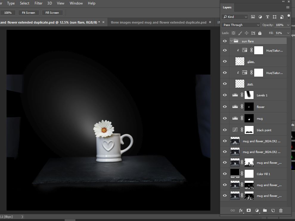
I found a 'brush' for the light beam. Added noise at 33% opacity on light only as per your article, any lower than this and it was still visible. Have I seen you write somewhere that if banding isn't present at 100% then it's not there?

-
On another iteration of this I did, or thought I had, but it made no difference. I'll check my noise pattern in case in the recent PS update the one I used wasn't correct but ty
-
this is by no means finished and I'm not totally sure how to add a fake light but why is there banding on the light I've added or how do I get rid of it or have I even done it correctly?

-
:-( OK, thanks for looking anyway. I'll just use the Nik software sparingly
-
Sent again. I did get a 'file sent' mesage yesterday
-
sorry, thought this was the right place - apologies
-
It's not necessarily that I 'need' to go to the effort, I like this effect, and some of the other effects that Nik has, but I'd like to manually learn how to draw the information out of the files as they do. I'll send the raw file anyway if that's ok
-
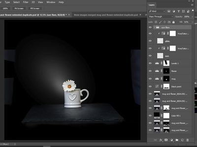
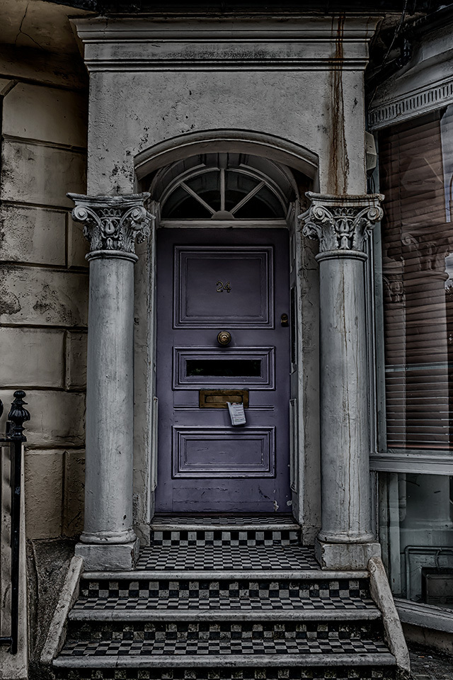
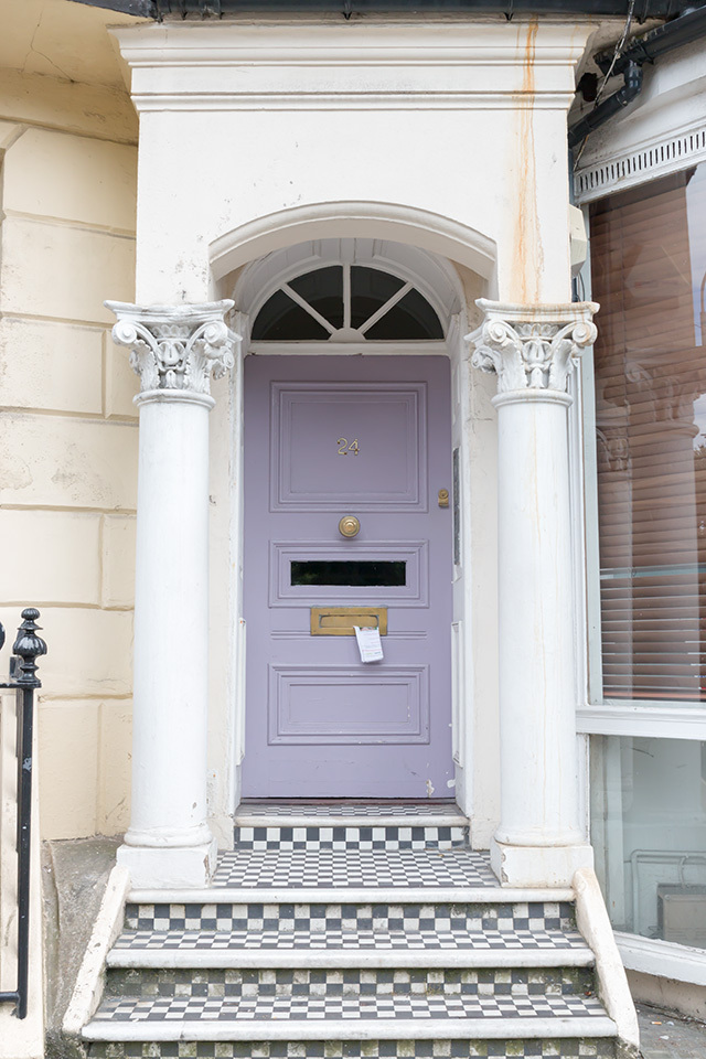
This image is mine and I've edited it using Nik software hdr effects but I'd like to know how to achieve this with photoshop
-
Ok and would I increase the canvas size before I did that or after?
-
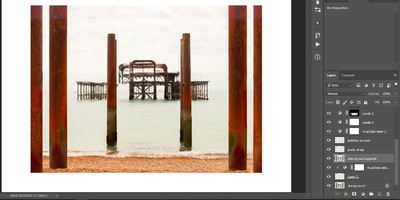
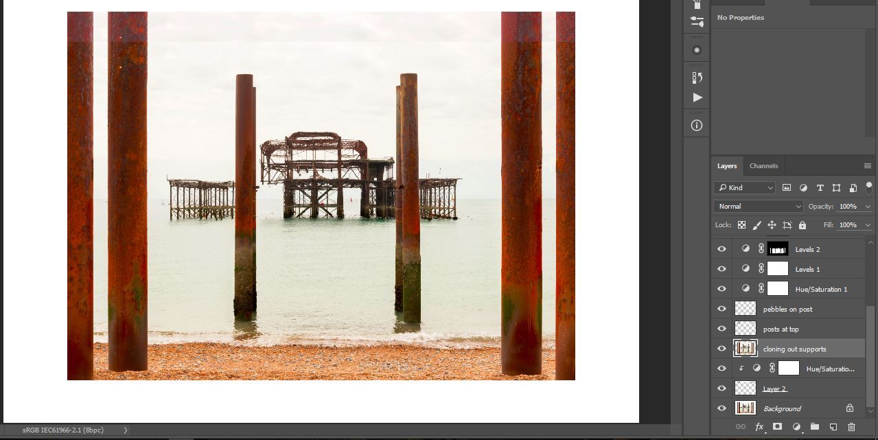
Not sure I've got my workflow correct which is why I may be struggling but how do I blend the copied portion of this picture to match the rest? I need a bit more sky and post to put the pier in the centre of the picture so I increased my canvas size, copied the portion I wanted, used a hue/saturation clipped layer to try and match colour (this may need adjusting) but the line where the two meet needs blending but I don't know where/how to do this
-
It's just an app on my iPad that I used to show you the difference in the colours, I didn't know how else to show them side by side
-
I kind of guessed you'd say that and I've just uploaded both versions of the file to my Adobe portfolio website and they appear to be the same so i guess there's no issue. I was just wondering what the issue was as it's a recent problem - it seems strange that a file would lose saturation on resize
-
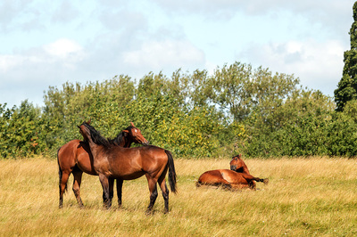
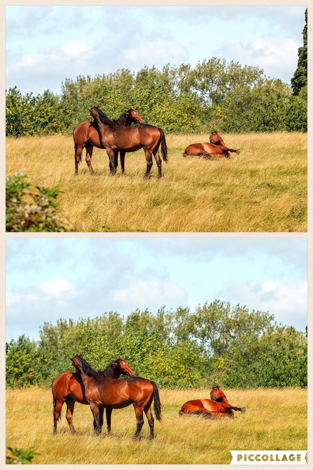
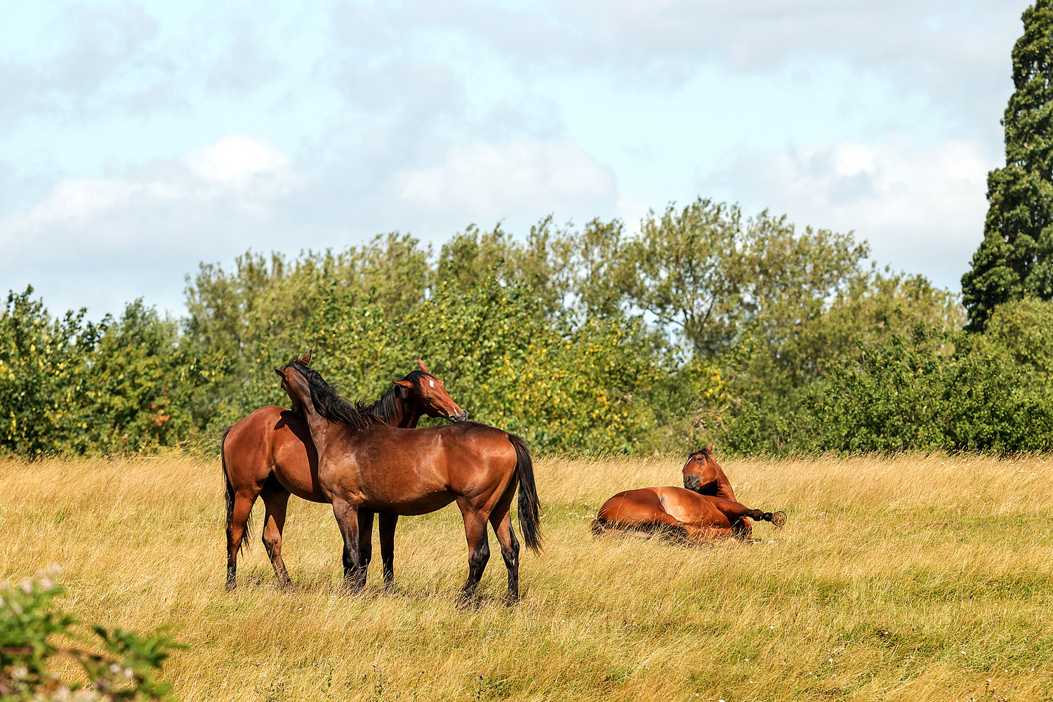
Firefox set up as per your instructions. There's a definite difference on my iPad. I upload files to Pixoto into weekly challenges and I only ever use 960 pixels on the longest edge. I put one on last week and it was really washed out compared to my file. Not sure how well the image I've attached is going to show up but in the full size file the horses have a definite 'red' saturated look to them but the smaller file shows them as brown

-
I resize my files to 960 x 640, 72 dpi for uploading to web pages.
I've just finished editing a picture which I saved at 12 x 8, 300 dpi for printing and also 960 x 640, 72 dpi for web upload. Looking at the files next to each other on my ipad, there is a marked difference in the colour saturation of each file - the smaller file which I upload to the web is decreased in saturation whereas the file for printing is as I expect it to be.
For each file I flattened my layers and prepared the image sizes as stated above. Why has the saturation diminished?
OK, so after attaching the files to this page it seems like the files look the opposite to my query above, ie, the larger file on the right looks slightly less saturated/vibrant than the smaller file on the left. Viewing the files in Bridge, they are both the same. I have not noticed this problem until this last week or so

LAB colour mode
in Miscellaneous questions or problems
Posted
not even if it's converted to a smart object before converting back to sRGB?