

Michelle Pena
-
Posts
364 -
Joined
-
Last visited
Posts posted by Michelle Pena
-
-
Thank you Brian, this amount sounds a lot better. Can this display be calibrated with my current X rite ?
So this M1 chip should be good for the current PS , I'm still on 2019!!
-
I've been reading in my photography groups that they have just bought the Mac mini and a large display. For them it works like a " beast" lol. And I may go that route.
This change Apple made just kinda turned me off now to their products. I think I may get a PC, gaming system and this way I don't have to worry about purchasing computers every three years! Since I have trouble with brightness in calibrating with a iMac maybe this is a sign to make the switch.
Another suggestion I've been receiving is trying a MacBook Pro?? Like how?? I can't edit on a laptop. Ana Brandt recently told me in a postt that she edits on a MacBook Pro and does not need to be calibrated, I cringed. But she's a pro newborn photographer.I just don't think editing on a laptop is for me.
Damien had suggestions on pc and monitor somewhere here correct? I taking the raw class with him so maybe I'll ask in one of the posts.
-
Ughh why would they do this?? NO way I'm paying 5k for a new Mac .For the first time I may be switching over back to PC.
In one of my photography groups , a photographer bought the 24 inch Mac with the 16gb unified memory and she's already getting the ram/memory error. She claims to have only Lightroom running and is receiving that error. She feels the M1 chip does make the 16 gb run like a 32gb as they told her.
This is devastating! Look forward to the article, thanks so much!
-
I'm ready to purchase a new iMac and the 27inch is not listed?
-
Prophoto light is on my wish list. I always wondered why from one frame to the next the images looked different. One image could be cool and the next warm. I often don't change camera settings but the power of the light I do depending on a lot of things going on in the set up.
I'm in the raw class now just trying to get past the first part of it

-
I have a Xplor ad400 pro, it’s very much like the Godox ad 400 pro . I don’t know the color temp on this one but it’s definitely a lot cooler than the Eienstein, the Eienstein strobe was crazy overly saturated. Very yellow blah the d850 didn’t like it lol between the high contrast of the d850 and the saturated Eienstein was just plain awful.
I’ll try auto norm and with Neutral or standard
-
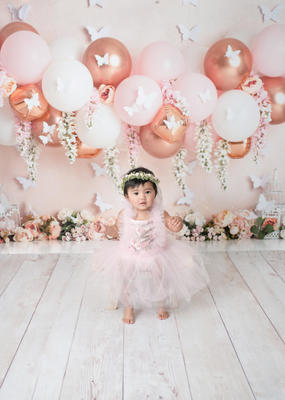
This image I added some red and minus 2 yellows in ACR and it looks a tad better. The auto WB 2 was used at the time thinking it would keep my image warm since I have trouble with cool images. Wonder if maybe since these turned out too yellow if I should use the Auto NORM?
-
I am having a heck of time editing in the auto WB and Neutral
I am not happy with this image and I have to deliver these in two weeks. Any suggestions. I see green on my end?
-
Not Bay Photo or mpix, I don't care for those either. I'll look into to a few other ones on that list. Do I send off for prints " as is" meaning at the calibration settings I am at now?
-
I understand that, unfortunately ShootProof does not any of those labs as an option
I’d have to switch to IPS probably to use any of those labs. Not ready for that switch yet. I want to focus on the raw class first.
Thank you Brian.
-
Brian do mind if I ask you which lab you use?
-
Ok , then that’s why I use the d50 it’s the closest setting to a match print.I had a photographer suggest to me to edit in a dark room with dim lighting lol! Wha??! And 4 bars on her iMac and she says her prints are not dark. Don’t worry I’m not going to do that.
-
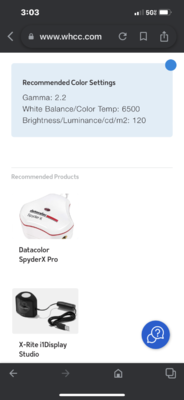
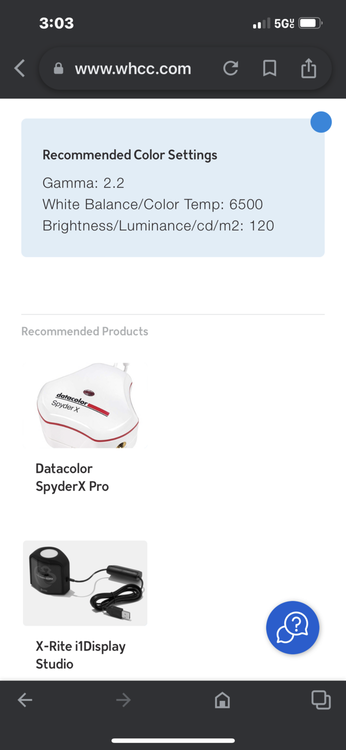
I checked and this what they recommended but I remember trying those settings before and it was off , prints didn’t match. I’ll try this again.
-
Whcc through ShootProof. If not mistaken, its been awhile since I went in . I think they suggest d50 .
-
It’s only been that setting that has worked all these years.
-
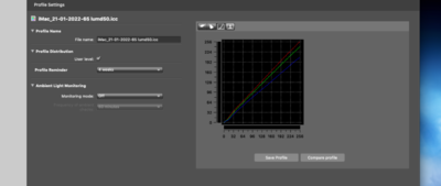
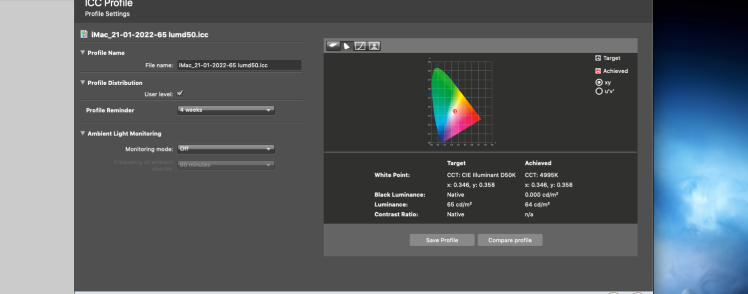
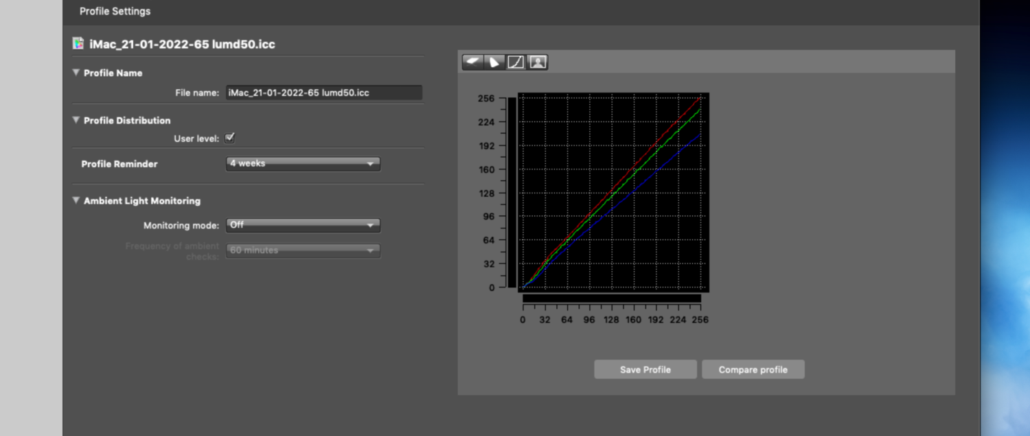
I just finished calibrating my monitor and followed Damien's instructions.
Brian, can you tell me if this is ok for iMac settings ?
D50 -64 lum....Prints seem to match up ok..I don't know if it's just me looking at them too long but the prints look a slightly green and my screen slightly red?
I don't think a client would see it but I do. I'll drag my results in. I use x rite i1display pro. I am at 2 bars on the brightness.
Thank you for any help.

-
I moved the lamps beside me and about two feet away. Doing this the light is softer. I will edit with the one tick and send off for prints.
-
Also,should I keep the brightness at one tick after doing this? Thank you.
-
Ok,I will try to work with that re-arrange the room so that they can be placed beside me, hopefully that does not cause glare.
They are directly in-front of me
-
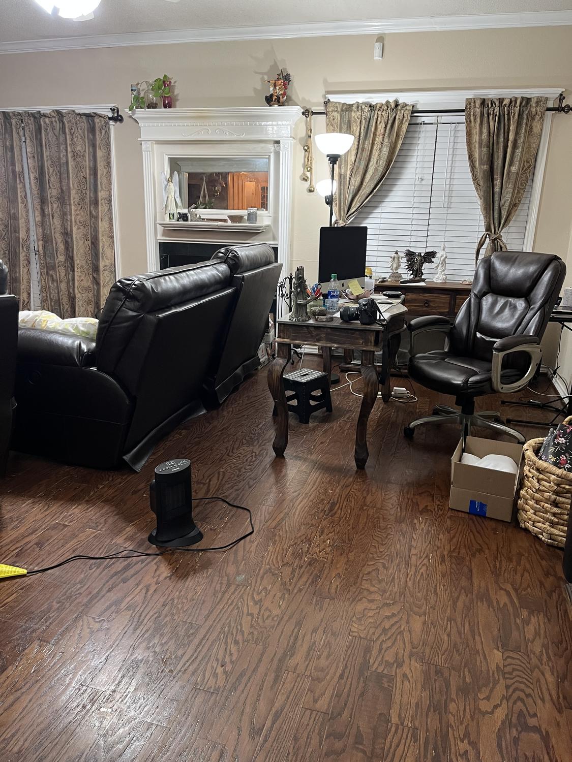
Oh dear, I just wouldn’t have the time. I shoot during the day clean up and set up for next day. Somewhere in there I eat too lol here is a picture of the room. I thought I had sent one yesterday. Excuse the mess .

-
I don't have a room that is any different in color unfortunately .
-
I went ahead and started using one click down and I can still see the screen a bit.
On another note,I had a client reach out to me and said her digitals are bright and if I can reduce the brightness. She's speaking only of the family part of the session not the newborn by herself. She is a very far person and dad and baby all had different skin tones. I explained to her if she printed them after I uped brightness her prints would be dark.
What then ? LOL I'm just..... digitals are too bright but darkening them will darken prints. I'm about to pull my hair. I am taking the Raw class though !
-
OK I just changed all those things.
-
 1
1
-
-
I understand this, even the whole brightness is changed one it's loaded on to ACR. I can have a brighter picture in camera and once its upload to ACR its way darker than what I shot it as.


What happened to the 27 inch iMac??
in The Macintosh User Group
Posted · Edited by Michelle Pena
Brian, the article would be posted in this group?
I don't mind up grading to PS cc 2022. I guess my main concerns are if they can be calibrated and are fast enough for PS. Those would be my deciding factors on if I should switch back to Pc or stay with Mac. And right now, although I have not made decision yet, it's been a hard one, seems PC is the best way to go. Believe me I love apple products and I love how they all sync my passwords together on all my devices! ( very important for a forgetful person) I will miss that one small feature lol! I know petty but important to me. Also, there are other things to consider all my backup drives are formatted to my Mac and how the heck will I get the info in need transferred to the PC??!! So many things and head is spinning ! lol