

Michelle Pena
-
Posts
364 -
Joined
-
Last visited
Posts posted by Michelle Pena
-
-
Oh, I also wanted to ask if anything has changed with setting up Photoshop? I have your article or Damien's on how to set it up. I'm about to upgrade to PS 2025 and want to ensure that my settings remain the same. Thanks so much!
-
I do know a bit about labs and how they work from the film days. A Loooong time ago... LOL... I used to work at a Riz Camera back in my early twenties, and they constantly calibrated and performed regular maintenance. Versus Walgreens, which rarely changed out the chemicals, so you know how that goes, lol! I use Shootproof for my clients. And tried all the labs except one or two, but I liked Miller's better. Have my settings in PS according to their specs. I will be talking to them on Monday about my issues. I wish they had CPQ as a choice.
-
I have the Apple Studio Display with my Mac mini M2 pro, and I also purchased the Calibrated Color Checker Pro new. So both are almost two years old. I'm shit out of luck then !
-
I tried the GB-LED setting this evening, and I think the screen looks better. Not as warm. Prints match a tad better. I'm about to edit a session that is mostly pink and white, which makes it super difficult to see colors correctly due to the warm screen. I may consider a new non-Apple monitor if I can with the Mac mini. I'm just not in the budget for it right now.

-
1 hour ago, Brian said:
You are the 1st person that has asked about the Apple Display Pro XDR, and unfortunately...I don't have any real experience with it.

I know the default White Point is D65, according to Apple, but I find that too cool. Personally, I'm using D55 on My 27" iMac and it matches my prints very well. I will say this...if you have the option to choose which Display Panel Type in your Calibration Software, look for GB-LED. If you choose the wrong one, you will get weird...and usually frustrating, results.
I have the regular Apple Display, not the XDR, but it doesn't matter though lol Yes, it's too cool at d65 but it's so easy on the eyes and to edit .With the d50 setting, it's so warm and dull, it's hard to edit on this; everything looks hazy. I'll try the GB-LED option! Maybe that will help some.
-
3 hours ago, Damien Symonds said:
Are you sure the light in your room is bright and white enough? Room lighting is the #1 cause of non-matching.
It's always been the same. I've not changed anything in a few years. LIght bulbs are white 6500k
-
 1
1
-
-
Sorry, not sure where to post this in the Apple or calibration section. Does anyone here edit with an Apple Display Pro ? Been having issues with prints being dull and dark.
I use a Colorchecker Display Pro. Prints not matching, they are either too warm or too cool on either setting.
These are the settings I have tried so far.. Can there be a D60 lol!! Lum 60 is the most it can do. 80 lum is too bright.
1) Native and 60 lum- too cool
2) D65 and 60 lum - too cool
3) D55 and 60 lum- way too warm- hard to see colors and brightness at this setting
4)D50 and 60 lum- still too warm but better
Does anyone have issues like this with their Apple Display? Should I purchase another non-Apple screen that I cannot afford for the Mac Mini?
Thanks for any help.
-
Yes, I took his class years ago! I never could understand. It was like relearning everything again. And I did give up because I was overwhelmed. I could retake it; I don't want to waste his time.
Sorry, you keep repeating yourself; that is how I learned. Unfortunately, I was never taught not to judge the LCD screen
The Profoto monolight ($800) seems too low; it's only 100w. I'm not sure if that would be enough light for anything I do.
-
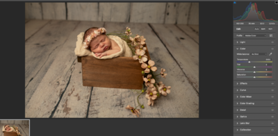
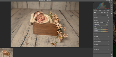
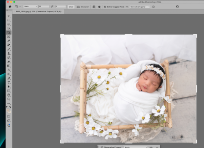
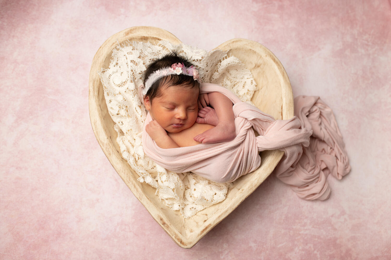
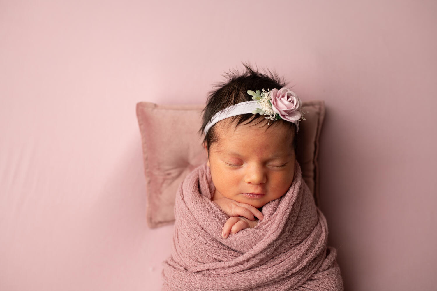
Ok, I grabbed that newborn session from yesterday and halfway edited a photo. It looks excellent already compared to the back of the camera. I want to show you a before and after. I won't show you the back of the camera image because, of course, the cell phone doesn't show the colors correctly or as is. So the back of camera looked very dull, with no contrast, yellowish green in color, almost hazy..you get the jist, Just scary looking LOL! The unedited uploaded image ( shown ) was in 5500wb in ACR and it added 50 ! The second photo is the halfway edited version. I was surprised that it could add contrast and light without looking wonky. Is this the correct direction I'm headed in? I know you explained a lot, but I am that person who will not understand until I see it for myself, more hands-on. This is how my brain comprehends information lol
The second edited photo is still a little too yellow-orange for my liking, and I hope I can fix it. I didn't use the grayscale to edit this photo for time's sake.
-
Yes , you are right ! In ACR , they are lower. Today I had a newborn used the new settings , and already I saw no hotspots nor too much brightness in baby’s face! This was after uploading into ACR by the way not LCD. There was no muddy look either. Now I haven’t started editing them yet,but I already noticed a softer better image. I feel it’s the neutral setting because I didn’t change the power of the light.
-
OK, I must have misunderstood you. I thought you meant keeping it on Kelvin at 5600 camera. But you meant to keep it at AWB, Correct?
Yes, I have been told the Flashpoint ad400 pro or Godox are bright lights.
-
3 hours ago, Brian said:
Just you wait until you get a Profoto Light. You will have "Portable Sunshine." That 86" PLM needs "Umph" to get the most out of it. Remember, all modifiers eat a little bit of light.
Also, the "Inverse Square Law" comes into play. Each time you double the distance between your subject and light, you lose about a stop of light. If you change the flash power from one value to another, say 1/8th power to 1/4 power, you need to adjust your Aperture by one stop. Same thing if you go from full power to half power. I think it's a percentage of 77% of light loss or somewhere around there. So going from 1 foot away to 2 feet, you lose 77%-ish of light power. 2 Feet to 4 Feet, another 77%-ish. That's why Photographers usually keep their lights 4 Feet - 8 Feet away, it gives them the most wiggle-room and still have decent light. Think of being on a Giant Dart Board, with your subject is in the Bullseye. The Rings around the Bullseye define the section of where you put your light, or you can visualize placing you light on the ring itself. Regardless of WHERE you place the light, the Light Power and Aperture Value remains the same as long as the light remains the same distance from the subject as you don't move it further away or closer.
Why does this matter? Because the further away your light is, the more contrast you will have. It's possible that you moved your light to a spot that isn't giving the results that you desire, so I would fiddle a bit, even go as far as to use a tape measure to figure things out. Use a Coffee Can or a Doll. Figure out where you want your light, what camera settings that you use, and mark things with Masking Tape and a Marker.
Golden Rule of Flash Photography:
Aperture Determines Light Power Used -- Shutter Speed Determines Ambient Light.
Zack Arias gave us an excellent video on this subject. Please watch this enough times until it sticks:
Zack Arias: Aperture/Flash RelationshipI will take a look at the link.
I feel I get a lot of hot spots, so I think the newborns are too bright. I don't feel I get soft lighting with newborns or sitting babies. With the 64-inch plm, I will move it around a lot with newborn sessions! Mostly away to prevent hot spots. I double-diffused and even triple-diffused this light, so it is not bright. I also shot in a room without windows; it's pretty much dark except for the modeling lamp.
-
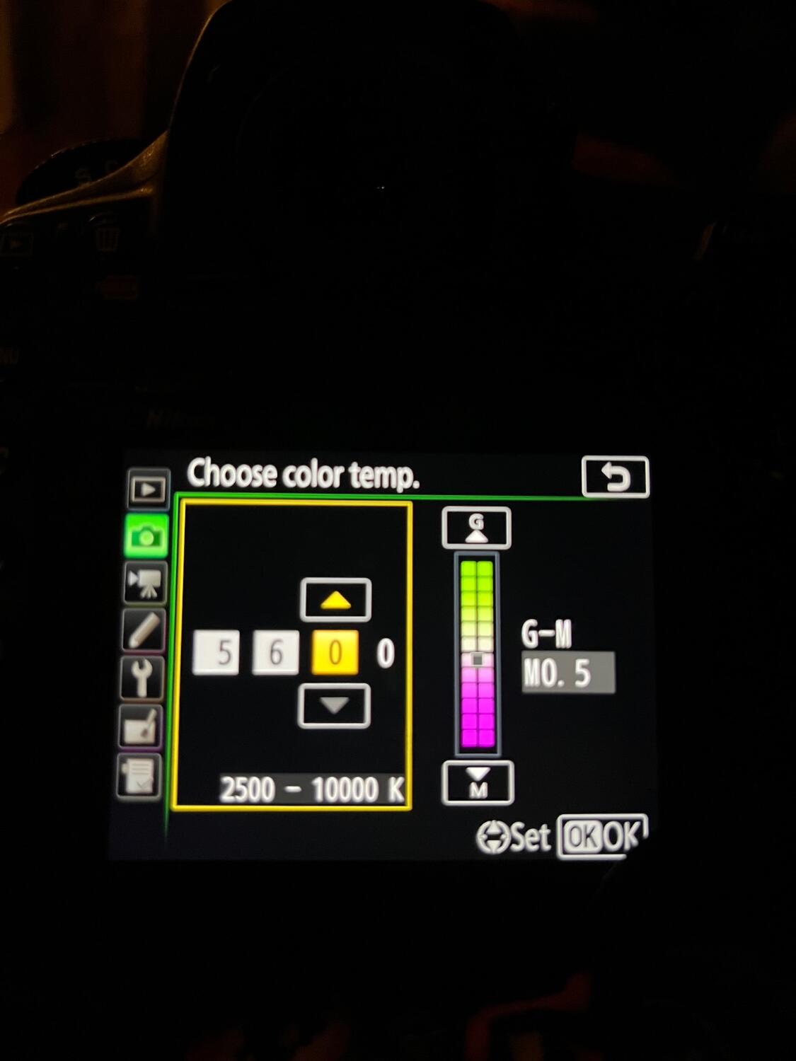
3 hours ago, Brian said:
Found it!!
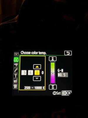
If the White Balance has been Fine-Tuned, an Asterisk will appear next to the K.
The G-M Setting on the right, SET IT TO 0.0!!!
(You moved it to M0.5. which is more Magenta.) Nikon Cameras have enough issues with the Reds, don't make things worse. By changing this setting, it AFFECTS ALL OF THE WHITE BALANCE ACROSS THE BOARD, REGARDLESS IF IT'S AWB OR SHADE OR CLOUDY, OR EVEN A KELVIN VALUE THAT YOU MANUALLY SET. That M0.5 setting is screwing with EVERYTHING. You want 0.0.
While you think you are making things better, unless your computer display is 100% dead on with your prints and you calibrate religiously, don't try to fine-tune your colors with the White Balance. How you see color is different than another person's eyeballs / brain. Don't ever judge color via your camera's LCD.
What does that mean? Fine-tuned?
I've changed it to 0.0. I did talk to the lab once, and they mentioned they added a plus one or two of red, which is why I moved it
. I have a newborn baby today and will shoot with the new settings.I hope all goes well. Mini Mac is calibrated almost to match prints, the only issue I have is brightness. I think it's been a few months since I calibrated. I may do that this evening
-
Ok I messed with the arrows again and I don’t know how or why but now it’s changed!
-
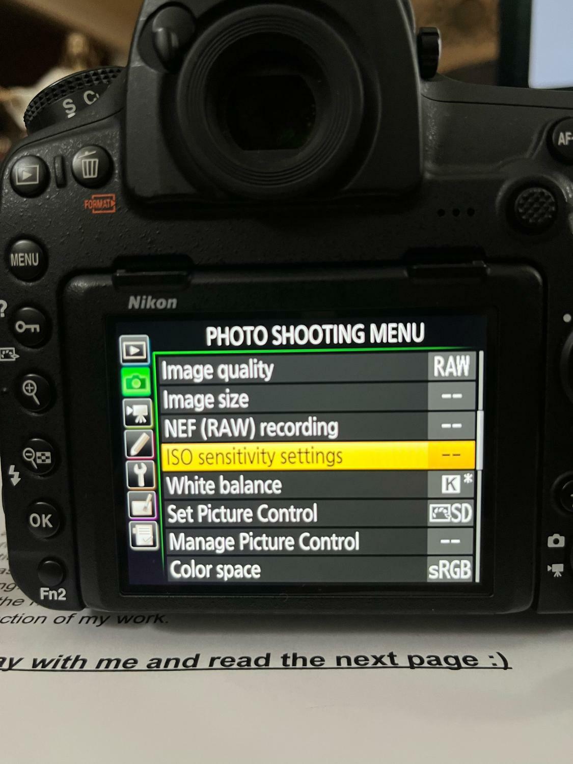
54 minutes ago, Brian said:
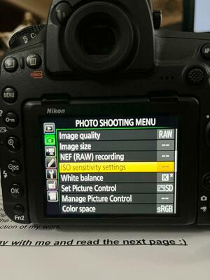
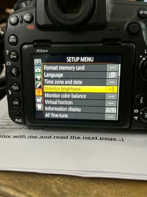
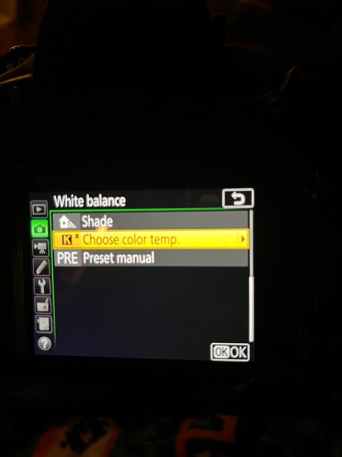
From the above photo, your White Balance is set wrong. See the K*? It should be just K.
- Hit Menu Button
- Head to Photo Shooting Menu (Camera Icon)
- Select White Balance in the list
- Select Choose color temp > and hit the right arrow on the directional pad
- Change the Value to 5 6 0 0 in the four blocks.
- Hit OK. You should see 'White Balance K' (No asterisks next to the K.)
I followed the directions and it still does not change the astrik out? Once I hit ok after setting it to 5600 it’s still k and astrick. Picture below .
For newborns, I use a 64 inch Paul c buff umbrella, white inside , white diffuser and black outside cover. I use this size for newborns and maternity . For sitting babies I use a 86 inch plm same set up and the 64inch .
I may have to take the raw class again.

-
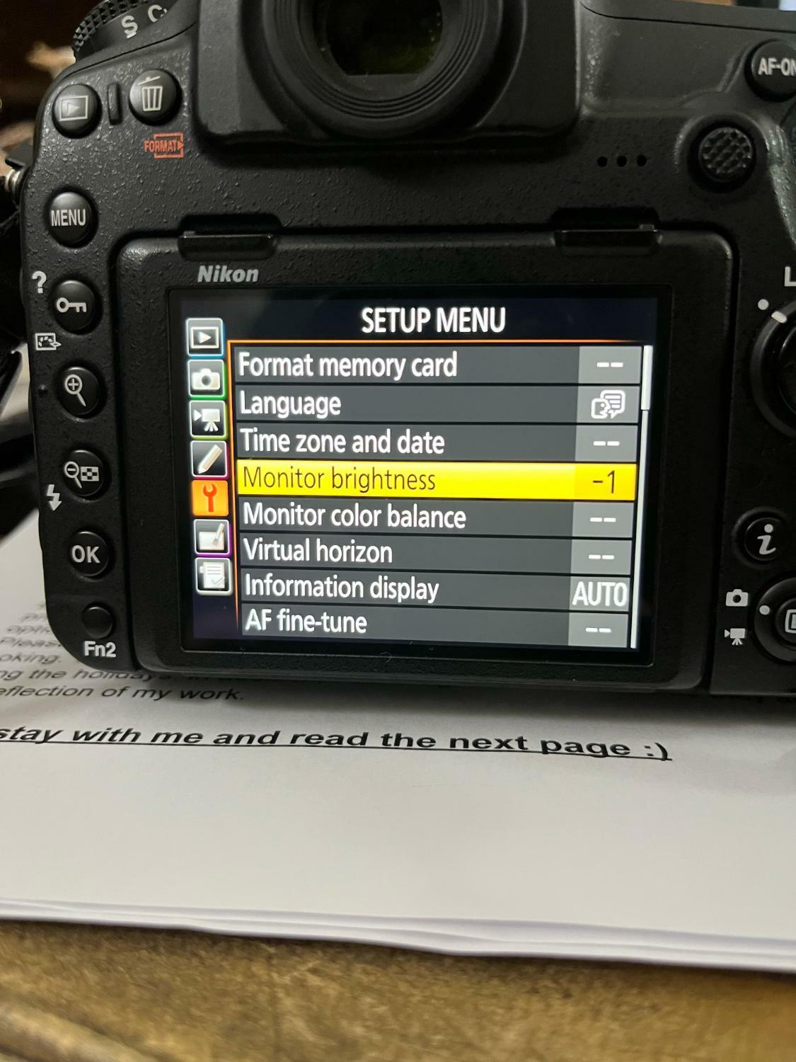
OK, the camera is already set to sRGB. Picture control is in neutral, and WB is at 5600k. I changed the LCD screen to -2 it was at -1 before..I'm not sure I see the difference. Did you see the Wb setting in the previous photo I sent you? It's on Kelvin, that is correct? I will attach a picture of a setup I used with those changes settings, not sure if it will do any good for you to judge it. I need to go down to 250iso... I do understand about using the histogram. But I do love some shadows in my newborn images, so the points are never in the middle
What should I do then? I do see your friend's images are clean-lit but flat. Not that that's bad, but I personally love a little more shadow and depth. I will start saving for the Profoto light!

-
Oh, and once I change those settings, do I also change my color profile in ACR to Neutral? Right now, I think I have it on " color."
-
My current settings are in the pictures below. I don't think I'm on AWB. Omgosh, neutral looks bland once I upload it to the Mac, but I will give it a shot. I have some free time tomorrow to try the new settings you suggested. Neutral,-2 monitor brightness, and WB of 5600k correct?
Profoto has been a light I've wanted. The B10, but this must be new. I'm not up to date on those lights.
I've heard that the Wescott FJ 400 and FJ 200 are suitable for what I do: newborns, babies, and maternity. What's your take on those lights
Thanks for your help.
-
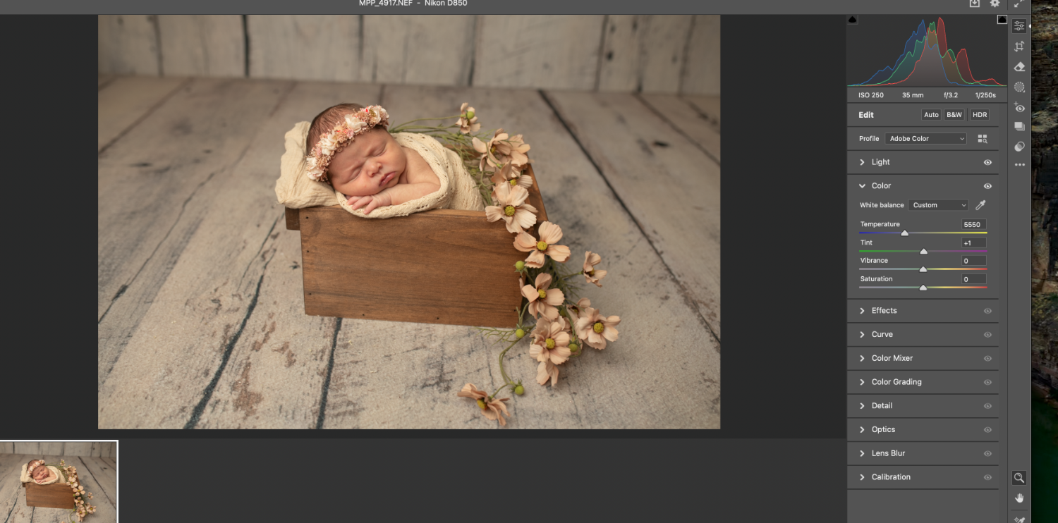
Hi Brian, I've been noticing for a few months now, and not every time... that the back of camera images have been saturated with ugly orange and glowy look. Nothing has changed regarding camera settings that I can tell, and when this happens, editing is a nightmare, even using the grayscale for WB. I don't know if my camera or strobe is causing the issue or if I'm accidentally hitting something. The bulb on my Flashpoint 400ad Pro is new for about 6 months( I've been using this light for 4 years and never had this issue), so I don't know what it could be. I'll attach unedited photos, but you may see a different color as it doesn't look the same on the back of the camera versus a computer. I have a D850, which is a very contrasty camera, but I have not seen images like this. WB was set at 5260k except for the mauve rug image, which was set at 5000k. Those settings should make the image cool in my experience. These are just awful. Any suggestions? Thank you!

-
Yes, most definitely!
-
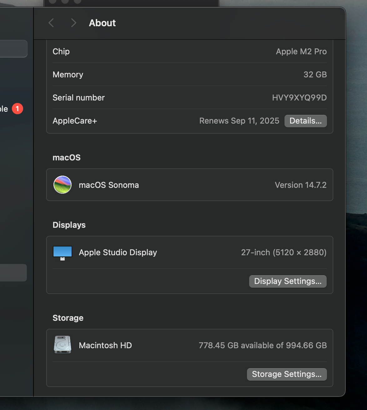
Should I be ok with upgrading to Sequoia? Its file is 7.48 GB. Has anyone had any issues? Thank you, Brian.
-
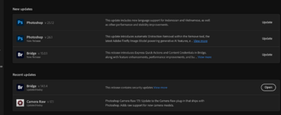
It's 7.48 GB, so I feel like it would be okay. I've only had this new Mac mini for over a year. Has anyone had issues?
Image below.
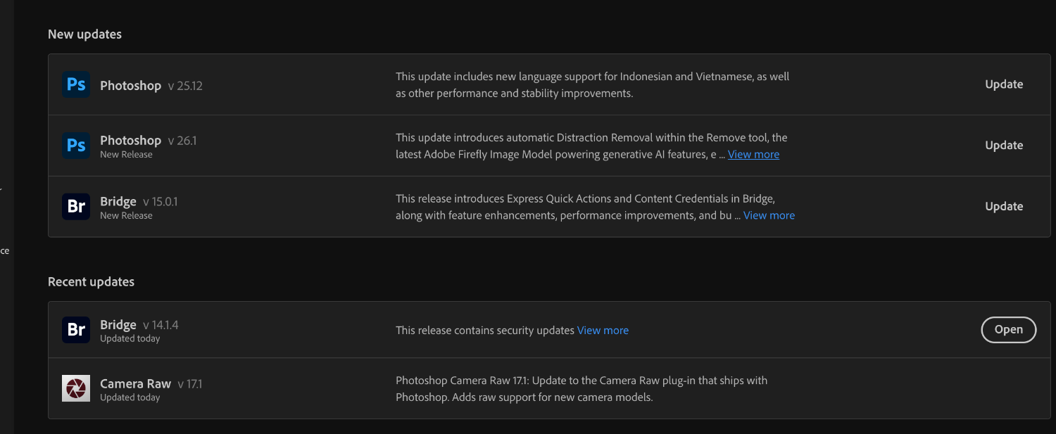
Also, has anyone experienced any issues with the Photoshop update? The image below shows what it's asking me to upgrade.

-
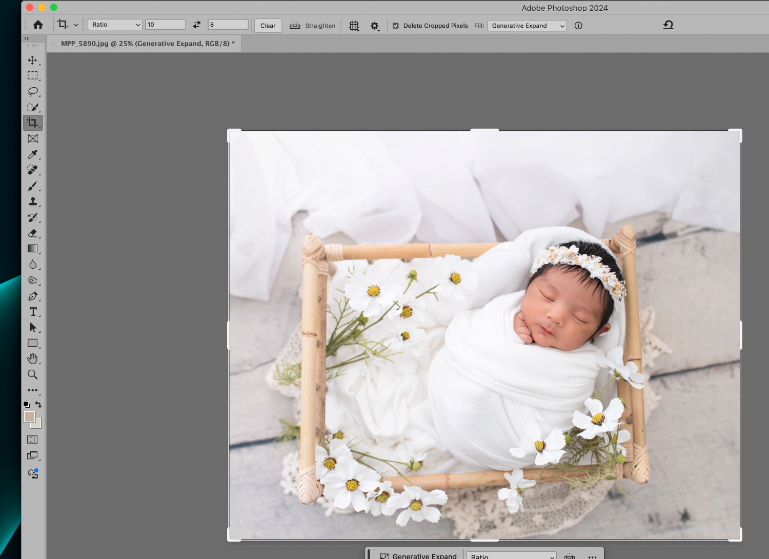
How can I get the resolution box back on the top tool bar? When clicking the crop box, it used to be there by height & width. Or is it gone now?
-
On 5/17/2024 at 10:41 PM, JessG said:
If I can butt in here, lol! I came from a 16 GB, and it slowed down because of all the PS updates. I could not upgrade to Sonoma or upgrade my PS to 2024 (I was using the 2019 version) I knew if I did, it would slow down the imac even more. Believe me, from my experience, saving up for my 32 GB M2 Pro mini Mac was the best choice ( of course, now they have the m3, which was not available yet when I purchased the new machine ...ugh). Everything runs smoothly.I have not yet updated to the new 14.5 Sonoma. The upgrade is 2.48 GB, which is not bad I think the M2 could handle it but If I don't need to upgrade, I won't. Photoshop runs so well on the new 2024 version. I can also use the AI features to remove items from pictures to remove wrinkles or to extend backgrounds, and it's fast at generating it! Take Brian's word for it: this one will not do what you need it to. Anyway, my two cents! LOL. Good luck, Jess!


Apple Display and Calibration
in The Macintosh User Group
Posted
Sorry, my questions are random lol! This is what Miller's prefers, so the North American purpose 2 or whatever it is changes to custom, is this an issue that you know of?
Below is a picture of what these specific settings to be.