cathm
-
Posts
3,826 -
Joined
-
Last visited
Everything posted by cathm
-
I think it's tough because I am trying to change the color to less yellow so i wasn't unsure about the sample color.... Should I use color balance layer?
-
Continue from above..... Here is how it current looks.

-
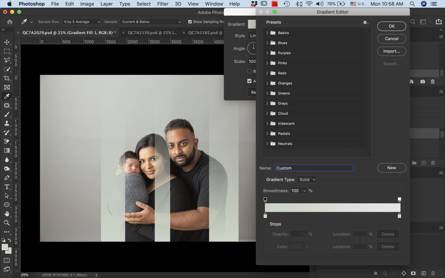
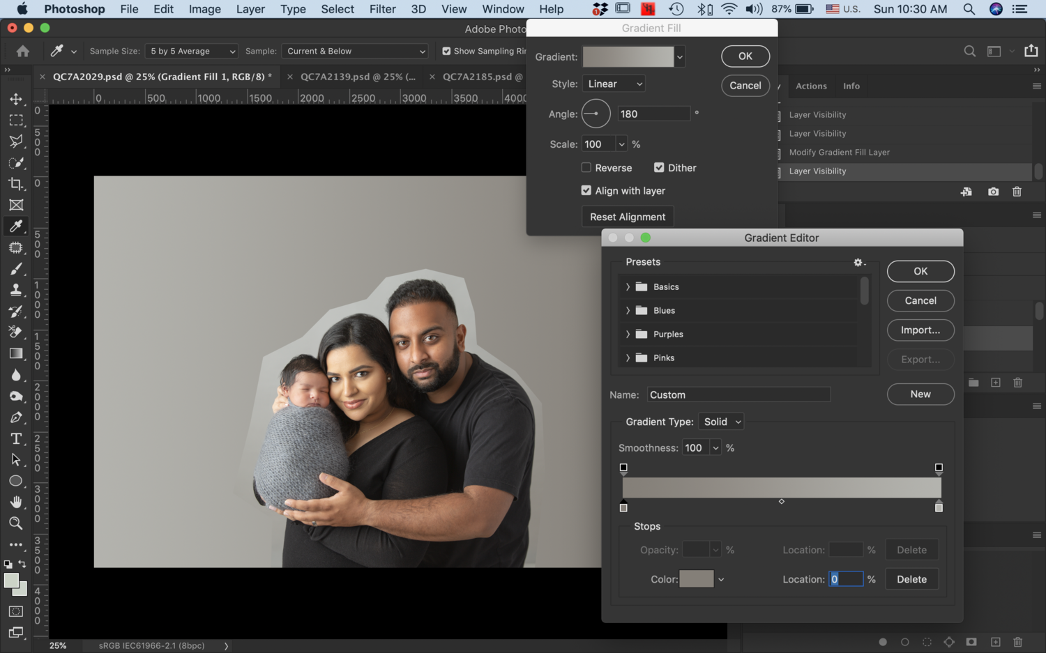
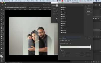
Do you have any advice of how I should create the second gradient layer? I am unsure about the sample color + locations.

-
Do I select a sample color from the background color that i am trying to match with? Is it possible for you to show me how you would do this?
-
Level for the background only, correct?
-
Actually, I would rather match the background color tone. Will you walk me through how I can achieve this?
-
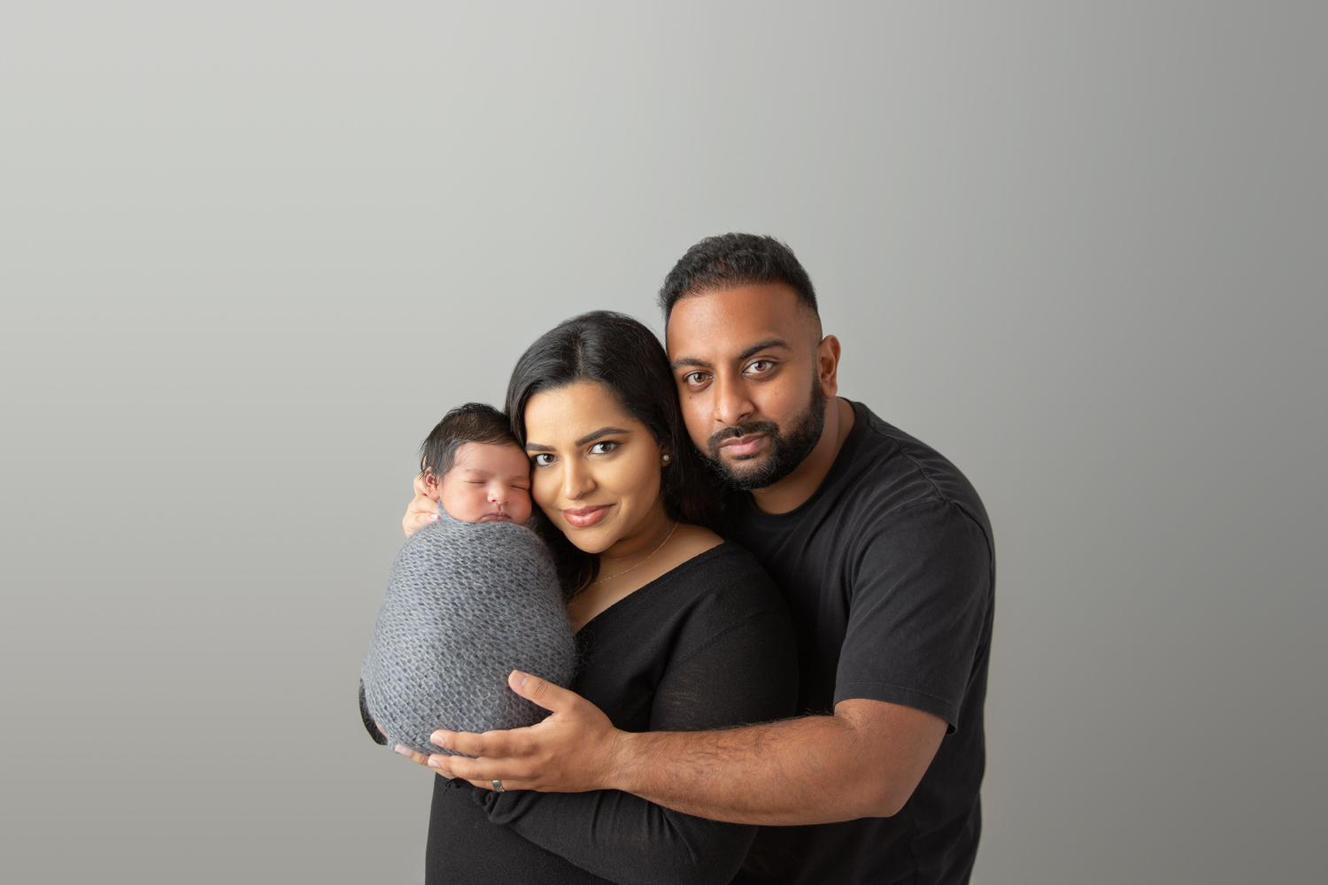
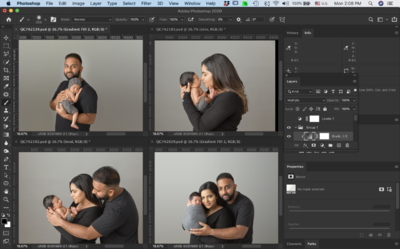
Thank you. I have further questions. I am planning to place these 4 images together in the album. Would you try to match the background color (top 2 is darker + more yellow) than the bottom 2).
-
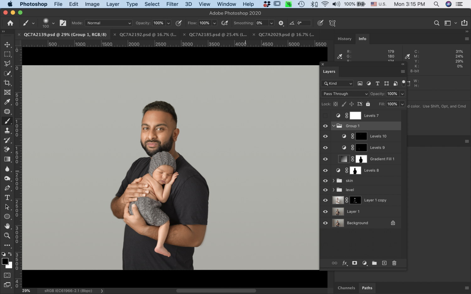
I found this one with 4 colors and was able to figure it out, thanks. Here is the finished image. I am wondering if I should raise the noise % from 10% to 20% as I see some vertical lines around the area above dad's head?


-
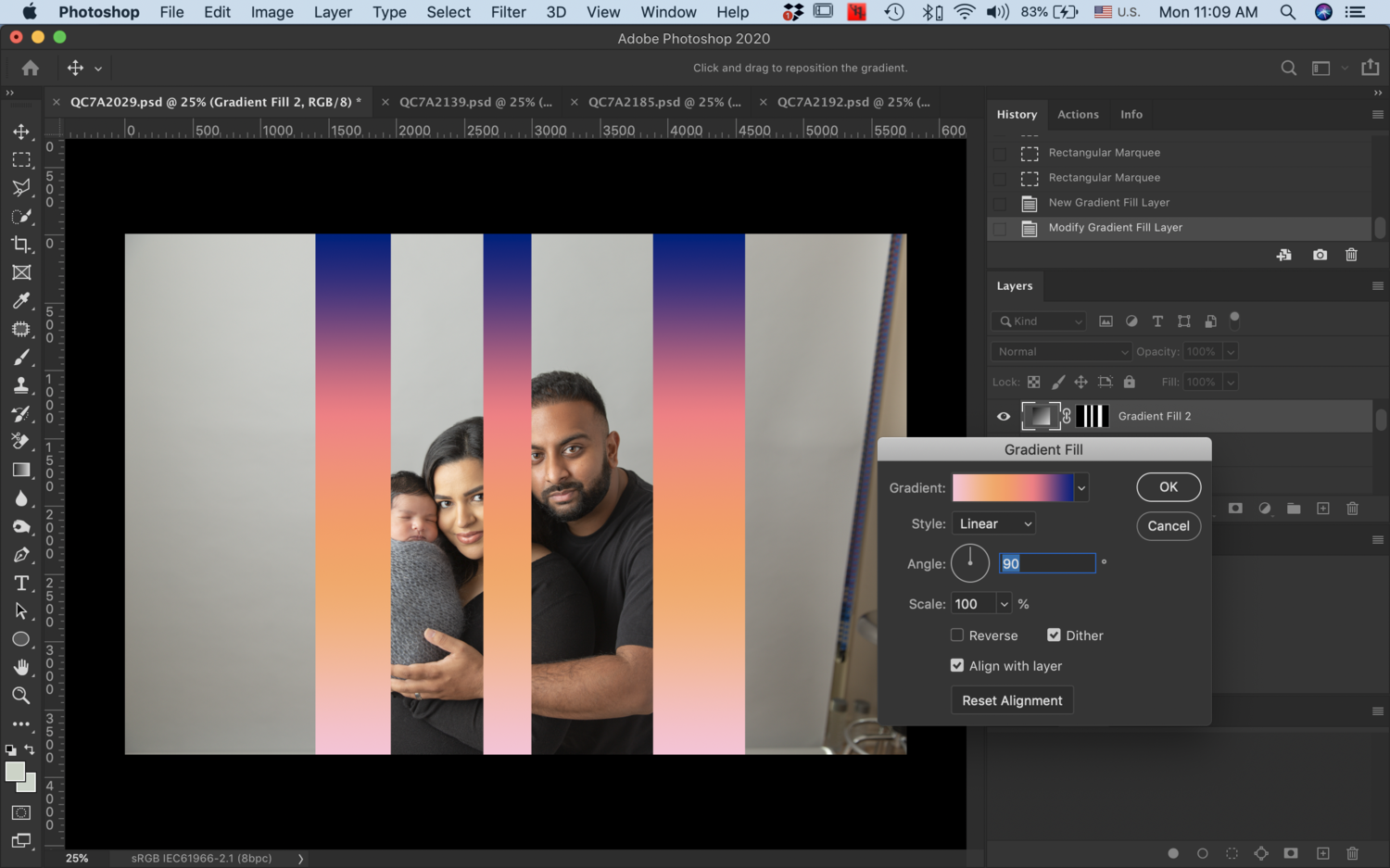
Thanks Damien. I am already stuck at step #2... I remember seeing the type of gradient that you selected before, but since I changed to PS 2020, I am not sure where to find it... Please see my attached screen shot and let me know, thanks!
-
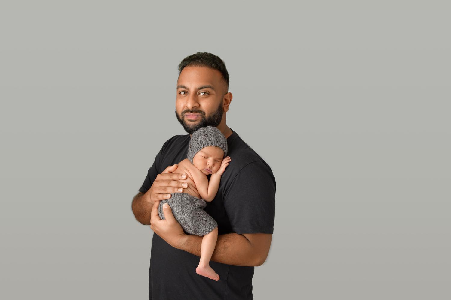
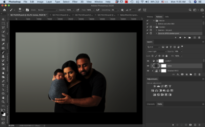
I would like to get help for replacing the background of this image. Here is what I have done so far to match the bottom part of the background, but how do I fix the light area around the face and above?

-
My prints are greener than my monitor
cathm replied to cathm's topic in Monitor calibration questions or problems
is it here? https://ask.damiensymonds.net/topic/471-raw-401/ -
My prints are greener than my monitor
cathm replied to cathm's topic in Monitor calibration questions or problems
OK. I am ready to join the RAW class now then. Where can I go join? -
My prints are greener than my monitor
cathm replied to cathm's topic in Monitor calibration questions or problems
No, as I mentioned, on BW image and the color image with charcoal grey background are noticible. -
My prints are greener than my monitor
cathm replied to cathm's topic in Monitor calibration questions or problems
Is it a bad idea to adjust the RGB on my monitor to match with my prints? -
My prints are greener than my monitor
cathm replied to cathm's topic in Monitor calibration questions or problems
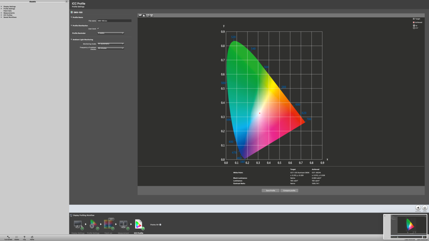
To clarify my question, I wasn't sure if I was suppose to use the target or achieved White point for x and y as a base and then decrease x and increase y by 0.005 or 0.01 -
My prints are greener than my monitor
cathm replied to cathm's topic in Monitor calibration questions or problems
5 prints -
My prints are greener than my monitor
cathm replied to cathm's topic in Monitor calibration questions or problems
Here is the result with D55. I still see a little green in those two images. I am not quite sure about what my x and y I should be using for the white point when I am going to recalibrate. (Decrease X and Increase Y) since the screen needs some green.
-
My prints are greener than my monitor
cathm replied to cathm's topic in Monitor calibration questions or problems
Got it. Here is the screen shot of my result. When I compare the prints to the monitor, I noticed that the black and white image and the color image with charcoal grey background shows more green/yellow on the prints compare to the monitor. Therefore, I will recalibrate using D55 as a new target.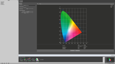
-
My prints are greener than my monitor
cathm replied to cathm's topic in Monitor calibration questions or problems
Why did you say to stick with method 1 yesterday but do method 2 today? -
My prints are greener than my monitor
cathm replied to cathm's topic in Monitor calibration questions or problems
Which preset should I select for my monitor when do method 2? -
My prints are greener than my monitor
cathm replied to cathm's topic in Monitor calibration questions or problems
Hi Damien! I have a question. For X-rite i1Display Pro calibration tutorial for dekstop method 1, you mentioned that "Most will also have a "Custom" or "User RGB" setting, but we're ignoring those in this method. We're sticking to the presets. My monitor had the following preset modes: Standard, Comfort View, Movie, Game, Color temperature, and Custom color. After recording the colour temperature of each of the presets, these 3 presets were close to 6,500K. - Game: between 6874 ~ 7050K - Color temperature: between 7110 - 7343K - Custom color: 6692 - 6842K and out of all, :Custom color preset" was the closest to 6,500K Should I use Custom color or Game preset? Please let me know so that I can move forward, thanks! -
My prints are greener than my monitor
cathm replied to cathm's topic in Monitor calibration questions or problems
I am done recalibrating my monitor. I still need to adjust RGB to match with the prints as the monitor is more red than the prints. -
My prints are greener than my monitor
cathm replied to cathm's topic in Monitor calibration questions or problems
My white point looked like below: 7038K 7055K 6956K 7033K 7100K. 6902K 6988K. 7037K. 6921K Since some numbers are higher than the range of 6000K - 7000K, do I move to Method 2 or not? -
My prints are greener than my monitor
cathm replied to cathm's topic in Monitor calibration questions or problems
got it! -
My prints are greener than my monitor
cathm replied to cathm's topic in Monitor calibration questions or problems
My monitor allows me to adjust the contrast and RGB so I checked all 3 of them. Is that ok?