
Damien Symonds
-
Posts
207,013 -
Joined
-
Last visited
-
Days Won
3,253
Posts posted by Damien Symonds
-
-
12 minutes ago, phyllisk said:
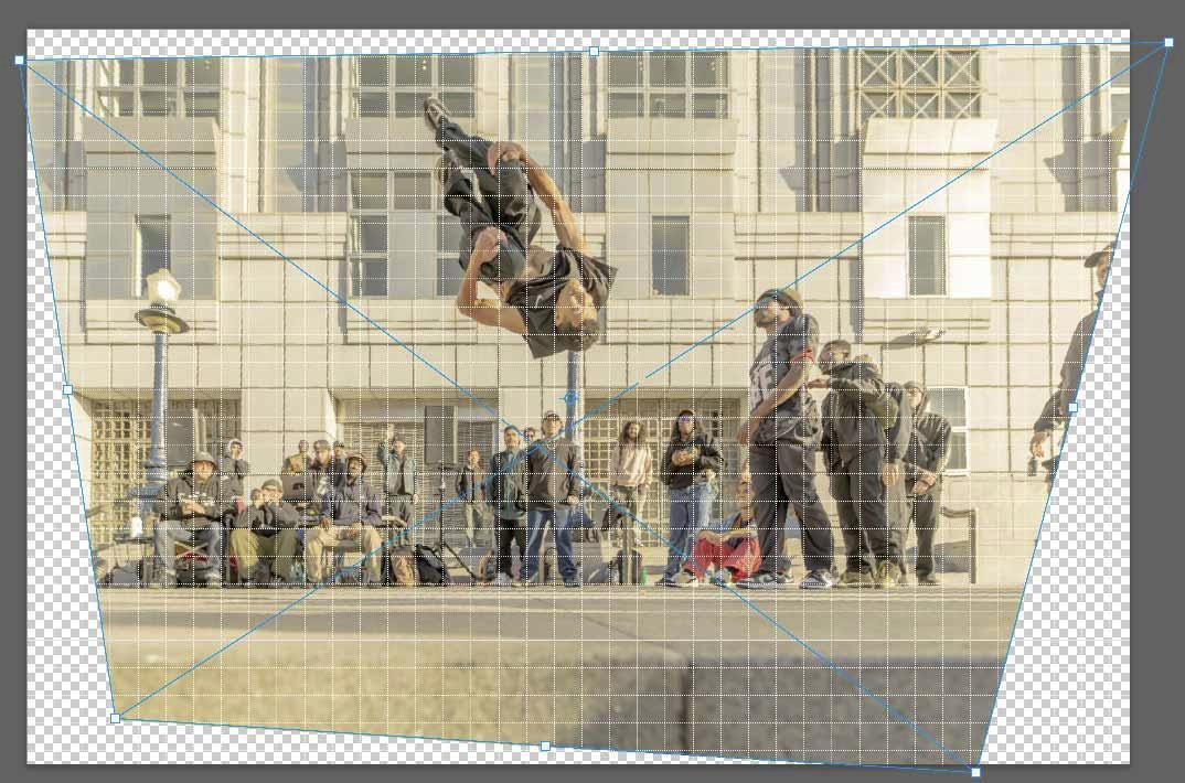
When I line up a building line, the one below the main subject's head: the lines higher on the building; the "horizon" at the spectators' feet; and the curb close to me are not straight.
Yes, your photo needs some perspective correction in both directions.

-
What makes you say the lines on the building weren't accurate?
-

This is supposed to be on "Document Profile", remember.
-
-
Michelle! STOP USING FUCKING MILLERS.
-
Are you sure the light in your room is bright and white enough? Room lighting is the #1 cause of non-matching.
-
 1
1
-
-
With careful swapping of detail from eye to eye, along with some cloning, yes, I'd say it's possible.
VERY time-consuming, though. Are you sure it's worth it?
-
Hmmm ... maybe D&S would work for that too?
-
Once you have run the filter, immediately add a black mask to the layer to hide it all, then paint white to reveal just the areas you want.
-
Quote
Have a question or concern? Please post a new question in one of the Main Hardware Forums in "Ask Brian."
Buy Brian a Beer!!

-
 1
1
-
-
In my culling process, I'd 4-star this one. It's good enough to use IF you really don't have any others to use from that pose. But of course if you had an equivalent 5-star, you'd ditch this one.
-
I guess you need to reorder prints of the exact same files you printed the first time.
If they come back looking different, you'll know it's a lab problem.
-
Well, we need to try to figure out why your screen matches one set of prints but not the other.
Can you think of any tiny reason why they might be different?
-
-
3 minutes ago, Sndrkstr said:
The lab told me to set my monitor to
- 90 - 120 cd/qm
- 5.000 kelvin (D50)
- Monitor-Gamma 2,2
After calibrating mine was 83 cd/qm 6500k Gamma 2.2
Should I change it to the lab wishes? They also told me to use their ICC profiles.
Juist checking the previous prints.
Oh shit. Never calibrate to D50. You did the right thing by calibrating to 6500K.
That's terrible advice. Better try a new lab.
-
Great. And your previous prints were too?
-
How odd.
Can you check the colour space? https://damiensymonds.net/art_tscs000.html
-
There's no quick way to do it. You just have to add a Levels layer and pull the black slider in aggressively (suggest to about 90 for this one) then invert the mask, then paint on patiently with a 10% brush.
-
1 hour ago, FullQuiver said:
I ordered prints from Miller Lab
Oh no!! Not Millers!
Order from a different lab please.
-
That's because its size is so big.
-
Sorry Phil, I'm an Aussie, I have no idea what's going on with large prints on your side of the pond.
-
Okay, if you like.
-
Oh heck.
I don't know, sorry Martha. Just cloning, I guess.
-
Definitely use ColorNavigator.
Saving to JPEG
in Photoshop / Elements / Bridge / ACR questions or problems
Posted
Because Adobe has a habit of changing our colour space at random times without us knowing, so we ALWAYS have to watch that field.
https://www.damiensymonds.net/art_tscs000.html