

Damien Symonds
-
Posts
207,204 -
Joined
-
Last visited
-
Days Won
3,263
Posts posted by Damien Symonds
-
-
Well I hope it's a lot better than this.
2 hours ago, Inês Maia said: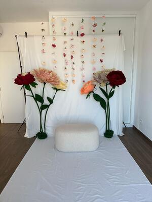
The mixed temperatures of the light is AWFUL.
-
You're definitely correct to use the NVIDIA.
-
What will your lighting setup be for the shoot?
-
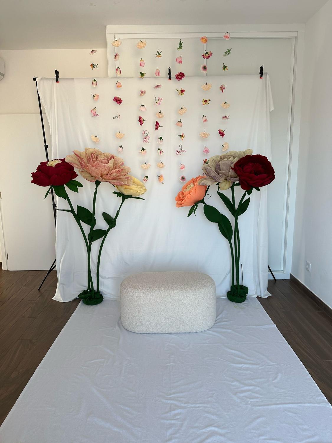
It's a start. Now get rid of the wrinkles.
Every wrinkle in that backdrop will equate to another one on your face, because editing a set like this will age you by ten years.
-
MAKE it an option.
-
Bigger backdrop. Seriously. No matter what it costs, it will still be cheaper than the editing nightmare.
-
-
That's great, thanks so much.
-
Hi Brian, my Mum's old Windows 10 computer is starting to tell her that it will cease getting support and updates from this October. It can't upgrade to W11 (I checked), so how urgently should I tell her to invest in a new computer?
-
Just to clarify - your laptop screen is the one you're calibrating? You don't have an external screen attached to it?
-
Yes, unfortunately I don't have exact instructions for that particular spyder, since I can no longer afford to keep buying the new devices as they come out.
I was hoping it might be similar software to the X2 Elite? https://www.damiensymonds.net/calibration-instructions/spyder-x2-elite-mac.html
-
-
Yep, perfect.
-
You must restart or shut down your computer every.single.day.
-
Have you restarted now?
-
Yes, you certainly are.
-
-
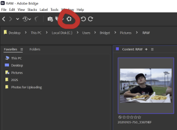
Right. Downloading ACR messed something up. You DEFINITELY didn't need to do that.
Let's try something different. Go to Elements itself, choose File>Open, and navigate to a folder of raw files and open one. Does it open okay?
-
Okay, and if you choose Elements ... ?
-
No worries.
And if you right-click on a photo, and choose "Open With" is Elements an option in there? -
In that case, select one file, then hit this button:
-
Okay, and if you select one of those raw files, then double click it, it opens in Camera Raw okay?
-
Those are jpeg files. Let's talk about raw files please.
-
Are you still around, @Bridget?

Backdrop extension
in Miscellaneous questions or problems
Posted
You have to avoid mixed lighting at all costs. Whatever that takes.