Sue Morris
-
Posts
303 -
Joined
-
Last visited
Everything posted by Sue Morris
-
Cropping Tutorial
Sue Morris replied to Sue Morris's topic in Questions about tutorials and articles
Thank you-- I saw that one but didn't recognise it as it was missing the part I am usually linking for. ( The cropping and resizing section.) -
Hi Damien, are you updating your basic cropping tutorial? I can't find it in your resources. I was trying to give someone a link to it.
-
Sorry Damien -- didn't get a reply from them.
-
I assume jpeg
-
Hi Damien. I am trying to help someone improve the quality of an image they want to use as a desktop screen background. Should they resize to the exact pixel dimensions of their screen? And is the standard sharpening for web practice enough? Also for some reason they say they are saving the image as 24 bit - am I right in thinking there is no advantage to this?
-
Red skin tutorials
Sue Morris replied to Sue Morris's topic in Questions about tutorials and articles
So for normal red patches of skin as covered in the blemishes article ( ignoring the skin class and the handyman method) -- counterintuitively you would use a hue/sat layer with +50 red and +75 lightness -- this prevents it becoming dull I assume. -
Red skin tutorials
Sue Morris replied to Sue Morris's topic in Questions about tutorials and articles
Does that cover all of what glowy is? is it just the angry shadows? -
Red skin tutorials
Sue Morris replied to Sue Morris's topic in Questions about tutorials and articles
Yeah, I know I should, but I am not sure I have a complete handle on it -- I see what you mean when the shadows get glowy-- all the eye creases & the like, usually after levels but does that cover it all? -
Red skin tutorials
Sue Morris replied to Sue Morris's topic in Questions about tutorials and articles
Ok -- now we are getting somewhere --so red isn't just red -- how would you describe 'hot' in this context? -
Red skin tutorials
Sue Morris replied to Sue Morris's topic in Questions about tutorials and articles
Here. (Dealing with “hot” areas of skin)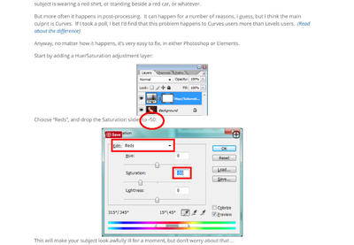
-
Red skin tutorials
Sue Morris replied to Sue Morris's topic in Questions about tutorials and articles
Ok but the question from the original post is still unanswered. When would you choose the +50 saturation +75 lightness settings over the -50 saturation variable lightness settings that I usually use? -
I know I could go and check for myself but are these the only 2 adjustment layers you can use for midtone contrast Damien?
-
Red skin tutorials
Sue Morris replied to Sue Morris's topic in Questions about tutorials and articles
I was just trying to direct them to one of your tutorials -- then when I read the two that I thought would help them they recommended two very different methods. -
Red skin tutorials
Sue Morris replied to Sue Morris's topic in Questions about tutorials and articles
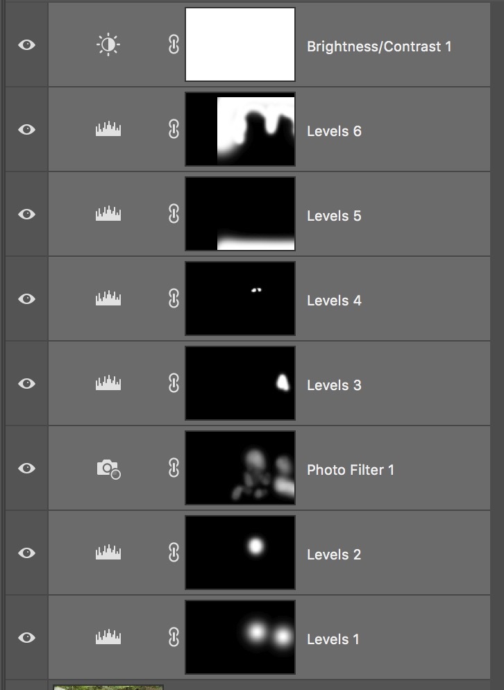
Sorry Damien -- forgot I asked a question! As I said it was someone else's image but here is a crop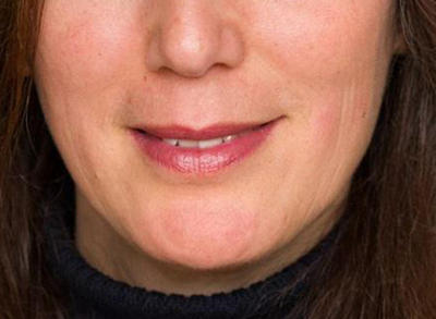
-
Hi Damien, I was just choosing one of your tutorials to recommend to someone trying to deal with some red blotchy skin. I had a read through Dealing with “hot” areas of skin -- and found that suggested turning down red saturation (-50) and to vary lightness as necessary. I thought I had read one where you changed both so I kept looking and found a section in Fixing Skin – acne, scratches, veins and blemishes that dealt with red patches, where the red slider was set at +50 saturation and +75 lightness. I usually start with -50 saturation and +50 lightness so this one confused me. Are they different methods and if so when would you use one over the other?
-
Why can't I remember this -- stared at PS for 10 mins trying to remember what to change then had to search for this thread.
-
Himself on a Nikon Coolscan LS-9000 ED.
-
Thanks Damien. This is going to be a great help preparing the images of my daughter's art works. Something that came up in the discussion - about the scans being in adobe rgb being an advantage. Should I be getting my husband to scan his 35mm and medium format negatives in one of the wider gamut color spaces instead of sRGB and because I will just be printing them at a photo lab when should I convert them back to sRGB.
-
On my mac the actions that came with PS are here; Macintosh HD-->Applications--> Adobe Photoshop CC 2017--> Presets--> Actions. However Damien's actions I have downloaded like the Black and white actions are in another Actions Folder that I keep all my Damien Stuff in (called Damien Stuff). So your action may or may not be with the "official" ones but looks like it will be in a folder named actions regardless.
-
Copying layers from one photo to another
Sue Morris replied to SueRoberts's topic in Help with editing
Thanks for bringing this up Sue -- I just read the tutorial and I am obviously doing something wrong -- I chose 2 up horizontal and grabbed a bunch of levels layers from one image and dropped them on the other. Depending on where I dropped them the levels layers didn't line up with the image.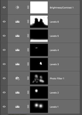

-
Blanket Fade Tutorial
Sue Morris replied to Heather Lynn Wilson's topic in Questions about tutorials and articles
https://www.damiensymonds.net/2011/10/blanket-fade-tutorial.html- 1 reply
-
- 2
-

-
Thank you, thank you, thank you. And of course that makes perfect sense in hindsight.
-
I thought I would ask this here rather than in the new class as it is a general question that I probably should have worked out a long time ago-- when you are masking Russell's rock image you masked the rock first then added a gradient to the mask for the sky-- when I add the gradient I lose the rock masking and I have looked all over the screen for an additive mode but I can't seem to find it. I have tried to add gradients like this before or multiple gradients but have always ended up adding multiple layers to do this.
-
Calibrating new imac
Sue Morris replied to Sue Morris's topic in Monitor calibration questions or problems
First prints back today after trying this -- colour difference is almost unnoticeable now in many of the images but think I still need to tweak the numbers a little. All in all a big improvement. -
Calibrating new imac
Sue Morris replied to Sue Morris's topic in Monitor calibration questions or problems
Thanks Damien