

Damien Symonds
-
Posts
212,007 -
Joined
-
Last visited
-
Days Won
3,483
Everything posted by Damien Symonds
-
I'm just playing with it to see what's possible ...
-
No, not a silly question at all! It was silly of me not to clarify. Thanks for asking.
-
Oh, sorry, with the raw edits done.
-
Tricky one! May I see the two original photos?
-
 Ignore all this too. My calibration instructions take you through all this.
 -
Ignore all of this nonsense. James seems to be correct, but you honestly don't need to worry about any of this stuff. It all happens automatically, and very safely. As long as your files are sRGB (the link I gave earlier will confirm) then no, you don't need to do anything else.
-
Holy crap!! No, this is SO wrong. Peter is an idiot of the highest order. Please read: https://www.damiensymonds.net/2010/02/please-ignore-your-monitor-profile.html Also this: https://www.damiensymonds.net/2012/01/web-browsers-and-facebook.html
-
Nope, this is all bollocks. Your screen is fine. I mean, it's true that there are much better screens out there, but you must not concern yourself with changing it at the moment. It will calibrate fine.
-
Which lab are the prints from? Do any of the prints have areas of some neutral tones? That would be sufficient.
-
Ignore all of this crap too. PLEASE stop reading random nonsense on websites. Just follow my calibration instructions, that is all.
-
Ignore all of this crap. DO NOT USE DISPLAYCAL.
-
I looked it up, and it looks very good. I've had good experiences with Acer screens.
-
Great. It's vitally important that you do this check: https://www.damiensymonds.net/art_tscs000.html
-
Hi @GraceCJG, thanks for posting! Let's take this a little chunk at a time ... Good choice. BAD choice. Stick to Spyder's own software. Don't listen to nerds. Please go ahead and calibrate using my instructions. First, read this if you haven't already. Then follow these instructions.
-
Sharing an article?
Damien Symonds replied to pbziegler's topic in Questions about tutorials and articles
This one is probably the one I've shared the most over the years: https://www.damiensymonds.net/2010/02/trash-those-jpegs.html -
Sharing an article?
Damien Symonds replied to pbziegler's topic in Questions about tutorials and articles
Yes, of course, that's very kind of you. But gosh, I don't know which article. So many ... Maybe this one? https://www.damiensymonds.net/2012/09/what-is-clean-processing.html -
No! No beer money! PLEASE put it towards joining the Raw Class again. As a previous student, the price is significantly lower.
-
Well, I'm stumped. When I edited your raw file, the moire is much less, and it's really easy to remove. But for yours, we'll have to do it the hard way. First, add a Dodge and Burn layer. Don't do anything to it yet, just let it sit there. Next, add a Solid Color layer of the good shirt colour. Set that layer's blend mode to "Color", then mask it to the shirt. That should take care of a lot of the moire, but a few visible stripes will remain in the worst areas. So return to the D&B layer and gently correct those striped areas.
-
Yep, unchecked is just as good. This should be fine. PLEASE don't wait any longer to take a class refresher. This makes me cry a little.
-
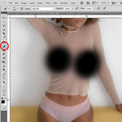
Choose the brush tool, and paint. That is all.
-
Don't post them one at a time. Post them all at once (in separate threads).
-
Did you try it, @SWhit?
-
Hmmm ... odd. It's nowhere near as strong when I edit it. Can you click on the blue link at the bottom of ACR. In the window that pops up, there's a "Sharpen for" option. That should be set to "None" at all times. I'm wondering if yours isn't set to None?
-
Gosh, this is really stubborn, isn't it? Do you mind sending me the raw file? Send it via https://spaces.hightail.com/uplink/BellePhotography
-
@abfriesen?

