-
Posts
211,279 -
Joined
-
Last visited
-
Days Won
3,459
Everything posted by Damien Symonds
-

Mickey Mouse Collage
Damien Symonds replied to Angreynolds's topic in How to achieve a certain look or effect
Great! Have you considered putting a border around the photos? Layer>Layer Style>Stroke Once you've added Stroke to one of the photos, you'll see it listed below the layer in the Layers panel. To copy it to the others, Option-drag it to the next layer, and the next, and so on. I don't know of a way to apply it to all layers at once, I'm sorry. -

Screen doesn't match print
Damien Symonds replied to Roleen's topic in Monitor calibration questions or problems
Hi Roleen, do you mind posting the photos you mentioned? -
No, copy my numbers EXACTLY.
-
May I have a screenshot, showing your layers panel and the channel mixer window?
-
Yes, that's correct.
-
Good. Now walk away. It won't get any better than this.
-
-
Oh, gee, I thought the other way would have been better - match the bottom to the top.
-
Hmmm ... do you think maybe the bottom lip needs to be more like the top lip colour?
-
Try this: https://www.damiensymonds.net/2015/06/the-wonderful-dust-scratches-filter.html
-
Maybe another little Levels layer, with the middle slider on the red channel on 1.25, and the middle slider on the blue channel on 0.90.
-

Mickey Mouse Collage
Damien Symonds replied to Angreynolds's topic in How to achieve a certain look or effect
You're totally welcome. I enjoyed it. -

Mickey Mouse Collage
Damien Symonds replied to Angreynolds's topic in How to achieve a certain look or effect
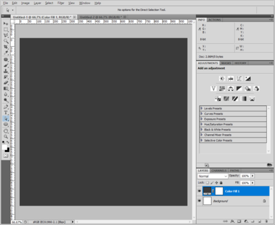
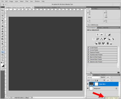
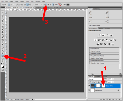
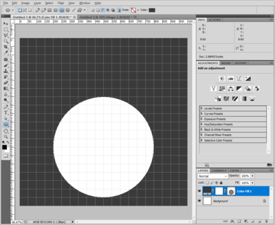
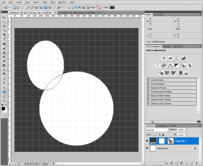
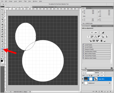
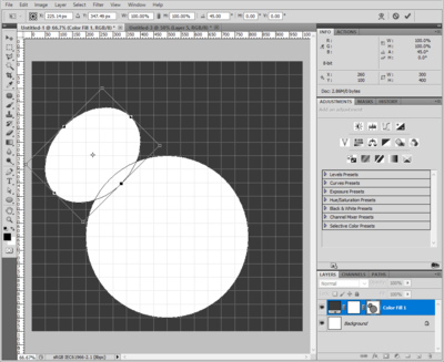
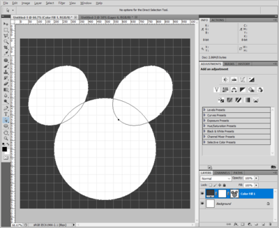
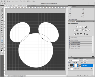
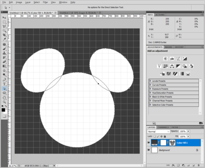
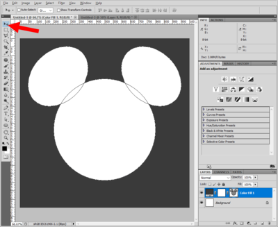
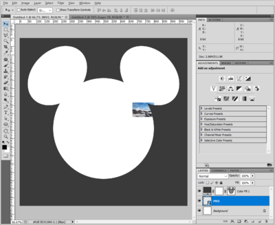
Sorry about my delayed reply. I hope you'll find this worth the wait ... 1. Make your blank file, and add your Solid Color layer for the surround colour: 2. There will, of course, be a normal pixel mask attached to the layer. But for this, we need a vector mask. So just hit the "Add mask" button: 3. This will add a vector mask to the layer (1). If you haven't ever seen this before, it will look weird, I know - having two masks on a layer seems strange. You can right-click and delete the first mask if it suits you, but I didn't bother for this demonstration. Now choose the elliptical shape tool (2) then make sure it's set to "Subtract from shape area" in the Options Bar (3). This will look different depending on your version of Photoshop - if it's not a little icon like mine, it might be a little drop-down menu instead. Whatever it is, I'm sure you'll find it ok. 4. At this point, it might be useful to turn on grids. Then draw your first big circle with the shape tool. If you have the "subtract" setting selected properly, it will create a hole in the middle of the layer, revealing the white Background layer underneath: 5. With the same tool selected, draw an ear-shaped oval: 6. Now choose the Direct Selection Tool or the Path Selection Tool. Either will work in this case, I think. The shortcut should be A. 7. Click on the oval you just drew to select it. (If you have the Path Selection Tool, simply clicking on it should be enough. If you have the Direct Selection Tool, you might need to Option-click.) Then, Cmd T to transform it. Rotate it, move it, and resize it as needed, until it's just where you want it: 8. After transforming you'll press Enter/Return to get rid of the transform handles, then Option-drag the ear across to copy it: 9. Then Edit>Transform Path>Flip Horizontal: 10. Then move it into place: 11. Then, if you're like me, you'll find that Mickey is looking good, but he's not positioned correctly within the image. To move him as a whole, just choose the Move Tool as normal, and move him to where you want him: 12. Finally, you can return to the Background layer, and start dragging images in from Bridge to commence building your design: -

Mickey Mouse Collage
Damien Symonds replied to Angreynolds's topic in How to achieve a certain look or effect
It wouldn't be versatile, no. Honestly, I'd just make the mickey mouse shape, then just drag and drop the photos you want from Bridge for each new version of the design. -

How to reduce yellow cast on screen
Damien Symonds replied to Schwpz's topic in Monitor calibration questions or problems
Having said that, I would still like you to calibrate your husband's computer to see what happens. And to find out for sure if your screen is LED or not. -

Mickey Mouse Collage
Damien Symonds replied to Angreynolds's topic in How to achieve a certain look or effect
Ok. So the question is - would it have exactly the same number of photos every time, and in exactly the same position? -

Mickey Mouse Collage
Damien Symonds replied to Angreynolds's topic in How to achieve a certain look or effect
Thanks. Would you be looking to make this as a one-off, or a template you could use repeatedly? -

How to reduce yellow cast on screen
Damien Symonds replied to Schwpz's topic in Monitor calibration questions or problems
Yes, I realise this is difficult - impossible, in fact - to be sure. All you can do is choose a space for editing that has nice neutral surrounds, and nice similar-to-daylight lighting. -
Yeah, if it was finer, the Dust & Scratches filter could have done it. But this is too dense.
-
I'm so sorry I don't know how to remove that


