

Damien Symonds
-
Posts
212,042 -
Joined
-
Last visited
-
Days Won
3,485
Everything posted by Damien Symonds
-
Oh gee. Tough one!! This is about the best I can offer, would it be good enough?
-
I look forward to seeing the outcome.
-
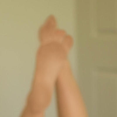
Be very thorough with this checking process. When I tried this fix, I found I very easily messed up the fingers a bit. So I had to zoom in and fix it very carefully.
-
This will make the whole photo crazy washed out, but importantly, it will give you a very clear view of where the flaws are in the background. Return to the Color Fill layer, and with a white brush (100% opacity) very carefully paint over those flawed areas until they disappear entirely. Once you've finished, turn off the Levels layer, so you're viewing the photo in its normal state again. Turn the Color Fill layer off and on a few times to make sure you haven't accidentally painted over the baby in any places.
-
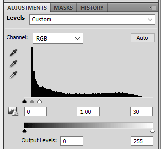
After you've made that layer, immediately hide it by inverting the mask. Then add a Levels layer above that. Change the white slider from 255 to about 30:
-
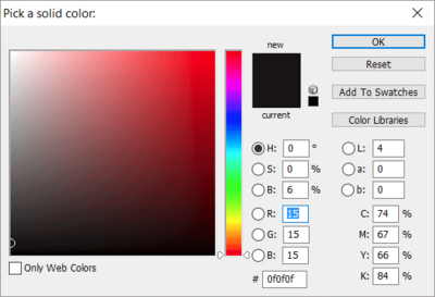
Anyway, we'll just have to do our best to fix it as is. Here's what you need to do: First, add a Solid Color layer. Enter 15 for the R, G and B values:
-
ALWAYS save PSDs. Even if you keep absolutely no other files, always save PSDs. https://www.damiensymonds.net/2010/02/trash-those-jpegs.html
-
That's excellent. May I see a screenshot, so I can see your layers panel?
-
Yep, we can definitely fix this. Can you tell me if you edited this in Photoshop, or only Lightroom?
-
Hi Adinah, do you mean it's uneven on your screen? Or in print? Or both?
-
Gosh, that's not bad!
-
 Gosh, that's very good of them.
 -
Bummer. That'll make this difficult. I don't know what to tell you, sorry. Until you can compare those prints with your screen, I don't see how you can get reprints at this stage.
-
Yes. ROES is not colour-managed, so it never matches Photoshop. Have you seen the client's prints with your own eyes?
-
VERY interesting. Are you able to re-create that to show me screenshots?
-
That's fine. That is NAGP2, nothing has changed. Anyway, it was always very unlikely that those settings would have caused this problem. Have you checked that your files were sRGB? https://www.damiensymonds.net/art_tscs000.html
-
https://www.damiensymonds.net/thread1.html
-
Are you still on those Custom settings? Or have you changed back to NAGP2? If you're still on Custom, may I see a screenshot of them?
-
Calibrated
Damien Symonds replied to Perli halpern's topic in Monitor calibration questions or problems
No, you don't need new prints. The old prints are fine. -
MacBook Pro calibration
Damien Symonds replied to Brenda BB's topic in Monitor calibration questions or problems
Oh, interesting. Does your screen have another option? Eg HDMI? -
Does it give an error message when you try to rate? There are three methods for rating. Are none of them working?
-
Are they on your internal hard drive as usual?
-
Calibrated
Damien Symonds replied to Perli halpern's topic in Monitor calibration questions or problems
Wait, what? How can you not be comparing to prints? You can't calibrate without print comparison.


