Damien Symonds
-
Posts
212,145 -
Joined
-
Last visited
-
Days Won
3,491
Everything posted by Damien Symonds
-
Are you still there, @Kendra? I'm sure we're REALLY close to solving your hard drive issues.
-

scanning pictures
Damien Symonds replied to diamante67's topic in Miscellaneous questions or problems
https://www.damiensymonds.net/scanning-guidelines-for-old-photo-restoration.html -
scanning pictures
Damien Symonds replied to diamante67's topic in Miscellaneous questions or problems
The Epson V line are excellent scanners. But not cheap. Unless you have a LOT of photos for scanning, the lab option might be better. -
scanning pictures
Damien Symonds replied to diamante67's topic in Miscellaneous questions or problems
Right. I mean, it'll do a job ... but it'll be a poor job. -
Yep, that's what I thought. Have you done this?
-
scanning pictures
Damien Symonds replied to diamante67's topic in Miscellaneous questions or problems
No. -
No. Sorry, I can't discuss this here, only in class. https://www.damiensymonds.net/trainingsharp.html
-
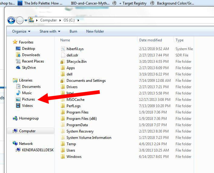
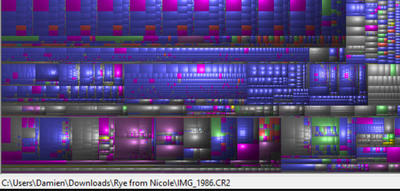
Now, when you hover your mouse over that massive green area, and look in the very bottom left corner of the screen, it will tell you what kind of file it is, and where. For example, on mine, I've hovered over a big folder and found it's a set of raw files that Nicole sent me: Can you tell us what your huge green area is?
-
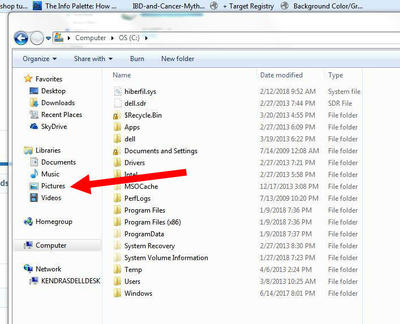
Click on the C drive in the top panel, then go to the Treemap menu and choose "Zoom In". Then show me another screenshot.
-
What about the Videos folder? Much in there?
-
That's excellent. We just need to make sure there aren't any anywhere on C drive.
-
Have you done what Brian advised, and move all image files off your C drive? It's still looking quite full.
-
HELP REQUIRED
Damien Symonds replied to Miriam H's topic in Monitor calibration questions or problems
Did you try soft-proofing? -
HELP REQUIRED
Damien Symonds replied to Miriam H's topic in Monitor calibration questions or problems
Are you sure you still can't? I rebooted the server after you said that, it should be ok now. -
I'm so sorry, no, I don't.
-
HELP REQUIRED
Damien Symonds replied to Miriam H's topic in Monitor calibration questions or problems
https://www.damiensymonds.net/2010/03/bit-about-soft-proofing.html -
Yeah, you're right! It's losing its high-bit data between scanning and Bridge. You definitely need to figure that out.
-
The most important question is, does the Plustek allow 48-bit scanning?
-
I think the Dmax is more noticeable for negatives than slides, but yes 3.6->4.0 is an important difference in dark areas. Are you saying that the Plustek isn't getting enough light into the slides?
-
No specific suggestions. Just make sure you make it VERY clear that this is THEIR fault. The same file should not print so vastly differently on two different media.
-
Strangely, he does have some green patches on his fingers - what's that from? But overall, this looks ok. So, did you ask the lab about this issue? What did they say?
-
Facebook Resize
Damien Symonds replied to fjdelatte's topic in Questions about tutorials and articles
Have you ever had a chance to look at them on other people's computers? -
removing watermark... for a good cause
Damien Symonds replied to diamante67's topic in Help with editing
No, definitely don't try it letter by letter. That wouldn't be efficient. If you can't get the text to line up, go straight to removing them with Content Aware Fill. -
removing watermark... for a good cause
Damien Symonds replied to diamante67's topic in Help with editing
Oh DARN. Anyway, I'll show you want I'd envisaged. Once you have that black text layer, change its blend mode to "Overlay" then lower the opacity (I think somewhere between 60 and 70% might work).