

Damien Symonds
-
Posts
211,592 -
Joined
-
Last visited
-
Days Won
3,468
Everything posted by Damien Symonds
-

Flyer
Damien Symonds replied to Jodie Williams's topic in Output - print, websites, Facebook, email, client disk, etc
May I see a screenshot from Photoshop, showing your design, and including the layers panel? -
Flyer
Damien Symonds replied to Jodie Williams's topic in Output - print, websites, Facebook, email, client disk, etc
Oh gosh, yeah, that's MUCH too low resolution. Generally, print resolution is 300 pixels per inch. However, you should speak to the printer to confirm that - some of them differ. Also, this is very important information. -
It rocks, doesn't it?
-
Calibrating my mac laptop
Damien Symonds replied to MelissaO's topic in Monitor calibration questions or problems
Of course. Every screen needs calibrating. http://www.damiensymonds.net/what2buy_cal.html -
I have seen the Lens Corrections to do some pretty awful things to photos when left on all the time. Distortion and stuff. As Sam said, use them as needed.
-
You'd still need to clone for the nostrils, though.
-
Dust & Scratches filter at 8/6 seems to work well.
-
Yes, I think there might be. Go ahead and do your raw processing, then post the close-up again and we'll discuss.
-
Download the PSD
-
Ok, excellent. How long have you noticed this problem? And the associated question, how long since your last calibration?
-
I think people will understand a tiny bit of missed focus in a photo like this. Go with it.
-
Oh, sorry! I extracted it first, THEN put it in my Program files folder.
-
Oh gosh. If you don't have any photos to borrow smooth fabric from, I don't have anything to suggest, sorry
-
This is the best I can manage. I realise it's not perfect, but is some improvement better than none?
-
Can you clarify your setup? It sounds like you are using a desktop screen plugged into a laptop, is that correct?
-
I put mine in C:Program Files. Then a shortcut to it in Startup items, so it pops up as soon as I log in.
-
Distressing a photo
Damien Symonds replied to Brettaney's topic in How to achieve a certain look or effect
Oh, that is SUCH a good question. I don't know for sure. But no, I rather think you'd add the overlay to the master file. -
wierd pixilation
Damien Symonds replied to Toni Agallar's topic in Miscellaneous questions or problems
Camera Raw Default is how a photo looks before you begin editing it. Since CRD fixed this problem, it means that the problem was caused by something you did editing. -
Distressing a photo
Damien Symonds replied to Brettaney's topic in How to achieve a certain look or effect
That's right, or scan it. -
wierd pixilation
Damien Symonds replied to Toni Agallar's topic in Miscellaneous questions or problems
Great! So go ahead and do your raw processing again, and watch out for it. By the way, I beg you to consider a refresher of The Raw Class. The new updated material will blow you away. As a previous member, the price is significantly discounted. -
Distressing a photo
Damien Symonds replied to Brettaney's topic in How to achieve a certain look or effect
Oh, sorry, I see what you mean! Yes, if you don't wish to buy a suitable overlay to use, you really would make one with sandpaper, I reckon. Probably paint black paint onto white paper, then scuff it artistically. -
Distressing a photo
Damien Symonds replied to Brettaney's topic in How to achieve a certain look or effect
Hmmm ... what am I looking at, exactly? The edges just look a bit blurred to me? -
Smoothness of brushes
Damien Symonds replied to Sunny's topic in Photoshop / Elements / Bridge / ACR questions or problems
I zoom in to about 400% and use a 6px brush (soft!) for this. And the Shift key. I can't stress this enough. NEVER use Hardness higher than 0%. -
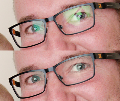
wierd pixilation
Damien Symonds replied to Toni Agallar's topic in Miscellaneous questions or problems
I'm flummoxed, sorry. I have no idea what it would be. I assume that if you choose "Camera Raw Defaults" from the little submenu over on the right-hand side, it's still there? -
Distressing a photo
Damien Symonds replied to Brettaney's topic in How to achieve a certain look or effect
Yes, a closeup of the corner would be good, thanks.

