

Damien Symonds
-
Posts
211,674 -
Joined
-
Last visited
-
Days Won
3,470
Everything posted by Damien Symonds
-
Absolutely.
-

Changing background color around hair
Damien Symonds replied to Kiwiellis's topic in Help with editing
Make sure you copy my numbers EXACTLY. If you get even one of them in the wrong position, the colour result will be vastly different. -
As I'm sure you know, I'm a big fan of photo filters to fix casts. Have you read this article? The best answer I can give is "Show me". The more you post, the more I can help you identify and fix the casts, and the better you'll get at identifying and fixing them yourself.
-
Changing background color around hair
Damien Symonds replied to Kiwiellis's topic in Help with editing
It's very simple. Just this Channel Mixer layer: Red +100, 0, 0, +10 Green +93, 0, 0, 0 Blue 0, +100, 0, 0 Then mask it on to the background. You'll be SO pleased to see that you don't need any precision at all around her hair - just let your mask blend gently into the edge of her hair. The same with her shirt. The only place you'll need precision masking is around her face. Make sure you zoom in, and use the Shift key. Once you've done it very accurately around the edge, switch to a 10% opacity brush, at a bigger size, and gently mask onto her skin a bit, to remove the pink cast that's on the side of her face. -
Changing background color around hair
Damien Symonds replied to Kiwiellis's topic in Help with editing
How about this?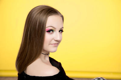
-
Changing background color around hair
Damien Symonds replied to Kiwiellis's topic in Help with editing
I have to go out to do grocery shopping now. I'll check in when I get back. -
Changing background color around hair
Damien Symonds replied to Kiwiellis's topic in Help with editing
If that's not the right shade of yellow, let me know how it should look. -
Changing background color around hair
Damien Symonds replied to Kiwiellis's topic in Help with editing
How would this be?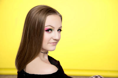
-
Changing background color around hair
Damien Symonds replied to Kiwiellis's topic in Help with editing
No, that shit is NEVER the best method. Give me a few minutes ... -
HELP ME!!
Damien Symonds replied to PhOtO JuNkie's topic in Monitor calibration questions or problems
What? NO!!!!!!! You don't need new prints. The prints you already have are fine. -
HELP ME!!
Damien Symonds replied to PhOtO JuNkie's topic in Monitor calibration questions or problems
How's the print match now? -
I'm aware of the change of interface (no, you don't have to do anything different) but not of the new values. Can you enlighten me?
-
At what point in the process is that popup appearing?
-
Ok, you didn't mention HDR in your original post, but it doesn't change anything. Please PLEASE don't wait too long to learn to do this properly. Ok, so this is where the BS is most evident. You've probably spotted it yourself. Jpeg files are 8-bit. And once data is 8-bit, it can never be genuine 16-bit again. So for your software (PTGUI) to tell you that it has magically turned your 8-bit jpegs into a 16-bit tiff is nonsense, of course. The Tiff part is a good idea, but the 16-bit part is just big-noting itself. Is the tiff file layered?
-
How did it turn out, @Rae?
-
Did you find out, @Sue Morris?
-
How did you go, @sturg80?
-
Bridge for Elements 11
Damien Symonds replied to Shsp00's topic in Photoshop / Elements / Bridge / ACR questions or problems
How did you go, @Shsp00? -
@Crystal Felton?
-
Are you still there, @PSikes?
-
The answers to your questions lie, most likely, in resolution (PPI). No it doesn't. Increasing the size of a photo makes it neither worse nor better quality. It just makes it larger. If you had a print of a photo, and looked at it at arm's length, and it looked good, you'd be satisfied. If you then held that same print REALLY close to your nose, it would be much bigger to your eyes. Would you complain that it was suddenly a bad print? Of course not - it's exactly the same print, you're just looking at a much closer view. No it doesn't. The only possible explanation for this is that you're viewing at greater that 100%. Never do that. Good. Never use anything else. Right. And this is the clue. This statement is why I suspect you're messing up the resolution (ppi) when resizing. So, talk to me about your process. Firstly, what resolution does your lab require for prints?
-
Definitely haven't changed my mind. https://www.facebook.com/damien.photoshop/photos/a.183682458346830.39021.183680248347051/1711588222222905/?type=3&theater
-
Bit depth isn't really related to panoramas. I mean, if you like using 16-bit, and have sufficient computer power to do so, there's no reason not to. However, if you're a good photographer, there's really no benefit to it. High-bit data is necessary for photos where you need to make large tonal shifts (eg aggressive Levels or Curves) in Photoshop. As long as you manage your light well, shoot in raw format, and edit your raw files properly before taking the photos to Photoshop (or any other pixel editing program), 8-bit should be perfectly fine. May I know a bit more about your editing workflow? How do you make your panoramas?
-
Have you read that one, @kellyjonesphoto?
-
It can mean that, but it definitely doesn't automatically mean that. In fact, sometimes smaller jpeg file size actually means BETTER print quality, because it indicates a less noisy file. So, I hope the article has helped you understand why your jpeg files are much smaller than the raw files. That's very natural. One aspect that the article doesn't discuss, however, is the loss of quality each time you save another jpeg. And this is where you fucked up. It's because of Lightroom, of course, and I sincerely hope that you will abandon that shit very soon. Next, please read this article and let me know when you have done so.


