Damien Symonds
-
Posts
212,184 -
Joined
-
Last visited
-
Days Won
3,494
Everything posted by Damien Symonds
-
I can't discuss this stuff outside of class, sorry.
-
Lori, are you high again? I've told you to stop smoking that stuff.
-
You must never start Photoshop work until the raw processing is done.
-

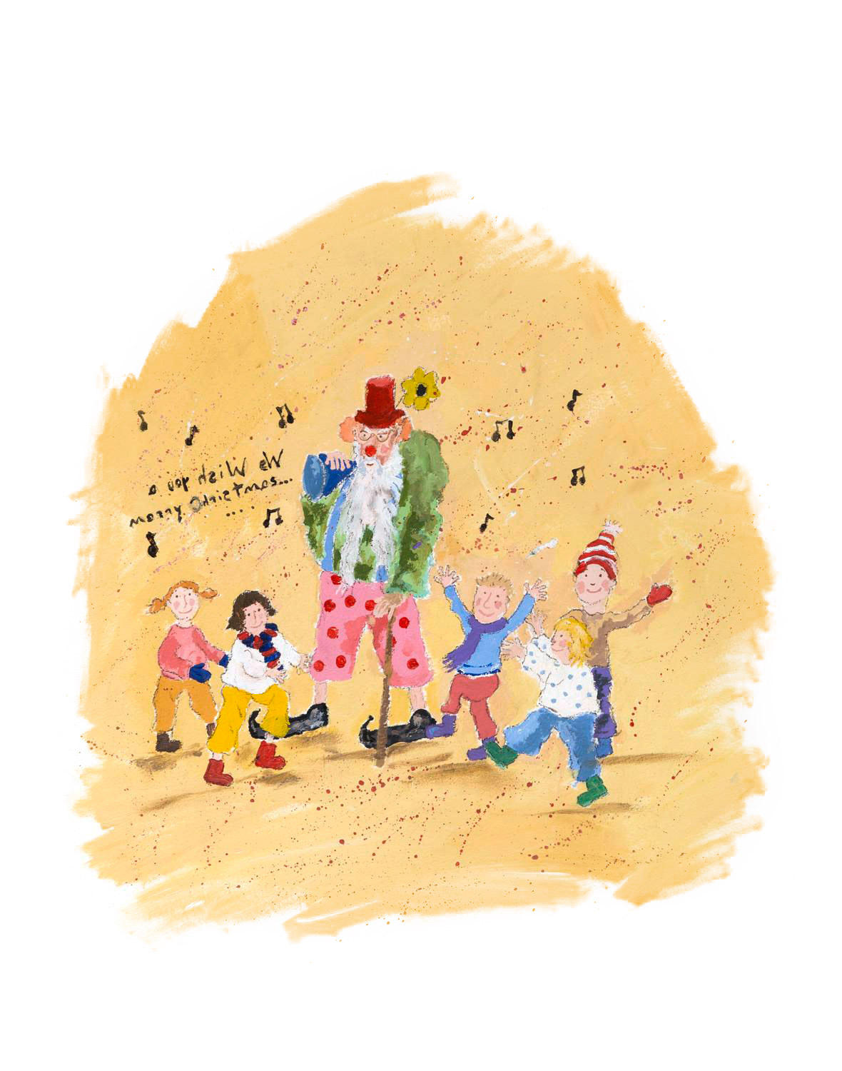
images for a children's christmas book
Damien Symonds replied to EmmaBrett's topic in Help with editing
Well, for the same reason we shoot in raw. It's good to start with as much range of colour as possible. How does this look?
-
images for a children's christmas book
Damien Symonds replied to EmmaBrett's topic in Help with editing
Oh! Actually, in this case, that's a good thing! Can you post the Adobe RGB files for me to see? -
images for a children's christmas book
Damien Symonds replied to EmmaBrett's topic in Help with editing
Oh, it's totally possible, don't worry! Did you do the scanning, or were they sent to you already scanned? -
I can't remember, sorry. Try it and see.
-
Not exactly. Open the first one into PS, then File>Place and choose the other raw file. No need for an intermediate PSD save. Only one PSD needed. Alas, I can't think of any "tricks", sorry.
-
Raw or Jpeg or ?
Damien Symonds replied to Kate00's topic in Photoshop / Elements / Bridge / ACR questions or problems
Do you have your filename extensions turned on? https://www.damiensymonds.net/2012/02/view-your-filename-extensions-windows.html -
images for a children's christmas book
Damien Symonds replied to EmmaBrett's topic in Help with editing
Oh gee. Are they drawn on white paper? Or is it somewhat off-white? -
Since the only photos of the middle-sized kid looking at the camera have him squinting, maybe you could use H as your base? H is the only one where the oldest kid is any good, and middle kid is at least happy; and mum is ok too. That just leaves little kid and Dad, and you could use them both from J.
-
Help Please
Damien Symonds replied to Glynda horsfall's topic in Photoshop / Elements / Bridge / ACR questions or problems
Screenshot please. -
Editing video
Damien Symonds replied to Jennifer Casalegno's topic in Miscellaneous questions or problems
It must be, but I don't know anything about video, sorry -
Right.
-
About Lisa Visser's Editing Style again
Damien Symonds replied to MissFrog's topic in How to achieve a certain look or effect
I don't know, sorry -
About Lisa Visser's Editing Style again
Damien Symonds replied to MissFrog's topic in How to achieve a certain look or effect
The PSD file is linked right there in the thread. Did you download it? -
Recreating Lisa Visser's Editing Style
Damien Symonds replied to tiffo27t's topic in How to achieve a certain look or effect
Yep! https://www.damiensymonds.net/channel-mixer-class -
No I didn't The Levels Class is the only one that genuinely changes lives, and you haven't taken it yet Yes, still the same. Just on a larger scale, as you sayd. Yes, one at a time. Here's the thing - you keep using the word "headswap", but it's vitally important not to lock yourself into that thinking. You need to approach each person on their merits. Always look for the best and easiest option. That won't always be headswaps. Sometimes it'll be face swaps, sometimes whole body swaps, sometimes, just torsos ... etc. So yes, I would like to see the photos.
-
Well, PLEASE don't print it until you've taken the Sharpening Class. You need to do it justice.
-
Are you going to print it?
-
Beautiful. @Lara, check this out!!
-
Alas, not smart enough, if you're making your black-and-whites in Lightroom. PLEASE don't wait any longer to take the Levels Class.
-
Yes, 70 is ample.
-
No, I meant these 2048 ones you're exporting. What quality are they?
-
Terrific. What quality level (on the 0-100 scale) do you save them at? And do you watermark them?