-
Posts
211,160 -
Joined
-
Last visited
-
Days Won
3,452
Everything posted by Damien Symonds
-
I can help you with the original question - the flooring. But we'll only be able to do it if you can satisfactorily clone the missing finger parts.
-
Only the third?? I reckon the thumb and first finger too.
-
Am I correct in thinking that the fabric is partially obscuring the fingers?
-
Ah that one's soft, isn't it. You'll have to ditch it.
-
This practice is based on the assumption that Graphic Designers, unlike regular members of the public, know how to handle photos for themselves. They can accurately crop and resize them for their exact needs. As it happens, this is largely a false assumption - most graphic designers are complete incompetent nincompoops; however there's a fundamental professional courtesy that requires us to pretend they are competent. Members of the public are, of course, also incompetent nincompoops in matters of digital photo files, but they generally don't pretend to be anything else, and certainly don't try to run graphic design businesses in spite of their incompetence. So no professional courtesy is required - we can wisely provide files that provide the most safety for their needs.
-
For ALL photos: Never crop or resize during editing. (Or sharpen - you must NEVER sharpening during your editing workflow, ever.) Then, for MOST photos (which are going to members of the public): Crop to 11:15 shape with no resolution when saving the digital files. But, for a FEW photos (which are likely to be used by a graphic designer, like this one is) make the resolution 300ppi, but don't crop or resize in any way. (To change the PPI without resizing, use the Image Size function, and make sure the "Resample Image" checkbox is not checked.)
-
The PPI is completely irrelevant for digitals. Completely. The only time it matters is if it's a commercial job, and you are providing the files to a graphic designer. For regular people, it matters not a damn. Correct. Never resize. However, you MUST crop before handing off the digital files. The 11:15 shape is vital. https://www.damiensymonds.net/2011/02/selling-digital-images.html
-
Making a grey background black around hair
Damien Symonds replied to Kim Howells's topic in Help with editing
Have you seen this thread? Remember that you only need to blacken immediately adjacent to the hair with the Levels layer. -

Raw or Jpeg or ?
Damien Symonds replied to Kate00's topic in Photoshop / Elements / Bridge / ACR questions or problems
Ok, great! So everything's fine now? -
That eye seems ok. May I see the other eye?
-

Making a grey background black around hair
Damien Symonds replied to Kim Howells's topic in Help with editing
I found I had to change the levels layer's blend mode to Luminosity - did you try that too? -

Night time edit
Damien Symonds replied to Angreynolds's topic in How to achieve a certain look or effect
The starburst things have got to go. Cheesy is for pizza, not photos. -

Night time edit
Damien Symonds replied to Angreynolds's topic in How to achieve a certain look or effect
-

Night time edit
Damien Symonds replied to Angreynolds's topic in How to achieve a certain look or effect
When you were browsing, did you see this one? Not the same scene by any means, but might give you ideas. -

Night time edit
Damien Symonds replied to Angreynolds's topic in How to achieve a certain look or effect
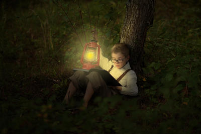
If the lamp really was the light source, two things would happen. His legs would be very dark, because they'd be in the shadow of the book His shirt and face would be very golden, from the lamplight, you know?


