-
Posts
211,279 -
Joined
-
Last visited
-
Days Won
3,459
Everything posted by Damien Symonds
-
There are a few aspects to this. First, can you go to Color Settings (in the Photoshop menu, I think) and make sure they're on "North America General Purpose 2" the way they should be? They must not be on "Custom" or any other setting. Correct. https://www.damiensymonds.net/2013/02/resizing-photos-in-templates-ps-pse.html
-
Well, the colour of the gradient in that area has to be as close as possible to the colour of the existing background. Any variation will, as you say, make the blend very difficult.
-
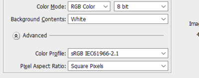
No, we're still talking about two different things. I know about the mode, I need to know the space. The profile. https://www.damiensymonds.net/tut_mini.html Well, what are the pixel dimensions of the images? Your template is the correct size, but that's not the part I'm worried about. By using the Image Size feature, in the Image menu. Terrific. Please, I beg you, do not go ahead with this until you know how to sharpen properly. This will change your life: https://www.damiensymonds.net/trainingsharp.html And now is the time to jump on board: https://www.facebook.com/damien.photoshop/photos/a.183682458346830.39021.183680248347051/1313016648746733/?type=3
-
Hi rose-anne, All images are RGB. Which flavour of RGB do you mean? https://www.damiensymonds.net/2010/11/colour-modes-vs-colour-spaces.html No, there is no benefit to doing so. It would only chew up your time. Cropping should not be necessary. You would simply resize. No, I can't think of any reason why it would make any difference. Your description all sounds right to me. I'm curious what you meant, though, by "combining two images". Do you mean a photo, plus the text? Will these prints be for commercial sale? Are you printing them on your own printer, or through a lab?
-

converting ps files to pdf.
Damien Symonds replied to mel@justbeus's topic in Miscellaneous questions or problems
I always consider PDFs really awful for this. They always end up MUCH bigger (in file size) that you anticipate or want, and that makes them unwieldy to email. Worse, you can't control the zoom level that they open at on your client's screen, so the images NEVER look their best - they're usually blown up beyond 100% and therefore look blurry. Much better, in my opinion, to create a private web page, then provide them with a link to it. -

converting ps files to pdf.
Damien Symonds replied to mel@justbeus's topic in Miscellaneous questions or problems
Bummer. Ok, so much for the workaround. Let's go back to the original problem. Have you tried (for testing purposes) using the "PDF Presentation" function with any completely different files? -
Oh, don't worry about a website. As long as it's fine in PS, that's the only thing that matters.
-
Good work. Have you remembered Dither, and adding the noise layer? It's looking very bandy presently.
-
Once you've done the raw processing, use a gradient layer to replace the whole background: https://www.damiensymonds.net/preventing-banding-in-backdrops/
-
Oh, I'm so sorry, I forgot. For that bit, leave your brush at 100% opacity, and actually change the colour you're painting with (by clicking on the foreground swatch in the toolbar) to 50% grey (128/128/128).


