Damien Symonds
-
Posts
212,192 -
Joined
-
Last visited
-
Days Won
3,494
Everything posted by Damien Symonds
-

Adding hair to a newborn
Damien Symonds replied to oedipamaas's topic in Miscellaneous questions or problems
Yeah, not easy. Did you take any other photos showing hair at different angles? Lying on the side, or even just turned to the side a little? Anything that might provide some hair we could borrow? -
There are no "tricks", sorry. Just clone or copy a big chunk of detail from elsewhere, and mask it on.
-
Oh, good job! She will never know.
-
iMac colour presets
Damien Symonds replied to EB Photography's topic in Monitor calibration questions or problems
You'll find everything a lot easier now -
iMac colour presets
Damien Symonds replied to EB Photography's topic in Monitor calibration questions or problems
No, you're following the wrong instructions. Go back to this page and choose the correct ones. -
Yep, that'll do.
-
Brush opacity, NOT layer.
-
Well, it's exactly how it looks. I added a black Solid Color layer, then inverted the mask, then very gently painted on with a 5% white brush.
-
What? No, it's just to add a bit of shadow. Can't you see that when you turn it off and on?
-
Oh, sorry! Yes, that's exactly right.
-
Not here. Post in the class.
-
Badly wrong, yes.
-
Oh dear. This won't be easy, but I'm confident we can fix it if we work carefully. First, go ahead and do your raw processing as normal, then post again for me when you're ready for the Photoshop work to begin.
-
Great!
-
I'm sure you're hoping for some magic from me, but it doesn't exist, sorry. Pour yourself a drink, and settle down for some very painstaking cloning.
-
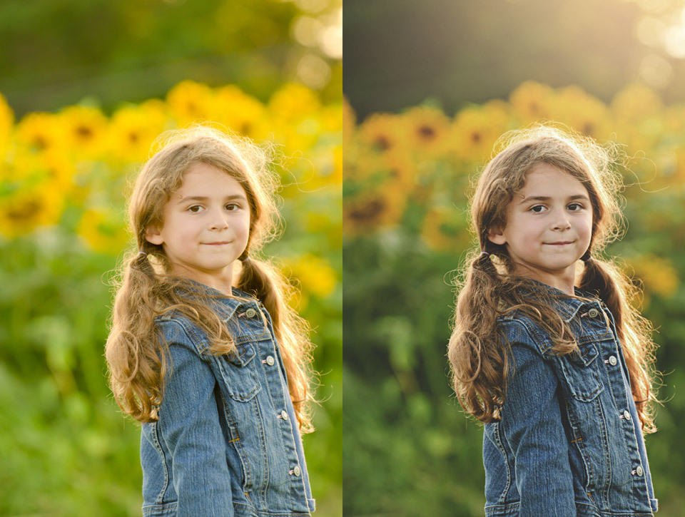
Oh yeah, that's better, except maybe his arm now isn't quite saturated enough.
-
May I see it with the skin a bit less glowy?
-
That's great, thank you. I've had a look at the channels, and I'm quite sure I can help you with this - it should be a fairly easy fix. So go ahead and do your raw processing first, as normal, then post the photo and the 100% crop again for me, and we'll discuss the solution.
-
??? The instructions were in the link I gave you.
-
Since screenshots aren't colour-managed, I need you to post the actual photo, thanks. And a 100% crop of the area as well.
-
Ok, you have two choices. Spend hours and hours painstakingly masking around your photos, until you go completely insane and end up in home for the deranged, and the result still won't be very good; or Re-shoot the photos on a white floor and wall.
-
You're living in a dreamland, Jennifer. Your photos can't EVER look the way they looked on your stupidly bright screen. You have to work within the bounds of reality, no matter how little you like it. The good news is, it will only take you a day or two to be used to your proper-brightness screen, and everything will look fine again.
-
The brightness of your screen has to match your prints, period. Your screen is much too bright.
-
Oh, great! Do you have a copy of that older photo to show us?
-
Download the file here.