Damien Symonds
-
Posts
210,852 -
Joined
-
Last visited
-
Days Won
3,436
Everything posted by Damien Symonds
-

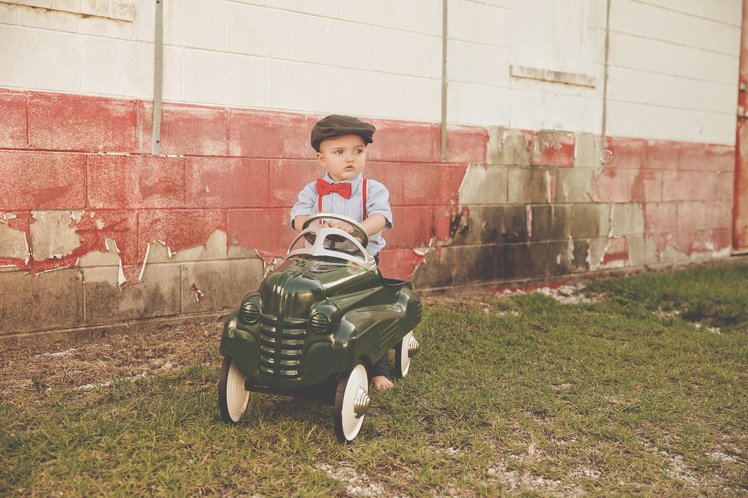
Vintage look
Damien Symonds replied to Mary Burgy's topic in How to achieve a certain look or effect
Ok, so does either of those two do it for you? I hope you understand that her photo has far fewer bright areas than yours, so the look won't be quite the same. -
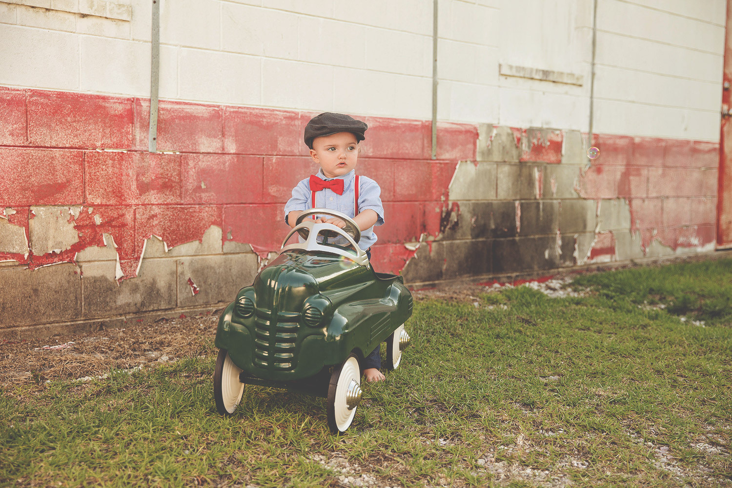
Vintage look
Damien Symonds replied to Mary Burgy's topic in How to achieve a certain look or effect
A lighter feel?? Are we looking at the same photo? Anyway, it's no problem to lighten it, of course. I don't know what you mean about cheering it up, sorry. Maybe less of the sepia undertone, and more of the original colour coming through?
-
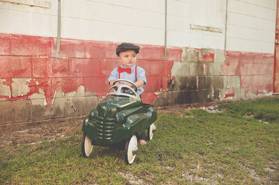
Vintage look
Damien Symonds replied to Mary Burgy's topic in How to achieve a certain look or effect
Is this something like?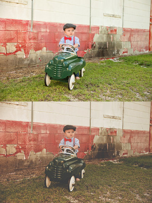
-
Lots of people have the same confidence issues, don't worry
-
This is good. Spectacularly good, in fact.
-
No, that's not the line tool. Click and hold on the tool in the toolbar, and you'll get a little flyout with all the tool varieties.
-
What is the "weight" of the line tool in the Options Bar? 2-4 pixels should be plenty.
-
No, that's the rectangle shape! Click and hold on the tool to get the line tool.
-
Turn off all the adjustment layers, so that only "Layer 7" and below are turned on. Make sure Layer 7 is still selected, and hit Cmd Opt Shift E to create a new merged layer. Convert that to a smart object. Make a new blank layer above that, and draw a line (using the Line Tool (U)) where the skirting board should go. Select the merged layer again, Cmd T to get the transform handles, and Option-click at the exact point where the skirting board bends, to put the centre marker there. Then rotate to line the skirting board up to the line you drew. Delete the line layer Mask the rotated layer. Turn all the adjustment layers back on.
-
Which layer has the extended skirting board on it?
-
Gosh no. May I see your layers panel?
-
That looks good at this size. I wish the skirting board didn't have a bend in it
-
Please do.
-
No, that's incorrect. I give better advice than those chumps.
-
That's right.
-
You've done a really great job. You should be very proud. My only suggestion is to make the shadow quite dark right along the edge of the fabric. That's important, to make it look like the fabric is resting on the skin.
-
Intense sunset/sunrise colors
Damien Symonds replied to tropicmom's topic in How to achieve a certain look or effect
Also, it goes without saying that you'll need a photo with more cloud detail. -
Intense sunset/sunrise colors
Damien Symonds replied to tropicmom's topic in How to achieve a certain look or effect
What a lovely photo. Now, can you provide one of your own that's lit the same? Please notice that the linked photo has NO shadows falling on the sand from the subjects, so it must have been taken after the sun had set (or before it had risen). -
Intense sunset/sunrise colors
Damien Symonds replied to tropicmom's topic in How to achieve a certain look or effect
Yes, you've clearly forgotten pretty much everything -
@Daniwright11?
-
Intense sunset/sunrise colors
Damien Symonds replied to tropicmom's topic in How to achieve a certain look or effect
No, a different example. A different linked photo, that you'd like to mimic. -
Won't import from camera - wheel just spins
Damien Symonds replied to Meetmow's topic in Lightroom questions or problems
How much space did it have at the time the problem occurred? 72.3 is a good deal less than the 1/3rd free space that @Brian recommends for your hard drive. I urge you to make it a regular thing - at least once a month, if not more. Card readers are dirt cheap, I urge you to get one pronto. -
Intense sunset/sunrise colors
Damien Symonds replied to tropicmom's topic in How to achieve a certain look or effect
https://www.damiensymonds.net/training.html I already told you ... -
12" x 18" Collage
Damien Symonds replied to kkvogelfamily12's topic in How to achieve a certain look or effect
Please PLEASE don't wait any longer to take the raw class. I can help you make your photos SO much better, you'll be blown away. -
12" x 18" Collage
Damien Symonds replied to kkvogelfamily12's topic in How to achieve a certain look or effect
Assuming that you do know how to use clipping masks, I've made the template for you. Download it here