

Damien Symonds
-
Posts
212,025 -
Joined
-
Last visited
-
Days Won
3,484
Everything posted by Damien Symonds
-

color space
Damien Symonds replied to HP78's topic in Photoshop / Elements / Bridge / ACR questions or problems
Oh, gosh, no, you must NEVER do that. Leave your Color Settings exactly as they are, on "North America General Purpose 2". That is the safe setting. http://www.damiensymonds.net/2010/02/please-ignore-your-monitor-profile.html Do you still have some of those older prints? To check that they still match your screen? As long as you can prove that, then yes, this sounds like a recent lab cock-up. -
Liv - 4: Minimising Hard Shadow under nose
Damien Symonds replied to lsin's topic in Help with editing
Just a little bright patch on the right-hand side. -
Alas, no, sorry. Sometimes depth-of-field blur can be passably sharpened for small prints; but this is motion blur, and it can't be fixed. Ditch the photo. http://www.damiensymonds.net/%3Fp%3D2573
-
Adobe bridge error
Damien Symonds replied to ishootfor3's topic in Photoshop / Elements / Bridge / ACR questions or problems
Can you do this for us? -
question about uniformity process
Damien Symonds replied to StacyG's topic in Monitor calibration questions or problems
Use Native. 7104 should be good enough. -
color cast on changing colour of blanket
Damien Symonds replied to Candi McGrail's topic in Help with editing
Great. -
Changing images to sgrb
Damien Symonds replied to HP78's topic in Miscellaneous questions or problems
Maybe, or maybe not. What file format are they saved in? -
Liv - 4: Minimising Hard Shadow under nose
Damien Symonds replied to lsin's topic in Help with editing
Yes. -
Yep, the Ultrasharps are excellent.
-
color cast on changing colour of blanket
Damien Symonds replied to Candi McGrail's topic in Help with editing
Download the PSD file It's going to seem like a heck of a weird process - first you make it black-and-white, then you make it skin-coloured, then finally you make it purple. But it's the only way I could find to prevent those casts, and problems with the edges. -
Oh, no, then that's fabulous.
-
I would use a combination of patch and clone tools to get rid of them completely, then lower the layer opacity slightly. Akin to this: http://www.damiensymonds.net/patch-tool-for-eye-bags.html Do you also need advice about the moire?
-
Liv - 4: Minimising Hard Shadow under nose
Damien Symonds replied to lsin's topic in Help with editing
Well, at the bottom, the brush opacity would need to be 100%. To fully remove the visible edge of the shadow, you know? -
Liv - 4: Minimising Hard Shadow under nose
Damien Symonds replied to lsin's topic in Help with editing
That looks great to me. Really well done. So the flaw is just in your masking, I'd say. -
color cast on changing colour of blanket
Damien Symonds replied to Candi McGrail's topic in Help with editing
Ok, what about this?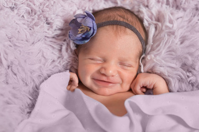
-
color cast on changing colour of blanket
Damien Symonds replied to Candi McGrail's topic in Help with editing
Gosh, I just realised how short-sighted I've been. I was assuming you wanted the colour to match the flower in the hair, but now I realise maybe you just wanted it to match the fluffy rug? Which is it? -
Adobe bridge error
Damien Symonds replied to ishootfor3's topic in Photoshop / Elements / Bridge / ACR questions or problems
There are two places to clear cache. One is in the Tools menu, and one is in Preferences. Make sure you do the one in Preferences - is that what you did? -
Replacing bkgrd behind Ryan and Jake
Damien Symonds replied to Cindy Young's topic in Help with editing
http://www.damiensymonds.net/2012/10/using-photoshops-gradient-layer.html -
color cast on changing colour of blanket
Damien Symonds replied to Candi McGrail's topic in Help with editing
The only solution I can find turns the little flowers on the blanket light purple as well. Is that ok? It's the best I can do.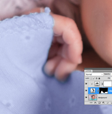
-
color cast on changing colour of blanket
Damien Symonds replied to Candi McGrail's topic in Help with editing
If you look at the blanket directly below the fingers of his left (our right) hand, you'll see why Hue/Saturation won't work for this anyway, regardless of any cast issues. See the weird flat shadow areas? -
Banding or artifact on seamless paper
Damien Symonds replied to MelissaL's topic in Help with editing
Well, there's good news and bad news. The good news is that there isn't banding in your photo. The bad news is that your screen is a pile of poo. -
Liv - 4: Minimising Hard Shadow under nose
Damien Symonds replied to lsin's topic in Help with editing
Can you Shift-click on the mask of the clone layer to temporarily turn it off, then show me the photo? So I can see your cloning in its entirety? -
calibration - warmth
Damien Symonds replied to Historyteach's topic in Monitor calibration questions or problems
And? -
Replacing bkgrd behind Ryan and Jake
Damien Symonds replied to Cindy Young's topic in Help with editing
It looks like you've chosen a solid-to-transparent gradient. That's wrong. It has to be all solid colours. -
Yes, that's much too big. You'll need to find out what size Squarespace resizes it too, and do so yourself, plus sharpening appropriately.
