-
Posts
211,284 -
Joined
-
Last visited
-
Days Won
3,459
Everything posted by Damien Symonds
-
It would need to be blurred a bit.
-

Kendrick Family Background
Damien Symonds replied to JessicaMont's topic in Questions about tutorials and articles
I agree with Samantha. You need to be in the Levels dialog in your Properties panel, not the Masks dialog. -

Lighroom Resolution box at export
Damien Symonds replied to Joy453's topic in Lightroom questions or problems
Relax, that number is meaningless. Only the pixel dimensions matter. http://www.damiensymonds.net/art_resolution.html http://www.damiensymonds.net/bridge-30-day-challenge -

Intersecting shapes on storyboard
Damien Symonds replied to Jackie Matthews's topic in Questions about tutorials and articles
You can place anything, but from a workflow point of view, mostly you'd place PSDs. -
Sorry, yes.
-
Oh, people will notice! Not least of all the guy himself!!!
-
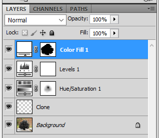
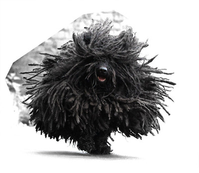
Ok, here's my layers panel: First, I added the Hue/Saturation layer. This is going to sound a little crazy, but go to every channel in the Hue/Sat dialog (Reds, Yellows, Greens, etc) and pull the Lightness slider all the way to +100 for each one. Don't do it on the Master channel, though. That will make the photo black-and-white, and lighten the background as much as possible. It also makes the dog's tongue too light and desaturated, so mask strongly on the nose/mouth area, and lightly over the fur on the chest, to your taste. I hope you can see what I mean from the thumbnail in my screenshot. Next, add a Levels layer. Pull the white slider in aggressively, to blow out as much background as possible. And fiddle with the middle slider a bit. I used 0.80 for the middle slider and 195 for the white slider. Next, add a white Solid Color layer on top. Invert its mask to black, then start painting white where you want white. Use your best judgement for the shadow - I painted over the shadow with a 10% brush a bit, to make it a bit less strong. You'll know what you like best. At this point I returned to the Background layer and made a new blank layer above it, for cloning. That was to get rid of some of the stones on the ground, that I couldn't paint out with white. Again, this will be to your taste. Then return to the top layer. At this point, pour yourself a stiff drink, because you're going to be zooming WAY in and carefully masking around the fur for the bits of background that couldn't be made white by the Levels adjustment. I did a few easy parts, but as you can see, I left the hard parts. This will take you a while. But it'll be worth it! I can't wait to see what you achieve.
-
I haven't done all the masking, because we're down to the painstaking part, but do you think this is promising so far?
-
Now, add a Hue/Saturation layer, go to Yellows, and move the Lightness slider all the way to the right. Then mask to her top.
-

Save for Web Action funny border
Damien Symonds replied to Natalie C's topic in Questions about tutorials and articles
An easy mistake to make, I'm sure. Thanks for letting me know. -

Save for Web Action funny border
Damien Symonds replied to Natalie C's topic in Questions about tutorials and articles
That must be the case, yes. -

Save for Web Action funny border
Damien Symonds replied to Natalie C's topic in Questions about tutorials and articles
Wait, what? How did you set a bigger size for the watermark than for the photos themselves? -

Save for Web Action funny border
Damien Symonds replied to Natalie C's topic in Questions about tutorials and articles
Could you temporarily turn off all the steps in the action after the Unsharp Mask step, then run the action on a photo. We need to see if the white borders are there before the action places the watermark. -

Save for Web Action funny border
Damien Symonds replied to Natalie C's topic in Questions about tutorials and articles
Did you check to make certain your logo file is RGB mode, not CMYK or something else? Have you read the Raw Class yet?


