Damien Symonds
-
Posts
212,165 -
Joined
-
Last visited
-
Days Won
3,493
Everything posted by Damien Symonds
-
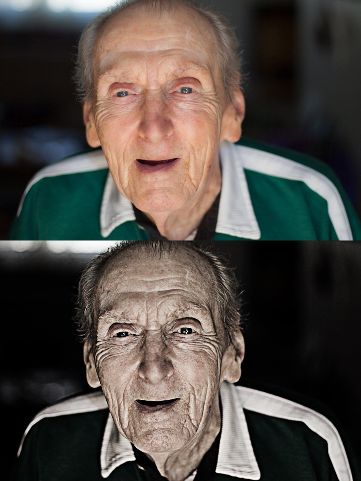
 A play with the "Dragan effect". The first three layers are duplicates of the Background layer, with High Pass filter run at various radii. The radii you choose will depend on your photo, so some experimentation is necessary. Download the file here.
-
Pictures open pixelated in PS from ACR
Damien Symonds replied to Twins mama's topic in The Macintosh User Group
Did that help? -
Yeah!!
-
Needs more, I think.
-
Now you can start your normal editing, particularly magenta photo filter for the foliage cast on them.
-
Alternately, a Hue/Saturation layer at 0/+40/-20, set to Multiply mode.
-
To that end, I'm thinking maybe a Hue/Saturation layer, set to 0/+75/-50, and masked on where desired.
-
So now it has to be all about the darkening. Adding shadows to her where shadows should exist.
-
Told ya I think if you can just manufacture a few more blades of grass encroaching onto his shin, that'll be good enough.
-
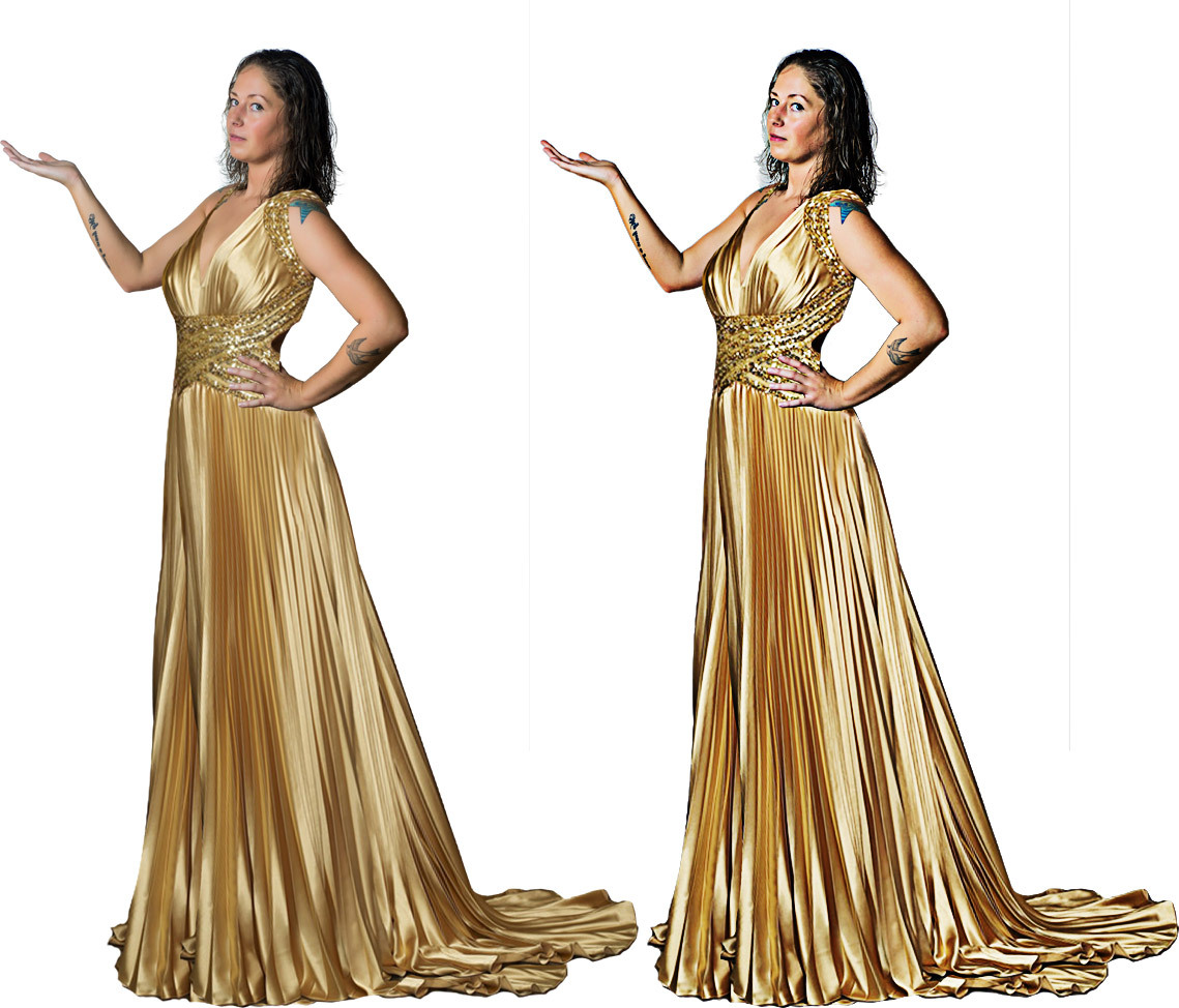
Now add a Photo Filter layer (one of the warming filters) and clip it to her. She needs a bit more warmth.
-
Not at all. Exactly the right direction. Can't you see that the image you want to put her into has a lot of distinction to all the edges? That's the "cartoon" look you were talking about. Yes, changed the colours. But that's not necessary with yours, is it? Your subject already has the warm tones you'd expect when being lit by that lamp.
-
I urge you to take it down aggressively first, eg -20, then very slowly bring it back up, and stop where you think it looks most plausible. I think you'll stop lower than -6, to be honest.
-
There are a few different styles there. The piper one definitely is cartoon, but I'm not sure if that's what you actually want? Generally this is done with high pass filters. How is this?

-
Gosh, nice work. Looking at it again though, I think you need to go a little lower still with the Lightness slider on that Hue/Sat layer you made.
-
Primary Monitor Wrapping (?) in Photoshop
Damien Symonds replied to HeatherH's topic in The Macintosh User Group
First, try these. -
Yes, this, I think.
-
Yes, and this is very tricky.
-
By jove, I think we're close. Just burn a bit more shadow around him.
-
Excellent. Now add a Hue/Saturation layer above the boy layer, and clip it to the boy layer (Cmd Opt G). Then lower the Lightness slider just a little - I feel he's a tiny bit too bright for the photo just now.
-
Good, but darken in front of him a bit too. Again, look at the shadows around the others.
-
The best way to mask and replace the background
Damien Symonds replied to cathm's topic in Help with editing
Right. -
The best way to mask and replace the background
Damien Symonds replied to cathm's topic in Help with editing
No, this is not a two-step process. Just mask the new background straight over the father. -
No, those shadows are too distinct. Look at how big and soft the shadow are around the nearby feet.
-
NO!!!!!!!!!!!!!!! It's 0.32 megapixels. Less than half of a megapixel.
-
The best way to mask and replace the background
Damien Symonds replied to cathm's topic in Help with editing
Any lab at all. Even a cheap suburban kiosk should print this ok. I'm flabbergasted that Bay messed this up.