Damien Symonds
-
Posts
212,165 -
Joined
-
Last visited
-
Days Won
3,493
Everything posted by Damien Symonds
-
Please @Jadegirly2k?
-
Definitely ok, yes.
-
Although I haven't used this particular screen, my general experience with HP screens has been great. The only problem is, I can't figure out how glossy or matte it is. I read through pages and pages of the Q&A, and some people said it was glossy, somebody else said it was glossy with an anti-glare coating, but somebody else said it was matte. You'll need to satisfy yourself that it's NOT glossy. Glossy screens are the devil for editing.
-

getting a new mointor
Damien Symonds replied to Nunzio's topic in Monitor calibration questions or problems
My personal experiences with LG monitors have been good. Out of interest, what size screen are you working on at the moment? -
getting a new mointor
Damien Symonds replied to Nunzio's topic in Monitor calibration questions or problems
I have used a BenQ myself, but I know plenty of people have said they love theirs. I think you'd be happy with this. I don't know what Eye Care is, but I'm very worried about "Brightness Intelligence". Make sure you turn that off. -
Sorry, no, for those ones use this: https://www.damiensymonds.net/art_tscs2.html
-
The PS setting is irrelevant. The raw setting is what matters. https://www.damiensymonds.net/art_tscs000.html
-
So how did you go? Got everything you need?
-
If you don't type "px" it will probably default to "in" ... which is fine when you're printing, but bad in present circumstances.
-
Unfortunately, the whole cropping process is far more complex than it used to be. In older versions of PS it was blissfully straightforward.
-
No, you can't use the "Ratio" option for this. You have to use the WxHxResolution option (I think that's what it's called for your version). Then, when you enter the numbers, make sure you add "px" to the end.
-
How did the calibration go, @beth0386?
-
Well, now that you've commented on this thread you're automatically "following" it, so when you hit the "Content I follow" link (both at the top right and bottom right of every page on this site) you'll get that list. That's not a perfect system but it's the only one I can think of, other than bookmarking this page in your browser. But you don't need to comment on a thread in order to follow it. You can just hit the blue "Follow" button in the top left corner.
-
How did you go, Kim?
-
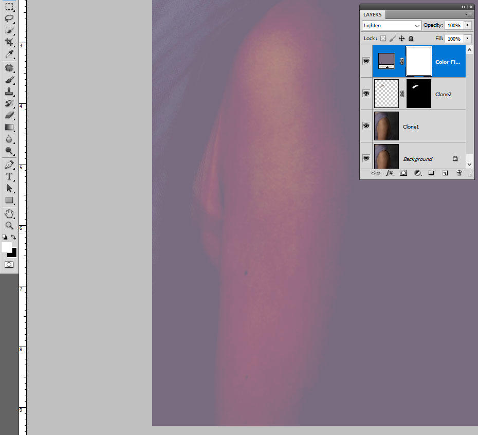
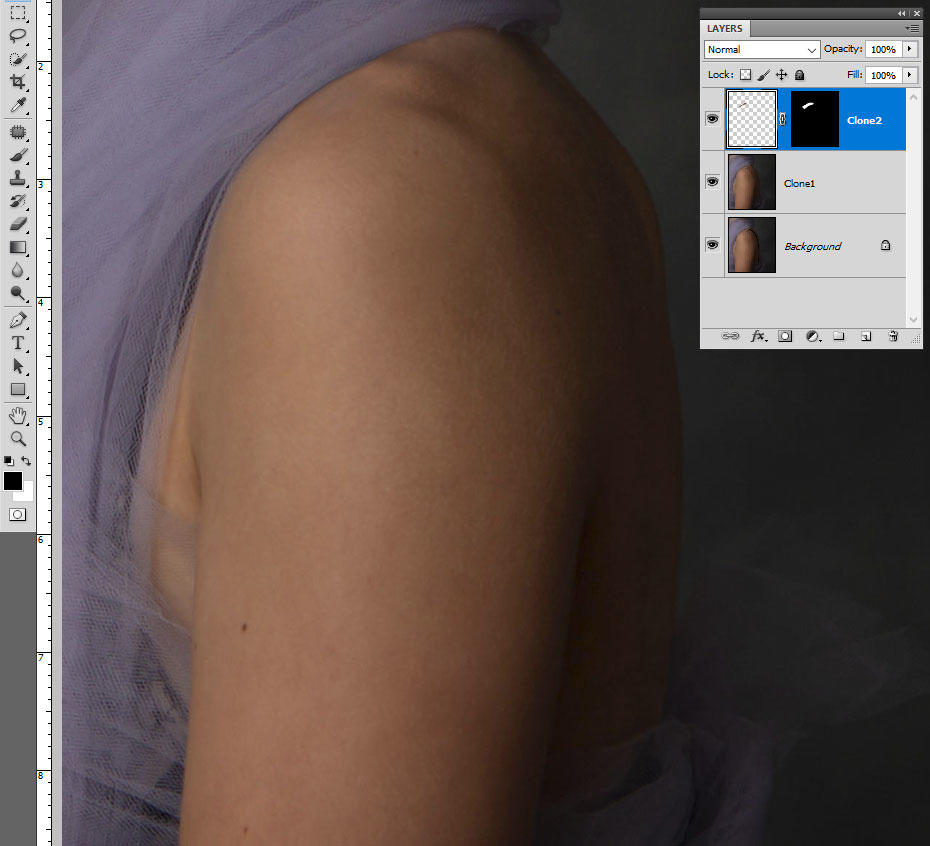
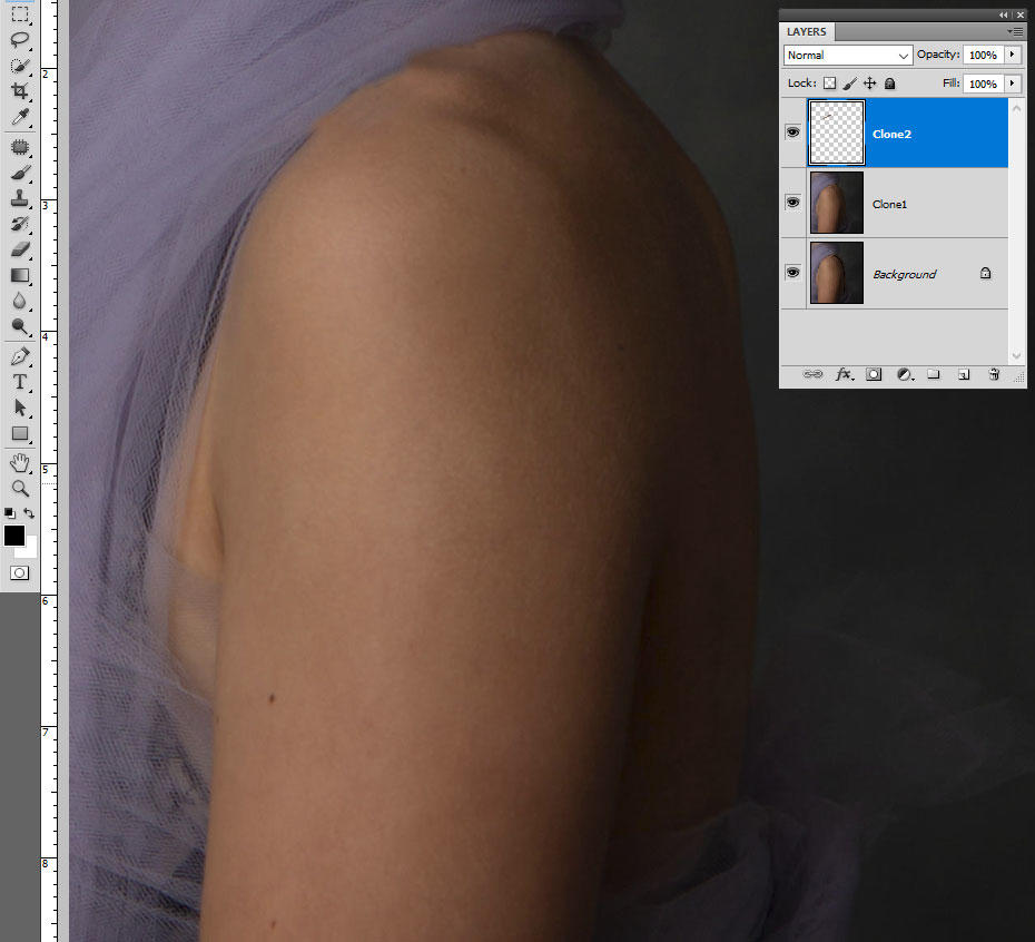
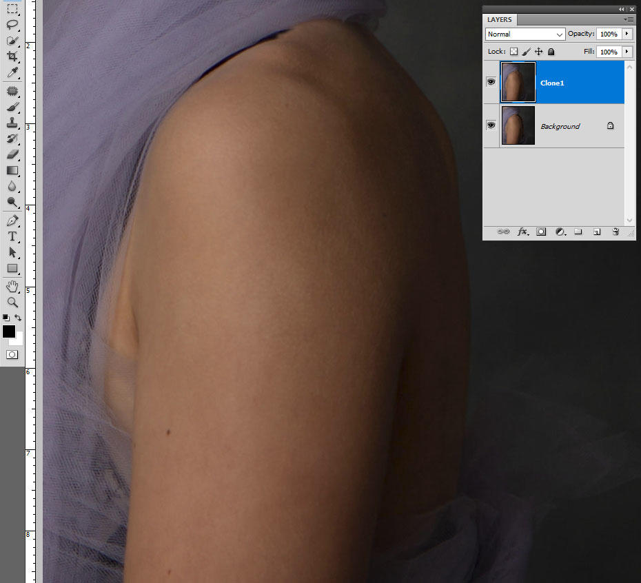
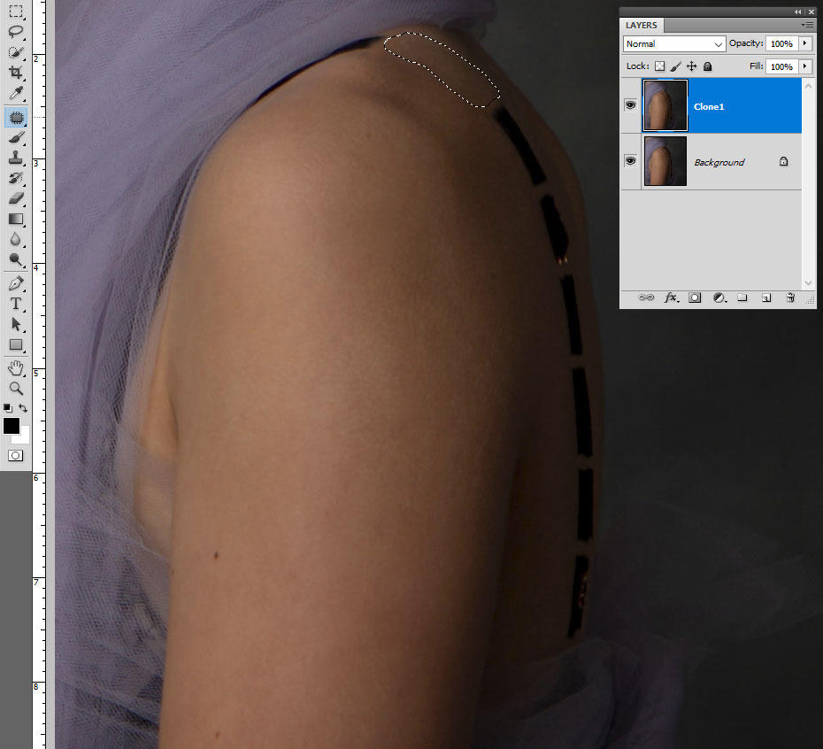
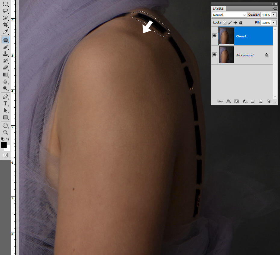
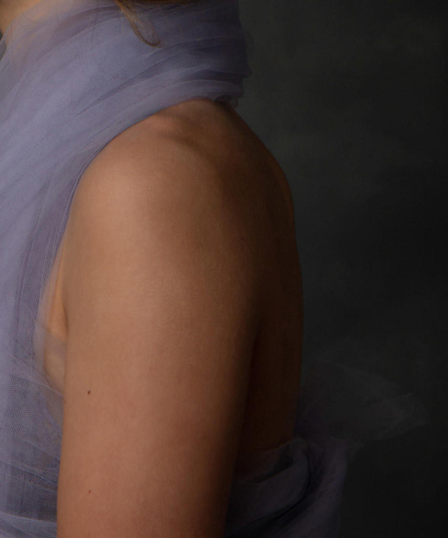
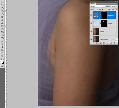
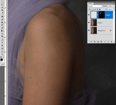
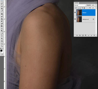
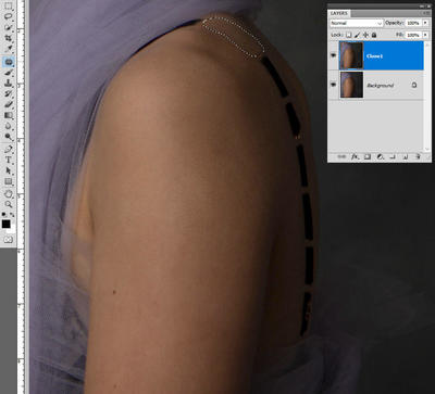
Phew! Glad you like it. Let me try to explain my steps ... The Patch Tool is the best way to get rid of the bulk of the strap, but as I've said before, it works best on "islands" - that is, smaller chunks of strap with "ocean" (skin) all around them. So the first step is to duplicate the Background layer and use the clone tool to carefully chop the strap into sections: Then use the Patch Tool to get rid of the sections. Drag around one and drag it to a nearby clean section of skin: Hopefully, this will fill the patch with seamless skin: Keep on repeating this ... ... until it's all clear: Then add a blank layer, and clone out the area where the strap runs under the fabric. Clone further than necessary: Then add a mask to that layer and mask it carefully: (More info here.) Finally, add a blank layer and use the eyedropper tool to sample some lighter-coloured fabric, then add a Solid Color layer of that colour. Put the layer on "Lighten" blend mode: Add a black mask to that layer, then very patiently paint on to the dark areas of the tulle with a low opacity brush (5-10%) until it is sufficiently disguised.


-
This is the best result possible, I think. At least, it's the best I can figure out how to do. Would it be sufficient?

-
In the Skin Class.
-
No, cropping is the only way to do it. Because those dimensions are a different shape to your native camera file. Try it and you'll see.
-
What did you decide to do, @Teresa?
-
saving
Damien Symonds replied to StudioPopJess's topic in Output - print, websites, Facebook, email, client disk, etc
Well, here's the irony. The truth is that bigger megabytes usually means it's a BAD file. Because noisy files are bigger, you see. Lovely clean files are smaller. https://www.damiensymonds.net/2015/08/about-jpeg-file-size.html -
saving
Damien Symonds replied to StudioPopJess's topic in Output - print, websites, Facebook, email, client disk, etc
Terrific. So, when you're saving those files for the clients, I recommend choosing Level 10 quality (on the 0-12 scale). -
Photo restoration
Damien Symonds replied to Silvia2's topic in Questions about tutorials and articles
Levels and Advanced Levels. And to a lesser degree, Channel Mixer. All of those classes require a fundamental knowledge of layers and masking, so if you don't have that knowledge, you'd need to take the Layers & Masks Class first. You can read its description of topics covered to see if you'd need it. -
saving
Damien Symonds replied to StudioPopJess's topic in Output - print, websites, Facebook, email, client disk, etc
Yes, this is correct. To confirm, you don't include a resolution when you crop? -
saving
Damien Symonds replied to StudioPopJess's topic in Output - print, websites, Facebook, email, client disk, etc
Sorry, I need more information so I can help you properly. When you say "printing", can you tell me your process? Are you sending files directly to the lab yourself? -
No, the thread in the raw class please.