Damien Symonds
-
Posts
211,593 -
Joined
-
Last visited
-
Days Won
3,468
Everything posted by Damien Symonds
-

i1 pro - this okay or redo ?
Damien Symonds replied to SueR's topic in Monitor calibration questions or problems
And how's the print match now? -
i1 pro - this okay or redo ?
Damien Symonds replied to SueR's topic in Monitor calibration questions or problems
I'm confused. Are you following my instructions or not? -
i1 pro - this okay or redo ?
Damien Symonds replied to SueR's topic in Monitor calibration questions or problems
It's always better to be slightly darker than slightly brighter. So maybe calibrate to 90? -
i1 pro - this okay or redo ?
Damien Symonds replied to SueR's topic in Monitor calibration questions or problems
Between 80 and 100 is most common. You'll likely need to calibrate a couple more times, while you're searching for the perfect target. -
i1 pro - this okay or redo ?
Damien Symonds replied to SueR's topic in Monitor calibration questions or problems
No, 120 will be MUCH too bright, surely? Unless your room is lit by football stadium floodlighting. Have you compared prints? -
Might be a good idea to ask for broader feedback in FBAD.
-
Problem with new ps
Damien Symonds replied to Erica's topic in Photoshop / Elements / Bridge / ACR questions or problems
What's this program?
-
I don't know of a way to adjust calibration for that, sorry.
-
You mentioned vibrance. Is that the sole difference? Do you think the colours are both the same, but CPQ's are a more saturated version?
-
Are you comparing equivalent stock? Eg lustre from both labs?
-
Are you saying that the WHCC prints are different from the CPQ ones?
-
Compact Flash won't connect. :(
Damien Symonds replied to Ratbag's topic in The Macintosh User Group
Have you tried ... Connecting the card to another computer to see if it reads it there? A different card reader? Another card in this reader to see if it reads ok? -
Problem with new ps
Damien Symonds replied to Erica's topic in Photoshop / Elements / Bridge / ACR questions or problems
What program are you viewing in? -
Problem with new ps
Damien Symonds replied to Erica's topic in Photoshop / Elements / Bridge / ACR questions or problems
https://www.damiensymonds.net/art_tscs000.html -
Calibration not working
Damien Symonds replied to Truth Designs's topic in Monitor calibration questions or problems
Ok, that's a bit better. Still not great, but out of the danger zone at least. I encourage you to run Glary on both computers when you get a chance, and maybe Scanner too. When you have time. -
Calibration not working
Damien Symonds replied to Truth Designs's topic in Monitor calibration questions or problems
Truly, it's amazing your computer even starts up. This is very very very bad. -
Calibration not working
Damien Symonds replied to Truth Designs's topic in Monitor calibration questions or problems
Holy crap!!! PLEASE tell me this is a typo?????? -
Calibration not working
Damien Symonds replied to Truth Designs's topic in Monitor calibration questions or problems
So that we may be thorough with our analysis, can you also do this for me? -
Calibration not working
Damien Symonds replied to Truth Designs's topic in Monitor calibration questions or problems
Ok. That firms my conviction that this is something to do with the PremierColor. If you can find how the settings differ, and make Cara's match yours, you'll (hopefully) find that Cara's computer calibrates properly. If this is the case, it might be also true that you get to hang on to your Spyder 3 for a bit longer -
Calibration not working
Damien Symonds replied to Truth Designs's topic in Monitor calibration questions or problems
Great! Chrome is completely shithouse, and we need a shithouse browser for this test. I want to know, when you both open the exact same web page, whether they look wildly different in colour. (Or whether this problem is restricted only to Adobe programs.) -
Calibration not working
Damien Symonds replied to Truth Designs's topic in Monitor calibration questions or problems
Which web browser do you both use? -
Calibration not working
Damien Symonds replied to Truth Designs's topic in Monitor calibration questions or problems
Gosh, how bizarre. So somehow you've turned something off, or Cara has turned something on ... or vice versa. If there is a Dell PremierColor control panel on both computers, you need to examine the settings and see how they differ, I reckon. -
Calibration not working
Damien Symonds replied to Truth Designs's topic in Monitor calibration questions or problems
How weird. In between "Night light settings" and "Scale and layout" there should be a "Colour profile" section. Does Cara's have the "Colour profile" section? -
Calibration not working
Damien Symonds replied to Truth Designs's topic in Monitor calibration questions or problems
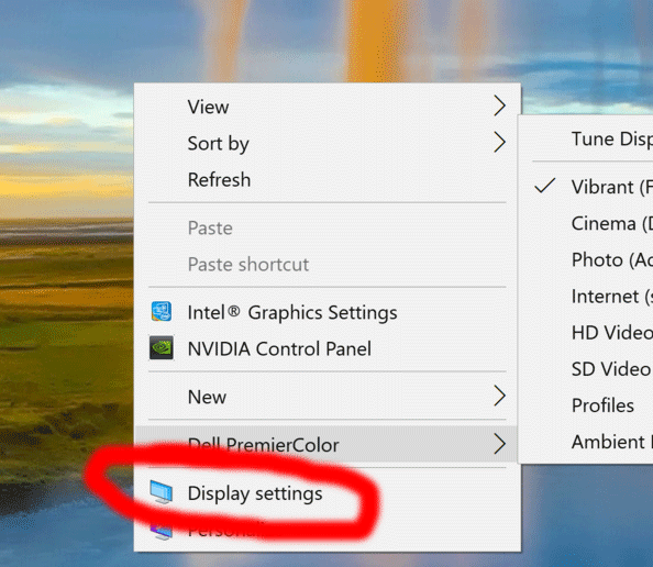
Hang on ... can you choose this for me? Then show me a screenshot of the window that opens?
-
Calibration not working
Damien Symonds replied to Truth Designs's topic in Monitor calibration questions or problems
For early Christmas, about the 16th. But let's hope we can get this sorted before then. Is yours set exactly like this too?