-
Posts
211,172 -
Joined
-
Last visited
-
Days Won
3,452
Everything posted by Damien Symonds
-
Now, can you post the actual raw edit in the Raw Class for me?
-
In the Lens Corrections tab in raw, there's a Lens Vignetting slider. That's the one to try. It doesn't work perfectly every time, but it's worth a shot.
-
Have you tried uploading it to Facebook, to check?
-
I have to head out and do the grocery shopping now. Funny how the family insist on being fed. I'll check in when I get back.
-
Because if the bigger FB size (2048) works ok, that would solve that problem immediately, yes?
-
We already know that 1500 (the size of images on this forum) works ok, because the very first version you posted looked fine.
-
Out of interest, can you also try the 2048 size, and see if it's any better? Don't post it for me, just let me know.
-
This might interest you too: https://www.damiensymonds.net/client-photoshop That's still 900.
-
By the way, regarding the action, have you seen this super-duper one? https://www.damiensymonds.net/act_web.html
-
It's ok, you're welcome to stick to the 11:15 shape. What you say makes sense. I just wanted to make sure you understood that it didn't HAVE to be 11:15 for Facebook. So, back to the topic at hand. Can you crop one to web size (let's use 960) and post it here for me so I can see the moire? Don't do the smart object thing at this stage, I just want to see the issue as it stands.
-
The Facebook sizes are 720, 960 or 2048 pixels on the long edge. Those are the sizes that FB advise for best quality. Nobody uses 720 any more, it's just so small. 2048 is lovely and big, if people are viewing on big screens, but overkill of course for people viewing on phones, which is most people now. Plus 2048 is printable, so it's dangerous from a piracy point of view - you need to make sure you've watermarked carefully. Do you add a watermark? 960 is pretty good. But of course watermarking is a good idea all the time anyway. The 11:15 shape is only for images which you're selling. For Facebook, you don't need to restrict yourself that way - you can crop to any shape that suits your photo best, you know?
-
Oh gee, this is a DISASTER!!!!!!!!!!!!!!!!!!!!!!!!! All of a sudden, moire is the least of your problems. Let's talk about this. For what website are you preparing this image?
-
Ok, what size is the web one? And what resolution for the print? Yeah, that's only for colour moire. Not applicable here, sadly.
-
You might need to accept this. Life isn't always fair. Can you tell me what size you're preparing at? Is it for print or web?
-
Home printing is for chumps. It's expensive and frustrating and absolutely not worth it. Not only is there the price of the printer, there's also the calibrator (MUCH more expensive than a monitor calibrator). And the cost of all the ink and paper (you need to allow for plenty of usage and spoilage while setting up. You would need to get thousands and thousands of prints made before you broke even.
-
Ok, so, can you tell me what you've tried so far?
-
Hi Sarah, have you read this?
-

Removing bra strap under lacy clothing
Damien Symonds replied to LSSmith's topic in Help with editing
Just the after, I guess. -

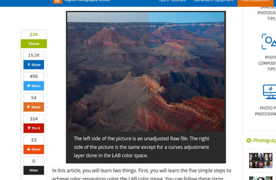
LAB colour mode
Damien Symonds replied to Jackie Matthews's topic in Miscellaneous questions or problems
Don't forget you already have some degree of control over the "L" by using Luminosity mode for your normal adjustments. -

LAB colour mode
Damien Symonds replied to Jackie Matthews's topic in Miscellaneous questions or problems
Let's say you'd done your stupid work in stupid LAB mode, then had it in your RGB PSD as a smart object. You did some more work here and there with some Levels layers, or skin layers, or whatever. Then you decided you wanted to tweak the stupid LAB work a bit more. You edit the smart object layer ... where? In a separate window, of course. And in that separate window, you are no longer viewing the whole edit, because you no longer have your other (levels, skin, etc) layers. You're back to an old edit. So you tweak your stupid LAB work. You return the updated smart object to the RGB PSD, where you find that your other layers no longer look the same! A levels layer that was safe is now clipping. A skin layer that was beautifully peachy is now orange. You do not need that shit in your life. -

LAB colour mode
Damien Symonds replied to Jackie Matthews's topic in Miscellaneous questions or problems
Just tell me what you're trying to achieve, and we'll achieve it in RGB. Of course not. -

LAB colour mode
Damien Symonds replied to Jackie Matthews's topic in Miscellaneous questions or problems
Any mode conversion change can't preserve layers. So you can't incorporate LAB editing into your existing workflow, it would need to be an entirely new workflow. -

LAB colour mode
Damien Symonds replied to Jackie Matthews's topic in Miscellaneous questions or problems
The first google hit: See what I mean? Who would ever take an unadjusted raw file into Photoshop to begin editing? Only an idiot.


