Damien Symonds
-
Posts
212,151 -
Joined
-
Last visited
-
Days Won
3,492
Everything posted by Damien Symonds
-
 Also, this:
 -
Hi Kate, I don't know for certain, but start with these: https://www.damiensymonds.net/2015/09/black-boxes-and-other-weird-behaviour.html Also, it might be handy if you could do this for me: https://www.damiensymonds.net/thread1.html
-
LAB colour mode
Damien Symonds replied to Jackie Matthews's topic in Miscellaneous questions or problems
Don't forget you already have some degree of control over the "L" by using Luminosity mode for your normal adjustments. -
LAB colour mode
Damien Symonds replied to Jackie Matthews's topic in Miscellaneous questions or problems
Let's say you'd done your stupid work in stupid LAB mode, then had it in your RGB PSD as a smart object. You did some more work here and there with some Levels layers, or skin layers, or whatever. Then you decided you wanted to tweak the stupid LAB work a bit more. You edit the smart object layer ... where? In a separate window, of course. And in that separate window, you are no longer viewing the whole edit, because you no longer have your other (levels, skin, etc) layers. You're back to an old edit. So you tweak your stupid LAB work. You return the updated smart object to the RGB PSD, where you find that your other layers no longer look the same! A levels layer that was safe is now clipping. A skin layer that was beautifully peachy is now orange. You do not need that shit in your life. -
LAB colour mode
Damien Symonds replied to Jackie Matthews's topic in Miscellaneous questions or problems
Just tell me what you're trying to achieve, and we'll achieve it in RGB. Of course not. -
LAB colour mode
Damien Symonds replied to Jackie Matthews's topic in Miscellaneous questions or problems
Any mode conversion change can't preserve layers. So you can't incorporate LAB editing into your existing workflow, it would need to be an entirely new workflow. -
LAB colour mode
Damien Symonds replied to Jackie Matthews's topic in Miscellaneous questions or problems
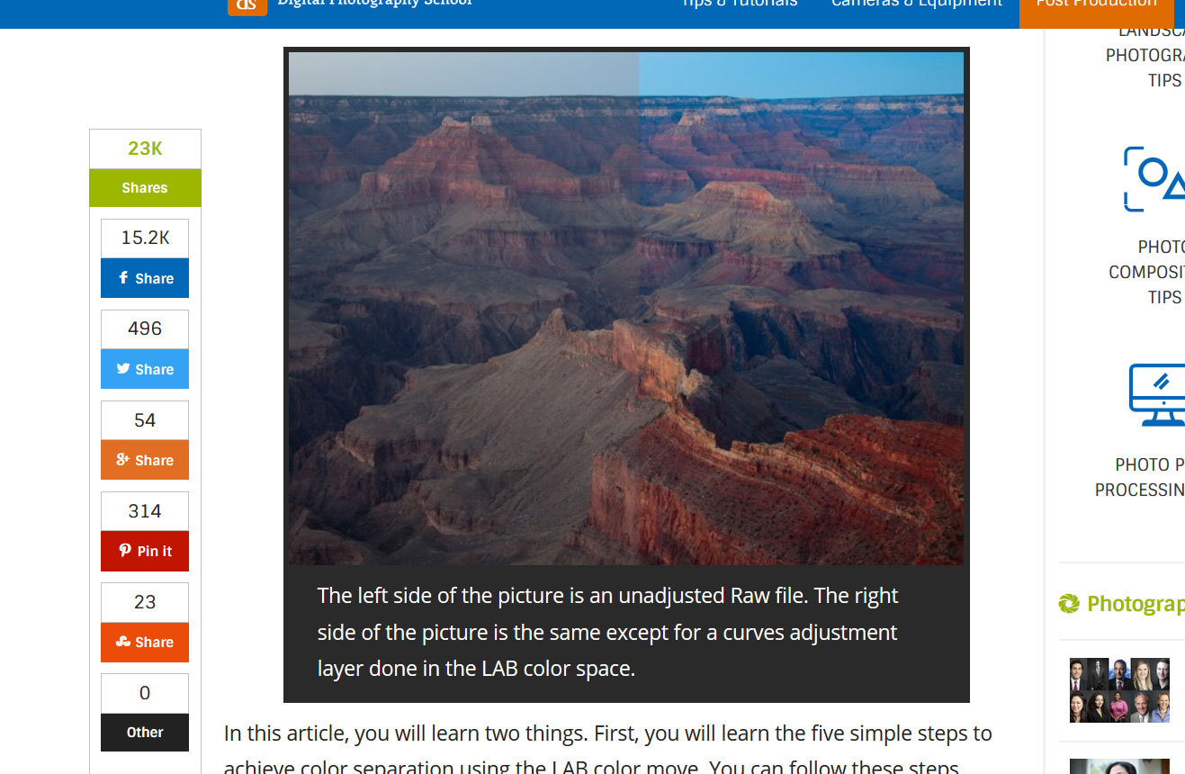
The first google hit: See what I mean? Who would ever take an unadjusted raw file into Photoshop to begin editing? Only an idiot.
-
LAB colour mode
Damien Symonds replied to Jackie Matthews's topic in Miscellaneous questions or problems
It's used exclusively by people who don't know how to edit. You are not one of those people. -
I agree with both of those things. It's just time, honestly. The more you do it, the easier it will feel. Yeah, I've never bothered with the shortcut keys. I just use my tablet as a mouse replacement, not also as a keyboard replacement.
-
Removing bra strap under lacy clothing
Damien Symonds replied to LSSmith's topic in Help with editing
May I see a screenshot? -
I'm sure your client will ADORE it.
-
I think it's gentle and "pastely" and lovely.
-
Oh, I really like the cleaner edges of the blanket!!!!!!
-
It goes without saying that this is slow at first, as you're learning how to choose the right gradients for the right situations. But like anything, it will speed up with practice, and I reckon you're going to get a LOT of practice.
-
Yeah, I just fiddled. A bit more about gradients here.
-
Not painted. Never painted. Take a look at the PSD, you'll see it.
-
Download the PSD You'll find both the versions in that PSD. The second version is the one that's presently turned on.
-
All of it, of course. Hold on, I'll upload the PSD ...
-
Now that I've seen what you like, I've had another go:
-
No, I agree with you. Lamps aren't much good, I reckon. Their light is too "directional" if you know what I mean. A good overhead light that spreads evenly around the room is much better.
-
A great learning exercise for you.
-
Stunning, well done.
-
Yep, that's not bad at all. Well done.
-
Did you Alt-click on my mask, to see it clearly?
-
Oh gosh yes. Have you read this information about obtaining and changing colours of gradients?