Damien Symonds
-
Posts
212,184 -
Joined
-
Last visited
-
Days Won
3,494
Everything posted by Damien Symonds
-

Adding a tattoo/writing
Damien Symonds replied to Lisa Anne's topic in How to achieve a certain look or effect
How did you go? -
I think you've done an excellent job so far. Now it's a slow and painstaking matter of handyman method.
-
Dark Fall Edits
Damien Symonds replied to nikki_neste's topic in How to achieve a certain look or effect
Great. Now, obviously the next step is the background blur. It will be MUCH better if you can achieve it in camera in future, but for now, do this then post for me. -
Oh, phew!
-
How did you go?
-
Have you got the Gradient Tool selected?
-
It's quite likely that what you desire is impossible. However, spell it out for me. What do you want to do with the background?
-
Don't feel bad, it's not your fault. That tool never works. It's an elaborate prank played by somebody with a sense of humour at Adobe HQ. "Let's add this feature to make people think they can extract hair! Ha ha ha!"
-
Dark Fall Edits
Damien Symonds replied to nikki_neste's topic in How to achieve a certain look or effect
Now we've got a good SOOR, can you post it here again so we can discuss the style? -
Sorry, I can't discuss this here, because it's information directly from my Levels Class. But this is definitely relevant: http://www.damiensymonds.net/2015/07/creamy-silky-perfect-angelic-skin.html
-
Just click on the mask (in case it isn't selected already) then Ctrl I (for "inverse").
-
Oh, wow! But the banding problem is new? You've never seen banding in your images before?
-
http://www.damiensymonds.net/2010/07/raw-noise-removal.html And, because you're likely to need faith: http://www.damiensymonds.net/2015/10/noise-reduction-and-sharpening-leap-of.html
-
Adding a tattoo/writing
Damien Symonds replied to Lisa Anne's topic in How to achieve a certain look or effect
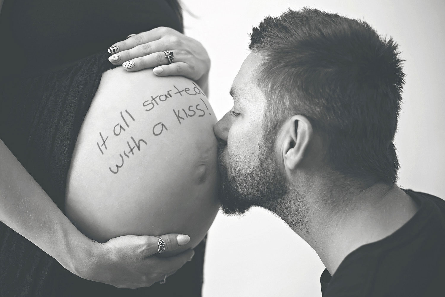
Download the PSD I strongly recommend you do what I did - that is, rotate the writing file so it's nice and straight, then crop it in a bit, then save it, before using it. You MUST NOT COPY AND PASTE the writing file onto the photo. You MUST use File>Place, so that it comes in as a smart object. This is vital. As a smart object, you can rotate and warp the layer as often as you like, without losing the previous adjustments. -
Adding a tattoo/writing
Damien Symonds replied to Lisa Anne's topic in How to achieve a certain look or effect
Ok, great! I used the Warp Tool, and of course this method. If you can give me a minute, I'll upload the PSD for you.
-
Adding a tattoo/writing
Damien Symonds replied to Lisa Anne's topic in How to achieve a certain look or effect
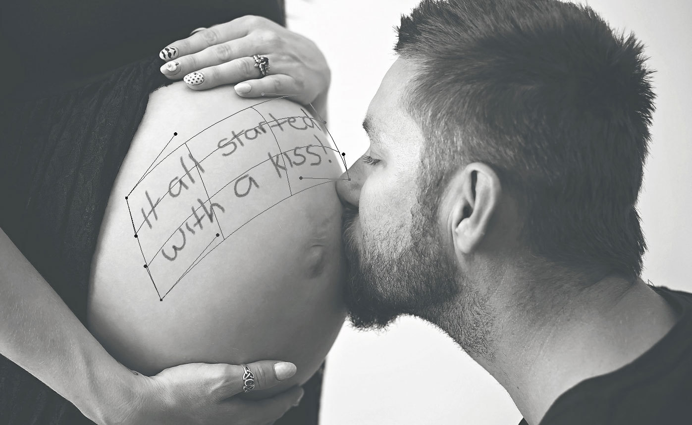
What about if we tried to curve it over the top of the tummy, like this?
-
Adding a tattoo/writing
Damien Symonds replied to Lisa Anne's topic in How to achieve a certain look or effect
Yeah, displacement was my initial thought, but I don't think it'll be necessary, to be honest. Can you give me the writing image by itself, so I can play? -
Adding a tattoo/writing
Damien Symonds replied to Lisa Anne's topic in How to achieve a certain look or effect
What text would she like? And does she want it hand-written? Can you show me what you've tried? -
Yay!
-
What did you decide?
-
Dark Fall Edits
Damien Symonds replied to nikki_neste's topic in How to achieve a certain look or effect
No, I want to discuss your actual raw edit. -
Dark Fall Edits
Damien Symonds replied to nikki_neste's topic in How to achieve a certain look or effect
Ok, can we start by discussing this in the Raw Class please? -
That sure is annoying. It's a pain, but I suggest you might have to do this.
-
So the update is the only thing different in the equation? It's exactly the same computer and Spyder that you've always had?
-
pse14 display
Damien Symonds replied to rebecks99's topic in Photoshop / Elements / Bridge / ACR questions or problems
And I urge you to revisit Module 2 of the Layers & Masks Class.