Damien Symonds
-
Posts
210,849 -
Joined
-
Last visited
-
Days Won
3,436
Everything posted by Damien Symonds
-
I urge you to read Module 11 of the class again, by the way. Regarding the wrinkle, plain old Patch Tool might work fine, I reckon.
-
Gosh yes, 5 is always too low.
-
Hmmm ... when you saved the jpeg file for upload just now, what Quality Level did you choose? It looks quite degraded.
-
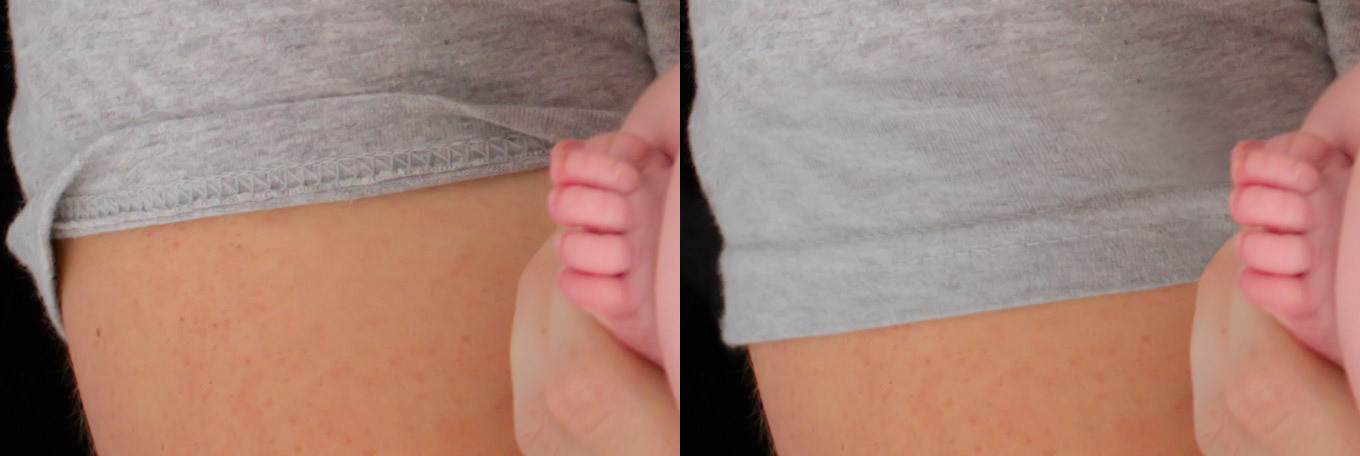
Hmmm ... that will depend on the texture, I guess. May I see a 100% crop?
-

pc running slow since cc installed
Damien Symonds replied to Stacey Sedgman's topic in The Windows & PC Hardware Forum
While you're waiting for Brian, can you do this for him? -
Your master file should be a PSD (or maybe a TIFF). Have you read this article?
-
This looks like fairly standard file corruption. Just save them again from your master files, and send them to her again. I'd be surprised if it happened twice.
-
So if you wanted to do a black-and-white of this one, use Channel Mixer for your conversion. Add the Channel Mixer layer, check the "Monochrome" box, then enter 0%, +100%, 0%, 0% for the four sliders.
-
Yes, it's because there's clipping in the Red channel (at the left-hand end) on the shirt.
-
After cloning, maybe a fade?
-
Ok, great, so you'll just clone blanket into that corner, won't you?
-
I'm curious why you're only worried about the green? Surely you'll want that whole top corner filled in with blanket?
-
http://www.damiensymonds.net/art_8x10.html
-
Yeah, that part is letting it down.
-
Are you talking about the shirt?
-
Download the PSD file I began by duplicating the Background layer and doing the Liquifying on it. Then I added the mask and masked it on. Then I realised I needed some new shadowing, so I created the Hue/Sat layer below the Liquify layer for that purpose. Finally, I realised that some grass was crooked, so I added the Clone layer for that purpose. If some or all of that doesn't make sense, add The Layers & Masks Class to your list.
-
Ok, then this is going to be challenging for you. You'll find plenty of YouTube videos to teach you; I've recorded one here. Give me a minute and I'll upload the PSD file of my edit, I hope you'll be able to make some sense of it.
-
Ok, phew! Glad you like it. Have you used the Liquify function before?
-
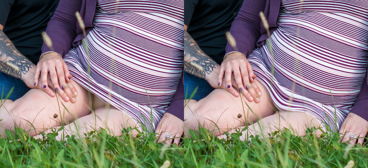
So I think your best (only) chance is to liquify the skirt down: Do you think it's plausible enough to get away with?
-
Ok, I've got a fix to show you for your consideration. Let me know when you've fixed the colour space problem, and we'll go ahead and start discussing her skirt.
-
Oh gee, I beg you, PLEASE don't wait a moment longer to take the Raw Class. However, your job right away is to fix the catastrophic colour space problem. Follow this troubleshooter all the way to its conclusion. While you're doing that, I'm going to have a play with your photo and see what's possible for the fix.
-
May I see the whole photo, or at least a larger area, so I understand the context here?
-
Oh gosh, the pattern is going to make it difficult, that's for sure. Go ahead and do your raw processing as normal, then post again for me, including a closer crop of the area (I always feel seedy asking that!)
-
Download the PSD
-
This is the best we can manage, I think: Some texture is lost, but hopefully nobody will look too closely. I'll upload the PSD in a moment ...