Damien Symonds
-
Posts
212,132 -
Joined
-
Last visited
-
Days Won
3,488
Everything posted by Damien Symonds
-

Camera Raw/Culling
Damien Symonds replied to lbp's topic in Photoshop / Elements / Bridge / ACR questions or problems
Yeah, this is REALLY bad. Don't do this. -
I don't have any experience at all, sadly. But I think it's fairly safe to say that if your friend does any animation with your photos - fading in, or whatever - then any sizing or sharpening you've done will probably go out the window. So I'd say just send the full-sized files.
-
Seeing cymk meaurments in lightroom
Damien Symonds replied to Chromatic Abberation's topic in Lightroom questions or problems
No. Skintone editing does not happen in a raw program. -
Extracting subject from green background
Damien Symonds replied to Hemant's topic in Help with editing
Yes, this is as good as it will ever get. -
Gosh no. I want you to reprocess them so that the white balances match. And make the boy a bit brighter.
-
Ah, too bad. Never mind, let's see what we can do. Can you do your noise removal, then post it again?
-
Ah, the Handyman Method should do it ok.
-
If that's what it takes to get a print match, yes. But make sure you're considering the WHOLE prints, not just skin.
-
Anyway, alas, sorry, there's nothing we can do about this. The hair and wood are too similar in colour. Your only hope is to find another photo where the hair isn't against the wood, and do a hair swap.
-
Hmmm ... the word "closeup" should be a link in my previous comment. Is it not showing up as one for you? (We're still ironing out the kinks in this new site.)
-
May I see a closeup of the hair area?
-
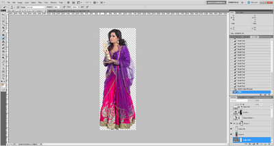
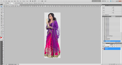
Extracting subject from green background
Damien Symonds replied to Hemant's topic in Help with editing
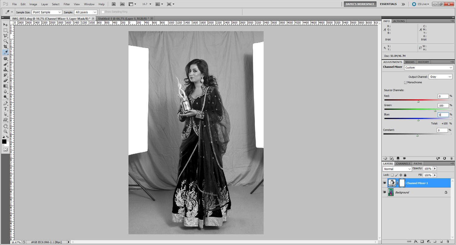
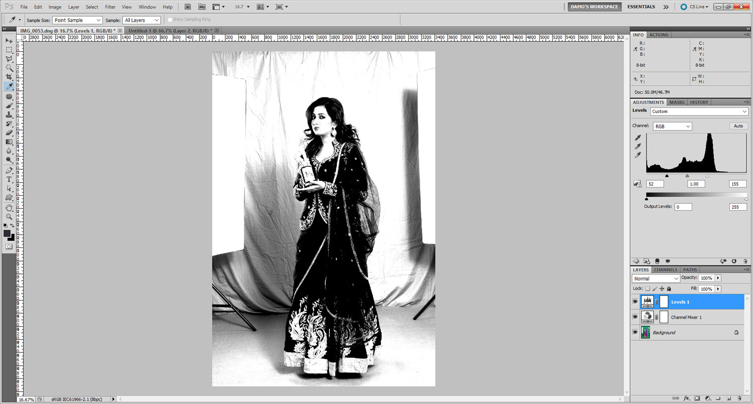
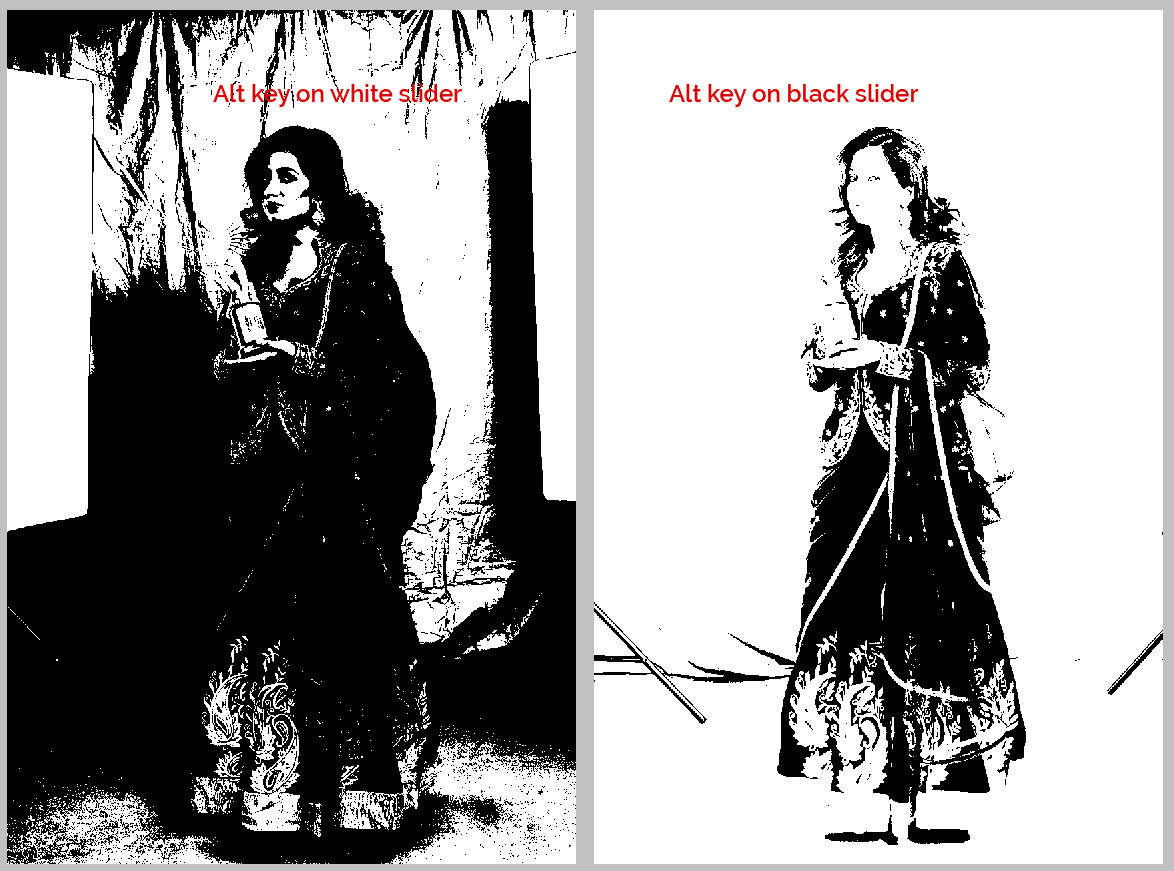
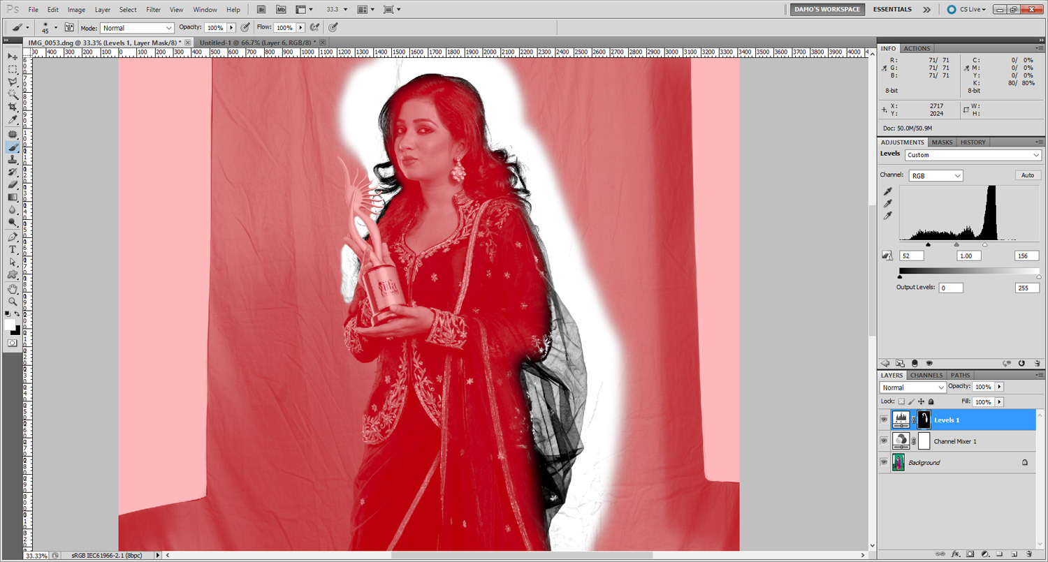
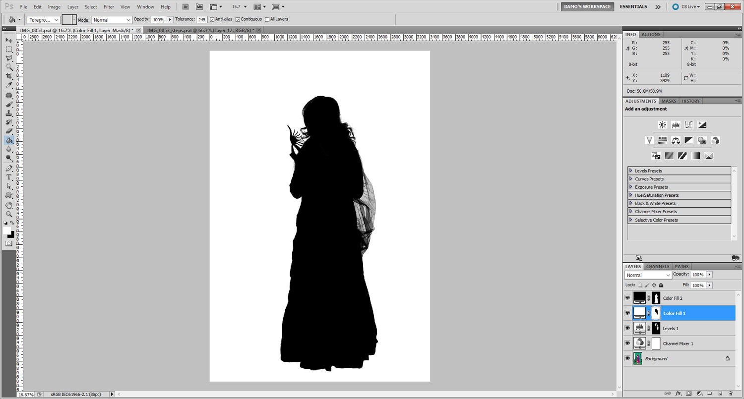
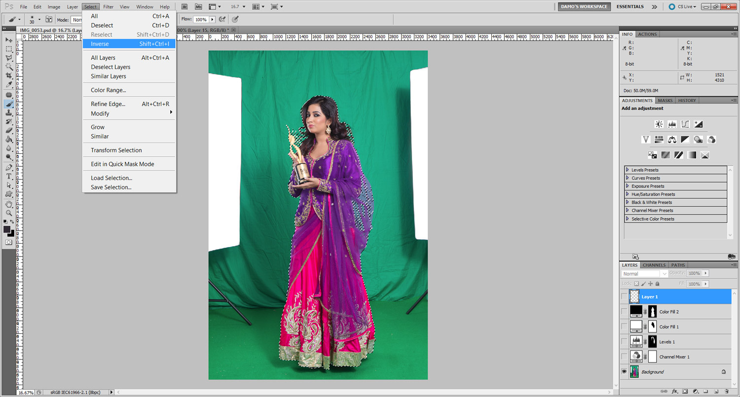
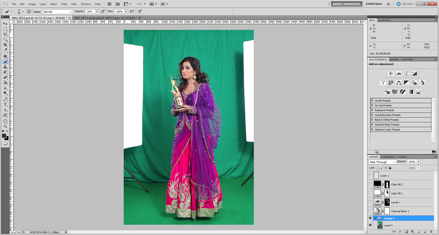
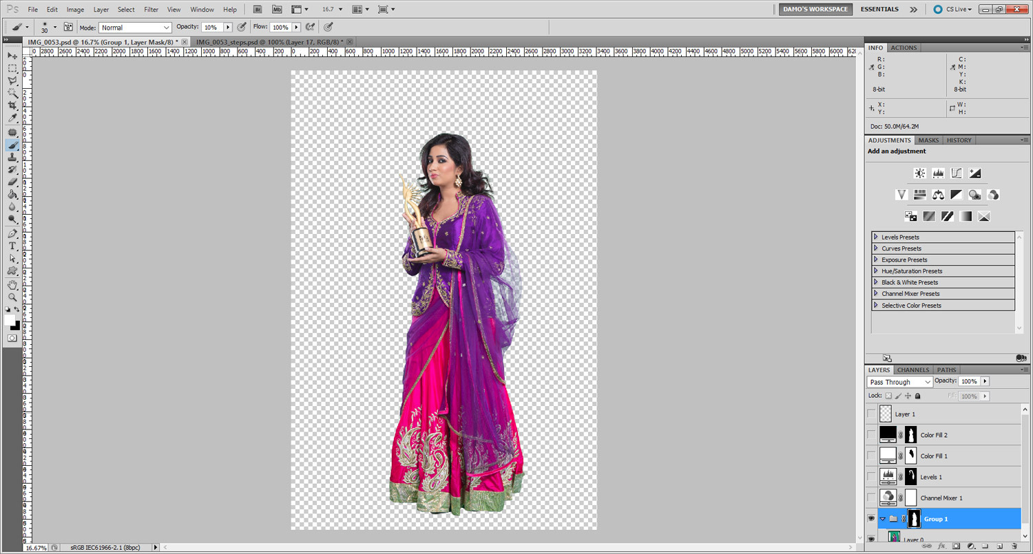
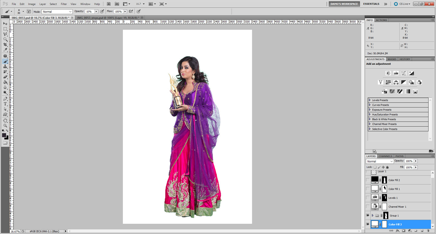
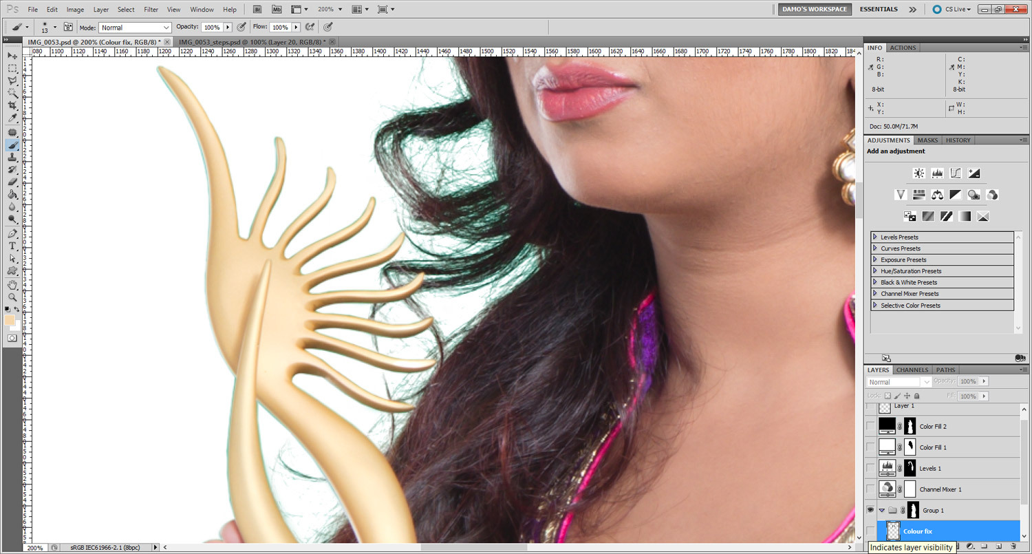
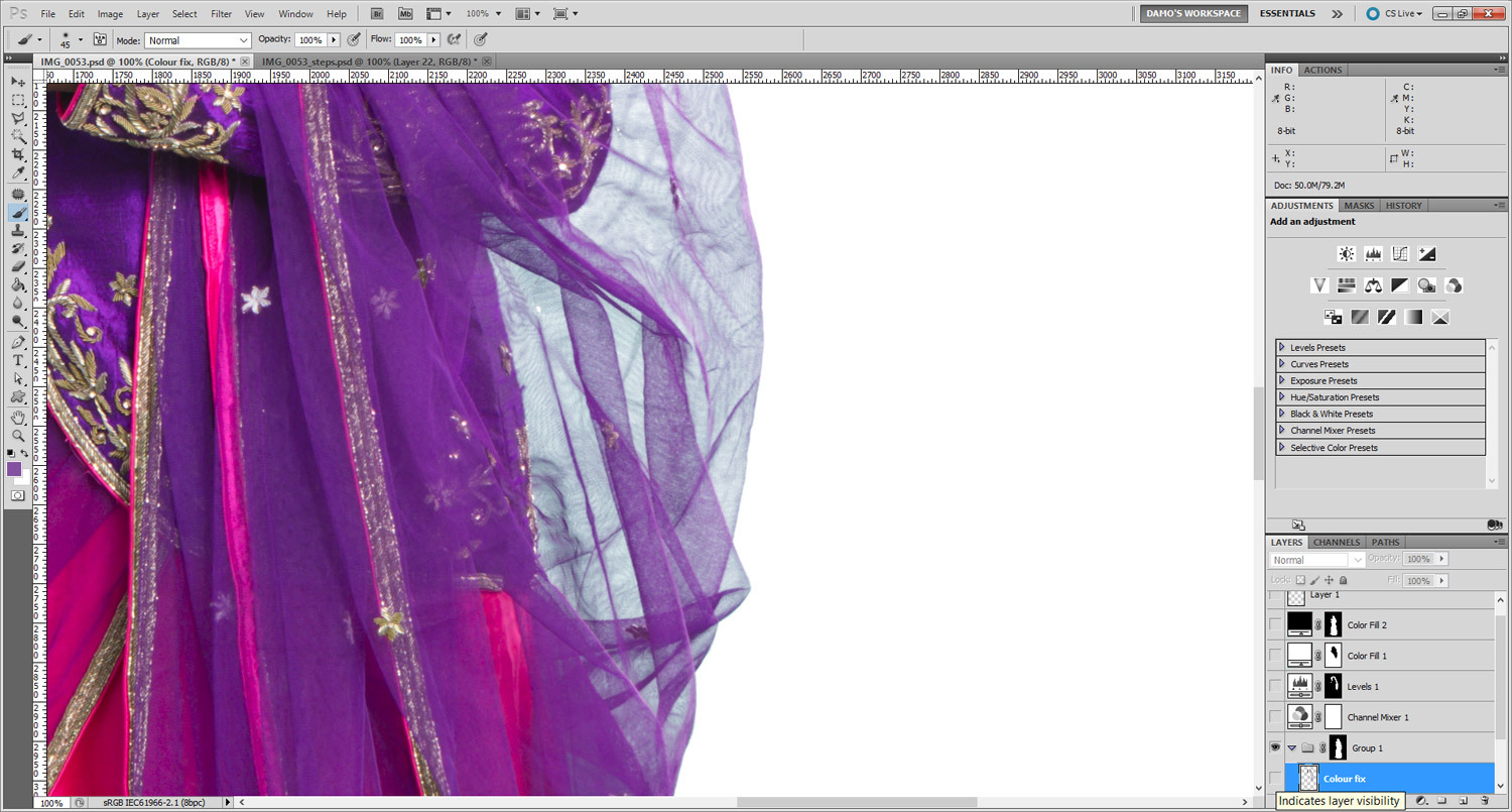
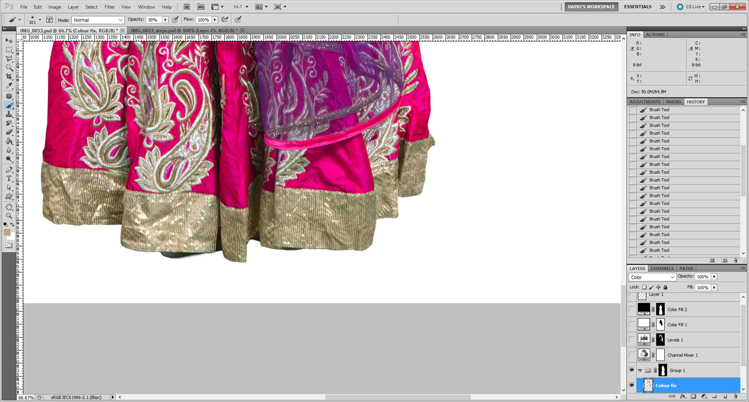
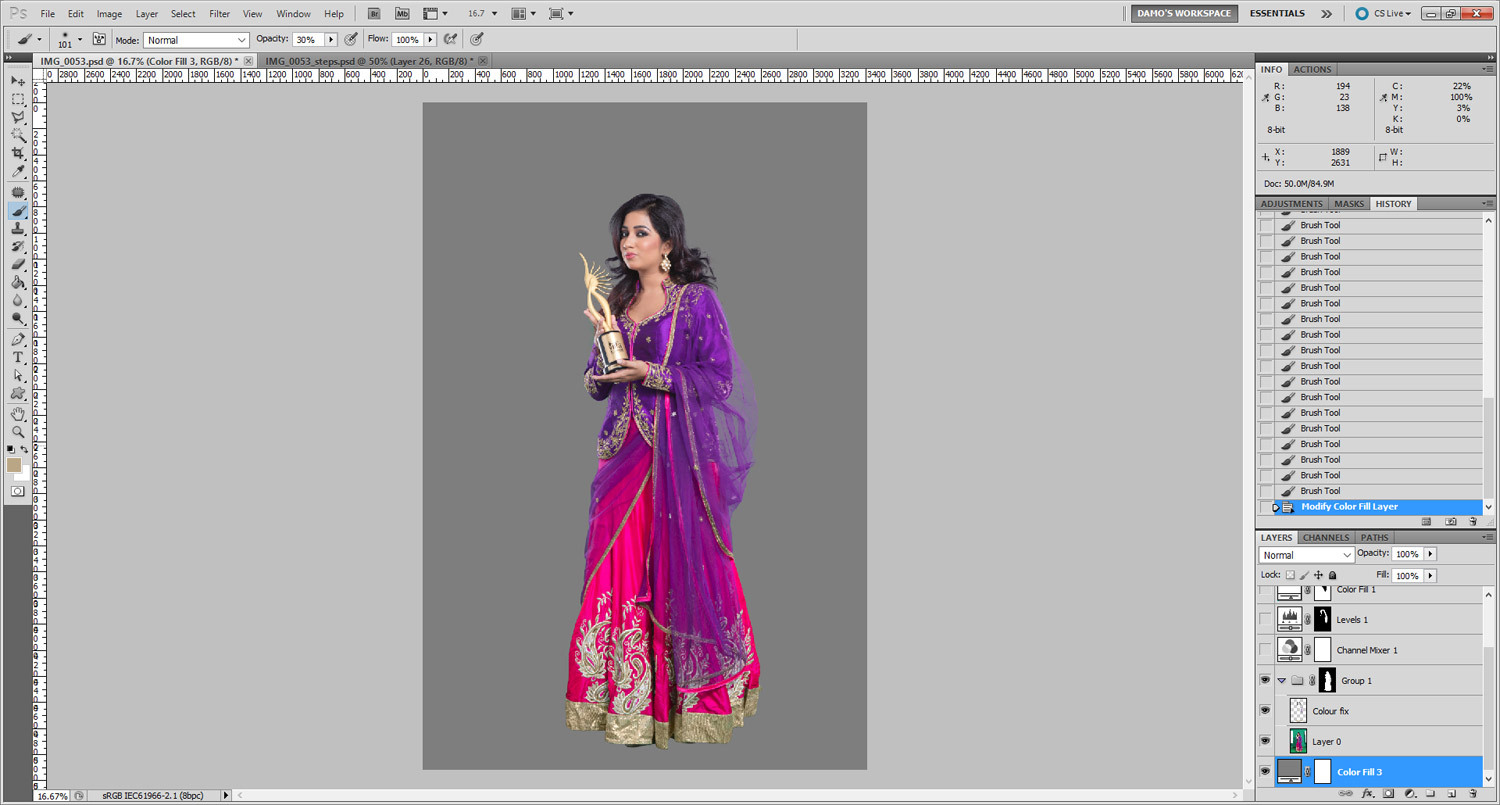
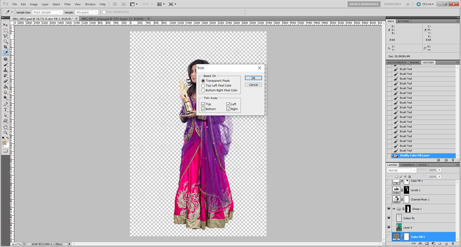
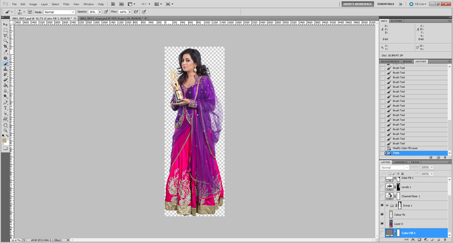
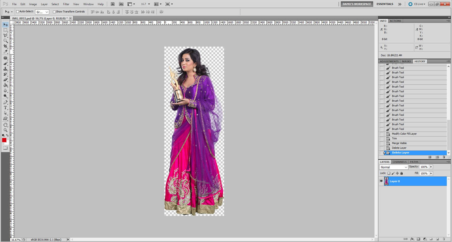
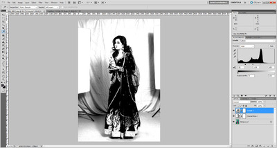
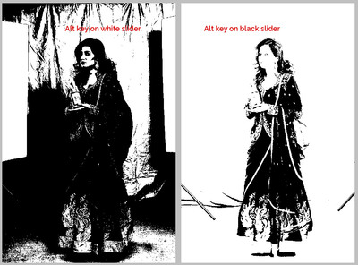
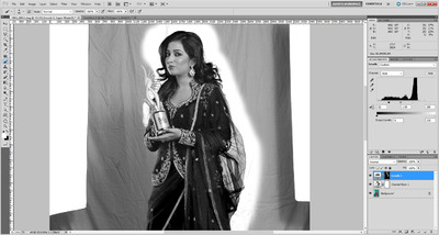
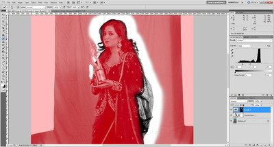
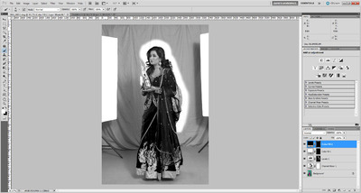
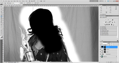
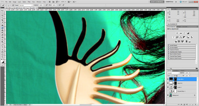
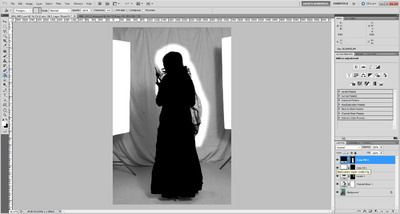
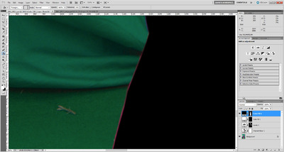
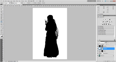
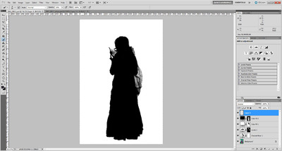
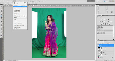
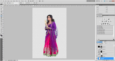
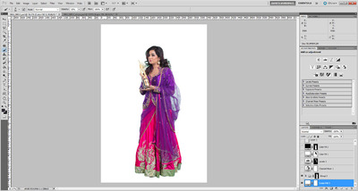
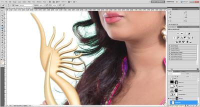
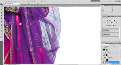
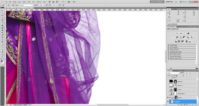
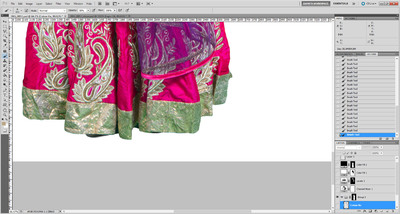
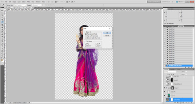
Ok, here goes ... (Note: This method only works in Photoshop. If you had Elements, you'd be outta luck.) 1. Add a Channel Mixer layer and check the Monochrome box, and enter 0/100/0: 2. Add a Levels layer and bring the white slider in as far as you can to make the background pure white, but not lose too much hair detail. This is a delicate balancing act. It's a good idea to hold down the Alt key while sliding the slider, so you can have a good view of what's clipping. Then do the same with the black slider, to fill in as much hair detail as you can, but not so far that you fill in unwanted detail too. 3. Invert the mask on that layer, then paint it only around the edges where it's needed - the hair and the veil in this case. No need to be very precise with this painting step. Here's the mask view so you can see a bit more clearly: 4. Add a white Solid Color layer, then a black Solid Color layer. Invert the mask on both layers so they're hidden: 5. On the black layer, start painting to completely and carefully obscure the subject where she needs to be completely preserved. Leave the wisps of hair to be wispy, of course. I started with her head: It's not a bad idea to turn all the other layers off sometimes, while doing this, so you're painting black over the original colour photo. That's what I did while going around that tricky trophy thing she's holding: To save your sanity, for heaven's sake make sure you use this method around the dress and other simple edges. Eventually, the subject will be completely black: I want to say that it's not vital to be accurate. In fact, it's better if you allow a tiny bit of room inside the edge of the subject. See how I've left a thin line of dress visible here? 6. Then paint on the mask of the white Solid Color layer, to make the whole background perfectly white. This should be very quick, because around the hair it's already white, so no precision necessary, and around the dress, you can paint straight underneath the black layer you already did before. 7. Add a new blank layer (this might not be necessary in all versions, but this step can be a bit buggy, so do it anyway.) 8. Ctrl Alt Shift 2 (Mac: Cmd Opt Shift 2) to make a luminosity selection (gives you marching ants all around the white areas): 9. Turn off all the layers except for the Background layer. (You should still have the marching ants active). Go to the Select Menu and choose "Inverse". This will make the marching ants go around the subject, not the background: 10. Double-click the Background layer to turn it into "Layer 0", then immediately Ctrl G to put it into a layer group (remember, you should still have the marching ants while you do this): 11. Click the mask button in the Layers panel to add a mask to the group. The marching ants will disappear, and so will the background: 12. In the layer group, above Layer 0, add a new blank layer and call it "Colour Fix", and change its blend mode to "Color": 13. Temporarily close the layer group by clicking its little arrow. Then add another white Solid Color layer and move it to the very bottom of the layer stack, below the group: 14. Then open the group again, and return to the "Colour Fix" layer you just made. This layer will serve the same purpose as it does for fixing Chromatic Aberration. When you zoom in, you'll see traces of green everywhere: So you sample various nearby colours, and start painting over that green, like this: Even the veil still has a hint of green tinge to it: So you sample some purple colour and paint with low opacity to get rid of it: The bottom is the worst - look at that awful green cast! Sample and paint gently over it: 15. Finally, it should be done. All the edges should be their correct colour. You should be feeling proud of yourself right now The last thing to do is change the bottom white layer to medium grey, and check the edges again to make sure everything's ok: 16. Then you can turn that bottom layer off, to see the photo in its transparent glory. Then finally, go to the Image menu and choose Trim, and trim away the transparent pixels: Leaving you with this: Save that PSD for yourself. That's your master file if you need to come back to it. 17. Finally, click on Layer 0, then go to the Layer menu and choose "Merge Visible". Then delete all the layers which are turned off, leaving you with this: Save that as a different PSD file, that's the one you'll send to your client. Hope this helps.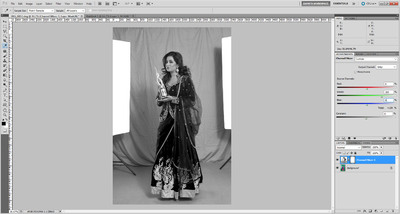


- 18 replies
-
- 15
-

-
Extracting subject from green background
Damien Symonds replied to Hemant's topic in Help with editing
Thanks. I have to bolt out and do the grocery shopping, because there's nothing in the house, and I'll write it up for you when I get back. -
Hell, I make it all the time, and I'm way past rookie.
-
But gee, don't worry about "bothering"! It's what I'm here for.
-
For the record, this is mentioned in the FAQs
-
No that's fine, perfectly legitimate. Just checking. If you Alt-click on the mask thumbnail to show it in black and white, is it pure black in that problem area?
-
Extracting subject from green background
Damien Symonds replied to Hemant's topic in Help with editing
Ok, great. That makes things a little easier, at least. Do you mind sending me the full-size file of the lady that you posted above? And would you mind if I used her to write a tutorial for you on my site? -
What is the purpose of the layer you're masking there?
-
Screen gone crazy after calibrating
Damien Symonds replied to Yve's topic in Monitor calibration questions or problems
Yep, post in the LR section for help with that. -
Coloured Watermark
Damien Symonds replied to Lozzer2006's topic in Photoshop / Elements / Bridge / ACR questions or problems
Hi Lauren, the action takes a little while to set up, but it's well worth it, I promise. It will save you so much time in the future. -
It's most likely Chromatic Aberration.
- 1 reply
-
- 1
-
-
Extracting subject from green background
Damien Symonds replied to Hemant's topic in Help with editing
Fair enough. Do you intend to leave some shadows around their feet? Or a clean cut-out down there? -
Extracting subject from green background
Damien Symonds replied to Hemant's topic in Help with editing
What file format will you be providing to them? -
Extracting subject from green background
Damien Symonds replied to Hemant's topic in Help with editing
And then what? What are they being used for?